CSS
border가 있는 페이지 레이아웃
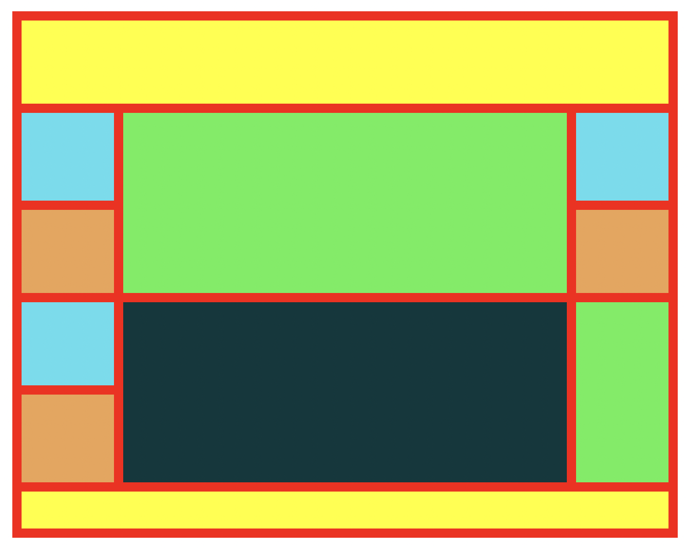
HTML 구성
<body>
    <div id="wrap">
        <header id="header"></header>
        <section id="section">
            <aside class="left">
                <div class="box1_1 color1 bottom h95"></div>
                <div class="box1_1 color2 top bottom h90"></div>
                <div class="box1_1 color1 top bottom h90"></div>
                <div class="box1_1 color2 top h95"></div>
            </aside>
            <article class="center">
                <div class="box5_2 color3 bottom"></div>
                <div class="box5_2 color4 top"></div>
            </article>
            <aside class="right">
                <div class="box1_1 color1 bottom h95"></div>
                <div class="box1_1 color2 top bottom h90"></div>
                <div class="box1_2 color3 top h195"></div>
            </aside>
        </section>
        <footer id="footer"></footer>
    </div>
</body>
CSS 구성
@charset "utf-8";
*{margin: 0;padding: 0;}
/* 먼저 border 없이 만들고 border를 만들고 height을 줄인다 */
#wrap{
    width: 700px;
    height: 550px;
    margin: 20px auto;
    border: 10px solid #f00}
#header{
    width: 100%;
    height: 90px;
    background: yellow;
    border-bottom: 10px solid #f00;}
#section{
    width: 100%;
    height: 400px;
}
#footer{
    width: 100%;
    height: 40px;
    background: yellow;
    border-top: 10px solid #f00;
}
.left{
    width: 100px;
    height: 100%;
    background: red;
    float: left;
}
.center{
    width: 480px;
    height: 100%;
    background: blue;
    float: left;
    border-left: 10px solid #f00;
    border-right: 10px solid #f00;
}
.right{
    width: 100px;
    height: 100%;
    background: red;
    float: left;
}
.box1_1{
    width: 100px;
    height: 100px;
}
.box5_2{
    width: 480px;
    height: 195px
}
.box1_2{
    width: 100px;
    height: 200px
}
.color1{
    background: rgb(83, 222, 238);
}
.color2{
    background: rgb(238, 163, 83);
}
.color3{
    background: rgb(88, 238, 83);
}
.color4{
    background: rgb(3, 56, 61);
}
.top{
    border-top: 5px solid #f00
}
.bottom{
    border-bottom: 5px solid #f00
}
.h95{
    height: 95px;
}
.h90{
    height: 90px;
}
.h195{
    height: 195px;
}
border가 있는 페이지 레이아웃
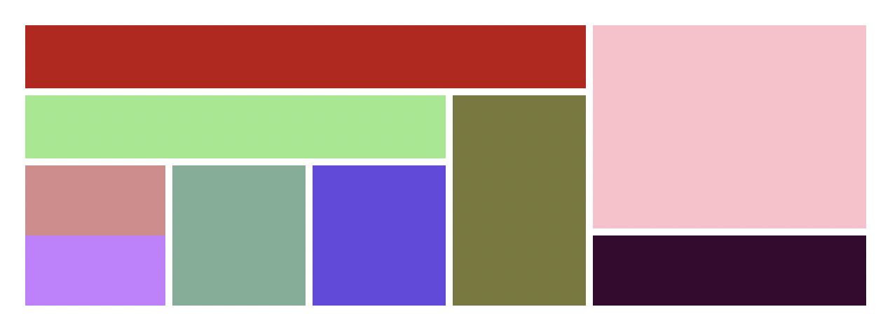
HTML 구성
<body>
    <div id="wrap">
        <div class="left">
            <div class="left_top"></div>
            <div class="left_bottom">
                <div class="left_bottom_left">
                    <div class="left_bottom_left_top"></div>
                    <div class="left_bottom_left_bottom">
                        <div class="left_bottom_left_bottom_left">
                            <div class="left_bottom_left_bottom_left_top">								</div>
                            <div class="left_bottom_left_bottom_left_bottom">							</div>
                        </div>
                        <div class="left_bottom_left_bottom_center"></div>
                        <div class="left_bottom_left_bottom_right"></div>
                    </div>
                </div>
                <div class="left_bottom_right"></div>
            </div>
        </div>
        <div class="right">
            <div class="right_top"></div>
            <div class="right_bottom"></div>
        </div>
    </div>
</body>
CSS 구성
@charset "utf-8";
@import url('./reset.css');

#wrap{
    width: 1200px;
    height: 400px;
}
.section1{
    width: 790px;
    height: 100%;
    float: left;
}
.section2{
    width: 400px;
    height: 100%;
    float: left;
}
.section1 .header{
    width: 100%;
    height: 80px;
    background: rgb(246, 233, 130);
    float: left;
}
.main{
    width: 100%;
    height: 300px;
}
.article1{
    width: 640px;
    height: 100%;
    background: yellow;
    float: left;
}
.article1_header{
    width: 100%;
    height: 90px;
    background: purple;
}
.article_left{
    width: 216.666px;
    height: 200px;
    float: left;
}
.article_left_up{
    width: 100%;
    height: 90px;
    background: rgb(116, 231, 122);
}
.article_left_down{
    width: 100%;
    height: 90px;
    background: rgb(67, 142, 234);
}
.article_center{
    width: 196.666px;
    height: 200px;
    background: rgb(177, 254, 212);
    float: left;
}
.article_right{
    width: 206.666px;
    height: 200px;
    background: rgb(214, 71, 236);
    float: left;
}
.article2{
    width: 150px;
    height: 300px;
    float: left;
}
.article2_aside{
    width: 100px;
    height: 300px;
    background: rgb(54, 173, 253);
    float: left;
}
.aside_up{
    width: 100%;
    height: 280px;
    background: rgb(252, 128, 240);
}
.aside_down{
    width: 100%;
    height: 100px;
    background: rgb(122, 29, 208);
}
.top{border-top: 10px solid #000;}
.bottom{border-bottom: 10px solid #000;}
.left{border-left: 10px solid #000;}
.right{border-right: 10px solid #000;}
div Grid 레이아웃 (onmouse 속성)
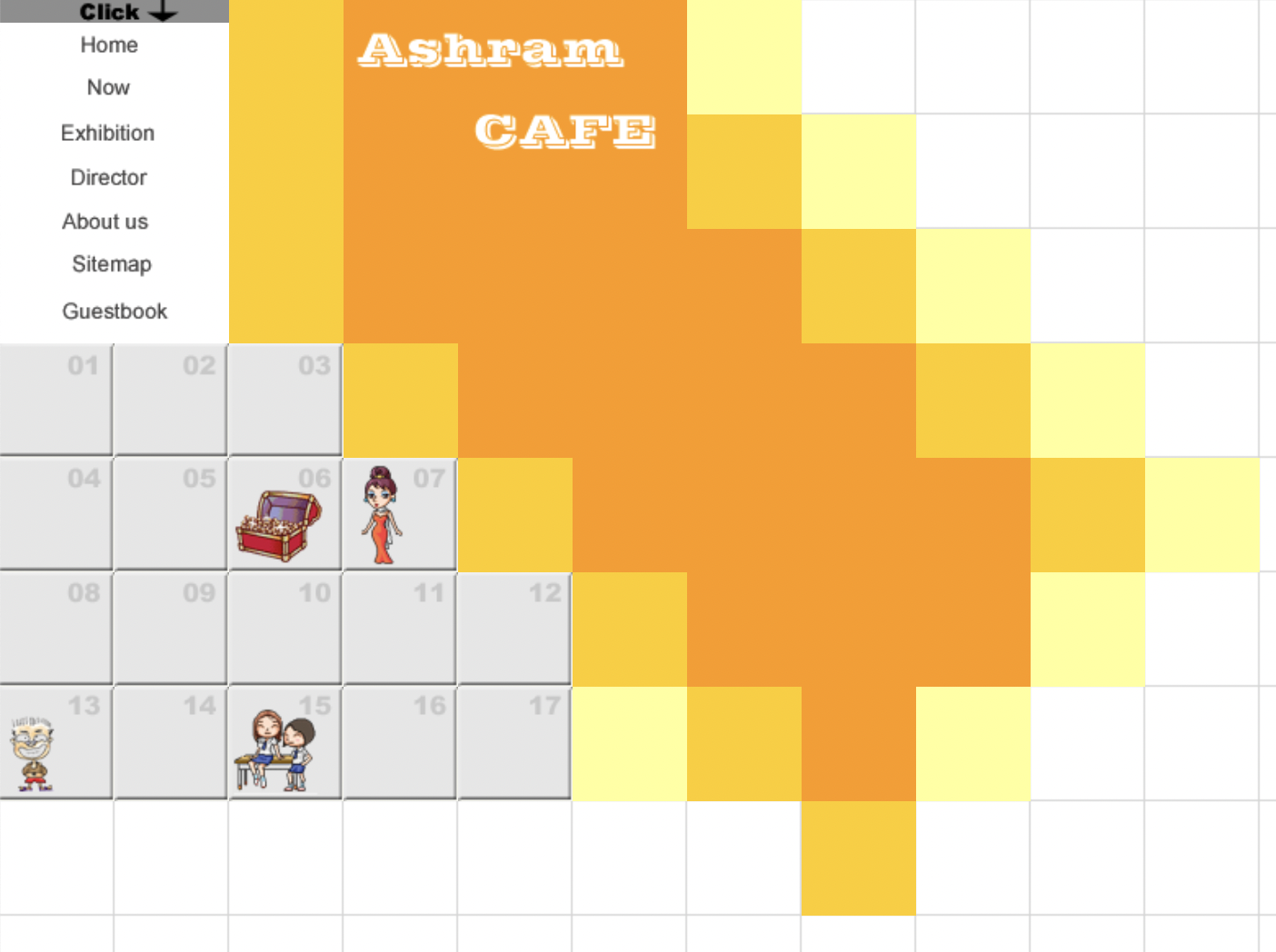
HTML 구성
<body>
    <div id="wrap">
        <div class="top">
            <div class="box2_3 fl">
                <ul>
                    <li><img src="./img/menu_click.gif" alt="click"></li>
                    <li><a href="#"><img src="./img/home_b1.gif" onmouseover="this.src='./img/home_b2.gif'" onmouseout="this.src='./img/home_b1.gif'" alt="home" ></a></li>
                    <li><a href="#"><img src="./img/now_b1.gif" onmouseover="this.src='./img/now_b2.gif'" onmouseout="this.src='./img/now_b1.gif'" alt="now"></a></li>
                    <li><a href="#"><img src="./img/exhibition_b1.gif" onmouseover="this.src='./img/exhibition_b2.gif'" onmouseout="this.src='./img/exhibition_b1.gif'" alt="exhibition"></a></li>
                    <li><a href="#"><img src="./img/director_b1.gif" onmouseover="this.src='./img/director_b2.gif'" onmouseout="this.src='./img/director_b1.gif'" alt="director"></a></li>
                    <li><a href="#"><img src="./img/aboutus_b1.gif" onmouseover="this.src='./img/aboutus_b2.gif'" onmouseout="this.src='./img/aboutus_b1.gif'" alt="aboutus"></a></li>
                    <li><a href="#"><img src="./img/sitemap_b1.gif" onmouseover="this.src='./img/sitemap_b2.gif'" onmouseout="this.src='./img/sitemap_b1.gif'" alt="sitemap"></a></li>
                    <li><a href="#"><img src="./img/guestbook_b1.gif" onmouseover="this.src='./img/guestbook_b2.gif'" onmouseout="this.src='./img/guestbook_b1.gif'" alt="guestbook"></a></li>
                </ul>
            </div>
            <div class="box1_3 fl">
                <div class="box1_1 color2"></div>
                <div class="box1_1 color2"></div>
                <div class="box1_1 color2"></div>
            </div>
            <div class="box3_3 fl">
                <div class="box3_2 color3"><img src="./img/title_cafe.gif" alt="title"></div>
                <div class="box1_1 fl color3"></div>
                <div class="box1_1 fl color3"></div>
                <div class="box1_1 fl color3"></div>
            </div>
            <div class="box1_3 fl">
                <div class="box1_1 color1"></div>
                <div class="box1_1 color2"></div>
                <div class="box1_1 color3"></div>
            </div>
            <div class="box1_3 fl">
                <div class="box1_1"></div>
                <div class="box1_1 color1"></div>
                <div class="box1_1 color2"></div>
            </div>
            <div class="box1_3 fl">
                <div class="box1_1"></div>
                <div class="box1_1"></div>
                <div class="box1_1 color1"></div>
            </div>
            <div class="box1_3 fl">
                <div class="box1_1"></div>
                <div class="box1_1"></div>
                <div class="box1_1"></div>
            </div>
            <div class="box1_3 fl">
                <div class="box1_1"></div>
                <div class="box1_1"></div>
                <div class="box1_1"></div>
            </div>
        </div>
        <div class="bottom">
            <div class="box11_1">
                <div class="box1_1 fl"><img src="./img/grid_gray01.gif" alt="gray01"></div>
                <div class="box1_1 fl"><img src="./img/grid_gray02.gif" alt="gray02"></div>
                <div class="box1_1 fl"><img src="./img/grid_gray03.gif" alt="gray03"></div>
                <div class="box1_1 fl color2"></div>
                <div class="box1_1 fl color3"></div>
                <div class="box1_1 fl color3"></div>
                <div class="box1_1 fl color3"></div>
                <div class="box1_1 fl color3"></div>
                <div class="box1_1 fl color2"></div>
                <div class="box1_1 fl color1"></div>
                <div class="box1_1 fl"></div>
            </div>
            <div class="box11_1">
                <div class="box1_1 fl"><img src="./img/grid_gray04.gif" alt="gray04"></div>
                <div class="box1_1 fl"><img src="./img/grid_gray05.gif" alt="gray05"></div>
                <div class="box1_1 fl"><img src="./img/grid_gray06.gif" alt="gray06"></div>
                <div class="box1_1 fl"><img src="./img/grid_gray07.gif" alt="gray07"></div>
                <div class="box1_1 fl color2"></div>
                <div class="box1_1 fl color3"></div>
                <div class="box1_1 fl color3"></div>
                <div class="box1_1 fl color3"></div>
                <div class="box1_1 fl color3"></div>
                <div class="box1_1 fl color2"></div>
                <div class="box1_1 fl color1"></div>
            </div>
            <div class="box11_1">
                <div class="box1_1 fl"><img src="./img/grid_gray08.gif" alt="gray08"></div>
                <div class="box1_1 fl"><img src="./img/grid_gray09.gif" alt="gray09"></div>
                <div class="box1_1 fl"><img src="./img/grid_gray10.gif" alt="gray10"></div>
                <div class="box1_1 fl"><img src="./img/grid_gray11.gif" alt="gray11"></div>
                <div class="box1_1 fl"><img src="./img/grid_gray12.gif" alt="gray12"></div>
                <div class="box1_1 fl color2"></div>
                <div class="box1_1 fl color3"></div>
                <div class="box1_1 fl color3"></div>
                <div class="box1_1 fl color3"></div>
                <div class="box1_1 fl color1"></div>
                <div class="box1_1 fl"></div>
            </div>
            <div class="box11_1">
                <div class="box1_1 fl"><img src="./img/grid_gray13.gif" alt="gray13"></div>
                <div class="box1_1 fl"><img src="./img/grid_gray14.gif" alt="gray14"></div>
                <div class="box1_1 fl"><img src="./img/grid_gray15.gif" alt="gray15"></div>
                <div class="box1_1 fl"><img src="./img/grid_gray16.gif" alt="gray16"></div>
                <div class="box1_1 fl"><img src="./img/grid_gray17.gif" alt="gray17"></div>
                <div class="box1_1 fl color1"></div>
                <div class="box1_1 fl color2"></div>
                <div class="box1_1 fl color3"></div>
                <div class="box1_1 fl color1"></div>
                <div class="box1_1 fl"></div>
                <div class="box1_1 fl"></div>
            </div>
            <div class="box11_1">
                <div class="box1_1 fl"></div>
                <div class="box1_1 fl"></div>
                <div class="box1_1 fl"></div>
                <div class="box1_1 fl"></div>
                <div class="box1_1 fl"></div>
                <div class="box1_1 fl"></div>
                <div class="box1_1 fl"></div>
                <div class="box1_1 fl color2"></div>
                <div class="box1_1 fl"></div>
                <div class="box1_1 fl"></div>
                <div class="box1_1 fl"></div>
            </div>
        </div>
    </div>
</body>
CSS 구성
@charset "utf-8";
*{margin: 0; padding: 0;}
body{background: url(../img/grid_back_02.gif);}
#wrap{
    width: 770px;
    height: 560px;
}
.fl{float: left;}
.box2_3{
    width: 140px;
    height: 210px;
    background: #fff;
}
li{
    list-style: none;
    line-height: 0;
}
.box1_3{
    width: 70px;
    height: 210px;
}
.box3_3{
    width: 210px;
    height: 210px;
}
.box3_2{
    width: 210px;
    height: 140px;
}
.box1_1{
    width: 70px;
    height: 70px;
}
.color1{
    background: #ffff99;
}
.color2{
    background: #ffcc00;
}
.color3{
    background: #ff9900;
}
최대한 중복되는 HTML의 클래스를 이용하여 CSS를 작성한다.
onmouse(마우스를 올릴때 바뀌는 이벤트)
onmouseover="this.src='경로'"
onmouseout="this.src='경로'"
image의 패딩공간 (인라인 블록화)

img요소의 블록화 img요소는 inline요소이다. 다시 말해 image요소는 텍스트 취급, 브라우저 요소 내의 텍스트를 렌더링할 때 나름의 방식이 있는데 이를 이해하려면 타이포그래피에 대해 어느정도는 알아야 한다.
- img{display: block;} 또는
- img{vertical-align: bottom;} 를 적용
- 첫번째, image요소를 블록요소로 전환하면 더 이상 텍스트 취급하지 않는다.
- 두번째, inline요소에 사용할 수 있는 vertical-align 프로퍼티를 사용하는 방법
(vertical-align 프로퍼티의 기본값은 baseline인데 이것을 bottom을 위치 조정하면된다.)
단위 (px, %, em, rem, vh, vw)
Absolute Units
- px (고정단위)
기초단위, 세세한 조정 (반응형에 적합하지 않지만, 세세한 조정필수 단위)
Relative Units
- % (상대단위)
인접한 부모를 기준으로 설정할 수 있다. 엘리먼트 기준 max-width / min-width
*%는 body와 html이 높이값이 없기 때문에 body와 html의 높이값을 정해주거나 vh,vw,를 사용한다.- em (상대단위)
부모 요소를 기준으로 자식요소의 크기가 결정됨 (폰트기준) 조상, 부모, 자식요소 등 관계복잡 시 기준이 복잡해 폰트사이즈 예측이 어렵다.
*body, wrap을 따른다.- rem (상대단위)
가장 최상단의 html에 정의된 사이즈를 기준으로 배수된다. em과 달리 인접한 부모요소와 관계없음
*rem은 root를 기준으로 따른다.- vh,vw (상대단위)
부모가 아닌 viewport, 보이는 화면 크기 높이값에 비례