
width: auto와 height: auto는 default 값으로 매우 자주 사용되는 속성중 하나입니다. 근데 이 auto 속성이 익숙함에 비해 어떻게 동작하는지에 대해서는 크게 생각하거나 다루지지 않아서 이에 대해 직접 정리하려고 합니다.
1. Iine-block
line-block 요소에서의 auto 속성은 자식 요소들 크기(margin + boreder + padding + width)에 자동으로 맞춥니다.
아래 예시 코드를 통해 inline-block 요소에 width: auto height :auto가 설정되면, 어떻게 동작하는지 알아보겠습니다.
<!DOCTYPE html>
<html>
    <head>
		<meta charset="UTF-8">
        <title>width, height auto</title>
        <link rel="stylesheet" href="styles.css">
    </head>
    <body>
			<div class=parent>
				<div class=inline-box>
						<div class=child>자식요소</div>
				</div>
			</div>
    </body>
</html>
.parent {
width: 100px;
height: 100px;
border: 1px solid black;
background-color:cornflowerblue;
}
.inline-box {
border: 1px dashed white;
display: inline-block;
}
.child {
width: 70px; height: 20px;
background-color: salmon;
font-size: 15px;
text-align: center;
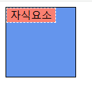
}parent 요소는 width, height 속성으로 크기와 높이를 100px로 설정하였습니다.
inline-box 요소는 display:inline-block 속성을 주어 인라인 블럭 요소로 설정해주었습니다.
inline-block 요소는 default 값으로 height, width에 auto 값이 들어가게됩니다.
따라서 inline-box 요소는 하위 자식 요소 만큼의 크기를 가지게됩니다.
child 요소는 width 70px과 height 20px를 주어 크기와 높이를 설정하였습니다. 따라서, inline-box 요소는 childe 요소의 width 70px과 height 20px를 갖게됩니다.
1-1. Inline-block의 딜레마 문제
Inline-block의 width: auto는 자식 요소의 크기를 기준으로 너비를 설정하는 반면, width: 100%는 부모 요소의 크기를 기준으로 너비를 설정합니다. 그렇다면 부모 요소(inline-block)에 width: auto를 설정하고, 자식 요소에 width: 100%를 설정한다면 서로의 크기를 기준으로 잡기 때문에, 딜레마 같은 순환 참조문제가 발생할 수 있습니다.
<!DOCTYPE html>
<html>
    <head>
		<meta charset="UTF-8">
        <title>width, height auto</title>
        <link rel="stylesheet" href="styles.css">
    </head>
    <body>
			<div class=parent>
						<div class=child></div>
			</div>
    </body>
</html>
.parent {
  width: auto;
  display: inline-block;
  border: 1px solid black;
  background-color:cornflowerblue;
}

.child {
  width: 100%;
  border: 1px dashed salmon;
  margin: 0 10px;
  height: 30px;
}
parent 요소는 width: auto 속성을 주어 자식 요소 크기를 기준으로 너비가 적용됩니다.
child 요소는 width: 100%로 설정하여 부모 요소 크기를 기준으로 동일한 너비로 적용됩니다.
이 결과 부모 요소의 크기는 24px로 설정되었으며, 자식 요소 크기 역시도 24px로 설정되었습니다.
먼저 부모 요소의 크기를 결정하기 위해서 자식 요소의 크기를 계산하게됩니다.
자식요소 child의 크기는 border(좌/우 총 2px) + margin(좌/우 총 20px) + 100% = 22px + 100%
여기서 딜레마는 100%를 어떻게 계산하는가 입니다. 계산하는 시점에 부모 요소의 width는 auto로 설정되어져 있기 때문에 0으로 처리되어서, 총 크기는 22px이 됩니다. 따라서 부모 요소의 width = 22px로 설정됩니다.

2. Block
Block 요소는 height:auto는 inline-block과 마찬가지로 자식 요소 크기를 기준으로 설정 하지만, width: auto는 부모 요소의 크기를 기준으로 설정합니다.
<!DOCTYPE html>
<html>
    <head>
		<meta charset="UTF-8">
        <title>width, height auto</title>
        <link rel="stylesheet" href="styles.css">
    </head>
    <body>
			<div class=parent>
				<div class=block-box>
						<div class=child>자식요소</div>
				</div>
			</div>
    </body>
</html>
.parent {
width: 100px;
height: 100px;
border: 1px solid black;
background-color:cornflowerblue;
}
.block-box {
display: block;
border: 1px dashed white;
}
.child {
width: 70px; height: 20px;
background-color: salmon;
font-size: 15px;
text-align: center;
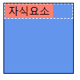
}block-box 요소에서 default 값으로 width, height auto로 설정됩니다. 따라서 height는 자식 요소 child의 높이인 22px로 설정되며, width 값은 부모 요소인 parent 요소의 크기인 100px로 설정됩니다.
2-1. Block의 width: auto는 width: 100%가 아니다.
Block 요소들은 한 줄을 다 채우면서 세로 방향으로 나열하게 되는데, 이러한 성질 때문에 width: auto를 width: 100%와 동일하다고 생각할 수 있습니다. 하지만 width: auto는 width = 100% - maring(좌/우) 값으로 설정되기 때문에 다릅니다.
<!DOCTYPE html>
<html>
  <head>
    <meta charset="UTF-8" />
    <title>width, height auto</title>
    <link rel="stylesheet" href="styles.css" />
  </head>
  <body>
    <div class="parent">
      <div class="child">자식요소</div>
    </div>
  </body>
</html>
.parent {
width: 100px;
height: 100px;
border: 1px solid black;
background-color:cornflowerblue;
}
.child {
border: 1px dashed salmon;
height: 20px;
color: white;
text-align: center;
}
.child1 {
margin: 0 10%;
width: auto;
}
.child2 {
margin: 0 10%;
width: 100%;
}
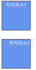
child1 요소에서는 width: auto 값을 주었습니다. 그 결과를 보면 width: auto를 주었어도, margin 값이 적용되어 width = 100% - margin(좌/우) 값이 된다는 것을 볼 수 있습니다.
child2 요소에는 width: 100% 값을 주었습니다. 이는 width = 100% + 10%로 설정되어 실제 width: auto 값과 다른 결과가 출력되어 parent 요소에서 child2 요소가 벗어난 것을 볼 수 있습니다.
3. width: auto, height: auto 사용시 주의
3-1. 부모요소가 height: auto이면, 자식요소의 top: %는 사용 불가!
만약 부모 요소의 width와 height가 auto로 지정되어 있을 때, 자식 요소의 위치속성(left, right, top, bottom)을 %로 지정하게 되면, left와 right는 제대로 동작하지만 top과 bottom은 동작하지 않습니다. 위치 속성을 %값으로 지정하면, 부모 요소의 크기를 기준으로 %를 계산하게 되는데, 부모 요소의 크기가 auto로 설정되어져 있기 때문에 계산에 문제점들이 발생합니다. 만약 상대값(%)이 아니라 절대값(px)로 설정하게 되면, 부모의 크기에 상관없이 움직일 수 있으므로 정상적으로 작동합니다.
3-2. 위치 속성과 transform에서의 height:auto
위치 속성과 동일하게 transform 속성은 요소를 이동시킬 때 사용할 수 있습니다. 하지만 이 둘에는 차이점이 존재합니다 :
좌표 기준에 차이점
- 위치 속성 : 부모 요소의 크기를 기준으로 좌표 이동을 하게됩니다.
- transform 속성 : 자신의 크기를 기준으로 좌표 이동을 하게됩니다.
기준 요소의 height:auto
- 위치 속성 : 부모 요소가 height: auto로 설정되어 있다면, 자식 요소의 top을 계산할 수가 없어서 세로 방향(top)으로 이동하지 않습니다.
- transform 속성 : 자신 요소가 height:auto로 설정되어 있더라도 transform은 CSS에 선언된 값을 기준으로 잡는게 아니라, 실제 크기를 계산하여 그 값을 기준으로 잡기 때문에, auto 선언과는 상관없이 세로 방향(x축)으로 이동할 수 있습니다.
<!DOCTYPE html>
<html>
  <head>
    <meta charset="UTF-8" />
    <title>width, height auto</title>
    <link rel="stylesheet" href="styles.css" />
  </head>
  <body>
    <div class="parent">
      <div class="child child1">자식요소1</div>
    </div>
    <div class="parent">
      <div class="child child2">자식요소2</div>
    </div>
  </body>
</html>
.parent {
width: 100px;
height: auto;
background-color: cornflowerblue;
border: 1px solid black;
}
.child1 {
background-color: salmon;
width: 80px;
height: 22px;
font-size: 16px;
color: white;
text-align: center;
position: relative;
top: 50%;
}
.child2 {
background-color: salmon;
width: 80px;
height: 22px;
font-size: 16px;
color: white;
text-align: center;
position: relative;
transform: translate(50%, 50%);
}
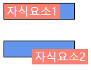
parent 요소의 height를 auto로 설정하였을때, child1 요소는 top 50%를 주었는데 불가하고 요소가 이동하지 않습니다. 이것은 앞서 설명한 것처럼 부모 요소가 height: auto로 설정되어 있기 때문에 자식 요소의 top을 계산할 수가 없어서 세로 방향(top)으로 이동하지 않습니다.
child2 요소는 세로방향(x축)으로 잘 이동된 것을 볼 수 있습니다. 이것 또한 앞서 설명한 것처럼 transform은 CSS에 선언된 값을 기준으로 잡는게 아니라, 실제 크기를 계산하여 그 값을 기준으로 잡기 때문에, auto 선언과는 상관없이 세로 방향(x축)으로 이동할 수 있습니다. 또한, 자기 자신을 auto로 설정하더라도 세로 방향으로 정상적으로 이동됩니다.
4. 정리
CSS에서 width: auto, height: auto는 요소의 크기를 설정할 때 자주 사용되며, 기본값으로 설정되는 경우가 많습니다. 하지만 이 속성은 요소의 display 유형 및 상위/하위 요소와의 관계에 따라 작동 방식이 달라 주의가 필요합니다.
Inline-block 요소
width: auto,height: auto는 자식 요소의 크기(padding,border,margin포함)를 기준으로 결정됩니다.- 부모와 자식 간 크기 계산의 기준이 다를 경우, 특히 부모 요소가
width: auto이고 자식 요소가width: 100%인 경우, "딜레마" 문제가 발생할 수 있습니다.→ 부모의 크기를 계산하려면 자식 크기가 필요하고, 자식 크기를 계산하려면 부모 크기가 필요한 순환 참조 문제입니다.
Block 요소
height: auto는 자식 요소의 크기를 기준으로 결정됩니다.width: auto는 부모 요소의 크기(width: 100% - margin)를 기준으로 설정되며,width: 100%와는 다른 동작을 합니다.margin속성을 사용할 경우,width: auto와width: 100%간의 차이가 두드러지므로 적절한 값을 설정해야 합니다.
위치 속성과 transform의 차이
position과transform은 요소를 이동시키는 속성이지만, 기준이 다릅니다.position: 부모 요소를 기준으로 이동.transform: 자신의 크기를 기준으로 이동.
- 부모 요소가
height: auto일 경우,position: relative; top: %와 같은 속성은 작동하지 않을 수 있습니다. 하지만transform: translate()는 정상적으로 동작합니다.
참고 사이트