Dialog
- dialog의 open / close를 처리하기 위한 state + Handle 함수 필요!
(App.js)
 /* dialog 상태 관리하기 위한 state */
  const [Dialog, setDialog] = useState(false);

  /* open/close하기 위한 Handle 함수 */
    const onHandleDialog = () => {
    setDialog(!Dialog);
  }
    ...
   /* Dialog에 Handle함수 연결 */
    <DialogButton onClick={onHandleDialog}>
        <i class="fas fa-cheese"></i>
    </DialogButton>
- DialogTemplate 내부에 Wrapper가 들어가는 구조
(Slider.js)
const DialogTemplate = styled.div`
    position: fixed;
    left: 0;
    top: 0;
    width: 100%;
    height: 100%;
    display: flex;
    align-items: center;
    justify-content: center;
    background: rgba(0,0,0,0.8);
    z-index: 2;
`;
const Wrapper = styled.div`
    display: flex;
    justify-content: center;
    align-items: center;
    position: relative;
    height: 500px;
    width: 60%;
    background: white;
`;

/* close 버튼 생성 */
const CloseButton = styled.button`
    position: absolute;
    top: 15px;
    right: 20px;
    border : none;
    background : white;
    font-size: 20px;
    cursor: pointer;
`;

...

/* render (close 버튼에 Handler 연결) */
    return (
        <DialogTemplate>
            <Wrapper>
                <CloseButton onClick={onHandleDialog}>
                        <i class="fas fa-times"></i>
                </CloseButton>
            </Wrapper>
        </DialogTemplate>
    )
1) background : rgba(0, 0, 0, 0.8)로 뒤에 배경 투명도는 80%로 유지
2) Dialog 박스 크기는 width:60% / height:500px
[ Dialog 결과 ]
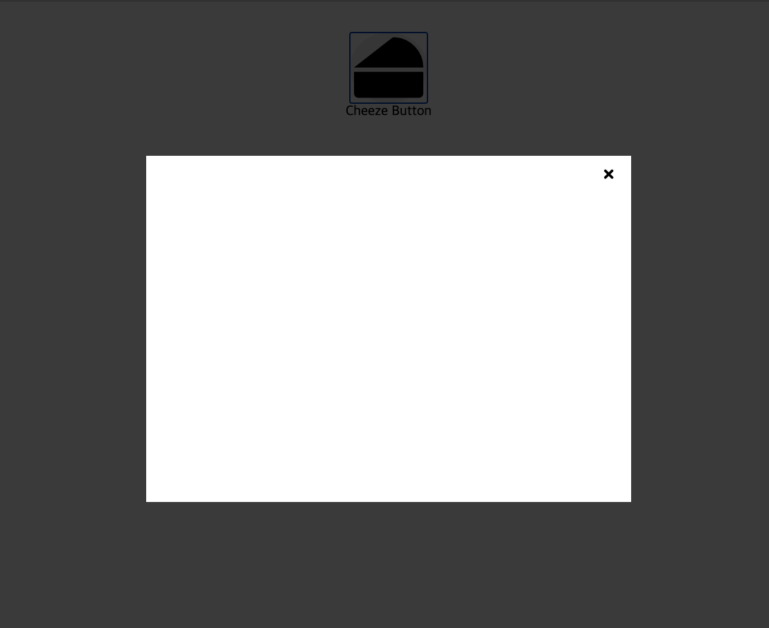
Image Slider
[ 결과물 미리보기 ]
[ 원리 ]
1) ImageList의 크기를 지정하고 넘치는 부분을 hidden처리
: ImgageList 내부에서 Image들은 모두 출력되지만 overflow:hidden 속성으로 안보이는 것const ImageList = styled.div` width: 250px; // Image 하나의 크기오아 동일해야 한다. hight: 250px; // 위와 동일 position: relative; display: flex; justify-content: flex-start; align-items: center; overflow: hidden; `;2) choiceIdx라는 state필요
: 현재 사용자가 몇번째 그림을 보고있는지에 따라 조건부 css 적용
(styled-components)3) 버튼을 클릭시 Image의 width만큼 해당 방향으로 transform
4) 오른쪽 버튼 클릭 -> choiceIdx+1 / 왼쪽 버튼 클릭 -> choiceIdx-1
: 조건문으로 가장 왼쪽과 오른쪽에서 증/감 되지 않게 예외처리
(Slider.js)
function Slider({onHandleDialog}) {
   /* 현재 사용자가 선택한 이미지 idx관리할 state */
    const [choiceIdx,setChoiceIdx] = useState(1);

   /* 버튼 클릭시 choiceIdx 증/감 */
    const onClickLeftButton = () => {
        if(choiceIdx != 1){
            setChoiceIdx(choiceIdx-1);
        }
    }
    const onClickRightButton = () => {
        if(choiceIdx != 3){
            setChoiceIdx(choiceIdx+1);
        }
    }

    return (
        <DialogTemplate>
            <Wrapper>
                <CloseButton onClick={onHandleDialog}>
                        <i class="fas fa-times"></i>
                </CloseButton>
                <ImageList choice={choiceIdx}>
                    <LeftButton onClick={onClickLeftButton}>
                        <i className="fas fa-chevron-circle-left fa-2x left"></i>
                    </LeftButton>
                    {
                        List.map((img) => (
                            <Image
                            idx={img.idx}
                            src={img.src}
                            choice={choiceIdx}>
                            </Image>
                        ))
                    }
                    <RightButton onClick={onClickRightButton}>
                        <i className="fas fa-chevron-circle-left fa-2x right"></i>
                    </RightButton>
                </ImageList>
            </Wrapper>
        </DialogTemplate>
    )
}
- 앞서 만든 Dialog내부에 ImageList가 위치
- ImageList내부에는 왼쪽버튼 / 이미지들 / 오른쪽버튼 이 들어있다.
* 이미지에 대한 정보는 List라는 state에 담겨있다.... const List = [ { "idx" : 1, "src" : "http://localhost:3000/images/cheeze1.jpeg" }, { "idx" : 2, "src" : "http://localhost:3000/images/cheeze2.jpeg" }, { "idx" : 3, "src" : "http://localhost:3000/images/cheeze3.jpeg" } ]
(Image.js)
import React from 'react'
import styled, { css } from 'styled-components';

  /* styled-components로 스타일링 + 조건부 css */
const ImageTemplate = styled.img`
    width: 250px;
    height: 250px;
    border-radius: 10%;
    ${props =>
        css`
            transform: translate(-${(props.choice-1)*250}px,0px);
            transition: 1s;
        `
    }
`;
function Image({idx, src, choice}) {
    return (
        choice = idx ?
        <ImageTemplate src={src} key={idx} choice={choice}>
        </ImageTemplate>
        : null
    )
}

export default Image
- 위 코드에서 가장 중요한 것은 choice에 따라 transform 해주는 부분
    ${props =>
        css`
            transform: translate(-${(props.choice-1)*250}px,0px);
            transition: 1s;
        `
    }
: 내가 2번째 그림을 보고 있다면 choice는 2이고 x축으로 250px이동해서 2번째 그림이 보이게 하는 원리!
(translateX()로 해도 무방)

Developer & PhotoGrapher