Flexbox(Flexible Box module)
flexbox 인터페이스 내의 아이템 간 공간 배분과 강력한 정렬 기능을 제공하기 위한 1차원 레이아웃 모델
Flexbox의 두 개의 축
flexbox를 다루려면 주축과 교차축이라는 두 개의 축에 대한 정의를 알아야 한다. 주축은 flex-direction 속성을 사용하여 지정하며 교차축은 이에 수직인 축으로 결정된다. flexbox의 동작은 결국 이 두 개의 축에 대한 문제로 환원되기 때문에 이들이 어떻게 동작하는지 처음부터 이해하는 것이 중요하다.
주축과 교차축
주축
주축은 flex-direction에 의해 정의되며 4개의 값을 가질 수 있다.
- row
- row-reverse
- column
- column-reverse
교차축
교차축은 주축에 수직하므로 만약 flex-direction(주축)이 row나 row-reverse 라면 교차축은 열 방향을 따른다. 주축이 column 혹은 column-reverse 라면 교차축은 행 방향을 따른다.
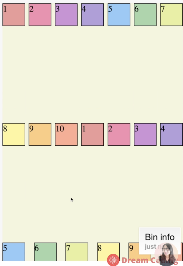
(예시)
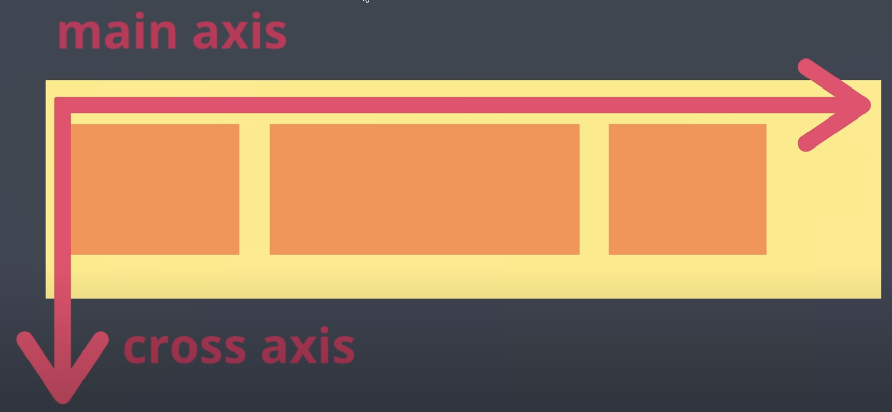
아이템들이 왼쪽에서 오른쪽으로 정렬된 상태이기 때문에 수평축이 주축이 되고 수직축이 교차축이 된다.
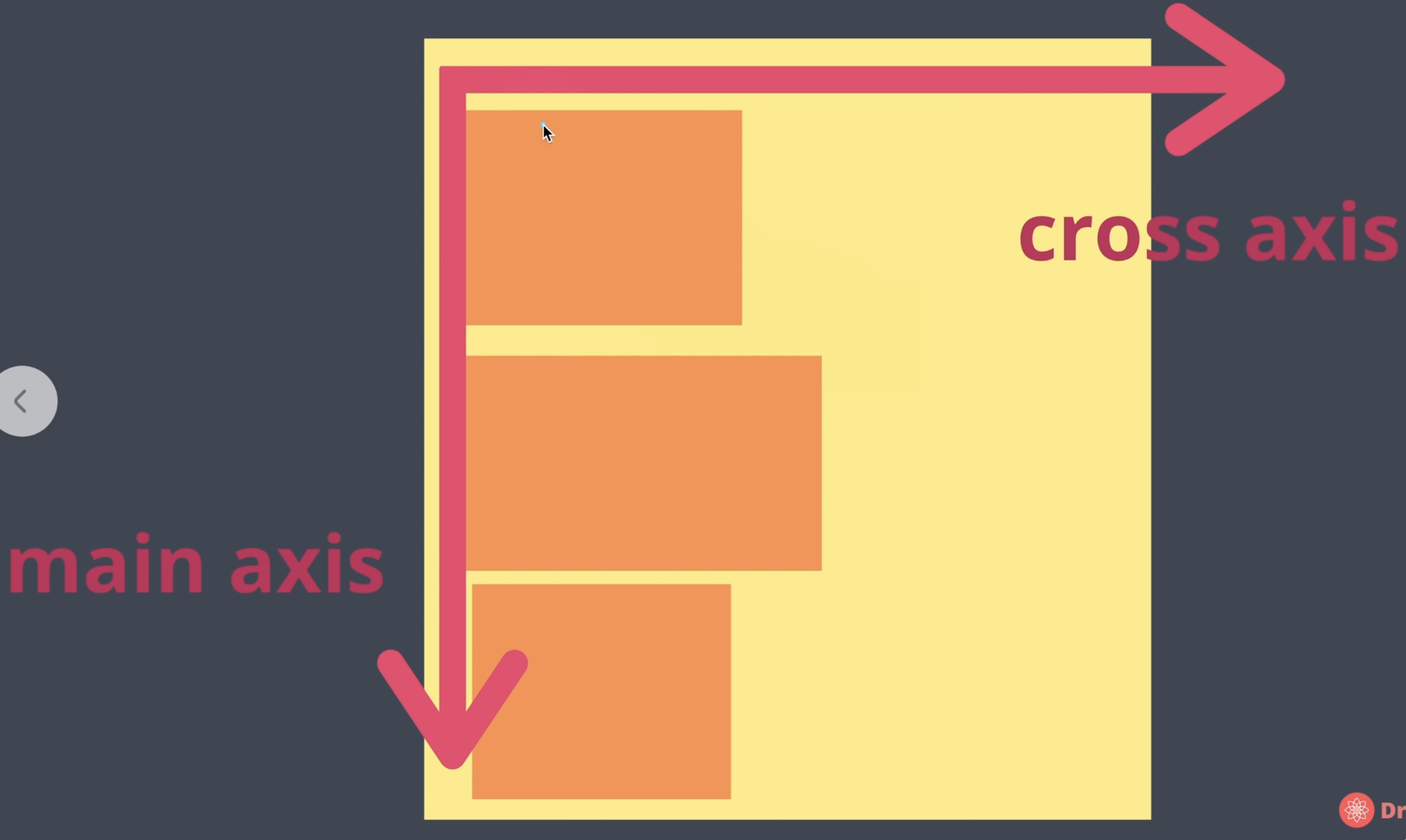
반대로 아이템들이 위에서 아래로 정렬된 상태이기 때문에 수직축이 주축이 되고 수평축이 교차축이 된다.
Container의 속성값들
flex-direction
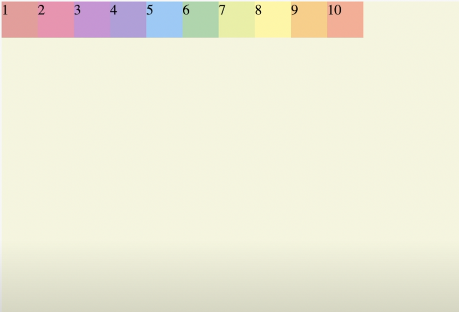
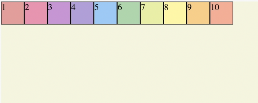
flexbox로 만들고 싶다면 먼저 해당 container에 display와 flex-direction을 지정한다.
.container {
 display: flex; /*아이템이 자동으로 왼쪽에서 오른쪽으로 정렬됨 */
 flex-direction: row; /*왼쪽에서 오른쪽 방향(기본값)*/
} 
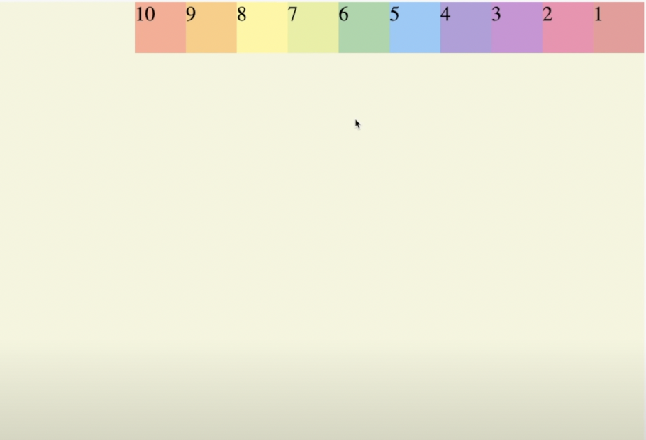
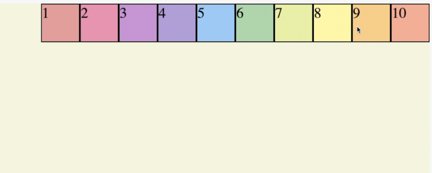
.container {
 display: flex;
 flex-direction: row-reverse; /*오른쪽에서 왼쪽 방향*/
} 
(column도 동일한 방법으로 사용)
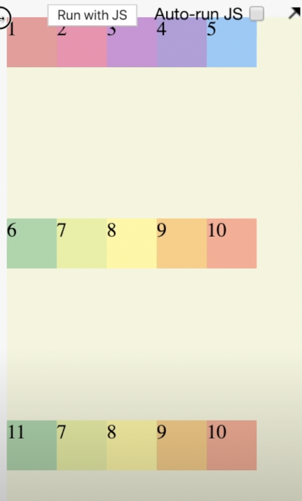
flex-wrap
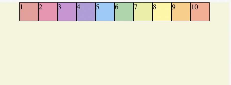
.container {
 display: flex;
 flex-direction: row;
 flex-wrap: nowrap; /*아이템이 한 줄에 다 붙어있음(기본값)*/
} 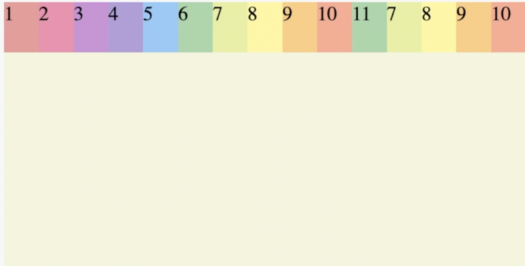
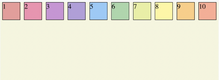
.container {
 display: flex;
 flex-direction: row;
 flex-wrap: wrap; /*아이템이 한 줄에 꽉 차게 되면 자동적으로 다음 라인으로 넘어감
 					reverse도 사용가능*/
} 
flex-flow
flex-direction과 flex-wrap을 한번에 묶어서 사용가능
.container {
 display: flex;
 flex-flow: column nowrap;
}
justify-content
주축에서 아이템들을 어떻게 배치할건지 결정해줌
.container {
display: flex;
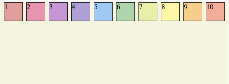
justify-content: flex-start; /*시작축으로 아이템 배치 (기본값)*/
} 
.container {
 display: flex;
 justify-content: flex-end; /*끝축으로 아이템 배치(아이템의 순서유지)
 							-reverse와의 차이점*/
} 
.container {
display: flex;
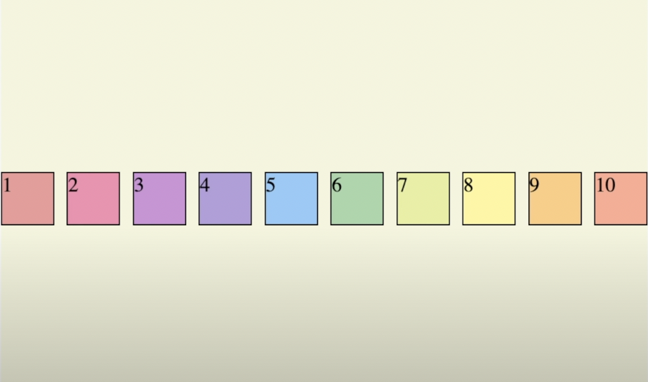
justify-content: center;
} 
.container {
 display: flex;
 justify-content: space-around; /*박스를 둘러싸는 space를 넣어줌
 								(처음과 끝에 있는 아이템 간격이 좁음)*/
} 
.container {
 display: flex;
 justify-content: space-evenly; /*모든 아이템에 똑같은 간격을 넣어줌*/
} 
.container {
 display: flex;
 justify-content: space-between; /*왼쪽과 오른쪽은 화면에 맞게 배치하고
 								중간에만 공간을 넣어줌*/
} 
align-items
교차축에서 아이템들을 어떻게 배치할건지 결정해준다.align-items는 baseline과 함께 사용한다.
.container {
 display: flex;
 justify-content: space-between;
 align-items: center;
} 
.container {
 display: flex;
 justify-content: space-between;
 align-items: baseline;
}
.item {
 width: 40px;
 height: 40px;
 border: 1px solid black;
}
.item1 {
 background: #ef9a9a;
 padding : 20px /*baseline 아이템*/
}
align-content
justify-content는 중심축에서 아이템들을 배치한다면 align-content는 반대축의 아이템들을 배치한다.
.container {
 display: flex;
 flex-direction: row;
 flex-wrap: wrap;
 justify-content: space-between;
 align-items: baseline;
 align-content: space-between;
} 
Item의 속성값들
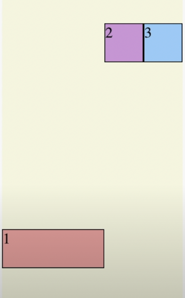
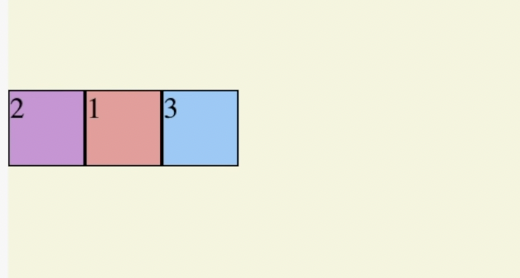
order - 아이템의 순서 지정
.container {
 display: flex;
}
.item {
 width: 40px;
 height: 40px;
 border: 1px solid black;
}
.item 1{
 background: #ef9a9a;
 order: 2
}
.item 2{
 background: #ce93d8;
 order: 1
}
.item 3{
 background: #90caf9;
 order: 3
}
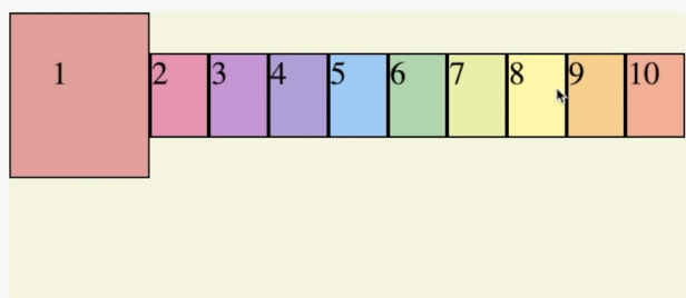
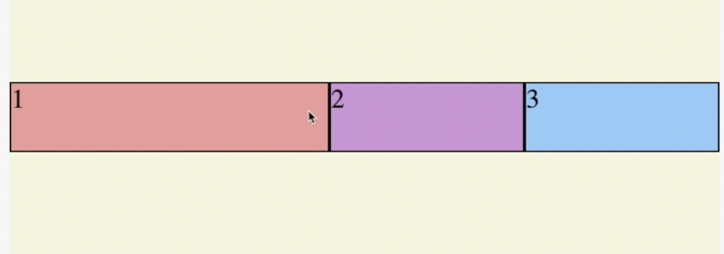
flex-grow - 화면 확대시 아이템 크기의 비율지정
.container {
 display: flex;
}
.item {
 width: 40px;
 height: 40px;
 border: 1px solid black;
}
.item 1{
 background: #ef9a9a;
 flex-grow: 2;
}
.item 2{
 background: #ce93d8;
 flex-grow: 1;
}
.item 3{
 background: #90caf9;
 flex-grow: 1;
}
flex-shrink - 화면 축소시 아이템 크기의 비율지정
.container {
 display: flex;
}
.item {
 width: 40px;
 height: 40px;
 border: 1px solid black;
}
.item 1{
 background: #ef9a9a;
 flex-grow: 2;
 flex-shrink: 2;
}
.item 2{
 background: #ce93d8;
 flex-grow: 1;
 flex-shrink: 1;
}
.item 3{
 background: #90caf9;
 flex-grow: 1;
 flex-shrink: 1;
}
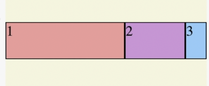
flex-basis
아이템들이 공간을 얼마나 차지해야 하는지 세부적으로 명시
.container {
 display: flex;
}
.item {
 width: 40px;
 height: 40px;
 border: 1px solid black;
}
.item 1{
 background: #ef9a9a;
 flex-basis: 60%;
}
.item 2{
 background: #ce93d8;
 flex-basis: 30%;
}
.item 3{
 background: #90caf9;
 flex-basis: 10%;
}
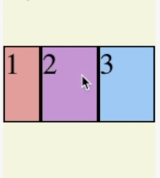
align-self
아이템별로 아이템들을 정렬할 수 있다.
.container {
 display: flex;
}
.item {
 width: 40px;
 height: 40px;
 border: 1px solid black;
}
.item 1{
 background: #ef9a9a;
 align-self: center;
}
.item 2{
 background: #ce93d8;
}
.item 3{
 background: #90caf9;
}