<!DOCTYPE html>
<html>
<style>
/* The container */
.container {
  display: block;
  position: relative;
  padding-left: 35px;
  margin-bottom: 12px;
  cursor: pointer;
  font-size: 22px;
  -webkit-user-select: none;
  -moz-user-select: none;
  -ms-user-select: none;
  user-select: none;
}

/* Hide the browser's default checkbox */
.container input {
  position: absolute;
  opacity: 0;
  cursor: pointer;
  height: 0;
  width: 0;
}

/* Create a custom checkbox */
.checkmark {
  position: absolute;
  top: 0;
  left: 0;
  height: 25px;
  width: 25px;
  background-color: #eee;
}

/* On mouse-over, add a grey background color */
.container:hover input ~ .checkmark {
  background-color: #ccc;
}

/* When the checkbox is checked, add a blue background */
.container input:checked ~ .checkmark {
  background-color: #2196F3;
}

/* Create the checkmark/indicator (hidden when not checked) */
.checkmark:after {
  content: "";
  position: absolute;
  display: none;
}

/* Show the checkmark when checked */
.container input:checked ~ .checkmark:after {
  display: block;
}

/* Style the checkmark/indicator */
.container .checkmark:after {
  left: 9px;
  top: 5px;
  width: 5px;
  height: 10px;
  border: solid white;
  border-width: 0 3px 3px 0;
  -webkit-transform: rotate(45deg);
  -ms-transform: rotate(45deg);
  transform: rotate(45deg);
}
</style>
<body>

<h1>Custom Checkboxes</h1>
<label class="container">One
  <input type="checkbox" checked="checked">
  <span class="checkmark"></span>
</label>
<label class="container">Two
  <input type="checkbox">
  <span class="checkmark"></span>
</label>
<label class="container">Three
  <input type="checkbox">
  <span class="checkmark"></span>
</label>
<label class="container">Four
  <input type="checkbox">
  <span class="checkmark"></span>
</label>

</body>
</html>
1. 일반 형제 연결자 (~, 선택기 레벨 4)
~/* On mouse-over, add a grey background color */
.container:hover input ~ .checkmark {
background-color: #ccc;
}- https://www.w3.org/TR/selectors-3/#general-sibling-combinators
- https://www.w3.org/TR/selectors-4/#general-sibling-combinators
예제
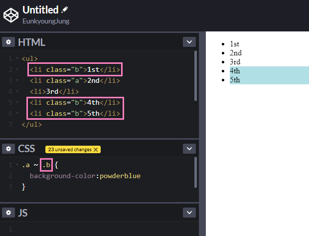
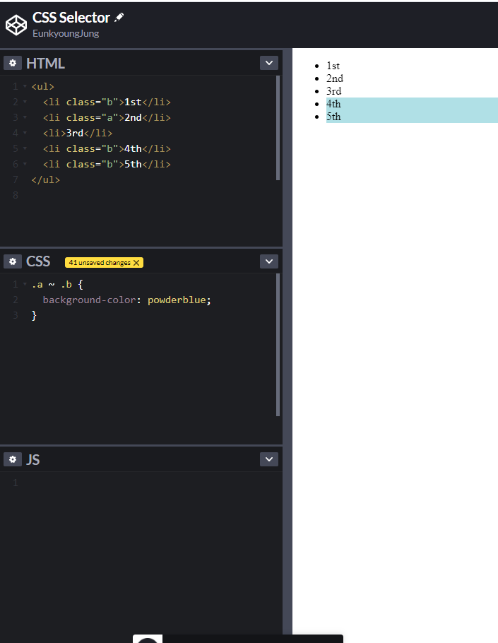
.a ~ .b위의 CSS 셀렉터".a ~ .b")의 의미는
"a 클래스 다음에 오는 b 클래스"라는 의미!
a 클래스 이전의 b 클래스는 셀렉되지 않음에 주의!
"&::placeholder"에서 "::"은 무엇인가?
CSS Selector 기초
Reference

#의식의흐름 #순간순간 #생각의스냅샷