Styled-component + TypeScript
저는
React,TypeScript,Styled-componet이 세가지 조합을 많이 사용하고 있습니다. Styled-component를 사용하는 이유는
- 독자적인 클래스를 만들어 스타일 충돌을 방지
- SASS와 같은 nesting, 변수 기능
- props를 활용한 조건부 스타일 지정
이 세가지 이유가 큰 것 같아요! props와 TypeScript를 활용해 모듈화한 컴포넌트의 스타일을 다양한 조건으로 사용 할 수 있어요!
Type, interface 지정하기
라벨버튼을 예시로 만들어 보겠습니다.
폰트컬러, 배경컬러, 테두리 를 props로 받아 스타일이 정해지는 컴포넌트 입니다.
label.jsx
1. React, Styled-componet와 css를 import해줍니다.
import React from "react";
import styled, { css } from "styled-components";
2. 타입과 인터페이스를 생성합니다.
import React from "react";
import styled, { css } from "styled-components";

type LabelRadius = "square" | "round";
type LabelColor = "blue" | "black" | "gray";
type LabelFontColor = "white" | "black";

interface LabelType {
 children: string; // 보여주고자 하는 글자
 radius: LabelRadius; // "square" | "round";
 background: LabelColor; // "blue" | "black" | "gray";
 fontColor: LabelFontColor; // "white" | "black";
}
인터페이스안에 타입을 주게 되면 해당하는 타입을 추론해주기 때문에 사용하기 더 편해집니다!
3. Props를 받아서 사용하는 컴포넌트를 만들어줍니다.
const Label = ({
  children,
  fontColor,
  background = "blue", // 값을 지정해주지 않으면 'blue'라는 값
  radius = "square", // 값을 지정해주지 않으면 'square'라는 값
}: LabelType) => {
  return (
    <StyleLabel
      radius={radius}
      fontColor={fontColor}
      background={background}>
      {children}
    </StyleLabel>
  );
};

export default Label;StyleLabel은 styled-component입니다. 이제 스타일을 지정해보겠습니다!
4. switch문을 활용한 props조건부 스타일
- 함수 선언
- 함수인자는 props
- props에 타입지정
- switch문 사용
- return값으로 import한 css를 사용
- 스타일 컴포넌트에 함수할당
// 테두리 지정 함수
const getLabelRadius = (radius: LabelRadius //위에서 사용한 Type사용) => {
  let labelRadius;

  switch (radius) {
    case "round":
      labelRadius = "20px";
      break;

    case "square":
      labelRadius = "0px";
      break;

    default:
      return null;
  }

  return css` // import한 stylec-component의 css사용
    border-radius: ${labelRadius};
  `;
};

// 배경컬러 지정 함수
const getLabelBackgroundColor = (background: LabelColor) => {
  let backgroundColor;

  switch (background) {
    case "black":
      backgroundColor = "#111111";
      break;

    case "blue":
      backgroundColor = "blue";
      break;

    case "gray":
      backgroundColor = "#eeeeee";
      break;

    default:
      return null;
  }
  return css`
    background: ${backgroundColor};
  `;
};

// 라벨 폰트컬러 지정 함수
const getLabelFontColor = (fontColor: LabelFontColor) => {
  let labelFontColor;

  switch (fontColor) {
    case "black":
      labelFontColor = "black";
      break;

    case "white":
      labelFontColor = "white";
      break;

    default:
      return null;
  }
  return css`
    color: ${labelFontColor};
  `;
};


const StyleLabel = styled.div<LabelType>` // 라벨 컴포넌트
  padding: 8px 16px;
  ${({ fontColor }) => getLabelFontColor(fontColor)};
  ${({ background }) => getLabelBackgroundColor(background)}
  ${({ radius }) => getLabelRadius(radius)}
`;
label.jsx 전체코드
import React from "react";
import styled, { css } from "styled-components";

type LabelRadius = "square" | "round";
type LabelColor = "blue" | "black" | "gray";
type LabelFontColor = "white" | "black";

interface LabelType {
  children: string;
  radius: LabelRadius;
  background: LabelColor;
  fontColor: LabelFontColor;
}

const Label = ({
  children,
  fontColor,
  background = "blue",
  radius = "square",
}: LabelType) => {
  return (
    <StyleLabel radius={radius} fontColor={fontColor} background={background}>
      {children}
    </StyleLabel>
  );
};

export default Label;

const getLabelRadius = (radius: LabelRadius) => {
  let labelRadius;

  switch (radius) {
    case "round":
      labelRadius = "20px";
      break;

    case "square":
      labelRadius = "0px";
      break;

    default:
      return null;
  }

  return css`
    border-radius: ${labelRadius};
  `;
};

const getLabelBackgroundColor = (background: LabelColor) => {
  let backgroundColor;

  switch (background) {
    case "black":
      backgroundColor = "#111111";
      break;

    case "blue":
      backgroundColor = "blue";
      break;

    case "gray":
      backgroundColor = "#eeeeee";
      break;

    default:
      return null;
  }
  return css`
    background: ${backgroundColor};
  `;
};

const getLabelFontColor = (fontColor: LabelFontColor) => {
  let labelFontColor;

  switch (fontColor) {
    case "black":
      labelFontColor = "black";
      break;

    case "white":
      labelFontColor = "white";
      break;

    default:
      return null;
  }
  return css`
    color: ${labelFontColor};
  `;
};

const StyleLabel = styled.div<LabelType>`
  padding: 8px 16px;
  ${({ fontColor }) => getLabelFontColor(fontColor)};
  ${({ background }) => getLabelBackgroundColor(background)}
  ${({ radius }) => getLabelRadius(radius)}
`;
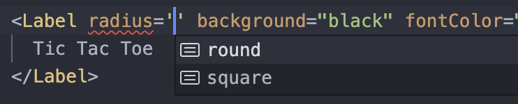
app.jsx 실제사용
<Label
  radius="round"
  background="black"
  fontColor="white">
  Tic Tac Toe
</Label>
이제 props의 값으로 스타일을 조건부로 사용할 수 있습니다.
라벨에서의 함수들은 retunr값으로 css를 뱉고있기때문에 이렇게 볼 수 있습니다.
const StyleLabel = styled.div`
  padding: 8px 16px;
  color: 'white';
  background: 'black';
  border-radius: '20px';
`;
모듈화한 컴포넌트를 만들기에 적합한것 같아요.
지금 사용한것은 문자를 전달했지만 사이즈를 전달해서 유동적인 사이즈의 버튼을 만들수도 있어요.

Front-End Developer 👨💻