tree
여러 개의 내용을 접어서 간략하게 표현하기. fontello 아이콘의 이미지를 이밎 파일이 아니라 딩벳폰트, 특정 문자가 이미지로 표현되게 하는 방식. (화면을 크게 확대해도 이미지가 깨지지 않는 벡터 방식의 이미지다.) https://fontello.com/ 폰텔로 사이트 들가서 원하는 폰트 고르고 다운, 압축해제하면 demo.html이 있는데 이를 브라우저에서 열면. 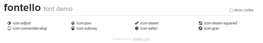이렇게 고른 폰트들이 나타난다.(확대를 해도 깨지지 않는 벡터방식 이미지.) show codes를 누르면 폰트들의 코드가 나타나게 된다.
여기서 코드 앞에 있는 0대신에 html용으로 &#을 써야 표기가 된다,
https://unicode-table.com/kr/#0041
유니코드 사이트 들가면 웹에서 글자 출력을 위한 코드들이 있다. 예를 들어 A의 코드는 A이다 이를 써서.
<style>
body{
font-family: "fontello";
/*폰트를 폰텔로로 바꿔서 네모 상자였던 이미지를 폰트로 바꿈*/
color:red;
font-size: 20px;
}
/* 코드가 아니라 직접 아이디의 이름을 쓸 수도 있음 -- i class*/
</style> </head> <body>
a
A

<i class="icon-steam-squared"></i> </body> 하면 이런식으로  나타남을 볼 수 있다.
폰텔로의 원리:
애니메이션 효과를 추가 하고 싶다면.
폰트 만들어보기.
https://www.youtube.com/watch?v=cx3P1RNg26E
<!DOCTYPE html>
<html lang="en" dir="ltr">

<head>
  <meta charset="utf-8">
  <title></title>
  <link rel="stylesheet" href="tree_fontello/css/fontello.css">
  <style>
    .tree,
    .tree ul {
      list-style: none;
      padding-left: 20px;
    }
    /* 사이의 간격. 인라인-블록 하면 둘의 성질을 다 갖춤.*/
    .tree *:before{
      width:21px;
      height:21px;
      display:inline-block;
    }
    .tree a:before {
      content:'\f1b0===>'
      font-family: fontello;
    }
    /*다운받은 폰트의 코드를 입력.*/
    .tree input[type="checkbox"] {
      display: none;
    }
    .tree input[type="checkbox"]:checked~ul {
      /*checked는 박스가 눌렸을 때. ~ 표시를 넣어서 체크되었을때 체크 태그 이후에 나오는 ul태그를 선택하게 된다. 즉 루트 아래의 노드가 사라지게 된다.*/
      display: none;
    }
  </style></head><body>
  <ul class="tree"><li>
 <input type="checkbox" id="root">
  <label for="root">루트</label>  <ul>
 <li> <a href="https://www.youtube.com/">노드1 </a></li>
  <li> <a href="https://www.youtube.com/">노드12 </a></li>
 <li> <input type="checkbox" id="node3">
 <label for="node3">노드3</label>  <ul>
 <li> <a href="https://www.youtube.com/">노드1</a> </li>
 <li> <a href="https://www.youtube.com/">노드12 </a></li>
 <li> <a href="https://www.youtube.com/">노드123 </a>/li>
</ul> </li> </ul> </li>  </ul></body></html>
결과. 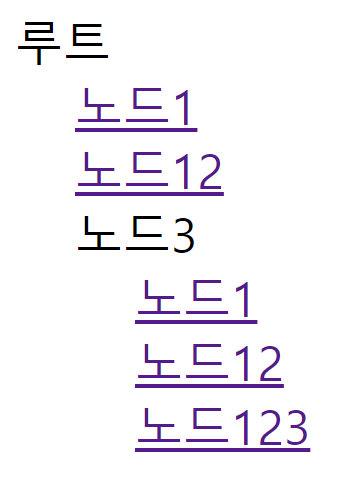
Holy Grail Layout
성배처럼 완벽한 웹페이지를 구현하는 것이 힘들 었지만 마침내 얻어낸 표준적인 레이아웃 배치. 참고자료
http://alistapart.com/article/holygrail
중요 요소에 테두리 치기.
<!doctype html><html><head><style>
    .container{    }

    *{  box-sizing: border-box;  }
  모든 것에 박스 부여


    .container{ border:5px solid black;  }
  전체에 검은 박스
    .container>*{ border:5px solid red; }
  모든 컨텐츠에 붉은 박스
    .container>.content>*{ border:5px solid green;}
  nav,main, ad등의 컨텐츠에 녹색 박스


    .container .content{
      padding-left:200px;
      padding-right:150px;
      overflow: hidden;
    }컨텐츠 전체에 간격 부여

    .container .content>*{
      float:left;
      padding-bottom:2500px;
      margin-bottom:-2500px;
    }컨텐츠 안의 모든 것을 좌측 정렬


  각각 nav와 aside에게 200,150px만큼의 크기를 할당해주고 남은 값은 전부 (100%) main이 사용한다.
    .container .content main{
      width:100%;
    }
    .container .content nav{
      width:200px;
      margin-left: -100%;
      left:-200px;
      position: relative;
    }
    .container .content aside{
      width:150px;
      margin-right:-150px;
    }


  클리어를 통해 footer는 float된 태그의 영향을 받지 않고 원래의 위치를 고수한다.
    .container footer{
      clear: both;
    }


  미디어 쿼리를 써서 반응 형 디자인, 600이하일 떄.
    @media (max-width:599px){
      .container .content{
        padding-left:0;
        padding-right:0;
        overflow: visible;
      }

    nav, main , aside의 순서로 한줄로 정렬 될 수 있도록 float를 사용.
      .container .content>*{
        float:none;
        padding-bottom:0;
        margin-bottom:0;
      }
      .container .content main{
        width:100%;
      }
      .container .content nav{
        width:auto;
        margin-left: 0;
        left:0;
        position: relative;
      }

      포지션을 relative로 해야 움직임(지정하지 않았을 떄는 Static이다)
      .container .content aside{
        width:auto;
        margin-right:0;
      }
    }
  </style></head>

<body>
  <div class="container">
    <header>  <h1>헤더</h1>  </header>

    <section class="content">
      <main>  대충 긴글  </main>
      <nav>
        <ul>
          <li>item</li> <li>item</li> <li>item</li>
        </ul>
      </nav>
      <aside> 광고  </aside>
    </section>

    <footer> FOOTER    </footer>

  </div></body></html>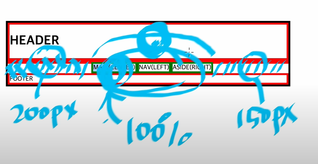
parallax는 시차라는 뜻으로 천문학에서 사용하는 용어. 멀리 있는 물체는 천천히 움직이고, 가까이 있는 물체는 빨리 움직이는 현상. 이 현상을 이용하면 입체감, 실체감을 높여서 보다 인상적인 디자인을 할 수 있다.
씬(장면)이 있고 그 장면 안에는 하나하나의 컨텐츠들이 있다.
뷰포트란 사용자에게 보이는 영역, 만약 스크롤을 내려야만 보이는 영역이 있다면 그건 뷰포트를 넘어간 것. 뷰포트의 크기를 선언할 떄 쓰는 것이
height:100vh;에서 vh의 역할 이다.
여백이 남아있는 문제를 없애기 위해 쓰는 게 reset.css ,문서의 모든 디자인 값을 초기화-- 마진, 패딩이 0.
이 코드를 따로 reset.css파일을 만들어서 참조하는 식으로 한다.
  <link rel="stylesheet" href="reset.css">

    overflow:hidden;을 해서 배경보다 커다란 요소를 감추기로 한다.
.scene header{ max-width:80%; }를 하면 헤더 부분의 최대 크기가 화면의 80% 이하가 된다.
      transform:translateX(-50%) translateY(-50%);을 해서 씬의 헤더를 화면 중앙에 있도록 한다.
    font-size:1.3rem;로 글씨 크기 조정.
배경이 하나가 아니라 여러개여야 하므로
Section을 복사한뒤 각각 숫자로 지정해놓고.
.scene.one{
background-image: url(image/fire.jpg);
}
.scene.two{
background-image: url(image/mount.jpg);
}
.scene.three{
background-image: url(image/fire.jpg);
}
같은 식으로 여러개의 배경을 만든다.
핵심인, 배경은 가만히 있고 글이 움직이는 것을 구현할려면
background-attachment: fixed;
사용하여 화면 자체에 이미지를 고정하는 식으로 하면 된다.
<!DOCTYPE html>
<html lang="en" dir="ltr">
<head>
<link rel="stylesheet" href="reset.css">
<link href="https://fonts.googleapis.com/css2?family=Hi+Melody&display=swap" rel="stylesheet">
<meta charset="utf-8">
<title></title>
<style media="screen">
body{
margin:0;
}
.scene {
height: 100vh;
overflow:hidden;
background-repeat: no-repeat;
background-size: cover;
background-attachment: fixed;
font-family: 'Hi Melody', cursive;
font-weight: 200;
}
.scene.one{
background-image: url(image/fire.jpg);
}
.scene.two{
background-image: url(image/mount.jpg);
}
.scene.three{
background-image: url(image/fire.jpg);
}
.scene header{
color:purple;
max-width: 50%;
position: relative;
left:50%; top:50%;
transform:translateX(-50%) translateY(-50%);
font-size:2rem;
}
.scene header h1{
font-size:3rem;
margin-bottom: 1rem;
border-bottom: 1px solid white;
}
</style> </head> <body>
<section class="scene one">
<header>
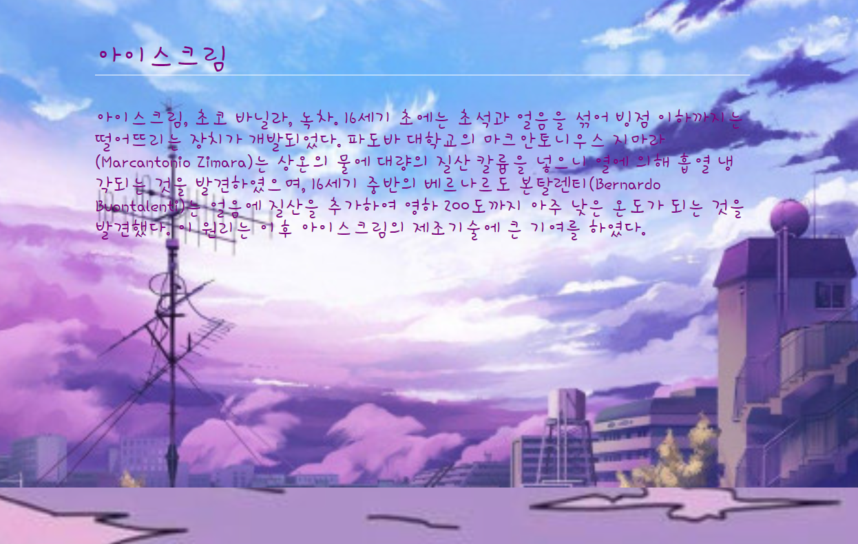
<h1> 아이스크림</h1><br>
아이스크림, 초코 바닐라, 녹차.
16세기 초에는 초석과 얼음을 섞어 빙점 이하까지는 떨어뜨리는 장치가 개발되었다. 파도바 대학교의 마크안토니우스 지마라(Marcantonio Zimara)는 상온의 물에 대량의 질산 칼륨을 넣으니 열에 의해 흡열 냉각되는 것을 발견하였으며, 16세기 중반의 베르나르도 본탈렌티(Bernardo Buontalenti)는 얼음에 질산을 추가하여 영하 200도까지 아주 낮은 온도가 되는 것을 발견했다. 이 원리는 이후 아이스크림의 제조기술에 큰 기여를 하였다.
</header>
</section>
<section class="scene two">
<header>
<h1> 아이스크림</h1>
아이스크림, 초코 바닐라, 녹차.
16세기 초에는 초석과 얼음을 섞어 빙점 이하까지는 떨어뜨리는 장치가 개발되었다. 파도바 대학교의 마크안토니우스 지마라(Marcantonio Zimara)는 상온의 물에 대량의 질산 칼륨을 넣으니 열에 의해 흡열 냉각되는 것을 발견하였으며, 16세기 중반의 베르나르도 본탈렌티(Bernardo Buontalenti)는 얼음에 질산을 추가하여 영하 200도까지 아주 낮은 온도가 되는 것을 발견했다. 이 원리는 이후 아이스크림의 제조기술에 큰 기여를 하였다.
</header>
</section>
<section class="scene three">
<header>
<h1> 아이스크림</h1>
아이스크림, 초코 바닐라, 녹차.
16세기 초에는 초석과 얼음을 섞어 빙점 이하까지는 떨어뜨리는 장치가 개발되었다. 파도바 대학교의 마크안토니우스 지마라(Marcantonio Zimara)는 상온의 물에 대량의 질산 칼륨을 넣으니 열에 의해 흡열 냉각되는 것을 발견하였으며, 16세기 중반의 베르나르도 본탈렌티(Bernardo Buontalenti)는 얼음에 질산을 추가하여 영하 200도까지 아주 낮은 온도가 되는 것을 발견했다. 이 원리는 이후 아이스크림의 제조기술에 큰 기여를 하였다.
</header> </section> </body> </html>완성된 사이트