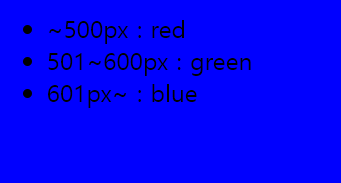
미디어 쿼리
- ~500px : red
- 501~600px : green
- 601px~ : blue
미디어 쿼리 적용 시
  @media(max-width:500px){
           .content{flex-direction: column; }
           .content nav, .content aside
           { border:none;  flex-basis: auto;}
           main{   order:0;   }
           nav{    order:1;   }
           aside{ order:2;  display: none; }
       }
float

```
그래픽
배경
background-color : red
background-image : url("bg.png")
background-repeat : repeat, no-repeat, repeat-x, repeat-y
background-attachment : scroll, fixed
background-position : left top or x% y% or x y
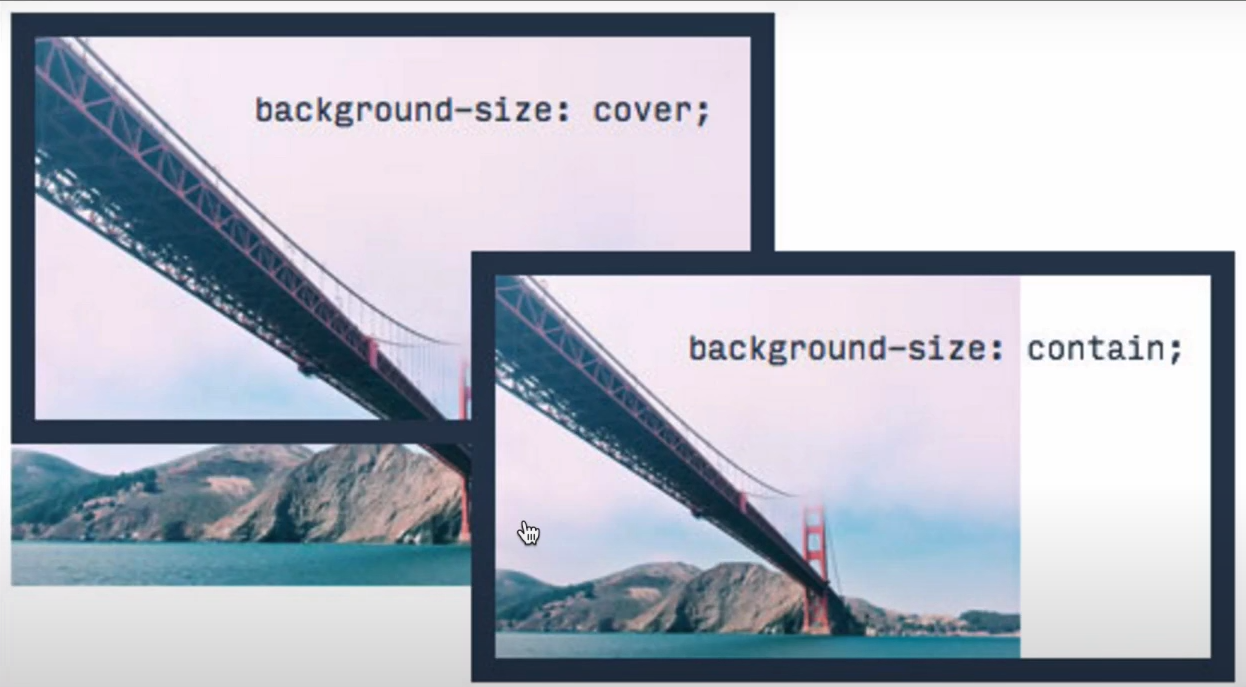
background-size : 100px 100px or cover or contain
필터
blend
블랜드는 이미지와 이미지를 혼합해서 새로운 이미지를 만들어내는 기법

<!doctype html>
<html>
  <head>
    <style>
      .blend{
        height:400px;
        border:5px solid;
        background-color: rgba(255,0,0,0.5);
        background-size:cover;
        background-image:url('image/fire.jpg');
        background-blend-mode: saturation;
        transition:background-color 30s;
      }
      .blend:hover{
        background-color: rgba(255,0,0,1);
        transition:background-color 5s;
      }
    </style>  </head>  <body>
    <div class="blend">
    </div>  </body></html>
마우스를 올려놓고(hover)하고 있으면 30초(transition)동안 장면이 빨간색으로 saturation하게 변한다.
<!doctype html><html> <head> <style>
      body{
        background-image: url(image/fire.jpg);
      }
      .blend{
        font-size:1rem;
        font-weight: bold;
        color:green;
        mix-blend-mode:screen;
      }
    </style>  </head>  <body>
    <div class="blend">
    긴글
    </div>  </body></html>
결과물은..

이렇게 이미지를 배경으로 노색, 스크린 모드의 글이 나타나게 된다.
mix-blend-mode을 통해 타이포그래피와 이미지 사이의 시각적효과가 달라지게 된다.
이러한 블랜드를 이용한 다양한 사례들을 보려면.
링크텍스트
링크텍스트
살펴보도록 하자.
transform
transform은 엘리먼트의 크기, 위치, 모양을 변경하는 속성. 유니티랑 비슷?트랜스폼의 기능들.
/* Keyword values */
transform: none;

/* Function values */
transform: matrix(1.0, 2.0, 3.0, 4.0, 5.0, 6.0);
transform: translate(12px, 50%);
transform: translateX(2em);
transform: translateY(3in);
transform: scale(2, 0.5);
transform: scaleX(2);
transform: scaleY(0.5);
transform: rotate(0.5turn);
transform: skew(30deg, 20deg);
transform: skewX(30deg);
transform: skewY(1.07rad);
transform: matrix3d(1.0, 2.0, 3.0, 4.0, 5.0, 6.0, 7.0, 8.0, 9.0, 10.0, 11.0, 12.0, 13.0, 14.0, 15.0, 16.0);
transform: translate3d(12px, 50%, 3em);
transform: translateZ(2px);
transform: scale3d(2.5, 1.2, 0.3);
transform: scaleZ(0.3);
transform: rotate3d(1, 2.0, 3.0, 10deg);
transform: rotateX(10deg);
transform: rotateY(10deg);
transform: rotateZ(10deg);
transform: perspective(17px);

/* Multiple function values */
transform: translateX(10px) rotate(10deg) translateY(5px);

/* Global values */
transform: inherit;
transform: initial;
transform: unset;
트랜스폼에대해 알려주는 사이트들에 대한 링크.
https://opentutorials.org/module/2367/13684
svg
웹브라우저에서 벡터 형식의 이미지 출력가능.
벡터 vs 비트맵.
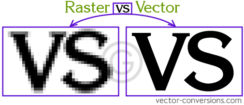
확대시 벡터는 이미지가 꺠지지 않지만 비트맵은 깨지게 됨.
벡터는 그래프(그래프는 확대해도 바뀌지 않음) 비트맵은 도트같은 형태라고 이해 .
svg는 백터(vector) 이미지를 표현하기 위한 포맷으로 w3c에서 만든 백터 이미지 표준.
SVG 자체는 CSS가 아니다
https://thenounproject.com/
svg이미지를 쉽게 가져오는 사이트.
svg관련 사이트
http://tutorials.jenkov.com/svg/index.html
http://codepen.io/search/pens?q=svg&limit=all&type=type-pens
모션그래픽
transition
<!doctype html><html><head>  <style>
    a{
      font-size:3rem;
      display:inline-block;
/*
      transition-property: font-size transform;
      transition-duration: 0.1s;
*/
      transition:all 0.1s;
    }
    a:active{
      transform:translate(20px, 20px);
      font-size:2rem;
    }
  </style></head><body>
  <a href="#">Click</a>
  </body></html>
액티브(활성화)되었을떄 아래로 이동, 사이즈 줄어듬.
링크를 누르면 글자가 통째로 줄어들었다가 다시 커지는, 스무스한 애니메이션 효과가 나타난다.
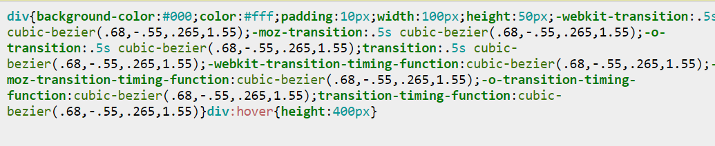
<!doctype html>
<html>
<head>
  <style>
    body{
      background-color: black;
      transition:all 1s;
    }
    div{
      background-color: black;
      color:white;
      padding:10px;
      width:100px;
      height:50px;
      -webkit-transition: all 500ms cubic-bezier(0.680, 0, 0.265, 1); /* older webkit */
      -webkit-transition: all 500ms cubic-bezier(0.680, -0.550, 0.265, 1.550);
         -moz-transition: all 500ms cubic-bezier(0.680, -0.550, 0.265, 1.550);
           -o-transition: all 500ms cubic-bezier(0.680, -0.550, 0.265, 1.550);
              transition: all 500ms cubic-bezier(0.680, -0.550, 0.265, 1.550); /* easeInOutBack */

      -webkit-transition-timing-function: cubic-bezier(0.680, 0, 0.265, 1); /* older webkit */
      -webkit-transition-timing-function: cubic-bezier(0.680, -0.550, 0.265, 1.550);
         -moz-transition-timing-function: cubic-bezier(0.680, -0.550, 0.265, 1.550);
           -o-transition-timing-function: cubic-bezier(0.680, -0.550, 0.265, 1.550);
              transition-timing-function: cubic-bezier(0.680, -0.550, 0.265, 1.550); /* easeInOutBack */
    }
    div:hover{
      height:400px;
    }
  </style>
</head>
<body onload="document.querySelector('body').style.backgroundColor='white';">
  <div>
    TRANSITION
  </div>
</body>
</html>
https://www.youtube.com/watch?v=YyZKPsMhVlw&list=PLuHgQVnccGMDaVaBmkX0qfB45R_bYrV62&index=52
상세한건 여기서.
link & import
천개 웹페이지의 css를 바꾸기 위햐서는 하나하나 바꾸는 것이 아니라 차근차근 바꿔야만 한다. 외부로 파일을 빼는 방법은 크게 두가지.
minify
코드 경량화
도구:
http://adamburgess.github.io/clean-css-online/
https://github.com/jakubpawlowicz/clean-css
https://opentutorials.org/module/2026/11852
긴 코드를
일케 줄여줌.
경량화 전
body{}
h1{
color:tomato;
}
후
h1{color:tomato}
preprocessor
CSS뛰어넘기 css는 표준화된 기술이라 변화에 미진할 수 있음.새로운 문법 도입은 강력한 기능을 주지만 기술의난도를 높이므로 css는 새로운 기능을 주기 힘들 수 있다.
그러면 여러가지 기능을 어떻게 추가하나??
CSS에 편리한 기능을 더한 새로운 언어를 만들고 이 언어에 따라서 작성한 코드를 어떤 프로그램으로 실행시키면 결과적으로 CSS를 만들어주는 도구들을 개발. 이런 도구를 preprocessor이라고 한다.
위의 것들을 비교한 사이트.
https://www.youtube.com/watch?v=wUG7Qe2LcGg&list=PLuHgQVnccGMDaVaBmkX0qfB45R_bYrV62&index=55
프리프로세서는 잠깐 스킵.