앞으로의 목표 👍
- javascript 능력 및 고난도 알고리즘 풀이 능력
- Nest, Graphql등 최신 기술 스택 활용 능력
- 기초 미니프로젝트 포트폴리오
- 로그인, 결제기반 심화프로젝트 포트폴리오
- 배포를 위한 네트워크 및 CI/CD 배포자동화 능력
- 120% 백엔드 개발 지식
오늘부터 꾸준히 해야할 일 👍
- 영타실력 늘리기
- 단축키 사용 익숙해지기
- 코드리딩 실력 키우기
- 데일리 퀴즈
- 포트폴리오 작성
- 독스에 친숙해지기
- MDN 보는 연습하기
오늘의 수업 👍
📝 flex vs grid
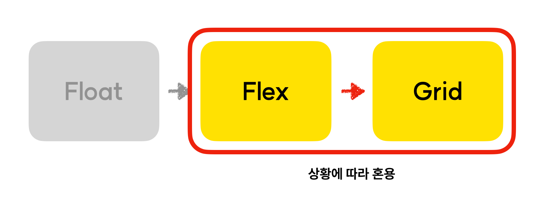
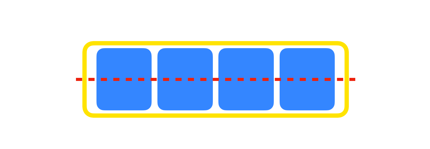
▷ flex
- 1차원적 구조
- 비교적 작은 단위에 적합
- 기획의 변경 가능성이 있는 경우에 적합
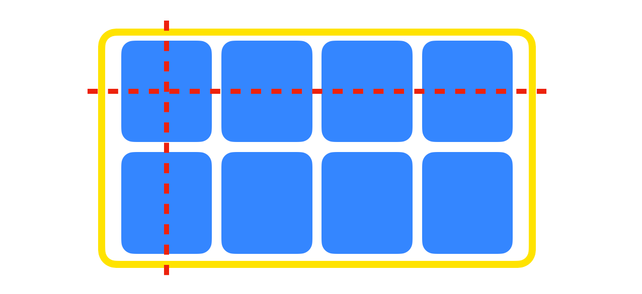
▷ grid
- 2차원적 구조
- 큰 규모에 적합
- 반응형 디자인을 효율적으로 구현
📝 grid
- display: grid
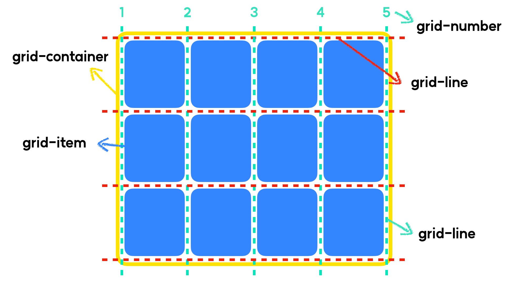
- grid-template
- grid-template-rows(행) : 1fr 2fr 200px
- grid-template-columns(열) : 1fr 2fr 200px
- 단위: fr - fraction(분수)의 약자
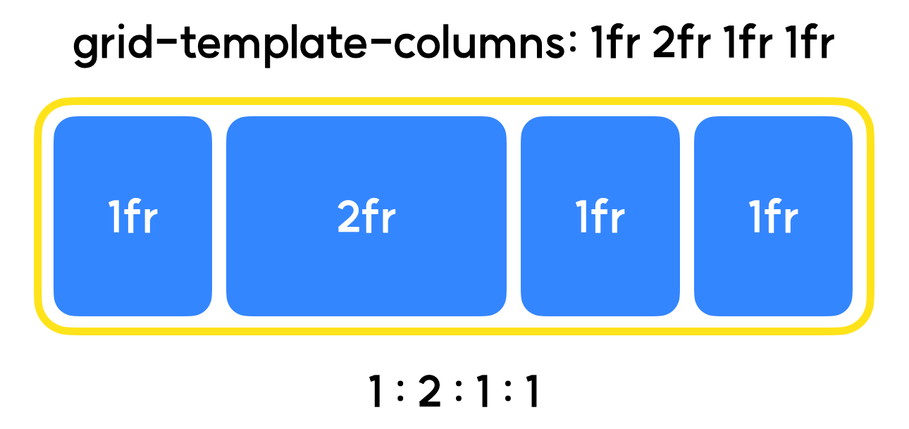
- 단위: fr - fraction(분수)의 약자
- repeat()
- repeat(a, b)라고 입력, b규격 grid-template a개 생성
- 연습 09-01
- html
<!DOCTYPE html> <html lang="ko"> <head> <meta charset="UTF-8"> <meta http-equiv="X-UA-Compatible" content="IE=edge"> <meta name="viewport" content="width=device-width, initial-scale=1.0"> <title>09-01-grid</title> <link rel="stylesheet" href="./index.css"> </head> <body> <div class="container"> <div class="item item1">item1</div> <div class="item item2">item2</div> <div class="item item3">item3</div> <div class="item item4">item4</div> <div class="item item5">item5</div> <div class="item item6">item6</div> </div> </body> </html> - css
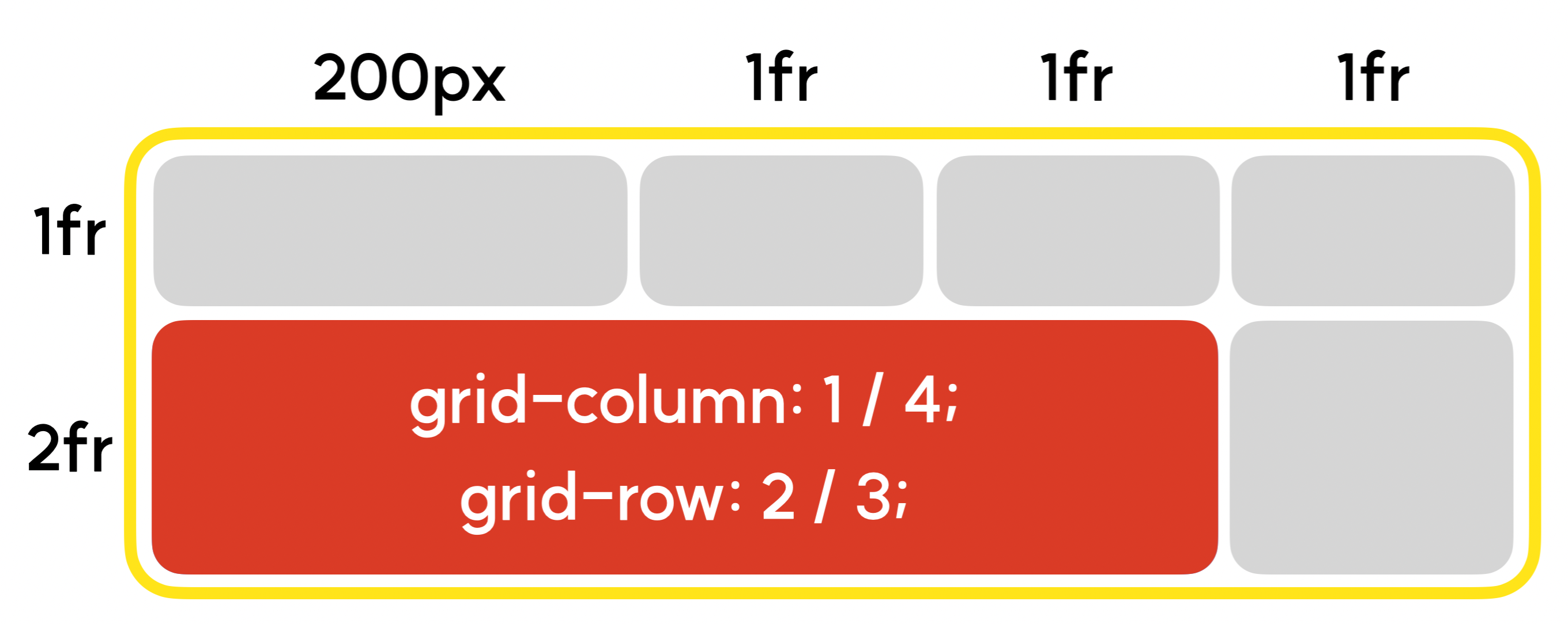
* {
    box-sizing: border-box;
}

.container {
    border: 2px solid red;
    display: grid;
    grid-template-columns: repeat(2, 1fr 2fr);
    grid-template-rows: repeat(3,100px);
    grid-gap: 5px;
}

.item {
    border: 2px solid blue;
}

.item1 {
    grid-column: 1 / span 2;
    /* span n = n칸을 차지한다 */
    grid-row: 1 / span 3;
    background-color: green;
}
- html
- grid-column & grid-row
-
grid-item이 열과 행 방향으로 얼마만큼의 영역을 차지할 지 정의
-
시작점이 되는 grid-number와 종료지점이 되는 grid-number 입력
-
📝 반응형 웹
- 기기의 Viewport 규격에 반응하여 레이아웃이 자동으로 변경되는 웹페이지
- max-width / max-height
- min-width / min-height
- max() - 소괄호 안에 입력된 값 중 제일 높은 값을 속성값으로 출력
- height : max(320px, 20%)
- min() - 소괄호 안에 입력된 값 중 제일 낮은 값을 속성값으로 출력
- width : min(1240px, 100%)
📝 미디어 쿼리
- 기본 형태
@media screen and (max-width: 500px) {
	/* 스크린의 너비가 500px 이하일 경우 적용시킬 스타일 시트를 적습니다. */
}- 연습 10-01
- html
<!DOCTYPE html> <html lang="ko"> <head> <meta charset="UTF-8"> <meta http-equiv="X-UA-Compatible" content="IE=edge"> <meta name="viewport" content="width=device-width, initial-scale=1.0"> <title>10-01-media-query</title> <link rel="stylesheet" href="./index.css"> </head> <body> <div class="box"> 박스입니다. </div> <div class="container"> <div class="box1"> 박스1 </div> <div class="box2"> 박스2 </div> </div> </body> </html> - css
* {
    box-sizing: border-box;
}

.box {
    height: 200px;
    background-color: blue;
    color: white;
    padding: 30px;
}

@media screen and (max-width: 600px){
    .box {
        background-color: red;
    }
}

.container {
    display: flex;
    flex-direction: row;

}

.box1 {
    width: 20%;

    background-color: green;
    color: white;

    padding: 30px;
}

.box2 {
    width: 80%;

    background-color: orange;
    color: white;

    padding: 30px;
}

@media screen and (min-width: 601px) {
    .container {
        flex-direction: column;
    }
    .box1 {
        width: 100%;
    }
    .box2 {
        width: 100%;
    }
}
- html
📝 breakPoint(중단점)
- 반응형 웹페이지의 작업 기준이 되는 중단점
- 절대적인 규격은 없다
- 연습 10-02
- html
<!DOCTYPE html> <html lang="ko"> <head> <meta charset="UTF-8"> <meta http-equiv="X-UA-Compatible" content="IE=edge"> <meta name="viewport" content="width=device-width, initial-scale=1.0"> <title>10-02-break-point</title> <link rel="stylesheet" href="./index.css"> </head> <body> <div class="container"> <span class="contents"> 안녕하세요. </span> </div> </body> </html> - css
* {
    box-sizing: border-box;
}

.container {
    width: 100%;
    background-color: red;
    padding: 30px;
}

.contents {
    color: white;
}

.contents:after {
    content: "저는 PC입니다.";
}

/* pc 기본 설정 */

@media screen and (max-width: 767px) {
    /* mobile */
    .container {
        background-color: blue;
    }
    .contents:after {
        content: "저는 mobile입니다";
    }
}

@media screen and (min-width: 768px) and (max-width: 1023px) {
    /* tablet */
    .container {
        background-color: green;
    }
    .contents:after {
        content: "저는 tablet입니다";
    }
}
- html
오늘의 마무리 👍
- 복습
- github 공부
- 블로그 포스팅
- 데일리 퀴즈
- 알고리즘 문제 풀기
항상 겸손한 자세로 배우면서 성장하자, 할 수 있다!! 💪
출처 : 코드캠프
개발자 블로그 / 항상 겸손한 자세로 배우면서 성장하자 할 수 있다!