✍️ svg의 stroke 속성에 animation을 걸어주면 괜찮은 UI 효과를 나타낼 수 있다. stroke animation + gradiant 를 이용하여 goldring이 반짝이는 모습을 구현한 예제와 함께 정리해보았다.
stroke 속성
<style>
.inner{
stroke: #e4a619;
stroke-width: 4px;
fill: transparent;
}
</style>
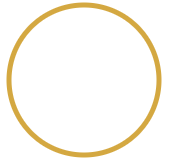
<svg class="line gradient" width="128" height="128">
<circle class="inner" cx="64" cy="64" r="60"/>
</svg>1. stroke
- 선 색을 정의함.
2. stroke-width
- 선 두께를 정의함.
3. stroke-dasharray
-
점선의 간격을 정의함.
-
시작점 : 3시 방향
-
ex) 점선 20px, 간격 20px

stroke-dasharray: 20px; -
ex) 점선 20px, 간격 10px

stroke-dasharray: 20px 10px; -
stroke-dasharray를 원주(=원의 길이)만큼 설정하면, 일반 원으로 보인다.
원주(=원의 길이) 구하는 공식
2πr = 2 3.14 원의 반지름
*소수점 자리는 올림 한다.
4. stroke-dashoffset
- 점선의 시작점을 정의함.
- ex) 점선 20px, 간격 10px, 시작점 10px 띄우고 시작
stroke-dasharray: 20px 10px; stroke-dashoffset: 10px; - stroke-dashoffset을 원주만큼 설정하면, 선이 보이지 않는다.
stroke animation
- stroke-dashoffset 에 animation을 걸어 회전하는 원의 테두리를 구현 함.
- 원의 stroke 에 gradiant 를 적용하여, 빛에 의해 금빛이 반짝이는 것처럼 표현함.
- 원주 = 2πr = 2 3.14 60 = 약 378
- stroke-dashoffset을 원주 만큼 적용 하였기에 animation 전 시작 모습은 골든 링이 보이지 않는 상태
- animation 60% 구간에서 dashoffset이 0이 되면서 goldring이 모두 보인다.
- 100% 에서 dashoffset이 -378이 되면서 선이 시계 방향으로 사라진다.
- animation 구간의 중간 값을 60%로 주고 , timing-function 을 ease-in-out으로 줌으로써 원의 회전에 가속도가 적용된 것 처럼 표현.
- goldring(=.outer)의 stroke에 linear gradiant를 적용하여 빛에 반사된 느낌을 줌.
- animation이 끝나고 다시 시작되는 부분을 gradiant를 적용하여 뒤에 배경이 되는 원(=.inner)의 색과 맞춰 자연스럽게 보이게 함.
참고 문헌
한 걸음 한 걸음 계속 걷는 자가 일류다