Styled Components를 활용해 다양한 기능의 커스텀 컴포넌트를 구현할 수 있다.
Storybook을 사용해 컴포넌트들을 관리할 수 있다.
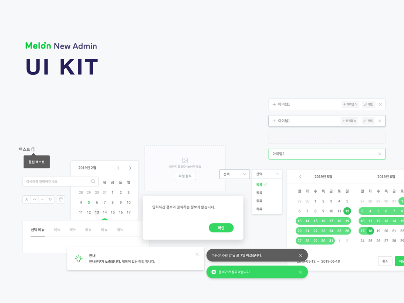
화면이 아무리 복잡하고 다양해도 기본적인 레이아웃 구성 내부에서 사용되는 UI들은 반복적으로 재사용되는 경우가 많다.
UI 컴포넌트를 도입함으로써 절대적인 코드량을 줄일 수 있다.
더불어 화면이 절대적으로 많고 복잡도가 있는 프로젝트에서는 개발 기간 단축에 절대적으로 기여할 수 있는 장점이 있다.
따라서 UI 컴포넌트를 사용해야 한다.
Bare minimum Requirement
지금까지 배운 React, Styled Components를 활용하여
React-custom-component를 완성합니다.
- Modal, Toggle, Tab, Tag 컴포넌트를 구현합니다.
💙 Modal 구현

 import { useState } from "react";
import styled from "styled-components";

export const ModalContainer = styled.div`
  // Modal을 구현하는데 전체적으로 필요한 CSS
  display: flex;
  justify-content: center;
  align-items: center;

  position: fixed;
  top: 0;
  bottom: 0;
  right: 0;
  left: 0;
`;

export const ModalBackdrop = styled.div`
  // Modal이 떴을 때의 배경을 깔아주는 CSS
  display: flex;
  justify-content: center;
  align-items: center;
  position: fixed;
  top: 0;
  bottom: 0;
  right: 0;
  left: 0;
  background-color: #dfe3ee;
`;

export const ModalBtn = styled.button`
  background-color: #3b5998;
  text-decoration: none;
  border: none;
  padding: 20px;
  color: white;
  border-radius: 30px;
  cursor: grab;
`;

export const ModalView = styled.div.attrs((props) => ({
  // attrs 메소드를 이용해서 아래와 같이 div 엘리먼트에 속성을 추가할 수 있습니다.
  role: "dialog",
}))`
  display: flex;
  justify-content: center;
  align-items: center;

  width: 15rem;
  height: 10rem;
  background-color: #3b5998;
  color: white;

  border-radius: 1rem;
`;

export const Modal = () => {
  const [isOpen, setIsOpen] = useState(false);

  const openModalHandler = (e) => {
    setIsOpen(!isOpen);
  };

  const onClickBackdrop = (e) => {
    setIsOpen(!isOpen);
  };

  return (
    <>
      <ModalContainer>
        <ModalBtn onClick={openModalHandler}>
          {isOpen ? "Opened!" : "Open Modal"}
        </ModalBtn>
        {isOpen ? (
          <ModalBackdrop onClick={onClickBackdrop}>
            <ModalView
         	 onClick={(event) => event.stopPropagation}>
               Hello, I'm Modal
			</ModalView>
          </ModalBackdrop>
        ) : null}
      </ModalContainer>
    </>
  );
};
POINT!
- 모달이 뜰 때, 뒷 배경을 꽉차게 설정하는 방법
:position: fixed/top: 0, bottom: 0, left: 0, right: 0속성 주기.- 모달창 클릭 시에는 꺼지지 않도록 설정하는 법
: 모달창 태그에onClick={(event) => event.stopPropagation}속성 주기
💙 Toggle 구현

import { useState } from "react";
import styled from "styled-components";

const ToggleContainer = styled.div`
  position: relative;
  margin-top: 8rem;
  left: 47%;
  cursor: pointer;

  > .toggle-container {
    width: 50px;
    height: 24px;
    border-radius: 30px;
    background-color: #dfe3ee;
  }
  > .toggle--checked {
	// toggle--checked 클래스가 활성화 되었을 경우의 CSS
    background-color: #3b5998;
  }

  > .toggle-circle {
    position: absolute;
    top: 1px;
    left: 1px;
    width: 22px;
    height: 22px;
    border-radius: 50%;
    background-color: #ffffff;
    transition: 0.2s;
  }
  > .toggle--checked {
    left: 27px;
    transition: 0.2s;
  }
`;

const Desc = styled.div`
  // 설명 부분의 CSS
  text-align: center;
  margin-top: 0.5rem;
`;

export const Toggle = () => {
  const [isOn, setisOn] = useState(false);

  const toggleHandler = () => {
    setisOn(!isOn);
  };

  return (
    <>
      <ToggleContainer onClick={toggleHandler}>
        <div className={`toggle-container ${isOn ? "toggle--checked" : null}`}/>
        <div className={`toggle-circle ${isOn ? "toggle--checked" : null}`} />
      </ToggleContainer>
      <Desc>{isOn ? "Toggle Switch ON" : "Toggle Switch OFF"}</Desc>
    </>
  );
};
POINT
- 삼항연산자로 className 추가하기
// isOn이 true면 className에 toggle--checked가 추가된다.
// false인 경우 null 부여
 className={`toggle-container ${isOn ? "toggle--checked" : null}`
- toggle On 시, circle 부드럽게 이동시키는 css
.toggle--checked {
    left: 27px;
    transition: 0.2s;
  }
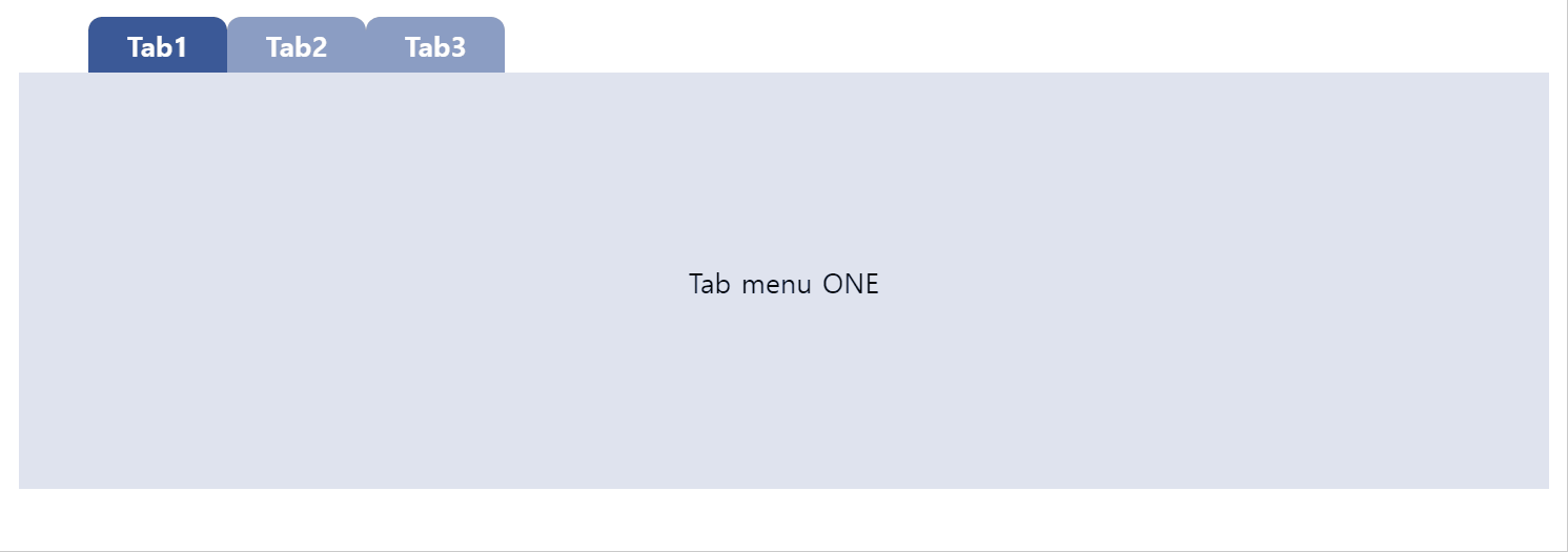
💙 Tab 구현
import { useState } from "react";
import styled from "styled-components";

const TabMenu = styled.ul`
  background-color: white;
  font-weight: bold;
  display: flex;
  flex-direction: row;
  justify-items: center;
  align-items: center;
  list-style: none;
  height: 2rem;
  margin: 0;

  .submenu {
    // 기본 Tabmenu 에 대한 CSS
    display: flex;
    justify-content: center;
    align-items: center;

    background-color: #8b9dc3;
    color: white;
    height: 2rem;
    width: 5rem;

    border-radius: 0.5rem 0.5rem 0 0;
  }

  .focused {
    // 선택된 Tabmenu 에만 적용되는 CSS
    background-color: #3b5998;
    color: white;
  }

  & div.desc {
    text-align: center;
  }
`;

const Desc = styled.div`
  text-align: center;
  background-color: #dfe3ee;
  height: 15rem;

  display: flex;
  justify-content: center;
  align-items: center;
`;

export const Tab = () => {

  const [currentTab, setCurrentTab] = useState(0);

  const menuArr = [
    { name: "Tab1", content: "Tab menu ONE" },
    { name: "Tab2", content: "Tab menu TWO" },
    { name: "Tab3", content: "Tab menu THREE" },
  ];

  const selectMenuHandler = (index) => {
    setCurrentTab(index);
  };

  return (
    <>
      <div>
        <TabMenu>
          {menuArr.map((tab, index) => {
            return (
              <li
                key={index}
                className={index === currentTab ? "submenu focused" : "submenu"}
                onClick={() => selectMenuHandler(index)}
              >
                {tab.name}
              </li>
            );
          })}
        </TabMenu>
        <Desc>
          <p>{menuArr[currentTab].content}</p>
        </Desc>
      </div>
    </>
  );
};
POINT
- map 함수를 이용해서 태그 반복 추가 하기
{menuArr.map((tab, index) => {
	return (
		<li key={index}
         className={index === currentTab ? "submenu focused" : "submenu"}
		 onClick={() => selectMenuHandler(index)}

   		{tab.name}
        </li>
	);
})}
💙 Tag 구현
import { useState } from "react";
import styled from "styled-components";

export const TagsInput = styled.div`
  margin: 8rem auto;
  display: flex;
  align-items: flex-start;
  flex-wrap: wrap;
  min-height: 48px;
  width: 480px;
  padding: 0 8px;
  border: 1px solid rgb(214, 216, 218);
  border-radius: 6px;

  > ul {
    display: flex;
    flex-wrap: wrap;
    padding: 0;
    margin: 8px 0 0 0;

    > .tag {
      width: auto;
      height: 32px;
      display: flex;
      align-items: center;
      justify-content: center;
      color: #fff;
      padding: 0 8px;
      font-size: 14px;
      list-style: none;
      border-radius: 6px;
      margin: 0 8px 8px 0;
      background: #3b5998;
      > .tag-close-icon {
        display: block;
        width: 16px;
        height: 16px;
        line-height: 16px;
        text-align: center;
        font-size: 14px;
        margin-left: 8px;
        color: var(--coz-purple-600);
        border-radius: 50%;
        background: #fff;
        cursor: pointer;
      }
    }
  }

  > input {
    flex: 1;
    border: none;
    height: 46px;
    font-size: 14px;
    padding: 4px 0 0 0;
    :focus {
      outline: transparent;
    }
  }

  &:focus-within {
    border: 1px solid #8b9dc3;
  }
`;

export const Tag = () => {
  const initialTags = ["CodeStates", "kimcoding"];

  const [tags, setTags] = useState(initialTags);

  const removeTags = (indexToRemove) => {

    const deletedTags = tags.filter((el, index) => {
      return index !== indexToRemove;
    });

    setTags(deletedTags);
  };

  const addTags = (event) => {

    let newTag = event.target.value;

    if (event.key === "Enter" && newTag !== "" && !tags.includes(newTag)) {
      setTags([...tags, newTag]);
      event.target.value = "";
    }
  };

  return (
    <>
      <TagsInput>
        <ul id="tags">
          {tags.map((tag, index) => (
            <li key={index} className="tag">
              <span className="tag-title">{tag}</span>
              <span
                className="tag-close-icon"
                onClick={() => removeTags(index)}
              >
                X
              </span>
            </li>
          ))}
        </ul>
        <input
          className="tag-input"
          type="text"
          onKeyUp={(e) => {
            addTags(e);
          }}
          placeholder="Press enter to add tags"
        />
      </TagsInput>
    </>
  );
};
POINT
🔽 태그 추가 함수 addTagsconst addTags = (event) => { let newTag = event.target.value; if (event.key === "Enter" && newTag !== "" && !tags.includes(newTag)) { setTags([...tags, newTag]); event.target.value = ""; } };
event.key가 "Enter"이고, 입력한 값이 빈문자가 아니며 기존 태그 배열에 입력 값이 존재하지 않을 경우 추가 한다.- 추가할 땐 스프레드 연산자를 사용해서 추가!
setTag([...tags, newTag])- 추가 후에 input값을 초기화 시키기 위해
event.target.value = "";🔽 태그 삭제 함수 removeTags는 filter 메서드를 사용해서 구현
const removeTags = (indexToRemove) => {

    const deletedTags = tags.filter((el, index) => {
      return index !== indexToRemove;
    });

    setTags(deletedTags);
  };
map메서드로<li>생성 시, key 값으로 index 값을 주어, 삭제 시에 index의 값을removeTags(index)와 같이 파라미터로 넘겨줄 수 있도록 했다.

목표는 "함께 일하고 싶은, 함께 일해서 좋은" Front-end 개발자