컴포넌트 연습하기
자주 쓰이는 컴포넌트들을 예제로 보여주신다. 탑-다운 방식의 접근법은 나도 좋아한다. 이렇게 배운 뒤, 제대로된 리액트의 구조를 잘 살펴봐야겠지?
Text 컴포넌트
이름만 들어선 어떠한 문자를 보여주는 컴포넌트다. 실용성이 있을까? 일단 만들어보자
//Text.js
import "./Text.css";
import PropTypes from "prop-types";

const Text = ({
  children,
  size,
  paragraph,
  block,
  strong,
  underline,
  delete: del,
  color,
  mark,
  code,
  ...props
}) => {
  const Tag = block ? "div" : paragraph ? "p" : "span";
  const fontStyle = {
    fontWeight: strong && "bold",
    fontSize: typeof size === "number" && size,
    textDecoration: underline && "underline",
    color: color,
  };
  if (mark) {
    children = <mark>{children}</mark>;
  }
  if (code) {
    children = <code>{children}</code>;
  }
  if (del) {
    children = <del>{children}</del>;
  }
  return (
    <Tag
      className={`${typeof size === "string" && `Text__size-${size}`}`}
      style={{ ...props.style, ...fontStyle }}
      {...props}
    >
      {children}
    </Tag>
  );
};

Text.propTypes = {
  children: PropTypes.node.isRequired,
  size: PropTypes.oneOfType([PropTypes.number, PropTypes.string]),
  strong: PropTypes.bool,
  underline: PropTypes.bool,
  delete: PropTypes.bool,
  style: PropTypes.object,
};

export default Text;

//Text.stories.js
import Text from "../components/Text";

export default {
  title: "Component/Text",
  component: Text,
  argTypes: {
    size: { control: "number" },
    strong: { control: "boolean" },
    underline: { control: "boolean" },
    delete: { control: "boolean" },
    color: { control: "color" },
    block: { control: "boolean" },
    paragraph: { control: "boolean" },
    code: { control: "boolean" },
    mark: { control: "boolean" },
  },
};

export const Default = (args) => {
  return <Text {...args}>Text</Text>;
};

export const Size = (args) => {
  return (
    <>
      <Text {...args} size="large">
        Text
      </Text>
      ;
      <Text {...args} size="normal">
        Text
      </Text>
      ;
      <Text {...args} size={24}>
        Text
      </Text>
      ;
    </>
  );
};
재사용은 용이해보이는데, 프롭스가 너무 많은게 아닐까? 이부분은 열심히 찾아보고 고민해봐야겠다.
Header 컴포넌트
h1태그를 사용하시는걸 보니 header보단 title이 더 맞는것 같기도 하고..?
//Header.js
import PropTypes from "prop-types";
const Header = ({
  children,
  level = 1,
  strong,
  underline,
  color,
  ...props
}) => {
  let Tag = `h${level}`;
  if (level < 1 || level > 6) {
    console.warn("Header only accept 1 2 3 4 5 6 as value");
    Tag = "h1";
  }
  const fontStyle = {
    fontWeight: strong ? "bold" : "normal",
    textDecoration: underline && "underline",
    color: color,
  };
  return <Tag style={{ ...fontStyle, ...props.style }}>{children}</Tag>;
};
Header.propTypes = {
  children: PropTypes.node.isRequired,
  level: PropTypes.oneOf([1, 2, 3, 4, 5, 6]),
  strong: PropTypes.bool,
  underline: PropTypes.bool,
  color: PropTypes.string,
  style: PropTypes.object,
};
export default Header;

//Header.stories.js
import Header from "../components/Header/Header";

export default {
  title: "Comonent/Header",
  component: Header,
  argTypes: {
    level: { control: { type: "range", min: 1, max: 6 } },
    strong: { control: "boolean" },
    underline: { control: "boolean" },
    color: { control: "color" },
  },
};

export const Default = (args) => {
  return <Header {...args}>헤더</Header>;
};
level: PropTypes.oneOf([1, 2, 3, 4, 5, 6]),
이렇게 프롭타입을 지정할수 있다는것도 처음 알았다 ㅎㅎ 뒤져보다가 알게됨!
Image 컴포넌트
화면에 들어온순간 이미지가 로딩되게 지연 로딩기법을 중심으로 만드신다 하셨다. 되게 궁금한걸?
음...하다가 스토리북에서 기본값 설정이 안되는 오류와 마주침.
강사님 버전과 내 버전이 다르다. 강사님이 하셨던 기본값 설정방법은 현재 Deprecated되어서...찾아봄🤨
벨로그 이미지업로드 이제야 되는구먼?
아무튼 위처럼 args프로퍼티 에 적으면 된다는데...
  args: {
    src: "https://picsum.photos/200",
    width: 500,
  },
이렇게 적고 확인해보니 놀랍게도 width만 적용됨
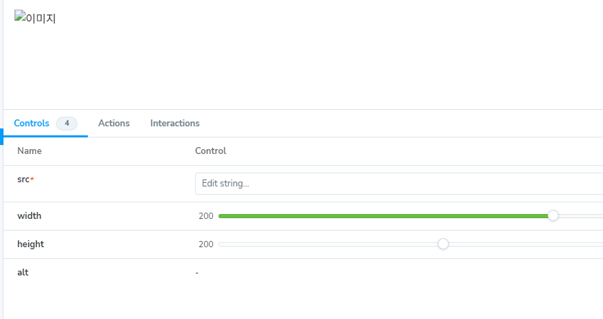
왜...지...?
30분째 해도 안되서 일단 넘어가려다가..다시해보니까 됨.
번들링중 뭔가 문제가 있던듯...? 결국 잘 된다.
lazy loading은 사용자가 보고있는 화면좌표가 필요함. 이때 intersection observer Api를 이용하면됨.
코드가 굉장히 길어졋다..
//Image.js
import PropTypes from "prop-types";
import { useEffect, useRef, useState } from "react";

let observer = null;
const LOAD_IMG_EVENT = "loadImage";

const onIntersection = (entries, io) => {
  entries.forEach((entry) => {
    if (entry.isIntersecting) {
      io.unobserve(entry.target);
      entry.target.dispatchEvent(new CustomEvent(LOAD_IMG_EVENT));
    }
  });
};

const Image = ({
  lazy,
  threshold = 0.5,
  placeholder,
  src,
  block,
  width,
  height,
  alt = "이미지",
  mode,
  ...props
}) => {
  const [isLoaded, setisLoaded] = useState(false);
  const imgRef = useRef(null);
  const imageStyle = {
    display: block && "block",
    width,
    height,
    objectFit: mode, //cover, fill, cotain
  };
  useEffect(() => {
    if (!lazy) {
      setisLoaded(true);
      return;
    }
    const handleLoadImage = () => setisLoaded(true);
    const imgElement = imgRef.current;
    imgElement && imgElement.addEventListener(LOAD_IMG_EVENT, handleLoadImage);
    return () => {
      imgElement &&
        imgElement.removeEventListener(LOAD_IMG_EVENT, handleLoadImage);
    };
  }, [lazy]);

  useEffect(() => {
    if (!lazy) {
      return;
    }
    if (!observer) {
      observer = new IntersectionObserver(onIntersection, { threshold });
    }
    imgRef.current && observer.observe(imgRef.current);
  }, [lazy, threshold]);
  return (
    <img
      ref={imgRef}
      src={isLoaded ? src : placeholder}
      style={{ ...imageStyle, ...props.style }}
      alt={alt}
    />
  );
};

Image.propTypes = {
  lazy: PropTypes.bool,
  threshold: PropTypes.number,
  placeholder: PropTypes.string,
  src: PropTypes.string.isRequired,
  block: PropTypes.bool,
  width: PropTypes.oneOfType([PropTypes.number, PropTypes.string]),
  height: PropTypes.oneOfType([PropTypes.number, PropTypes.string]),
  alt: PropTypes.string,
  mode: PropTypes.string,
};

export default Image;

//Image.stories.js
import Image from "../components/Image/Image";

export default {
  title: "Component/Image",
  component: Image,
  argTypes: {
    lazy: {
      control: "boolean",
      type: "boolean",
    },
    threshold: {
      control: "number",
    },
    placeholder: {
      control: "text",
      type: "string",
    },
    src: {
      name: "src",
      control: { type: "text", require: true },
      type: { name: "string", require: true },
    },
    block: {
      name: "block",
      control: "boolean",
      type: "boolean",
    },
    width: {
      name: "width",
      control: { type: "range", min: 200, max: 600 },
    },
    height: {
      name: "height",
      control: { type: "range", min: 200, max: 600 },
    },
    alt: {
      name: "alt",
      control: { type: "string" },
    },
    mode: {
      name: "object-fit",
      options: ["cover", "fill", "contain"],
      control: { type: "inline-radio" },
    },
  },
  args: {
    src: "https://picsum.photos/200",
    width: 500,
    placeholder: "https://via.placeholder.com/200",
    threshold: 0.5,
    lazy: false,
  },
};

export const Default = (args) => {
  return (
    <>
      <Image {...args} />
      <Image {...args} />
    </>
  );
};

export const Lazy = (args) => {
  return (
    <div>
      {Array.from(new Array(20), (_, k) => k).map((i) => (
        <Image {...args} lazy block src={`${args.src}?${i}`} key={i} />
      ))}
    </div>
  );
};
IntersectionObserver Api의 사용법을 자세히 알아보겠다.
new IntersectionObserver(onIntersection, { threshold })새로운 인터섹션 옵저버 객체를 생성한다. 이때 첫번째 인자로 옵저브됐을때 실행할 함수, 두번째 인자로 관찰중인대상이 얼마나 노출되엇을때 실행할지 결정짓는 임계점을 설정.- 전달한 함수의 첫번재 인자는 관찰 대상들이고 두번째 인자는 생성된
IntersectionObserver객체 자체다.
const onIntersection = (entries, io) => {
  entries.forEach((entry) => {
    if (entry.isIntersecting) {
      io.unobserve(entry.target);
      entry.target.dispatchEvent(new CustomEvent(LOAD_IMG_EVENT));
    }
  });
};- 관찰중인 대상과 뷰포트가 맞닥뜨렸을때 관찰 대상에서 제거하고 이벤트 실행!
천천히 따라가면 충분히 이해 가능하다!
Spacer 컴포넌트
grid, flex가 아닌 컴포넌트에서 간격을 벌리고싶을때 사용하는듯 하다. 컴포넌트까지 만들일인가 싶다. 어떤 연유로 만들게 된걸까? 그래도 몰랐던 리액트 메서드들을 많이 알아간다.
//Spacer.js
import React from "react";

const Spacer = ({ children, type = "horizontal", size = 8, ...props }) => {
  const spacerStyle = {
    ...props.style,
    display: type === "vertical" ? "block" : "inline-block",
    verticalAlign: type === "horizontal" && "middle",
  };

  const nodes = React.Children.toArray(children)
    .filter((element) => React.isValidElement(element))
    .map((element, idx, elements) => {
      return React.cloneElement(element, {
        ...element.props,
        style: {
          ...element.props.style,
          marginRight:
            type === "horizontal" && idx !== elements.length - 1 && size,
          marginBottom:
            type === "vertical" && idx !== elements.length - 1 && size,
        },
      });
    });
  return (
    <div {...props} style={{ ...spacerStyle }}>
      {nodes}
    </div>
  );
};

export default Spacer;

//Spacer.stories.js
import Spacer from "../components/Spacer/Spacer";

export default {
  title: "Component/Space",
  component: Spacer,
  argTypes: {
    size: {
      control: { type: "range", min: 8, max: 64 },
    },
  },
  args: {
    size: 8,
  },
};

const Box = ({ block, style }) => {
  return (
    <div
      style={{
        display: block ? "block" : "inline-block",
        width: 100,
        height: 100,
        backgroundColor: "blue",
        ...style,
      }}
    ></div>
  );
};

export const Horizontal = (args) => {
  return (
    <Spacer {...args} type="horizontal">
      <Box />
      <Box />
      <Box />
      <Box />
    </Spacer>
  );
};
export const Vertical = (args) => {
  return (
    <Spacer {...args} type="vertical">
      <Box block />
      <Box block />
      <Box block />
      <Box block />
    </Spacer>
  );
};
타입은 코드가 너무길어져서 넣지않겠음... nodes에서 사용한 메서드를 정리해보자.
- React.Children.toArray:
children태그들을 받아서 배열로 만들어준다. - React.isvalidelement : 정상적인 React요소인지 검사해준다.
- React.cloneElement(element, [props], [...children]) : props를 얕게 복사하여 기존 엘리먼트를 복사한 엘리먼트를 내놓음. 이때 key와 ref는 유지된다.
그러니까...children으로 들어온 컴포넌트(jsx태그)를 배열화 하고 리액트요소인지 검사한뒤, 수평이면 우측마진, 수직이면 하단 마진을 준다.
간단하구먼?
Spinner 컴포넌트
로딩에 사용하는 그 똥글뱅이 컴포넌트다. 강의에서는 svg를 이용하셨는데, 그냥 저번에 사용한 css 가져옴
//Spinner.js
import styled from "@emotion/styled";

const Icon = styled.div`
  box-sizing: border-box;
  border: 2px solid black;
  border-top-color: transparent;
  border-radius: 50%;
  animation: spinning 1s infinite linear;
  @keyframes spinning {
    0% {
      transform: rotate(0deg);
    }
    100% {
      transform: rotate(360deg);
    }
  }
`;

const Spinner = ({
  size = 24,
  color = "#919EAB",
  isLoading = true,
  ...props
}) => {
  const sizeStyle = {
    width: size,
    height: size,
  };
  return isLoading && <Icon {...props} style={{ ...sizeStyle }} />;
};

export default Spinner;

//Spinner.stories.js
import Spinner from "../components/Spinner/Spinner";

export default {
  title: "Component/Spinner",
  component: Spinner,
  argTypes: {
    size: {
      control: "number",
    },
    color: {
      control: "color",
    },
    isLoading: {
      control: "boolean",
    },
  },
  args: {
    size: 24,
  },
};

export const Default = (args) => {
  return <Spinner {...args} />;
};
스토리북 쓰면서 느낀게...너 굉장히 번거롭구나?
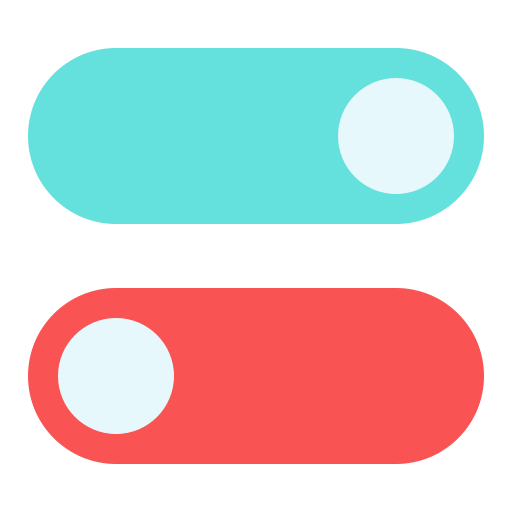
Toggle 컴포넌트
이런 토글버튼을 만들어보겠음
다 첨부하면 너무 길어지니까...요약해보겠음
<label>
  <input type='checkbox'/>
  <button></button>
</label>
이렇게 인풋에 체크박스를 걸어두고, display:none을 하여 숨김. 하지만 label태그때문에 버튼 누르면 checkbox가 체크됨. => 이를 이용하여 CSS만으로 checked, disabled 이벤트 처리 가능
  &:checked + div {
    background: lightgreen;
  }
  &:checked + div:after {
    left: calc(100% - 26px);
  }
  &:disabled + div {
    opacity: 0.7;
    cursor: not-allowed;
    &:after {
      opacity: 0.7;
    }
  }
그리고 useToggle이라는 커스텀훅을 만들어서 사용했는데, 스토리북이 상태를 인식하지 못한다(프롭스가 useState로 바뀜). 이를 해결하기위해 useArgs라는 애드온(함수)를 사용해야 한단다.
import { useArgs } from '@storybook/manager-api';

const [args, updateArgs, resetArgs] = useArgs();

// To update one or more args:
updateArgs({ key: 'value' });

// To reset one (or more) args:
resetArgs((argNames: ['key']));

// To reset all args
resetArgs();
이렇게까지 해야하는지는 잘 모르겠다. 대규모 프로젝트라면...필요할것 같다.
느낀점
강의 마지막에는 검색기능을 한번 구현하셨다.
지금까지 사용했던 컴포넌트들을 사용하지 않는건 아쉽지만 컴포넌트들을 어떻게 조합할지 감이 왔다.
생각보다 props가 많아도 되겠구나? 싶기도 하고...일단 고민이 된다!
그리고 스토리북은 좋긴한데 수정할때마다 한번 더 작업을 거치는게 좀 귀찮다..ㅠㅠ