
📝 오늘 한 것
- grid
📚 배운 것
1. grid
1) grid가 필요한 이유
flex container에 justify-content: space-between을 부여한 경우 레이아웃이 의도하지 않은 모양이 될 수 있다.
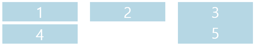
우선, 양 옆 간격은 쉽게 조정할 수 있지만 위 아래 간격은 일관되게 한 번에 조정할 수 있는 프로퍼티가 flexbox에는 없기 때문에 개별 item에 margin을 부여하는 식으로 구현해야 한다.
또한, flex container에 justify-content: space-between과 flex-wrap: wrap을 함께 지정했다면 경우에 따라서는 마지막 줄에서는 flex item이 쭉 배치되지 않고 가운데가 비어 있는 채로 양 옆으로 정렬될 수도 있다.
<div class="father">
  <div class="child">1</div>
  <div class="child">2</div>
  <div class="child">3</div>
  <div class="child">4</div>
  <div class="child">5</div>
</div>
.father {
display: flex;
flex-wrap: wrap;
justify-content: space-between;
}
.child {
flex-basis: 30%;
color: white;
background-color: lightblue;
font-size: 50px;
display: flex;
justify-content: center;
align-items: center;
}
.child:nth-child(4) {
margin-top: 10px;
}이와 같은 문제를 해결하기 위해서는 grid(격자 무늬)를 이용하는 게 편리하다.
2) display: grid
display: flex와 마찬가지로 display: grid를 부모 컨테이너에 적용해야 한다.
grid를 design하기 위해 다른 프로퍼티들 또한 대부분의 경우 부모 컨테이너에 추가해야 한다.
3) columns / rows
(1) grid-template-columns / rows / gap
grid-template-columns와 grid-template-rows를 이용해 grid container의 column 및 row의 개수와 grid item들의 너비 및 높이를 설정할 수 있다.
/* grid container(부모 컨테이너) */
.father {
  display: grid;
  grid-template-columns: 250px 250px 250px; /* grid column의 개수 3개, 하나당 너비는 250px */
  gap: 10px; /* 또는 column-gap: 10px; row-gap: 10px; */
}

/* grid item */
.child {
  color: white;
  background-color: lightblue;
  font-size: 50px;
}
grid-template-rows 프로퍼티를 추가하지 않으면, grid item의 높이는 grid item에 지정한 font-size 프로퍼티에 영향을 받는다.
grid item의 font-size를 5px로 줄이면 grid item의 각 높이도 그에 따라 줄어든다.
grid-template-rows: 100px 50px;grid item의 높이를 제어하기 위해 grid-template-columns 프로퍼티와 같은 방식으로 grid-template-rows 프로퍼티를 추가할 수 있다.
(2) repeat()
grid item들이 같은 너비 혹은 높이를 가지는 경우 grid-template-columns 또는 rows 프로퍼티의 값으로 수치를 반복해서 적는 대신에 repeat() 함수를 사용할 수 있다.
grid-template-columns: 250px 250px 250px;

/* 위와 아래는 같다 */

grid-template-columns: repeat(3, 250px);
4) grid-template-areas
grid-template-area를 이용해 grid layout을 만들 수 있다.
(1) grid-template-columns / rows
<div class="grid">
<div class="header"></div>
<div class="content"></div>
<div class="nav"></div>
<div class="footer"></div>
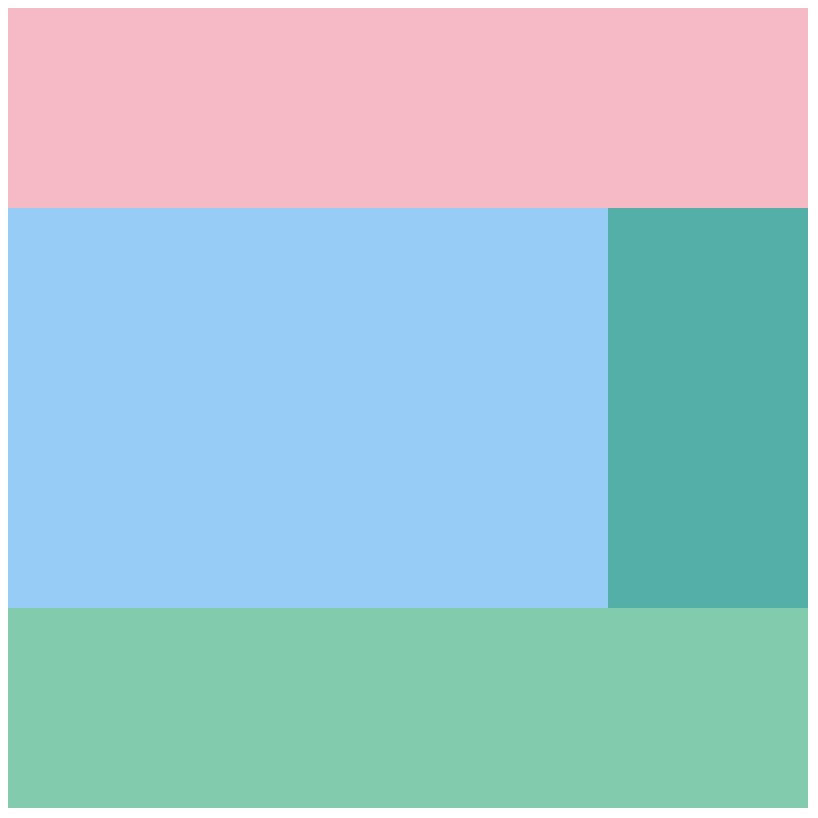
</div>grid를 이용하여
맨 위에 header
중간에 container와 navigation
맨 밑에 footer
가 오도록 하려고 한다.
이때 아래처럼만 작성하면 화면에는 아무것도 뜨지 않는다.
.grid {
  display: grid;
}

.header {
  background-color: lightpink;
}

.content {
  background-color: lightskyblue;
}

.nav {
  background-color: lightseagreen;
}

.footer {
  background-color: mediumaquamarine;
}
grid design을 위해서는 grid container(부모 컨테이너)에는 display: grid를 지정하는 것 외에도 grid item들의 크기를 결정하기 위한 프로퍼티(grid-template-columns / rows)를 반드시 따로 지정해줘야 한다.

.grid {
display: grid;
/* 추가 */
grid-template-columns: repeat(4, 200px);
grid-template-rows: repeat(4, 200px);
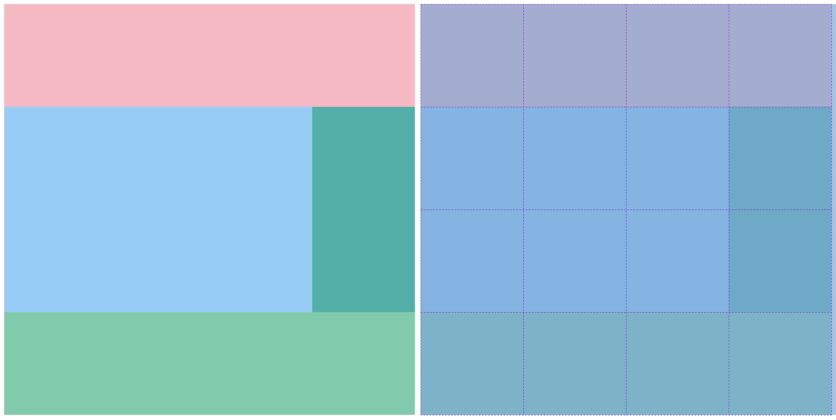
}(2) grid-template-areas / grid-area
grid container(부모 컨테이너)에 grid-template-columns / rows를 지정하여 4x4(16개)의 영역을 만들었다.
먼저, grid-template-areas를 이용해 순서대로 각 영역에 이름을 붙여야 한다.
/* grid container(부모 컨테이너) */
.grid {
  display: grid;
  grid-template-columns: repeat(4, 200px);
  grid-template-rows: repeat(4, 200px);
  grid-template-areas:
    "header header header header"
    "content content content nav"
    "content content content nav"
    "footer footer footer footer";
}
grid item에는 위에서 붙인 이름들을 지정해야 한다.
이해를 돕기 위해 class이름과 grid-area의 이름을 동일하게 작성했지만 둘은 전혀 상관이 없다.
.header {
  background-color: lightpink;
  grid-area: header;
}

.content {
  background-color: lightskyblue;
  grid-area: content;
}

.nav {
  background-color: lightseagreen;
  grid-area: nav;
}

.footer {
  background-color: mediumaquamarine;
  grid-area: footer;
}
다음과 같은 결과물을 완성했다.
이는 실제로 오른쪽 그림처럼 16개의 영역으로 나뉘어져 있다.
grid를 이용해 이처럼 쉽게 layout을 완성할 수 있다.
✨ 내일 할 것
- grid
