🤔
styled-components와 더 친해지기 위해 ThemeProvider를 이용해서 다크모드 예제를 만들어봤다.
🔻 theme.js
export const dark = {
    colors: {
        titleColor: "#fff",
        bgColor: "#232332",
    }
}
export const light = {
    colors: {
        titleColor: "#232332",
        bgColor: "#fff",
    }
}- 다크모드일 때, 라이트모드일 때 텍스트 컬러와 배경 컬러를 지정해준다.
import styled, { ThemeProvider } from "styled-components";- styled-components에서
ThemeProvider를 import 해준다.
🔻 App.jsx
<import { light,dark } from "./theme";

<ThemeProvider theme={theme}>
      <MainContainer>
        <Button
          title={theme === dark ? "라이트 모드" : "다크 모드"}
          onclick={toggleTheme}
        />
      </MainContainer>
    </ThemeProvider>
ThemeProvider를 최상위로 두어 나머지 컴포넌트들을 감싸준다.theme.js에서 작성했던 light, dark 모드 테마를 import 해준다.- 최상위 부모가 theme을 가지고 있기 때문에 sc에서 props로 접근이 가능하다!
🔻 Button.jsx
import styled from "styled-components";

function Button({ title, onclick }) {
  return (
    <ButtonContainer onClick={onclick}>
      <ButtonText>{title}</ButtonText>
    </ButtonContainer>
  );
}

const ButtonContainer = styled.button`
  width: fit-content;
  height: 30px;
  background-color: ${props => props.theme.colors.titleColor};
  cursor: pointer;
`;

const ButtonText = styled.span`
  color: ${(props) => props.theme.colors.bgColor};
`;

export default Button;- Button 컴포넌트는 위와 같다!
- 버튼의 텍스트 색깔, 배경 색깔은 MainContainer의 배경색과 반대로 지정되도록 titleColor와 bgColor를 바꿔서 설정해줬다.
🔻 App.jsx
const [themeMode, setthemeMode] = useState(false);
  const theme = themeMode === false ? light : dark;

  const toggleTheme = () => {
    setthemeMode(!themeMode);
};- useState를 사용해서
themeModestate를 동적으로 다뤄준다.
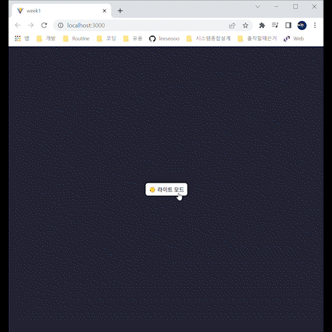
🔻결과물

꾸준히 공부하기