
Tailwind + Emotion
Tailwind
Tailwind CSS는 Utility-First를 지향한다. 부트스트랩을 사용해보았다면 조금 더 친숙하게 다가올 것이다. margin-top을 주고 싶은 경우 mt-숫자 와 같이 사용하는 것 말이다.
<p class="mt-3 p-5 text-red bg-yellow-400">
  안녕하세요
</p>
빠르고 쉽게 스타일할 수 있으며, 일관된 디자인하기에 좋다. 사용법은 class에 이름을 넣어주는 것이 아니라 스타일을 넣어주면 된다. Tailwind 공식문서에서 원래 사용하던 CSS 문법을 검색하여 Tailwind 문법으로 변환된 것을 쉽게 찾아볼 수도 있다.
하지만 몇 가지 단점도 있다. 원래 알던 속성이 다른 이름으로 존재하기 때문에 숙지할 필요가 있고, 자바스크립트 코드 사용이 불가하기 때문에 불편하다. 또한, 인라인으로 스타일을 줘서 내가 보기에 매우 불편하기도 하다.(관심사의 분리가 이루어지지 않음)
그래서 관심사의 분리를 하고, JavaScript 코드도 사용하기 위해 Emotion하고 같이 사용해보기로 했다.
Emotion
Styled-Components와 같은 CSS-in-JS이다. CSS에서는 명시적으로 정의하지 않는 경우 부모 요소에서 자동으로 상속되는 속성이 있다. 하지만 CSS-in-JS에서는 문서 레벨이 아니라 컴포넌트 레벨로 CSS를 추상화 하기 때문에 부모 요소의 속성을 상속하지 않는다.
React에서는 CSS-in-JS를 많이 사용하고 있다.
interface StrNumTheme {
  strNum: number;
  theme: Theme;
  isTrue: boolean;
}

//...

<List strNum={strNum} theme={theme} isTrue={isTrue} />

//...

const List = styled.div<StrNumTheme>`
  font-size: 14px;
  margin-bottom: 5px;
  margin-left: ${({ strNum }) => strNum * 10}px;
  color: ${({ isTrue, theme }) => (isTrue ? theme.MAIN : theme.POINT_FONT)};
  font-weight: ${({ isTrue }) => (isTrue ? 700 : 400)};
  &:hover {
    color: ${({ theme }) => theme.BUTTON_SUB};
    font-weight: 700;
  }
`;
JavaScript 변수를 이용하여 스타일에 영향을 주고 싶은 경우에는 props로 넘겨줄 수 있다. 타입스크립트를 사용하게 되면 interface도 선언해줘야 할 것이다.
twin.macro
우리는 Tailwind와 Emoion에 대해 알아보았다. 이번에는 이 두개의 장점을 모두 살려보자.
설치
타입스크립트 기반 next
yarn create next-app --example with-typescript-eslint-jest test-next

테일윈드, 이모션, 트윈마크로
yarn add @emotion/react @emotion/styled @emotion/css @emotion/server
yarn add -D twin.macro tailwindcss postcss@latest autoprefixer@latest @emotion/babel-plugin babel-plugin-macros

tailwind.config.js 생성
npx tailwindcss-cli@latest init -p
package.json
  "babelMacros": {
    "twin": {
      "preset": "emotion"
    }
  }
.babelrc.js
module.exports = {
  presets: [
    ['next/babel', { 'preset-react': { runtime: 'automatic', importSource: '@emotion/react' } }],
  ],
  plugins: ['@emotion/babel-plugin', 'babel-plugin-macros'],
};
twin.d.ts
twin.macro 설정
import 'twin.macro';

import { css as cssImport } from '@emotion/react';
import styledImport from '@emotion/styled';

declare module 'twin.macro' {
  // The styled and css imports
  const styled: typeof styledImport;
  const css: typeof cssImport;
}
tsconfig.json
.d.ts 파일 include 및 절대경로
  "compilerOptions": {
    "target": "es5",
    "lib": ["dom", "dom.iterable", "esnext"],
    "baseUrl": ".",
    "paths": {
      "@/*": ["./*"],
      "@pages/*": ["pages/*"],
      "@server/*": ["server/*"],
      "@public/*": ["public/*"],
      "@styles/*": ["styles/*"],
      "@components/*": ["components/*"],
      "@utils/*": ["utils/*"],
      "@hooks/*": ["hooks/*"]
    },
    "allowJs": true,
    "skipLibCheck": true,
    "strict": true,
    "forceConsistentCasingInFileNames": true,
    "noEmit": true,
    "esModuleInterop": true,
    "module": "esnext",
    "moduleResolution": "node",
    "resolveJsonModule": true,
    "isolatedModules": true,
    "jsx": "preserve",
    "incremental": true
  },
  "include": ["**/*.d.ts", "**/*.ts", "**/*.tsx"],
  "exclude": ["node_modules"]
postcss.config.js
css파일 압축을 위한 cssnano와 Tailwind CSS v2의 IE 지원을 위한 autoprefixer을 사용하기 위해 플러그인에 넣었다.
module.exports = {
  plugins: {
    tailwindcss: {},
    autoprefixer: {},
    cssnano: {},
  },
};
tailwind.config.js
커스터 마이징을 할 수 있는 곳이다. margin-top 속성을 주기 위해 mt-를 입력해보고 자동완성을 기다려보자. 선택할 수 있는 폭이 좁다. 하지만 픽셀 단위 또는 나의 마음대로 UI를 구현해야할 때가 있을 것이다.
const plugin = require('tailwindcss/plugin');

module.exports = {
  mode: 'jit',
  content: ['pages/**/*.{ts,tsx}', 'components/**/*.{ts,tsx}'],
  theme: {
    extend: {
      spacing: {
        1: '1px',
        2: '2px',
        //...
      },
      fontSize: {
        'title-0': '90px',
        //...
        'head-0': '45px',
        //...
        'body-1': '18px',
        //...
        'caption-1': '12px',
        //...
      },
      fontFamily: {
        garamond: 'GaramondPremrPro, Arial, sans-serif',
        noto: 'Noto Sans, Arial, sans-serif',
      },
      fontWeight: {
        ultralight: 100,
        light: 200,
        thin: 300,
        normal: 400,
        medium: 500,
        semibold: 600,
        bold: 700,
        extrabold: 800,
        black: 900,
      },
      lineHeight: {
        default: '1.2',
        12: '12px',
        //...
      },
      minWidth: {
        320: '320px',
        //...
      },
      maxWidth: {
        140: '140px',
        //...
      },
      minHeight: {
        882: '882px',
      },
      maxHeight: {
        460: '460px',
      },
      boxShadow: {
        sm: '0px 0px 8px rgba(0, 0, 0, 0.1)',
        md: '0px 2px 16px rgba(0, 0, 0, 0.1)',
        lg: '0px 4px 32px rgba(0, 0, 0, 0.1)',
      },
      keyframes: {
        show: {
          '0%': { transform: 'scale(0)', opacity: 1 },
          '100%': { transform: 'scale(1)', opacity: 1 },
        },
        fadeIn: {
          '0%': { opacity: 0 },
          '100%': { opacity: 1 },
        },
      },

      animation: {
        show: 'show 200ms cubic-bezier(.6, 0, .4, 1) 1000ms forwards',
        fadeIn: 'fadeIn 300ms cubic-bezier(.6, 0, .4, 1) forwards',
      },
    },
    screens: {
      xsm: '320px',
      sm: '428px',
      md: '768px',
      lg: '1024px',
      xl: '1280px',
    },
  },
  variants: {
    extend: {
      backgroundColor: ['disabled'],
    },
  },
  plugins: [
    plugin(({ addComponents }) => {
      const components = {
        '.flex-center': {
          display: 'flex',
          justifyContent: 'center',
          alignItems: 'center',
        },
      };
      addComponents(components);
    }),
  ],
};
이제 text-body-1 처럼 사용하여 font-size를 부여할 수 있다. 폰트의 크기는 18px가 될 것이다. 글꼴이나 박스쉐도우, 심지어 애니매이션에 관련된 부분까지 입맛에 맞게 추가가 가능하다.
플러그인을 만질 수도 있다.(궁금하다면 공식문서를 참고해보자.)
사용
import { css } from '@emotion/react';
import tw, { styled } from 'twin.macro';
Tailwind를 위한 tw와 css-in-js를 위한 styled와 css를 불러오자.
const Caption = tw.p`
  font-noto font-light text-caption-1 w-full
  md:font-thin md:text-head-5 md:leading-26 md:whitespace-normal md:text-left md:mt-37
`;
먼저 Tailwind를 사용해보자. 스타일드 컴포넌트를 사용하는 것 처럼 const 변수 = tw.태그 형태를 쓴다. 그리고 여기에 Tailwind 문법을 사용하는 것이다.
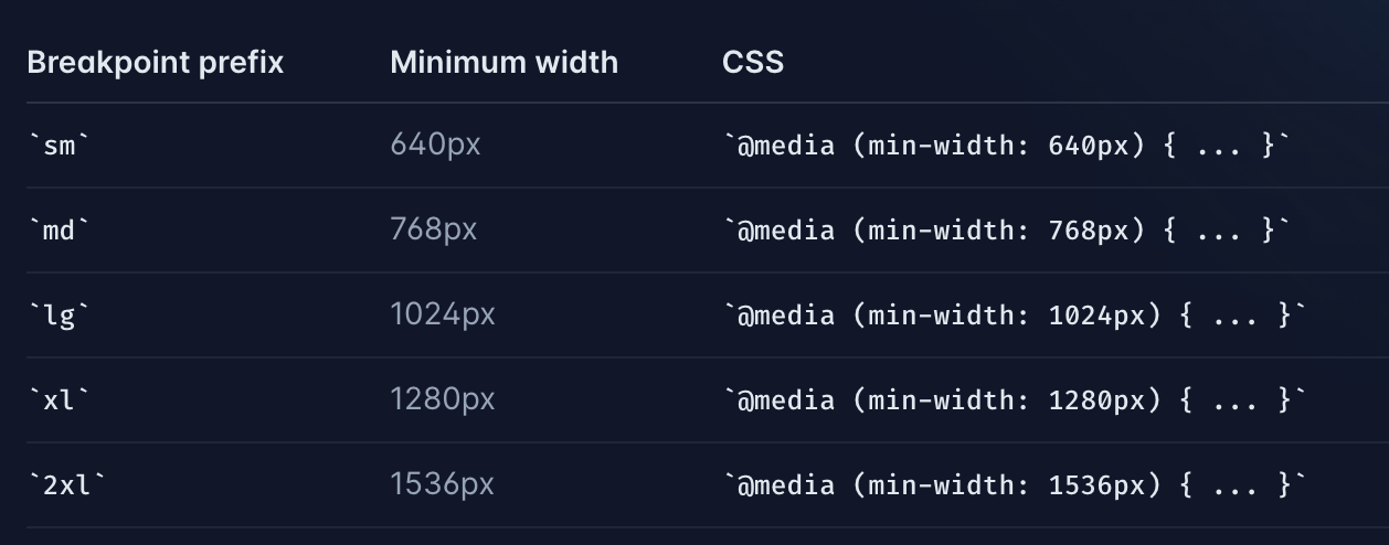
md는 반응형을 위한 Tailwind 속성이다. 간단하게 반응형을 구현할 수 있고, 모바일 퍼스트이다.
<Icon index={i + 1} />Icon 이라는 것을 index를 이용한 스타일을 하고싶다.
JavaScript를 사용하는 것이다.
interface IconProps {
  index: number;
}

const Icon = styled.div<IconProps>(({ index }) => [
  tw`
  md:w-198 md:flex-shrink-0 md:mt-20
`,
  css`
    position: relative;
    &::before {
      content: '0${index}';
      padding: ${index};
    }
  `,
]);
Tailwind만 사용했다면 불가능한 동작을 emotion, twin.macro로 가능하게 했다.
그리고 인라인으로 스타일을 사용하지 않아도 되어 html과 css가 분리 된다.
플러그인
aspect ratio에 대한 설정을 할 수 없는 것이 twin.macro의 단점이라고 말씀해주신 분이 계셨다.하지만 What is twin.macro? 글에서 보면 aspect-ratio 를 위한 플러그인이 존재하는 것을 볼 수 있다. 그 외에도 TailwindUI, Custom Forms, Typography, Gradients 에 대한 플러그인도 있으니 사용해봐도 좋을 것 같다.
복잡한 초기셋팅, tailwind의 단점과 똑같이 새로 속성을 익혀야 한다는점, 오히려 가독성이 떨어질 수 있다는 부분들이 단점인 것 같다.

mt-3 이 부분이 진짜 부트스트랩이랑 비슷하네..신기방기 🙄