진행사항
동료와 코드 스타일을 조금 더 맞출 수 있도록 prettier 설정을 했고, eslint도 우리의 입맛에 맞게 추가해주었다. Back단은 Strapi를 사용하고 있고, 헤로쿠로 배포했다. 스키마 구조는 UI를 설계하며 파악해보려고 한다.
Card
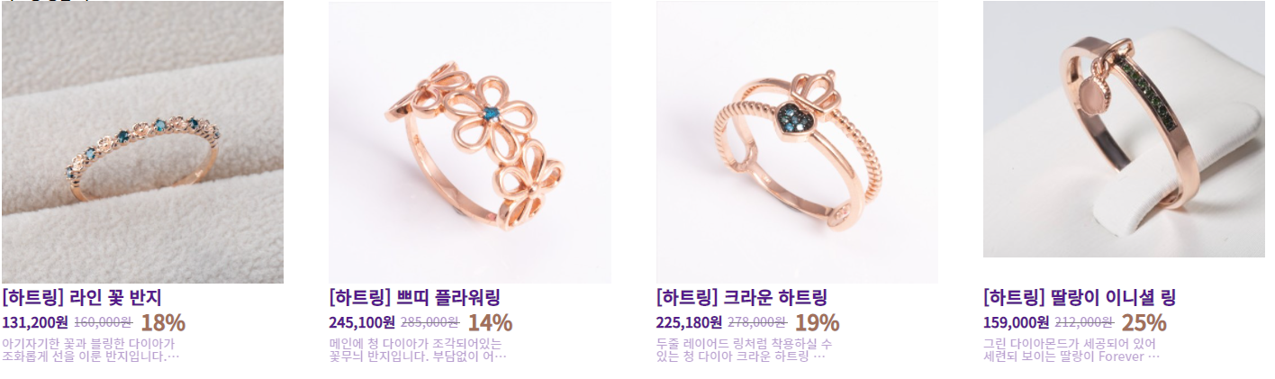
먼저 Home에서 아이템들을 보여주기 위한 Card 컴포넌트를 설계했다.
const CardData = {
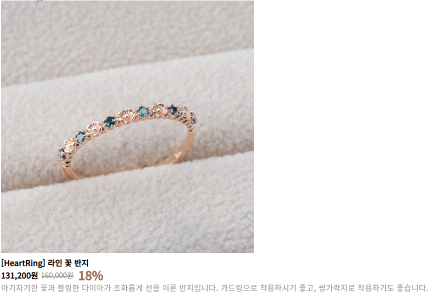
src: "./images/라인꽃반지.jpg",
label: "라인 꽃 반지",
price: 160000,
sale: 18,
content: "아기자기한 꽃과 블링한 다이아가 조화롭게 선을 이룬 반지입니다. 가드링으로 착용하시기 좋고, 쌍가락지로 착용하기도 좋습니다.",
}이미지 주소, 라벨, 가격, 세일(퍼센트), 내용에 대한 목 데이터를 생성했다. 이 데이터를 이용하여 Card를 설계할 것이다.
  const salePrice = (CardData.price*(100-CardData.sale)*0.01).toLocaleString(undefined);
  const OriginPrice = CardData.price.toLocaleString(undefined);
OriginPrice는 원래 가격이고, salePrice은 원래 가격에서 세일한 퍼센트를 적용한 것이다. 3자리마다 콤마(,)를 찍어주기 위해 toLocaleString을 사용했다.
<Container>
  <img src={CardData.src} alt={CardData.label} />
  <Label>[HeartRing] {CardData.label}</Label>
  <PriceContainer>
    <SalePrice>{salePrice}원</SalePrice>
    <Price>{OriginPrice}원</Price>
    <Sale>{CardData.sale}%</Sale>
  </PriceContainer>
  <Content>{CardData.content}</Content>
</Container>
그 후, 목 데이터를 사용하여 UI를 설계했다.
CardContainer
  return(
    <Container>
      <h2 className="sr-only">하트링 상품 리스트</h2>
      <CardUl>
        {CardData.map((data) => {
          return (
            <li key={`Card-key-${data.label}`}>
              <Link href="#">
                <a>
                  <Card data={data}/>
                </a>
              </Link>
            </li>
          )
        })}
      </CardUl>
    </Container>
  )
Card를 사용하는 CardContainer 컴포넌트를 생성했다. 현재 글로벌 스타일에 a태그에 대한 reset이 적용되어 있지 않아 추후에 적용할 예정이다.
그리고 CardContainer에서 Card컴포넌트에 data를 넘겨주고, Card에서는 data를 받아 사용하도록 코드를 다시 수정했다.
마무리
다음글에서는 헤더와 푸터를 설계해보겠다.

함께 일하고 싶은 개발자가 되기 위해 달려나가고 있습니다.