
머신러닝·딥러닝 문제해결 전략 책을 읽으면서
Kaggle 경진대회 코드와 문제해결 전략을 정리한 글
6장 자전거 대여 수요 예측 경진대회 - 탐색적 데이터 분석
경진대회 이해
- 워싱턴 D.C의 자전거 무인 대여 시스템 과거 기록을 기반으로 향후 자전거 대여 수요를 예측하는 대회
- 주어진 데이터는 2011년부터 2012년까지 2년간의 자전거 대여 데이터
- 캐피털 바이크셰어 회사가 공개한 운행 기록에 다양한 외부 소스에서 얻은 당시 날씨 정보를 조합하여 만들었다고 함
- 대여 데이터는 한 시간 간격으로 기록되어 있으며 그중 훈련 데이터는 매달 1일부터 19일까지의 기록이고, 테스트 데이터는 매달 20일부터 월말까지의 기록
- 피처는 대여 날짜, 시간, 요일, 계절, 날씨, 실제 온도, 체감 온도, 습도, 풍속, 회원 여부
- 이 데이터를 활용해 시간별 자전거 대여 수량을 예측
- 예측할 값이 범주형 데이터가 아니므로 본 대회는 회귀 문제에 속함
데이터 둘러보기
import numpy as np
import pandas as pd
# 데이터 경로
data_path = '/kaggle/input/bike-sharing-demand/'

train = pd.read_csv(data_path + 'train.csv')  # 훈련 데이터
test = pd.read_csv(data_path + 'test.csv')    # 테스트 데이터
submission = pd.read_csv(data_path + 'sampleSubmission.csv') # 제출 샘플 데이터train.shape, test.shape((10886, 12), (6493, 9))# 훈련 데이터 확인
train.head()| datetime | season | holiday | workingday | weather | temp | atemp | humidity | windspeed | casual | registered | count | |
|---|---|---|---|---|---|---|---|---|---|---|---|---|
| 0 | 2011-01-01 00:00:00 | 1 | 0 | 0 | 1 | 9.84 | 14.395 | 81 | 0.0 | 3 | 13 | 16 |
| 1 | 2011-01-01 01:00:00 | 1 | 0 | 0 | 1 | 9.02 | 13.635 | 80 | 0.0 | 8 | 32 | 40 |
| 2 | 2011-01-01 02:00:00 | 1 | 0 | 0 | 1 | 9.02 | 13.635 | 80 | 0.0 | 5 | 27 | 32 |
| 3 | 2011-01-01 03:00:00 | 1 | 0 | 0 | 1 | 9.84 | 14.395 | 75 | 0.0 | 3 | 10 | 13 |
| 4 | 2011-01-01 04:00:00 | 1 | 0 | 0 | 1 | 9.84 | 14.395 | 75 | 0.0 | 0 | 1 | 1 |
# 테스트 데이터 확인
test.head()| datetime | season | holiday | workingday | weather | temp | atemp | humidity | windspeed | |
|---|---|---|---|---|---|---|---|---|---|
| 0 | 2011-01-20 00:00:00 | 1 | 0 | 1 | 1 | 10.66 | 11.365 | 56 | 26.0027 |
| 1 | 2011-01-20 01:00:00 | 1 | 0 | 1 | 1 | 10.66 | 13.635 | 56 | 0.0000 |
| 2 | 2011-01-20 02:00:00 | 1 | 0 | 1 | 1 | 10.66 | 13.635 | 56 | 0.0000 |
| 3 | 2011-01-20 03:00:00 | 1 | 0 | 1 | 1 | 10.66 | 12.880 | 56 | 11.0014 |
| 4 | 2011-01-20 04:00:00 | 1 | 0 | 1 | 1 | 10.66 | 12.880 | 56 | 11.0014 |
훈련 데이터를 활용해 모델을 훈련한 뒤, 테스트 데이터를 활용해 대여 수량(count)을 예측해야 하는데
테스트 데이터에 casual과 registered 피처가 없으므로 모델을 훈련할 때도 훈련 데이터의 casual과 registered 피처를 빼야함
# 제출 샘플 파일 확인
submission.head()| datetime | count | |
|---|---|---|
| 0 | 2011-01-20 00:00:00 | 0 |
| 1 | 2011-01-20 01:00:00 | 0 |
| 2 | 2011-01-20 02:00:00 | 0 |
| 3 | 2011-01-20 03:00:00 | 0 |
| 4 | 2011-01-20 04:00:00 | 0 |
제출 파일은 데이터를 구분하는 ID 값(datetime)과 타깃값으로 구성되어 있음
여기서 ID 값(datetime)은 데이터를 구분하는 역할만 하므라 타깃값을 예측하는 데에는 아무런 도움을 주지 않음
따라서 추후 모델 훈련 시 훈련 데이터에 있는 datetime 피처는 제거할 계획
(atetime 피처는 연도, 월, 시간 등의 정보를 포함하기 때문에 이들 정보를 추출한 뒤 제거)
# info() 함수를 사용하여 DataFrame 각 열의 결측값이 몇 개인지, 데이터 타입은 무엇인지 파악
train.info()<class 'pandas.core.frame.DataFrame'>
RangeIndex: 10886 entries, 0 to 10885
Data columns (total 12 columns):
# Column Non-Null Count Dtype
--- ------ -------------- -----
0 datetime 10886 non-null object
1 season 10886 non-null int64
2 holiday 10886 non-null int64
3 workingday 10886 non-null int64
4 weather 10886 non-null int64
5 temp 10886 non-null float64
6 atemp 10886 non-null float64
7 humidity 10886 non-null int64
8 windspeed 10886 non-null float64
9 casual 10886 non-null int64
10 registered 10886 non-null int64
11 count 10886 non-null int64
dtypes: float64(3), int64(8), object(1)
memory usage: 1020.7+ KBtest.info()<class 'pandas.core.frame.DataFrame'>
RangeIndex: 6493 entries, 0 to 6492
Data columns (total 9 columns):
# Column Non-Null Count Dtype
--- ------ -------------- -----
0 datetime 6493 non-null object
1 season 6493 non-null int64
2 holiday 6493 non-null int64
3 workingday 6493 non-null int64
4 weather 6493 non-null int64
5 temp 6493 non-null float64
6 atemp 6493 non-null float64
7 humidity 6493 non-null int64
8 windspeed 6493 non-null float64
dtypes: float64(3), int64(5), object(1)
memory usage: 456.7+ KB더 효과적인 분석을 위한 피처 엔지니어링
- 일부 데이터는 시각화하기에 적합하지 않은 형태일 수 있으므로 시각화 하기 전에 해당 피처를 분석하기 적합하게 변환
datetime 피처는 연도, 월, 일, 시간, 분, 초로 구성되어 있음
따라서 세부적으로 분석해보기 위해 구성요소별로 나누어 피처 추가
datetime 피처는 object 타입이기 때문에 문자열처럼 다룰 수 있어 split() 함수를 사용해 공백 기준으로 문자를 나눔
print(train['datetime'][100])  # datetime 100번째 원소
print(train['datetime'][100].split())  # 공백 기준으로 문자열 나누기
print(train['datetime'][100].split()[0])  # 날짜
print(train['datetime'][100].split()[1])  # 시간
2011-01-05 09:00:00
['2011-01-05', '09:00:00']
2011-01-05
09:00:00# 날짜 문자열을 연도, 월, 일로 나누기
print(train['datetime'][100].split()[0]) # 날짜
print(train['datetime'][100].split()[0].split("-")) # "-" 기준으로 문자열 나누기
print(train['datetime'][100].split()[0].split("-")[0]) # 연도
print(train['datetime'][100].split()[0].split("-")[1]) # 월
print(train['datetime'][100].split()[0].split("-")[2]) # 일2011-01-05
['2011', '01', '05']
2011
01
05# 시간 문자열을 시, 분, 초로 나누기
print(train['datetime'][100].split()[1]) # 시간
print(train['datetime'][100].split()[1].split(":")) # ":" 기준으로 문자열 나누기
print(train['datetime'][100].split()[1].split(":")[0]) # 시간
print(train['datetime'][100].split()[1].split(":")[1]) # 분
print(train['datetime'][100].split()[1].split(":")[2]) # 초09:00:00
['09', '00', '00']
09
00
00 판다스 apply() 함수로 앞의 로직을 datetime에 적용해
날짜(date), 연도(year), 월(month), 일(day), 시(hour), 분(minute), 초(second) 피처 생성
train['date'] = train['datetime'].apply(lambda x: x.split()[0])  # 날짜 피처 생성

# 연도, 월, 일, 시, 분, 초 피처를 차례로 생성
train['year'] = train['datetime'].apply(lambda x: x.split()[0].split('-')[0])
train['month'] = train['datetime'].apply(lambda x: x.split()[0].split('-')[1])
train['day'] = train['datetime'].apply(lambda x: x.split()[0].split('-')[2])
train['hour'] = train['datetime'].apply(lambda x: x.split()[1].split(':')[0])
train['minute'] = train['datetime'].apply(lambda x: x.split()[1].split(':')[1])
train['second'] = train['datetime'].apply(lambda x: x.split()[1].split(':')[2])
calendar와 datetime 라이브러리를 활용해 요일 피처 생성
0은 월요일, 1은 화요일, 2는 수요일 순으로 매핑
(머신러닝 모델은 숫자만 인식하므로 모델을 훈련할 때는 피처 값을 문자로 바꾸면 안됨)
from datetime import datetime  # datetime 라이브러리 임포트
import calendar

print(train['date'][100]) # 날짜
# datetime 타입으로 변경
print(datetime.strptime(train['date'][100], '%Y-%m-%d'))
# 정수로 요일 반환
print(datetime.strptime(train['date'][100], '%Y-%m-%d').weekday())
# 문자열로 요일 반환
print(calendar.day_name[datetime.strptime(train['date'][100], '%Y-%m-%d').weekday()])
2011-01-05
2011-01-05 00:00:00
2
Wednesday앞의 로직을 apply() 함수로 적용해 요일(weekday) 피처 추가
train['weekday'] = train['date'].apply(
    lambda dateString:
    calendar.day_name[datetime.strptime(dateString, '%Y-%m-%d').weekday()])
season과 weather 피처는 범주형 데이터인데 현재 1, 2, 3, 4라는 숫자로 표현되어 있어서 정확히 어떤 의미인지 파악하기 어려움
시각화 시 의미가 잘드러나도록 map() 함수를 사용하여 문자열로 변화
train['season'] = train['season'].map({1: 'Spring',
                                       2: 'Summer',
                                       3: 'Fall',
                                       4: 'Winter'})
train['weather'] = train['weather'].map({1: 'Clear',
                                         2: 'Mist, Few clouds',
                                         3: 'Light Snow, Rain, Thunderstorm',
4: 'Heavy Rain, Thunderstorm, Snow, Fog'})train.head()| datetime | season | holiday | workingday | weather | temp | atemp | humidity | windspeed | casual | registered | count | date | year | month | day | hour | minute | second | weekday | |
|---|---|---|---|---|---|---|---|---|---|---|---|---|---|---|---|---|---|---|---|---|
| 0 | 2011-01-01 00:00:00 | Spring | 0 | 0 | Clear | 9.84 | 14.395 | 81 | 0.0 | 3 | 13 | 16 | 2011-01-01 | 2011 | 01 | 01 | 00 | 00 | 00 | Saturday |
| 1 | 2011-01-01 01:00:00 | Spring | 0 | 0 | Clear | 9.02 | 13.635 | 80 | 0.0 | 8 | 32 | 40 | 2011-01-01 | 2011 | 01 | 01 | 01 | 00 | 00 | Saturday |
| 2 | 2011-01-01 02:00:00 | Spring | 0 | 0 | Clear | 9.02 | 13.635 | 80 | 0.0 | 5 | 27 | 32 | 2011-01-01 | 2011 | 01 | 01 | 02 | 00 | 00 | Saturday |
| 3 | 2011-01-01 03:00:00 | Spring | 0 | 0 | Clear | 9.84 | 14.395 | 75 | 0.0 | 3 | 10 | 13 | 2011-01-01 | 2011 | 01 | 01 | 03 | 00 | 00 | Saturday |
| 4 | 2011-01-01 04:00:00 | Spring | 0 | 0 | Clear | 9.84 | 14.395 | 75 | 0.0 | 0 | 1 | 1 | 2011-01-01 | 2011 | 01 | 01 | 04 | 00 | 00 | Saturday |
date 피처가 제공하는 정보는 모두 year, month, day 피처에도 있으므로 추후 date 피처는 제거
또한 세분화된 month 피처를 세 달씩 묶으면 season 피처와 의미가 같아짐
지나치게 세분화된 피처를 더 큰 분류로 묶으면 성능이 좋아지는 경우가 있어 여기서는 season 피처만 남기고 month 피처는 제거
데이터 시각화
import seaborn as sns
import matplotlib as mpl
import matplotlib.pyplot as plt
%matplotlib inline
분포도
- 분포도(distribution plot)는 수치형 데이터의 집계 값(총 개수, 비율 등)을 나타내는 그래프
# 타깃값인 count의 분포도 그리기
# 이번 장에서는 타깃값의 분포를 알면 훈련 시 타깃값을 그대로 사용할지 변환해 사용할지 파악할 수 있기 때문
mpl.rc('font', size=15)      # 폰트 크기를 15로 설정
sns.displot(train['count']) # 분포도 출력<seaborn.axisgrid.FacetGrid at 0x7f11587a4650>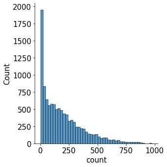
x축은 타깃값인 count를 나타내고, y축은 총 개수를 나타냄
분포도를 보면 타깃값인 count가 0 근처에 몰려 있음. 즉, 분포가 왼쪽으로 많이 편향되어 있음
회귀 모델이 좋은 성능을 내려면 데이터가 정규분포를 따라야 하는데,
현재 타깃값 count는 정규분포를 따르지 않음
따라서 현재 타깃값을 그대로 사용해 모델링한다면 좋은 성능을 기대하기 어려움
데이터 분포를 정규분포에 가깝게 만들기 위해 가장 많이 사용하는 방법은 로그변환
로그변환은 count 분포와 같이 데이터가 왼쪽으로 편향되어 있을 때 사용
# count를 로그변환한 값의 분포
sns.displot(np.log(train['count']))<seaborn.axisgrid.FacetGrid at 0x7f1151678c10>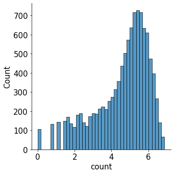
타깃값 분포가 정규분포에 가까울수록 회귀 모델 성능이 좋음
피처를 바로 활용해 count를 예측하는 것보다 log(count)를 예측하는 편이 더 정확
따라서 여기서도 타깃값을 log(count)로 변환해 사용
다만, 마지막에 지수변환을 하여 실제 타깃값인 count로 복원해야 함
막대 그래프
- 연도, 월, 일, 시, 분, 초별로 총 여섯 가지의 평균 대여 수량을 막대 그래프로 그려보기
- 이 피처들은 범주형 데이터이며 각 범주형 데이터에 따라 평균 대여 수량이 어떻게 다른지 파악
# 스텝 1: m행 n열 Figure 준비하기
mpl.rc('font', size=14)     # 폰트 크기 설정
mpl.rc('axes', titlesize=15)   # 각 축의 제목 크기 설정
figure, axes = plt.subplots(nrows=3, ncols=2)  # 3행 2열 Figure 생성 (서브플롯 전체가 figure 변수에 할당되며, 각각의 서브플롯 축 6개는 axes 변수에 할당)
plt.tight_layout()             # 그래프 사이에 여백 확보
figure.set_size_inches(10, 9)  # 전체 Figure 크기를 10x9인치로 설정 (너비 10인치, 높이 9인치)

# 스텝 2 : 각 축에 서브플롯 할당
# 각 축에 연도, 월, 일, 시간, 분, 초별 평균 대여 수량 막대 그래프 할당
sns.barplot(x='year', y='count', data=train, ax=axes[0, 0])
sns.barplot(x='month', y='count', data=train, ax=axes[0, 1])
sns.barplot(x='day', y='count', data=train, ax=axes[1, 0])
sns.barplot(x='hour', y='count', data=train, ax=axes[1, 1])
sns.barplot(x='minute', y='count', data=train, ax=axes[2, 0])
sns.barplot(x='second', y='count', data=train, ax=axes[2, 1])

# 스텝 3 : 세부 설정 (각 서브플롯에 제목을 추가하고, x축 라벨이 겹치지 않도록 개선)
# 3-1 : 서브플롯에 제목 달기
axes[0, 0].set(title='Rental amounts by year')
axes[0, 1].set(title='Rental amounts by month')
axes[1, 0].set(title='Rental amounts by day')
axes[1, 1].set(title='Rental amounts by hour')
axes[2, 0].set(title='Rental amounts by minute')
axes[2, 1].set(title='Rental amounts by second')

# 3-2 : 1행에 위치한 서브플롯들의 x축 라벨 90도 회전
axes[1, 0].tick_params(axis='x', labelrotation=90)
axes[1, 1].tick_params(axis='x', labelrotation=90)
# axis 파라미터에 원하는 축을 명시하고 labelrotation 파라미터에 회전 각도를 입력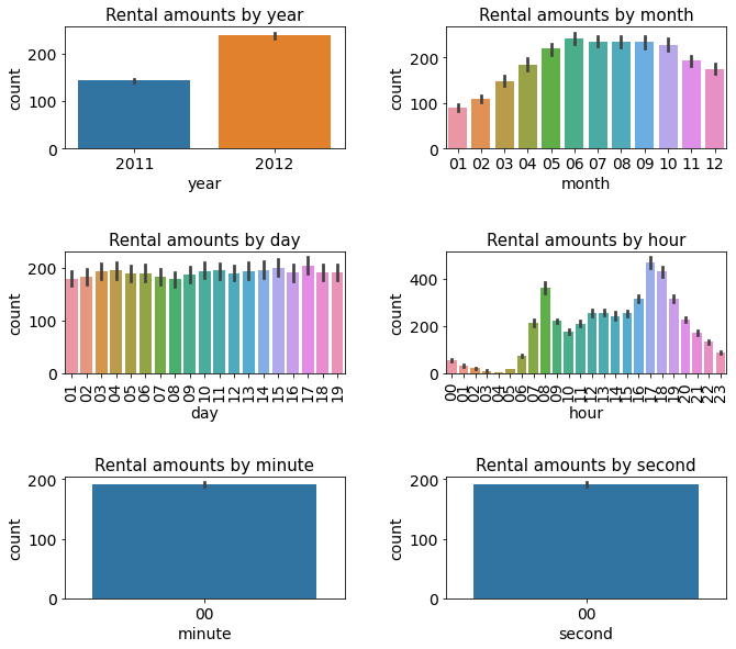
박스플롯
- 박스플롯(box plot)은 범주형 데이터에 따른 수치형 데이터 정보를 나타내는 그래프
- 막대 그래프보다 더 많은 정보를 제공하는 특징
- 계절, 날씨, 공휴일, 근무일(범주형 데이터)별 대여 수량(수치형 데이터)을 박스플롯으로 그려보기
# 스텝 1 : m행 n열 Figure 준비
figure, axes = plt.subplots(nrows=2, ncols=2) # 2행 2열
plt.tight_layout()
figure.set_size_inches(10, 10)

# 스텝 2 : 서브플롯 할당
# 계절, 날씨, 공휴일, 근무일별 대여 수량 박스플롯
sns.boxplot(x='season', y='count', data=train, ax=axes[0, 0])
sns.boxplot(x='weather', y='count', data=train, ax=axes[0, 1])
sns.boxplot(x='holiday', y='count', data=train, ax=axes[1, 0])
sns.boxplot(x='workingday', y='count', data=train, ax=axes[1, 1])

# 스텝 3 : 세부 설정
# 3-1: 서브플롯에 제목 달기
axes[0, 0].set(title='Box Plot On Count Across Season')
axes[0, 1].set(title='Box Plot On Count Across Weather')
axes[1, 0].set(title='Box Plot On Count Across Holiday')
axes[1, 1].set(title='Box Plot On Count Across Working Day')

# 3-2 : x축 라벨 겹침 해결
axes[0, 1].tick_params(axis='x', labelrotation=10)  # 10도 회전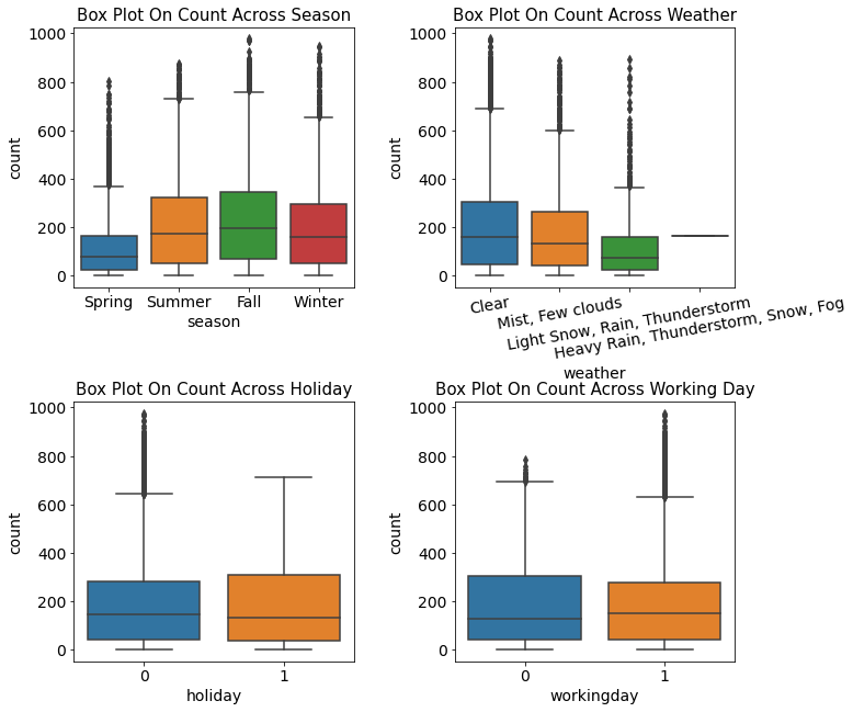
- 계절별 대여 수량 : 자전거 대여 수량은 봄에 가장 적고, 가을에 가장 많음.
- 날씨별 대여 수량 : 날씨가 좋을 때 가장 대여 수량이 많고, 안 좋을수록 수량이 적음.
- 공휴일 여부에 따른 대여 수량 : 공휴일일 때와 아닐 때 자전거 대여 수량의 중앙값은 거의 비슷함. 다만 공휴일이 아닐 때는 이상치가 많음.
- 근무일 여부에 따른 대여 수량 : 근무일일 때와 아닐 때 자전거 대여 수량의 중앙값은 거의 비슷함. 다만 근무일일 때 이상치가 많음.
포인트플롯
- 근무일, 공휴일, 요일, 계절, 날씨에 따른 시간대별 평균 대여 수량을 포인트플롯(point plot)으로 그려보기
- 포인트플롯은 범주형 데이터에 따른 수치형 데이터의 평균과 신뢰구간을 점과 선으로 표시함
- 신뢰구간 : 모수가 어느 구간 안에 있는지를 확률적으로 나타내는 방법
- 막대 그래프와 동일한 정보를 제공하지만, 한 화면에 여러 그래프를 그려 서로 비교해보기에 더 적합함
# 스텝 1 : m행 n열 Figure 준비
mpl.rc('font', size=11)
figure, axes = plt.subplots(nrows=5)  # 5행 1열
figure.set_size_inches(12, 18)

# 스텝 2 : 서브플롯 할당
# 근무일, 공휴일, 요일, 계절, 날씨에 따른 시간대별 평균 대여 수량 포인트플롯
sns.pointplot(x='hour', y='count', data=train, hue='workingday', ax=axes[0])
sns.pointplot(x='hour', y='count', data=train, hue='holiday', ax=axes[1])
sns.pointplot(x='hour', y='count', data=train, hue='weekday', ax=axes[2])
sns.pointplot(x='hour', y='count', data=train, hue='season', ax=axes[3])
sns.pointplot(x='hour', y='count', data=train, hue='weather', ax=axes[4])
<AxesSubplot:xlabel='hour', ylabel='count'>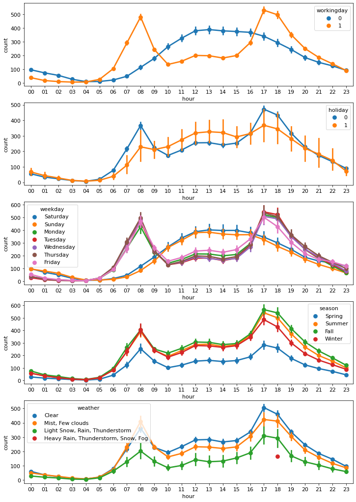
- 근무일 여부에 따른 시간대별 평균 대여 수량 : 출퇴근 시간에 대여 수량이 많고 쉬는 날에는 오후 12~2시에 가장 많음.
- 공휴일/요일 여부에 따른 시간대별 평균 대여 수량 : 근무일 여부에 따른 포인트플롯과 비슷한 양상을 보임.
- 계절에 따른 시간대별 평균 대여 수량 : 대여 수량은 가을에 가장 많고, 봄에 가장 적음.
- 날씨에 따른 시간대별 평균 대여 수량 : 날씨가 좋을 때 대여량이 가장 많음. 그런데 폭우, 폭설이 내릴 때 18시(저녁 6시)에 대여 건수가 있음. 이런 이상치는 제거를 고려해보는 것도 괜찮은 방법이며 실제로 실험한 결과 이 데이터를 제거한 경우 최종 모델 성능이 더 좋아짐. 따라서 추후 이 데이터는 제거(weather == 4인 데이터 제거)
회귀선을 포함한 산점도 그래프
- 수치형 데이터인 온도, 체감 온도, 풍속, 습도별 대여 수량을 '회귀선을 포함한 산점도 그래프(scatter plot graph with regression line'로 그려보기
- 회귀선을 포함한 산점도 그래프는 수치형 데이터 간 상관관계를 파악하는 데 사용
# 스텝 1 : m행 n열 Figure 준비
mpl.rc('font', size=15)
figure, axes = plt.subplots(nrows=2, ncols=2)  # 2행 2열
plt.tight_layout()
figure.set_size_inches(7, 6)

# 스텝 2 : 서브플롯 할당
# 온도, 체감 온도, 풍속, 습도 별 대여 수량 산점도 그래프
sns.regplot(x='temp', y='count', data=train, ax=axes[0, 0],
            scatter_kws={'alpha': 0.2}, line_kws={'color': 'blue'})
sns.regplot(x='atemp', y='count', data=train, ax=axes[0, 1],
            scatter_kws={'alpha': 0.2}, line_kws={'color': 'blue'})
sns.regplot(x='windspeed', y='count', data=train, ax=axes[1, 0],
            scatter_kws={'alpha': 0.2}, line_kws={'color': 'blue'})
sns.regplot(x='humidity', y='count', data=train, ax=axes[1, 1],
            scatter_kws={'alpha': 0.2}, line_kws={'color': 'blue'})

# regplot() 함수의 파라미터 중 scatter_kws={'alpha': 0.2}는 산점도 그래프에 찍히는 점의 투명도를 조절.
# alpha를 0.2로 설정하면 평소에 비해 20% 수준으로 투명해짐 (alpha가 1이면 완전 불투명하고, 0이면 완전 투명해서 안보임)
# line_kws={'color': 'blue'}는 회귀선의 색상을 선택하는 파라미터 (회귀선이 잘 보이도록 그래프에 찍히는 점보다 짙은 색으로 설정)
<AxesSubplot:xlabel='humidity', ylabel='count'>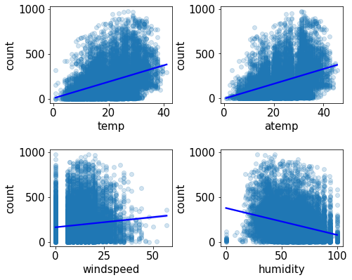
- 회귀선 기울기로 대략적인 추세를 파악할 수 있음
- 온도과 체감 온도가 높을수록 대여 수량이 많고, 습도는 낮을수록 대여 수량이 많음
- 다시말해 대여 수량은 추울 때보다 따뜻할 때 많고, 습할 때보다 습하지 않을 때 많음
- 풍속별 대여 수량 산점도 그래프의 회귀선을 보면 풍속이 셀수록 대여 수량이 많음
- 바람이 약할수록 많을 것 같은 예상과 다른 결과
- 이유는 windspeed 피처에 결측값이 많기 때문 (관측치가 없거나 오류로 인해 0으로 기록됐을 가능성이 높음)
- 결측값이 많아서 그래프만으로 풍속과 대여 수량의 상관관계를 파악하기 힘듬
- 결측값을 다른 값으로 대체하거나 windspeed 피처를 삭제해야 함. 여기서는 피처 자체를 삭제하도록 함.
히트맵
- temp, atemp, humidity, windspeed, count는 수치형 데이터이며 수치형 데이터끼리 어떤 상관관계가 있는지 알아보기
- corr() 함수는 DataFrame 내의 피처 간 상관계수를 계산해 반환
train[['temp', 'atemp', 'humidity', 'windspeed', 'count']].corr()| temp | atemp | humidity | windspeed | count | |
|---|---|---|---|---|---|
| temp | 1.000000 | 0.984948 | -0.064949 | -0.017852 | 0.394454 |
| atemp | 0.984948 | 1.000000 | -0.043536 | -0.057473 | 0.389784 |
| humidity | -0.064949 | -0.043536 | 1.000000 | -0.318607 | -0.317371 |
| windspeed | -0.017852 | -0.057473 | -0.318607 | 1.000000 | 0.101369 |
| count | 0.394454 | 0.389784 | -0.317371 | 0.101369 | 1.000000 |
- 조합이 많아 어느 피처들의 관계가 깊은지 한눈에 들어오지 않으므로 히트맵(heatmap) 필요
- 히트맵은 데이터 간 관계를 색상으로 표현하여, 여러 데이터를 한눈에 비교하기에 좋음
# corr() 함수로 구한 상관관계 매트릭스를 heatmap() 함수에 인수로 넣어주기
corrMat = train[['temp', 'atemp', 'humidity', 'windspeed', 'count']].corr() # 피처 간 상관관계 매트릭스
fig, ax = plt.subplots()
fig.set_size_inches(10, 10)
sns.heatmap(corrMat, annot=True)  # 상관관계 히트맵 그리기 (annot=True : 상관계수가 숫자로 표시됨)
ax.set(title='Heatmap of Numerical Data')
[Text(0.5, 1.0, 'Heatmap of Numerical Data')]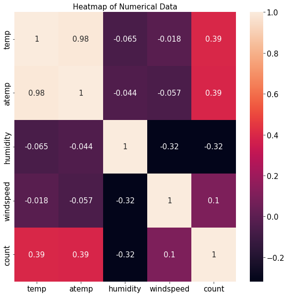
타깃값인 count와의 상관관계가 중요
- 온도(temp)와 대여 수량(count) 간 상관계수는 0.39로 양의 상관관계를 보임
- 온도가 높을수록 대여 수량이 많다는 뜻
- 반면, 습도(humidity)와 대여 수량(count) 간 상관계수는 -0.32로 음의 상관관계를 보임
- 습도가 낮을수록 대여 수량이 많다는 뜻
- 앞서 산점도 그래프와 분석한 내용과 동일
- 풍속(windspeed)과 대여 수량(count)의 상관계수는 0.1로 상관관계가 매우 약함
- windspeed 피처는 대여 수량 예측에 별 도움을 주지 못할 것으로 예상
- 성능을 높이기 위해 모델링 시 windspeed 피처 제거
- 앞의 '회귀선을 포함한 산점도 그래프'에서 결측값이 많다는 이유로 같은 결론에 도달
분석 정리 및 모델링 전략
분석 정리
- 타깃값 변환 : 분포도 확인 결과 타깃값인 count가 0 근처로 치우쳐 있으므로 로그변환하여 정규분포에 가깝게 만들어야 함. 타깃값을 count가 아닌 log(count)로 변환해 사용할 것이므로 마지막에 다시 지수변환해 count로 복원해야 함.
- 파생 피처 추가 : datetime 피처는 여러 가지 정보의 혼합체이므로 각각을 분리해 year, month, day, hour, minute, second 피처를 생성할 수 있음
- 파생 피처 추가 : datetime 피처에 숨어 있는 또 다른 정보인 요일(weekday) 피처를 추가
- 피처 제거 : 테스트 데이터에 없는 피처는 훈련에 사용해도 큰 의미가 없음. 따라서 훈련 데이터에만 있는 casual과 registered 피처는 제거
- 피처 제거 : datetime 피처는 인덱스 역할만 하므로 타깃값 예측에 아무런 도움이 되지 않음
- 피처 제거 : date 피처가 제공하는 정보는 year, month, day 피처에 담겨 있음
- 피처 제거 : month는 season 피처의 세부 분류로 볼 수 있음. 데이터가 지나치게 세분화되어 있으면 분류별 데이터 수가 적어서 오히려 학습에 방해가 되기도 함.
- 피처 제거 : 막대 그래프 확인 결과 파생 피처인 day는 분별력이 없음
- 피처 제거 : 막대 그래프 확인 결과 파생 피처인 minute와 second에는 아무런 정보가 담겨 있지 않음
- 이상치 제거 : 포인트 플롯 확인 결과 weather가 4인 데이터는 이상치임
- 피처 제거 : 산점도 그래프와 히트맵 확인 결과 windspeed 피처에는 결측값이 많고 대여 수량과의 상관관계가 매우 약함
모델링 전략
- 베이스라인 모델 : 가장 기본적인 회귀 모델인 LinearRegression 채택
- 성능 개선 : 릿지, 라쏘, 랜덤 포레스트 회귀 모델
- 피처 엔지니어링 : 앞의 분석 수준에서 모든 모델에서 동일하게 수행
- 하이퍼파라미터 최적화 : 그리드서치
- 기타 : 타깃값이 count가 아닌 log(count)임
