학습내용
유튜브 전체 영역 나누기, 상단 nav 만들기
github소스코드
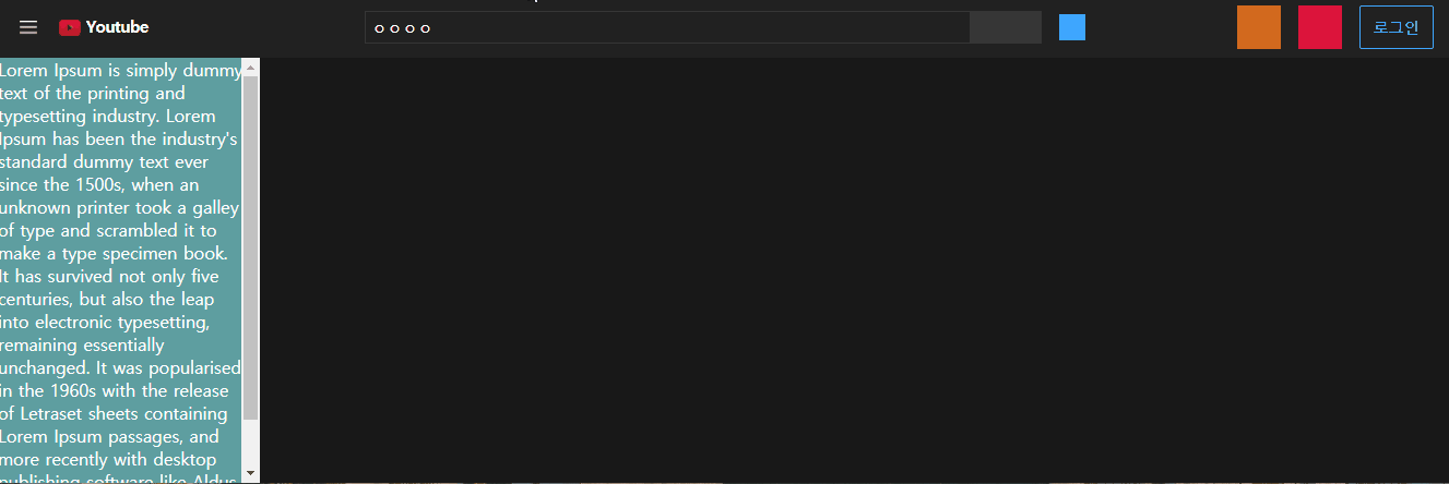
유튜브 전체영역 나누기
- 상단 nav, 왼쪽 nav는 fixed, 내용 부분은 absolute로 모든 영역이 3차원이기 때문에 미리 모든 영역을 감싸는 div를 하나 만들어준다. 최소 넓이값을 지정해서 일정 길이 이하로는 내용물이 줄어들지 않도록 했다.
#wrapper {
    position: relative;
    width: 100%;
    height: 100%;
    min-width: 1320px;
}
상단 nav 영역 지정
#youtube-top-nav {
    position: fixed;
    width: 100%;
    height: 56px;
    background-color: #212121;

    padding: 0 16px;
}
왼쪽 nav 영역 지정
- 왼쪽 nav 메뉴에 따로 스크롤 생길 것을 대비해서 내부에 content를 담는 영역을 전체 크기보다 살짝 작게 만들어주었다.
overflow: scroll항상 스크롤 있는 속성,auto필요할 때 스크롤 생기는 속성- 3차원 영역이므로 top, left, bottom 등을 이용해 공간을 늘려주었다.
#youtube-left-nav {
    position: fixed;
    overflow-y: auto;
    overflow-x: hidden;

    width: 240px;
    background-color: #212121;

    top: 56px;
    left: 0;
    bottom: 0;
}
#youtube-left-content {
    position: absolute;
    width: 225px;
    height: 100%;
    background-color: cadetblue;
}
메인 content 영역 지정
#youtube-main {
    position: absolute;
    background-color: #181818;

    top: 56px;
    left: 240px;
    right: 0;
    bottom: 0;
}
상단 nav 만들기
유튜브 로고 넣기
- 강의에선 전체 이미지로 처리했지만 적절한 로고 이미지를 찾지 못해 이미지와 span태그로 글자를 넣어서 flex로 정렬하는 방식을 사용했다.
<h1><a class="flex-start" href="#">
  <img src="img/youtube-logo-no-letter.png" alt="">
  <span>Youtube</span>
</a></h1>
#youtube-top-nav .nav-left h1 img {
width: 20px;
height: 15px;
margin: auto 0;
}
#youtube-top-nav .nav-left h1 span {
display: inline-block;
margin-left: 5px;
letter-spacing: -.5px;
padding-bottom: 2px;
}nav-center
- absolute 사용해서 flex 영향력에서 벗어나게 중앙정렬했다.
#youtube-top-nav .nav-center {
    position: absolute;
    left: 50%;
    transform: translateX(-50%);
}- search-wrap 요소들의 색상은 실제 유튜브 페이지의 hsl 값을 복사해서 사용했다.
#youtube-top-nav .nav-center .search-wrap input {
    width: calc(100% - 65px);
    height: 30px;
    border: solid 1px  hsl(0deg 0% 21%);
    background-color: #212121;
    padding: 2px 6px;

    font-size: 14px;
    color: #ffffff;
}
#youtube-top-nav .nav-center .search-wrap .btn-search {
    width: 65px;
    height: 30px;
    border: solid 1px  hsl(0deg 0% 21%);
    background-color: hsl(0deg 0% 21%);
}
어려웠던 점
- 상단 왼쪽 유튜브 로고 부분에 실제 로고 이미지를 넣고 싶었는데 다크모드에 맞는 흰색 글씨의 적절한 로고 이미지를 찾을 수 없었다.
- 왼쪽 사이드메뉴 안에 내용을 담는 새로운 영역을 만들었는데, height를 100%로 했더니 브라우저 기준으로 크기가 지정되는지 스크롤을 내리니 부모처럼 끝까지 영역지정이 되지 않았다.
해결방법
- 빨간 재생버튼만 이미지로 넣고 youtube 글자는 span으로 넣어주었다. 이 부분때문에 left의 길이가 늘어나서 center 등 다른 부분에도 추가적인 길이 수정이 필요했다.
- 지금 당장 강의에서 다루진 않았지만 이 역시 bottom 등을 이용해 늘려줄 것으로 예상된다.
소감
구조는 트위치와 비슷하지만 이전과 다르게 큰 영역들을 먼저 잡아주고 시작해서 더 효율적이라는 생각이 들었다.

문서화를 좋아하는 개발자