Navbar 만들기
src/views 에 파일을 다음과 같이 형성하고, vue-Router 의 index.js 파일의 내용을 수정 해봅시다. 새로 형성한 *.vue 파일에는 <template> filename </template> 정도를 넣어줍시다. 여기서 파일의 경로중 ‘@’는 레포지토리 최상단 vite.config.js에서 alias로 설정된 ./src 의 경로를 의미하는 기호입니다.
$ ls src/views
AboutView.vue  ArchiveView.vue  HomeView.vue  SearchView.vue  TagView.vue
import { createRouter, createWebHistory } from 'vue-router'
import HomeView from '@/views/HomeView.vue'
import SearchView from '@/views/SearchView.vue'
import ArchiveView from '@/views/ArchiveView.vue'
import TagView from '@/views/TagView.vue'
const router = createRouter({
history: createWebHistory(import.meta.env.BASE_URL),
routes: [
{
path: '/',
name: 'home',
component: HomeView
},
{
path: '/search',
name: 'search',
component: SearchView
},
{
path: '/archive',
name: 'archive',
component: ArchiveView
},
{
path: '/tag',
name: 'tag',
component: TagView
},
]
})
export default router그리고 NavBar.vue를 다음과 같이 수정해봅시다.
<template>
    <div>
        <div class="flex justify-content-between align-items-center">
            <div class="flex align-items-center">
                <div class="text-2xl ml-2 font-bold">
                    <RouterLink to="/search" class="router">
                        {{ props.title }}
                    </RouterLink>
                </div>
                <!-- svg : moon -->
                <svg v-if="props.toggle" class="ml-2 svg-moon cursor-pointer" xmlns="http://www.w3.org/2000/svg" width="24"
                    height="24" viewBox="0 0 24 24" @click="toggleChange">
                    <path
                        d="M10.719 2.082c-2.572 2.028-4.719 5.212-4.719 9.918 0 4.569 1.938 7.798 4.548 9.895-4.829-.705-8.548-4.874-8.548-9.895 0-5.08 3.808-9.288 8.719-9.918zm1.281-2.082c-6.617 0-12 5.383-12 12s5.383 12 12 12c1.894 0 3.87-.333 5.37-1.179-3.453-.613-9.37-3.367-9.37-10.821 0-7.555 6.422-10.317 9.37-10.821-1.74-.682-3.476-1.179-5.37-1.179zm0 10.999c1.437.438 2.562 1.564 2.999 3.001.44-1.437 1.565-2.562 3.001-3-1.436-.439-2.561-1.563-3.001-3-.437 1.436-1.562 2.561-2.999 2.999zm8.001.001c.958.293 1.707 1.042 2 2.001.291-.959 1.042-1.709 1.999-2.001-.957-.292-1.707-1.042-2-2-.293.958-1.042 1.708-1.999 2zm-1-9c-.437 1.437-1.563 2.562-2.998 3.001 1.438.44 2.561 1.564 3.001 3.002.437-1.438 1.563-2.563 2.996-3.002-1.433-.437-2.559-1.564-2.999-3.001z" />
                </svg>
                <!-- svg : sun -->
                <svg v-else class="ml-2 svg-sun cursor-pointer" xmlns="http://www.w3.org/2000/svg" width="24" height="24"
                    viewBox="0 0 24 24" @click="toggleChange">
                    <path
                        d="M4.069 13h-4.069v-2h4.069c-.041.328-.069.661-.069 1s.028.672.069 1zm3.034-7.312l-2.881-2.881-1.414 1.414 2.881 2.881c.411-.529.885-1.003 1.414-1.414zm11.209 1.414l2.881-2.881-1.414-1.414-2.881 2.881c.528.411 1.002.886 1.414 1.414zm-6.312-3.102c.339 0 .672.028 1 .069v-4.069h-2v4.069c.328-.041.661-.069 1-.069zm0 16c-.339 0-.672-.028-1-.069v4.069h2v-4.069c-.328.041-.661.069-1 .069zm7.931-9c.041.328.069.661.069 1s-.028.672-.069 1h4.069v-2h-4.069zm-3.033 7.312l2.88 2.88 1.415-1.414-2.88-2.88c-.412.528-.886 1.002-1.415 1.414zm-11.21-1.415l-2.88 2.88 1.414 1.414 2.88-2.88c-.528-.411-1.003-.885-1.414-1.414zm2.312-4.897c0 2.206 1.794 4 4 4s4-1.794 4-4-1.794-4-4-4-4 1.794-4 4zm10 0c0 3.314-2.686 6-6 6s-6-2.686-6-6 2.686-6 6-6 6 2.686 6 6z" />
                </svg>
            </div>
            <div class="mr-2">
                <RouterLink to="/search" class="router mr-2">Search</RouterLink>
                <RouterLink to="/archive" class="router mr-2">Archive</RouterLink>
                <RouterLink to="/tag" class="router">Tag</RouterLink>
            </div>
        </div>
    </div>
</template>

<script setup>
import { RouterLink } from 'vue-router'

const props = defineProps({
    title: {
        type: String,
        required: true,
    },
    toggle: {
        type: Boolean,
        required: true,
    },
})

const emit = defineEmits(['toggle-change'])

const toggleChange = () => {
    emit('toggle-change')
    console.log('toggleChange')
}

</script>

<style scoped>
.router {
    height: 3.5rem;
    text-decoration: none;
    color: inherit;
}

.router:hover {
    color: #2663e8;
}

.svg-moon {
    fill: #eae9e6;
}

.svg-moon:hover {
    /* Apply your hover styles here */
    fill: #eedc34;
}

.svg-sun:hover {
    fill: rgb(225, 46, 46);
}
</style>
추가된 요소가 많이 생겼습니다. 하나 하나 뜯어서 보도록 합시다. 우선 script 부분입니다.
<script setup>
import { RouterLink } from 'vue-router'

const props = defineProps({
    title: {
        type: String,
        required: true,
    },
    toggle: {
        type: Boolean,
        required: true,
    },
})

const emit = defineEmits(['toggle-change'])

const toggleChange = () => {
    emit('toggle-change')
    console.log('toggleChange')
}

</script>
저는 이 컴포넌트에, vue-router의 기능 중 하나인 RouterLink를 import 했습니다. RouterLink는 위의 Template 쪽에서 html의 a 태그를 대신 해줄 또 다른 컴포넌트 입니다.
그리고 vue의 내장 기능 중 하나인 defineProps를 사용했습니다. 특정 버전부터 따로 Import 하지 않아도 사용할 수 있다고 합니다. defineProps는 부모 컴포넌트로부터 특정 변수나 인자들을 받을 때를 위해 사용하는 기능 입니다.
여기서 부모 컴포넌트는, NavBar.vue를 사용할 App.vue가 될 것이고 자연스럽게 NavBar.vue는 자식 컴포넌트가 됩니다.
정의된 title과 toggle이라는 요소의 값이 각각의 변수 타입에 맞게 부모로부터 흘러 들어옵니다. required로 부모가 자식 컴포넌트에게 필수적으로 전달해야 함을 명시했습니다. 하지만 defineProps 단일 방향으로 데이터가 흐릅니다. 만약 자식이 부모에게 무언가 값의 변화를 알리고 싶다면, defineEmits을 사용해야 합니다.
const toggleChange 에 정의된 함수 아래, 함수가 실행되면, emit('toggle-change') 가 실행되는데, 부모 컴포넌트는 안에 정의된 'toggle-change' 를 통해 자식이 전달한 어떤 이벤트를 감지 합니다. 그 과정은 App.vue를 수정하는 부분에서 다시 살펴 보겠습니다.
<template>
    <div>
        <div class="flex justify-content-between align-items-center">
            <div class="flex align-items-center">
                <div class="text-2xl ml-2 font-bold">
                    <RouterLink to="/search" class="router">
                        {{ props.title }}
                    </RouterLink>
                </div>
                <!-- svg : moon -->
                <svg v-if="props.toggle" class="ml-2 svg-moon cursor-pointer" xmlns="http://www.w3.org/2000/svg" width="24"
                    height="24" viewBox="0 0 24 24" @click="toggleChange">
                    <path
                        d="M10.719 2.082c-2.572 2.028-4.719 5.212-4.719 9.918 0 4.569 1.938 7.798 4.548 9.895-4.829-.705-8.548-4.874-8.548-9.895 0-5.08 3.808-9.288 8.719-9.918zm1.281-2.082c-6.617 0-12 5.383-12 12s5.383 12 12 12c1.894 0 3.87-.333 5.37-1.179-3.453-.613-9.37-3.367-9.37-10.821 0-7.555 6.422-10.317 9.37-10.821-1.74-.682-3.476-1.179-5.37-1.179zm0 10.999c1.437.438 2.562 1.564 2.999 3.001.44-1.437 1.565-2.562 3.001-3-1.436-.439-2.561-1.563-3.001-3-.437 1.436-1.562 2.561-2.999 2.999zm8.001.001c.958.293 1.707 1.042 2 2.001.291-.959 1.042-1.709 1.999-2.001-.957-.292-1.707-1.042-2-2-.293.958-1.042 1.708-1.999 2zm-1-9c-.437 1.437-1.563 2.562-2.998 3.001 1.438.44 2.561 1.564 3.001 3.002.437-1.438 1.563-2.563 2.996-3.002-1.433-.437-2.559-1.564-2.999-3.001z" />
                </svg>
                <!-- svg : sun -->
                <svg v-else class="ml-2 svg-sun cursor-pointer" xmlns="http://www.w3.org/2000/svg" width="24" height="24"
                    viewBox="0 0 24 24" @click="toggleChange">
                    <path
                        d="M4.069 13h-4.069v-2h4.069c-.041.328-.069.661-.069 1s.028.672.069 1zm3.034-7.312l-2.881-2.881-1.414 1.414 2.881 2.881c.411-.529.885-1.003 1.414-1.414zm11.209 1.414l2.881-2.881-1.414-1.414-2.881 2.881c.528.411 1.002.886 1.414 1.414zm-6.312-3.102c.339 0 .672.028 1 .069v-4.069h-2v4.069c.328-.041.661-.069 1-.069zm0 16c-.339 0-.672-.028-1-.069v4.069h2v-4.069c-.328.041-.661.069-1 .069zm7.931-9c.041.328.069.661.069 1s-.028.672-.069 1h4.069v-2h-4.069zm-3.033 7.312l2.88 2.88 1.415-1.414-2.88-2.88c-.412.528-.886 1.002-1.415 1.414zm-11.21-1.415l-2.88 2.88 1.414 1.414 2.88-2.88c-.528-.411-1.003-.885-1.414-1.414zm2.312-4.897c0 2.206 1.794 4 4 4s4-1.794 4-4-1.794-4-4-4-4 1.794-4 4zm10 0c0 3.314-2.686 6-6 6s-6-2.686-6-6 2.686-6 6-6 6 2.686 6 6z" />
                </svg>
            </div>
            <div class="mr-2">
                <RouterLink to="/search" class="router mr-2">Search</RouterLink>
                <RouterLink to="/archive" class="router mr-2">Archive</RouterLink>
                <RouterLink to="/tag" class="router">Tag</RouterLink>
            </div>
        </div>
    </div>
</template>
template 쪽은 무언가 간단해보이면서도 이것저것이 많이 붙어 있습니다. 저는 개인적으로 html의 div 태그를 거의 유일하다시피하게 사용합니다. 그래서 조금 가시성이 안 좋아보이긴 하는데, 좋은 작성 방법을 추천해주시면 감사 하겠습니다.
아무튼, 각종 div에는 class들이 달려있습니다. 그 class들에는 primeFlex에 정의된 것도 있고, 제가 style에서 수동으로 만든 것도 붙어 있습니다. 이 영역들은 기본적인 CSS 문법에 관련된 것들이기 때문에 깊게 설명들이지는 않겠습니다. primeFlex 사이트에 들어가보면, 정의된 클래스와 해당하는 css 문법이 나열되어 있습니다. 예를들어 위의 코드 중 제가 사용한, justify-content-between는 css에서 justify-content: space-between와 매칭 됩니다.
그 다음은 {{ props.title }} 입니다. vue.js에서는 html에 javscript의 변수를 표현하기 위해서는 {{ }} 를 사용 합니다.
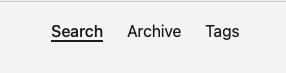
저는 총 네가지의 RouterLink 를 사용했습니다. 이곳에서의 to는 url의 경로를 나타냅니다. 그리고 svg쪽을 잘 살펴보시면 @click 이라는 built-ins directive가 있습니다. @click은 v-on:click의 줄임 표현입니다.
built-in directive 중 또 많이 사용하는 것을 적용해 봅시다. v-for 입니다. 우선 코드에 두가지 요소를 추가합니다. RouterLink가 같은 형식으로 반복되는 경향을 코드 상에서 최소화 시켜볼 겁니다.
<template>
...
			<!--
      <div class="mr-2">
          <RouterLink to="/search" class="router mr-2">Search</RouterLink>
          <RouterLink to="/archive" class="router mr-2">Archive</RouterLink>
          <RouterLink to="/tag" class="router">Tag</RouterLink>
      </div>
      -->

			<div class="flex gap-4">
          <RouterLink v-for="path in paths" :key="path.name" :to="path.path" class="router flex align-items-center ">
              {{ path.name }}
          </RouterLink>
      </div>
...
</template>

<script setup>
import { ref } from 'vue'
...
const paths = ref([
    {
        name: 'Search',
        path: '/search',
    }, {
        name: 'Archive',
        path: '/archive',
    }, {
        name: 'Tag',
        path: '/tag',
    },
])
</script>
코드를 살펴보시면, 주석처리 해놓은 원래의 RouterLink 파트가 내용만 바뀌고 반복되는 점을 찾아서 v-for의 기능을 사용해 코드를 좀 더 수정하기 편하게 만들었습니다. v-for 내부에는 “path in paths” 라는 부분이 있는데, 아래 script 단에서 정의한 변수 paths를 사용했음을 짐작할 수 있습니다.
언젠가 제가 vue를 공부할까, react를 공부할까 했을 때, 이런 점이 vue의 간편한 요소라고 했던 글이 기억나네요.
여기서 ref 가 등장합니다. reactive 성을 다루기 위해 사용하는 API 중 하나로, 화면 상에서 동적으로 변화시킬 변수들을 ref로 선언하는 것 입니다. 이 변수에 값에 접근하기 위해서는 .value 를 뒤에 붙여서 사용해야 합니다. 다만, template 쪽 에서 사용할 때는 그럴 필요가 없습니다. 예를 들면 {{ var.value }}가 아닌 {{ var }}만 사용해도 된다는 의미입니다.
여기서 기능을 하나 더 추가 해봅시다. 사용자가 RouterLink에 해당하는 부분을 클릭 했을 때 해당하는 url이 바뀐다는 것은 저번 게시글에서 확인해 보았습니다. 그럼 이제 제가 해보고 싶은 것은 아래 사진처럼 특정 url로 들어갔을 때 해당하는 부분에만 강조를 주고 싶습니다.
그렇다면 현재의 vue-router의 path를 프로그래밍적 currentPath 라는 이름으로 뽑아 낸 다음, 위에서 새로 만든 RouterLink에 조건을 활용해서 path.name 과 비교 후 클래스나 스타일을 추가 해야할 것 같습니다. vue-router 문서를 뒤적거리며 그런 기능이 있나 한 번 살펴 볼까요?
<script setup>
...
import { RouterLink, useRoute } from 'vue-router'
const route = useRoute()
...
<script>
useRoute를 사용하면 현재 경로의 정보를 얻어낼 수 있습니다! 이제 선택적으로 스타일을 구현해보도록 하겠습니다. bind class(혹은 style) 라는 것을 사용하면 됩니다.
<Template>
...
	<div class="flex gap-4">
      <RouterLink v-for="path in paths" :key="path.name" :to="path.path" class="router flex align-items-center">
          <div :class="isActive(path.path)">
              {{ path.name }}
          </div>
      </RouterLink>
  </div>
...
</Template>

<script>
...
const isActive = (path) => {
    return { 'border-bottom-1 font-bold': path === route.path, }
};
</script>
IsActive 의 함수를 사용하면, { 'border-bottom-1 font-bold': path === route.path, } 를 리턴해 줍니다. 이 정도면 얼추 대강의 NavBar 가 준비 된 것 같습니다.
그럼 이제 App.vue에서 위의 컴포넌트를 실행하고 더해 화면의 골격 까지도 다음 코드를 이용해 잡아봅시다.
<script setup>
import { ref, onMounted } from 'vue';
import NavBar from './components/NavBar.vue';

const navbarRef = ref(null);
const contentHeight = ref(null);

onMounted(() => {
  // Get the height of the navbar_div element
  if (navbarRef.value) {
    contentHeight.value = `calc(100vh - ${navbarRef.value.offsetHeight}px)`
  }
});

const toggleDarKMode = ref(false);
</script>

<template>
  <div id="main" :class="[toggleDarKMode ? 'surface-900 text-300' : 'bg-blue-50']"
    style="width: 100%; height: 100vh; min-width: 360px;">
    <div id="navbar_div" class="flex flex-column align-items-center" ref="navbarRef">
      <NavBar class="navbar my-3" title="Geronimo! ~" :toggle="toggleDarKMode"
        @toggle-change="toggleDarKMode = !toggleDarKMode" />
    </div>
    <div id="content_div" class="flex flex-column align-items-center">
      <div class="border-1 content" :style="{ height: contentHeight }">
        <RouterView />
      </div>
    </div>
  </div>
</template>

<style>
@media (min-width:360px) and (max-width:800px) {
  .content {
    width: 100%;
  }

  .navbar {
    width: 100%;
  }
}

@media (min-width:800px) and (max-width:1072px) {
  .content {
    width: 800px;
  }

  .navbar {
    width: 800px;
  }
}

@media (min-width:1072px) {
  .content {
    width: 800px;
  }

  .navbar {
    width: 1072px;
  }
}
</style>
다시 한 번 코드에 대한 분석을 해봅시다.
가장 먼저 style을 체크하면, @media를 활용한 반응형 골격의 정도를 정의해 놓았습니다. 그 다음 template에서 정의한 클래스를 기반으로 화면의 구성비율을 결정했습니다. id로 div 태그를 구별해놓았는데 최상단을 main으로 두고, 밑으로 navbar_div, content_div 의 영역을 분리하여 적절한 width와 height를 여러 방식을 이용해 결정하고 있습니다. ( :stlye을 활용한 부분을 살펴보시면 좋을 것 같습니다 ) 제 개인적으로 css에서 제일 어려운 부분이 이런 위치 결정인 것 같습니다.
클래스 중 ‘border-1’는 실선 테두리를 그려주는 primeFlex의 기능입니다. 위치 혹은 크기를 결정할 때 저는 테두리를 그려 놓고 체크해보는 편 입니다.
다른 부분은 슬금슬금 넘어가도, 아래 내용은 확인해보고 가야겠습니다.
<script>
import { ref, onMounted } from 'vue';
import NavBar from './components/NavBar.vue';
...
onMounted(() => {
  // Get the height of the navbar_div element
  if (navbarRef.value) {
    contentHeight.value = `calc(100vh - ${navbarRef.value.offsetHeight}px)`
  }
});

const toggleDarKMode = ref(false);
</script>

<template>
...
<NavBar class="navbar my-3" title="Geronimo! ~" :toggle="toggleDarKMode"
  @toggle-change="toggleDarKMode = !toggleDarKMode" />
...
</template>
첫 번째로는 onMounted 입니다. Vue.js api 중 reactivity 와 lifecycle 에 대한 기능들이 있다는 걸 확인 했었는데요, onMounted는 lifecycle에 해당하는 기능입니다. 링크 안 그림에서 볼 수 있다시피, 렌더링 과정 중 정말 많은 시점에서 어떤 일을 할지 결정 할 수가 있습니다. 저는 그리 깊은 활용까지는 해보지는 못했고, 주로 onMounted 많이 사용했던 것 같습니다. 여기서는 특정 div의 height 값을 결정 하는 데 사용하고 있습니다.
그리고 NavBar 컴포넌트의 활용입니다. title과 :toggle, @toggle-change 라는 directive를 활용해서 dataProps에 전달할 값을 설정하고, 컴포넌트에게서 수신 받은 이벤트를 처리하기도 합니다.
특히 @toggle-change="toggleDarKMode = !toggleDarKMode"에서 @toggle-change를 이용해 NavBar 안에 있는 svg가 클릭 될 때 마다 toggleDarKMode의 boolean 값이 참과 거짓을 반복하게 만든 점을 확인하실 수 있을실 겁니다. 그리고 이 toggleDarKMode 값을 이용해 저는 다시 한 번 bind class 를 활용했습니다. :class="[toggleDarKMode ? 'surface-900 text-300' : 'bg-blue-50']"
흠 근데 아직 뭔가 이상해요 … 뭘까요 … 아! footer가 필요하겠네요. footer를 새로운 컴포넌트로 만들어서 추가해도 되고, 아래 사진처럼 정말 간략하게 추가해도 될 것 같습니다. 위의 내용을 참고하여 한 번 컴포넌트로 만들어 보시는 게 어떨까요? ( 전 빠르게 진행하고자 따로 컴포넌트를 만들지 않고 넘어갔습니다)

이제 기본 골자는 완성 했습니다. 이제 메인 화면을 꾸며볼 차례입니다.
메인 화면 꾸미기
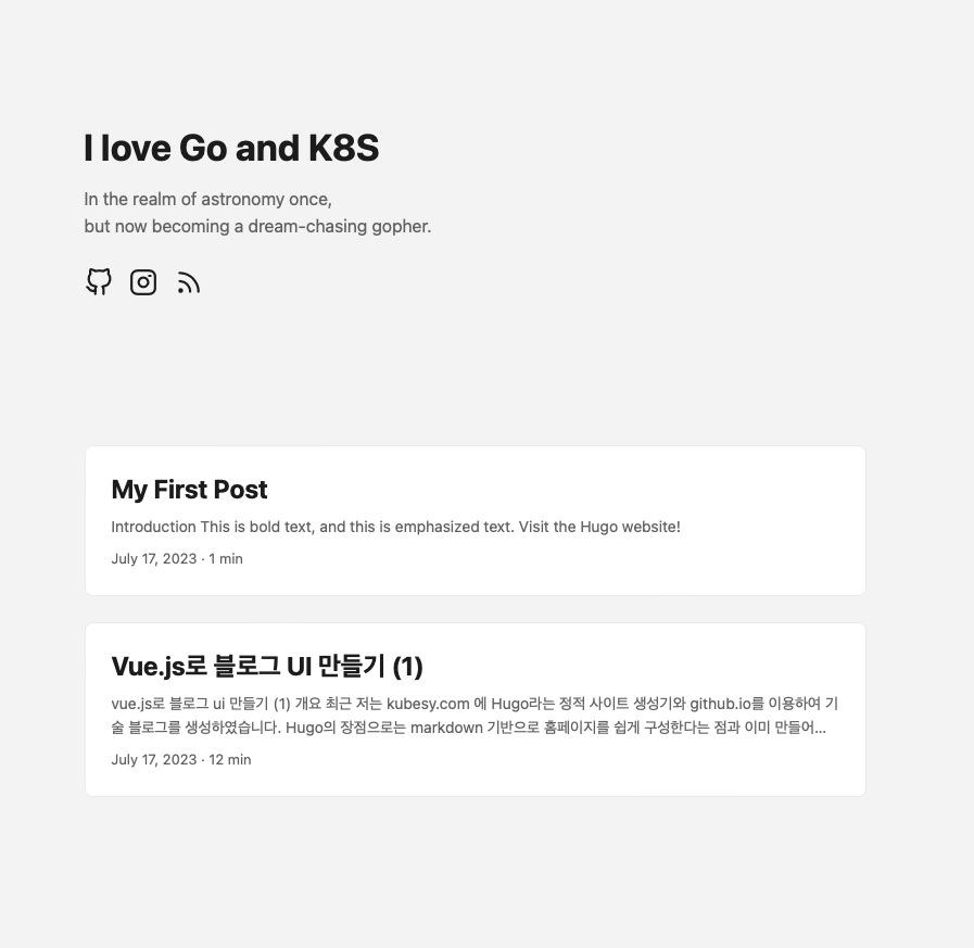
메인 화면에는 크게 두 영역으로 나뉘어 있습니다.
제 프로필이 간략하게 표시된 상단의 영역 하나와, 아래 게시글들이 카드 형식으로 나열된 부분 하나 입니다. 그리고 또 휴고 블로그에서 /posts 라는 경로로 가보면 제 프로필 영역은 사라지고 오로지 카드들이 나열된 형태만 남아있습니다.
그럼 각각의 영역을 프로필, 포스트 별로 컴포넌트화 시켜서 HomeView.vue 안 에 구성해보는 게 어떨까 싶어집니다. 또한 vue-router에 /posts 라는 경로를 추가 해줘야겠습니다. 그 외의 작업들은 앞선 내용들과 얼추 비슷하다고 봅니다.
$ ls src/components/
NavBar.vue  PostsComponent.vue  ProfileComponent.vue  icons

$ ls src/views
AboutView.vue  ArchiveView.vue  HomeView.vue  PostsView.vue  SearchView.vue  TagView.vue
ProfileComponent.vue 입니다.
<template>
    <div class="profile">
        <h1 class="mb-3">
            {{ props.title }}
        </h1>
        <div v-html="introduce" class="text-500" style="line-height:170%;"></div>
        <div class=" flex mt-4 gap-3">
            <a href="https://github.com/Larshavin" target="_blank" style="color: inherit; ">
                <i class="pi pi-github" style="font-size: 1.6rem"></i>
            </a>
            <a href="https://www.instagram.com/larshavin/" target="_blank" style="color: inherit; ">
                <i class="pi pi-instagram" style="font-size: 1.6rem"></i>
            </a>
        </div>
    </div>
</template>

<script setup>
import { computed } from 'vue'
const props = defineProps({
    title: {
        type: String,
        required: true,
    },
    introduce: {
        type: String,
        required: true,
    },
})

const introduce = computed(() => {
    return props.introduce.replace(/\n/g, '<br />')
})
</script>

<style scoped>
.profile {
    margin: 8rem 2rem 1rem 2rem;
}
</style>
이 코드에서 설명드려야 할 부분이 있다면 primeIcon 과 v-html, computed 가 사용 되었다 정도겠습니다.
프론트엔드를 만지다보면 Icon이 필요할 때가 분명 존재 합니다. 주로 많이 쓰이는 것이 Font Awesome 겠지만, primeIcon 이라는 것도 있습니다. 저번 게시글에서 소리 소문 없이 설치하긴 했습니다만, primeVue와 연동하여 쓰기에 괜찮습니다. 물론 그 양이 그렇게 많지는 않아서 저는 font awesome과 함께 사용하는 편 입니다.
v-html은 {{ 변수 }} 로 보통 표현하는 것 대신, html 문법이 만족하게 표현해줍니다. 만약 string 변수에 “\n” 가 들어갔을 때 {{ 변수 }}는 이 \n를 표현하지 못합니다. 또한 아래 코드를 사용하여 “\n”가
로 바뀐 상태라도 그 적용이 안되는 걸 확인 할 수 있는데, v-html을 사용하면 쉽게 해결 됩니다.
const introduce = computed(() => {
    return props.introduce.replace(/\n/g, '<br />')
})
computed는 vue에서 보통 함수(메소드)로 많이 사용한 것들에 대한 대체로 사용이 가능합니다. 다만 간단한 연산일 때만 이용하는 것이 좋습니다. 특히 템플릿 안에서 자바스크립트 계산을 진행해야 할 때가 종종 오곤하는데, 그럴 때 마다 computed를 사용해서 더 유지보수가 쉽게 만들어 줄 수도 있습니다.
HomeView.vue 입니다.
<script setup>
import { ref } from 'vue'
import Profile from '@/components/ProfileComponent.vue'

const title = ref("I love Go and K8S")
const introduce = ref("In the realm of astronomy once, \n but now becoming a dream-chasing gopher.")
</script>

<template>
  <Profile :title="title" :introduce="introduce" />
</template>
Profile이 추가가 되었습니다. 다른 작업을 다 하고 나서, 왠지 프로필 사진도 추가하면 좋겠네요.
하지만 그 전에 게시글 카드를 만들어 봅시다.
저희는 UI만을 만들 예정이기 때문에, 게시글 관리에 관한 방법은 깊게 생각하지 않아도 될 것 같습니다. Mock 데이터로 게시글에 대한 흉내만 내보도록 해봅시다. (물론 실용적으로 쓰기 시작하려면 언젠간 고려해야 하겠지만요.)
우선 App.vue에 전역으로 사용할 만한 css 하나를 추가해줍니다. class no-scroll을 만들어 스크롤바 가 생겼을 때 이를 표시하지 않게 만듭니다. 스크롤바는 게시글 카드 영역에 카드 상자 크기를 넘을 만큼 많이 쌓였을 때를 대비한 것 입니다.
<style>
/* ( 크롬, 사파리, 오페라, 엣지 ) 동작 */
.no-scroll::-webkit-scrollbar {
  display: none;
}

.no-scroll {
  -ms-overflow-style: none;
  /* 인터넷 익스플로러 */
  scrollbar-width: none;
  /* 파이어폭스 */
}
</style>
그리고 HomeView.vue를 다음과 같이 바꿔봅니다. 프로필 밑 div에서는 overflow-y-auto를 사용하고 있습니다. 이 게시글의 이유와 같다고 보면 될 것 같습니다.
<script setup>
import { ref } from 'vue';
import Profile from '@/components/ProfileComponent.vue';
import Posts from '@/components/PostsComponent.vue';

const title = ref("I love Go and K8S");
const introduce = ref("In the realm of astronomy once, \n but now becoming a dream-chasing gopher.");
</script>

<template>
  <div class="flex flex-column " style="height: 100%;">
    <div class="">
      <Profile :title="title" :introduce="introduce" />
    </div>
    <div class="overflow-y-auto no-scroll flex flex-column justify-content-center mt-3">
      <Posts />
    </div>
  </div>
</template>
이제 정말 카드를 집어 넣기만 하면 됩니다. 카드의 형태 자체는 그리 어려울 것이 없습니다. 다만 이제 슬슬, pinia를 써야하는 것이 아닌가 라는 생각이 들기 시작 합니다.
밝은 버전의 테마에서는 카드의 색깔을 흰색으로 해도 충분했습니다. 하지만 전 어두운 버젼에서는 회색빛에 가까운 처리가 되길 바라고 있습니다.
최상단 컴포넌트에서는 쉽게 다크 모드 여부를 알 수 있었고, 또한 글자 위주의 설정이었기 때문에 색상 관리가 그다지 어렵지 않았지만, 점점 더 깊어지는 컴포넌트의 구조상 부모 컴포넌트가 가지고 있는 다크 모드 여부에 대한 정보를 관리하기가 힘들어지는 것이죠.
그렇기 때문에 우선 pinia 에 다크 모드 여부에 대한 변수를 만들어봅시다.
/src/stores/toggle.js 파일을 만듭니다.
import { ref } from 'vue'
import { defineStore } from 'pinia'

export const useToggleStore = defineStore('toggle', () => {
    const toggleDarkMode = ref(false)
    return { toggleDarkMode }
})
정말 간단한 코드입니다. useToggleStore 라는 곳에는 이제 toggleDarKMode 가 저장되어 있습니다. 이제 이것들을 사용하기만 하면 되는데요, 저희는 우선 App.vue를 살짝 고칠 것이고, 이후에 다시 본래 목적으로 돌아오겠습니다.
사용하는 것에 대한 설명은 이 문서 이쪽에 설명되어 있습니다.
<script setup>
...
import { storeToRefs } from 'pinia'
import { useToggleStore } from '@/stores/toggle'
const toggleStore = useToggleStore()
const { toggleDarKMode } = storeToRefs(toggleStore)
...
// const toggleDarKMode = ref(false)
...
</script>
App.vue에서 코드 네 줄을 추가한 후 기존에 선언해 놓았던 변수를 코멘트 처리했습니다. 이제 어느 컴포넌트에서도 손쉽게 toggleDarKMode를 추적할 수 있습니다.
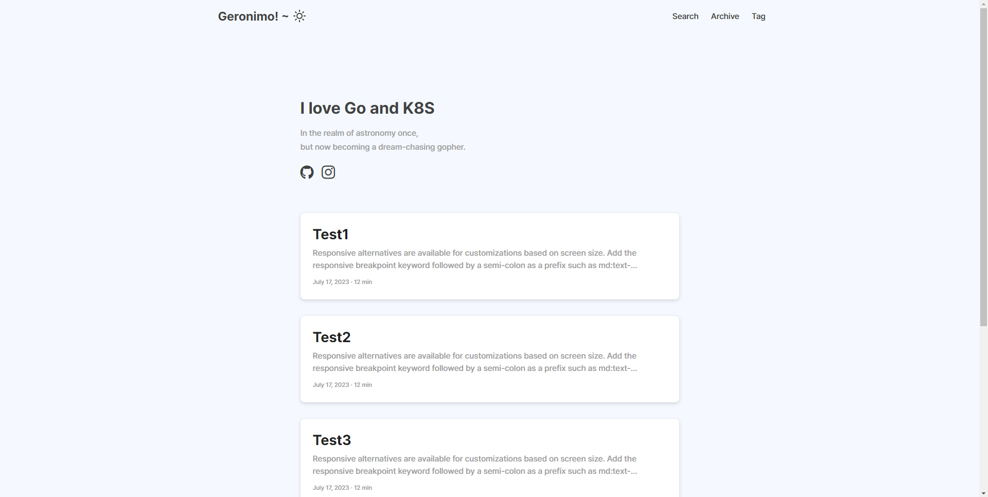
이제 PostComponent.vue 파일을 아래와 같이 작성하면 메인 화면에 mock데이터로 구성된 post 카드들이 나열하여 보이게 됩니다.
<script setup>
import { ref, computed } from 'vue'
import { storeToRefs } from 'pinia'
import { useToggleStore } from '@/stores/toggle'
const toggleStore = useToggleStore()
const { toggleDarKMode } = storeToRefs(toggleStore)

const darkMode = computed(() => {
    return toggleDarKMode.value ? 'surface-800 text-0' : 'surface-card text-900'
})

const posts = ref([
    {
        "title": 'Test1',
        "content": 'Responsive alternatives are available for customizations based on screen size. Add the responsive breakpoint keyword followed by a semi-colon as a prefix such as md:text-overflow-clip to use a responsive class.',
        "date": 'July 17, 2023 · 12 min',
    },
		...
])

</script>

<template>
    <div v-for="post in posts" :key="post.content" class="border-round-lg mx-5 my-5 p-4 shadow-2 flex flex-column gap-2"
        :class="darkMode" style="height: 120px;">
        <div class="font-bold text-3xl" style="height: 30%;">
            {{ post.title }}
        </div>
        <div class="text-500 line-height-3 line w-full" style="height: 50%;">
            {{ post.content }}
        </div>
        <div class=" text-500 text-xs flex align-items-center" style="height: 20%;">
            {{ post.date }}
        </div>
    </div>
</template>

<style scoped>
.line {
    text-overflow: ellipsis;
    overflow: hidden;
    word-break: break-word;

    display: -webkit-box;
    -webkit-line-clamp: 2;
    -webkit-box-orient: vertical
}
</style>
그런데 뭔가 카드들이 존재하는 곳의 높이가 너무 제한적이라 답답한 기분이 들죠? 저는 다시 App.js 파일을 수정하여 카드가 많은 만큼 화면이 아래로 내려갈 수 있게 했습니다. 여러분도 개인의 취향에 맞는 방향으로 세부적인 css를 고쳐 보셨으면 좋겠습니다!
여기서 이제 커스텀을 더 진행한다면, 게시물 pagination을 추가 해볼 수도 있고, 인상적인 양 옆의 빈 공간을 좀 더 효율적으로 사용하도록 구상해볼 수 있을 것 같습니다. 다만 제 생각에 그것들은 게시글을 어떻게 저장하고 관리할 것인가의 방식이 정해지고 건드려도 나쁘지 않을 듯 합니다. 그러니 잠시 추후로 미루어도 좋을 것 같습니다.
이번 글은 여기서 마치고, 다음 글에서는 게시글의 디테일을 꾸며보겠습니다.

항상 좋은 글 감사합니다.