반응형 웹을 위한 설정
뷰포트 설정
<meta name="viewport" content="user-scalable=no, initial-scale=1, maximum-scale=1">| 값 | 설명 |
|---|---|
| width | 화면너비 |
| height | 화면 높이 |
| initial-scale | 초기 확대 비율 |
| user-scalable | 확대 및 축소 가능 여부 |
| minimum-scale | 최소 축소 비율 |
| maximum-scale | 최대 확대 비율 |
| target-densitydpi | DPI 지정 |
미디어 쿼리 설정
-
@-rule
css 내부에서 특정한 규칙을 표현하는데 사용
@import, @font-face, @media(<미디어 쿼리>)... -
media 속성
link tag에 입력해서 해당 미디어 쿼리 조건에 맞는 장치에서만 css파일 불러올 때 사용한다.
<link rel="stylesheet" href="<파일명>" media="<미디어 쿼리>">| 미디어 타입 | 설명 |
|---|---|
| all | 모든 장치 |
| aural | 음성 장치 |
| braile | 표시 전용 점자 장치 |
| handheld | 손으로 들고 다니는 작은 장치 |
| 프린터 | |
| projection | 프로젝터 |
| screen | 화면 |
| tty | 터미널 등 그림을 띄울 수 없는 장치 |
| tv | 텔레비전 |
| embossed | 인쇄 전용 점자 장치 |
미디어 타입 연산자
- only : 해당 장치 에서만
- not : 해당 장치 제외한
| 미디어 특징 | 설명 |
|---|---|
| width | 화면 너비 |
| height | 화면 높이 |
| device-width | 장치 너비 |
| device-height | 장치 높이 |
| orientation | 장치 방향 |
| device-aspect-ratio | 화면 비율 |
| color | 장치 색상 비트 |
| color-index | 장치에서 표현 가능한 최대 색상 개수 |
| monochrome | 흑백 장치의 픽셀당 비트 개수 |
| resolution | 장치 해상도 |
📌practice01
media 쿼리를 설정한 후 큰 화면과 작은 화면, 모바일 화면에서의 차이를 나타낼 수 있는지 확인해보았다🤔
<!DOCTYPE html>
<html>
<head>
	<meta charset="utf-8">
	<title>media 쿼리 설정해보기</title>
	<meta name="viewport" content="user-scalable=no, initial-scale=1, maximum-scale=1">
	<style type="text/css">
		/*스마트폰*/
		@media screen and (max-width:  767px){
			body{
				background: pink;
			}
		}
		/*태블릿 pc*/
		@media screen and (min-width:  768px) and (max-width: 959px){
			body{
				background: yellowgreen;
			}
		}
		/*데스크탑*/
		@media screen and (min-width:  960px){
			body{
				background: skyblue;
			}
		}
	</style>
</head>
<body>
	<h1>Responsive Web Practice</h1>
	<p>Responsive Web Practice Responsive Web Practice Responsive Web Practice Responsive Web Practice Responsive Web Practice Responsive Web Practice Responsive Web Practice Responsive Web Practice Responsive Web Practice Responsive Web Practice Responsive Web Practice Responsive Web Practice Responsive Web Practice Responsive Web PracticeResponsive Web Practice Responsive Web PracticeResponsive Web Practice Responsive Web Practice Responsive Web Practice</p>
</body>
</html>
📌practice01-1
여러가지 화면에 대해서 연습해봤으니 스마트폰 가로 세로 화면 방향 전환시에도 가능한지 연습해보자
<!DOCTYPE html>
<html>
<head>
	<meta charset="utf-8">
	<title>가로세로 방향 전환</title>
	<meta name="viewport" content="user-scalable=no, initial-scale=1, maximum-scale=1">
	<style type="text/css">
		@media screen and (orientation: portrait){
			/*세로*/
			body{
				background: gray;
			}
		}
		/*가로*/
		@media screen and (orientation: landscape){
			body{
				background: purple;
			}
		}
	</style>
</head>
<body>
	<h1>Responsive Web Practice</h1>
	<p>Responsive Web Practice Responsive Web Practice Responsive Web Practice Responsive Web Practice Responsive Web Practice Responsive Web Practice Responsive Web Practice Responsive Web Practice Responsive Web Practice Responsive Web Practice Responsive Web Practice Responsive Web Practice Responsive Web Practice Responsive Web PracticeResponsive Web Practice Responsive Web PracticeResponsive Web Practice Responsive Web Practice Responsive Web Practice</p>
</body>
</html>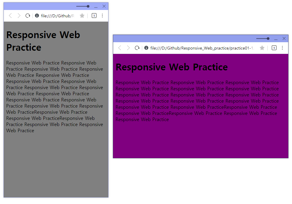
잘된당😊
