Position
- 요소의 속성값에 애니메이션을 줘서 '스르륵' 변화할 수 있게 도와준다.
- position의 4가지 요소
1) property: 변화값(CSS 속성)
2) duration: 지속시간 (ms, s)
3) [timing-function] : 변화속도 (ease-in, ease-out, ease-in-out, cubic-beizer()*지정)
4) [delay] : 지연 (시간 표기) '몇 초/분 후 실행'
Animation
- transition보다 자유롭고 더 많은 효과를 줄 수 있다.
@keyframes 으로 애니메이션을 선언
@keyframes name {
  from {
  }
  to {
  }
  or
@keyframes name {
  0% {
  }
  50% {
  }
  100%{
  }
- animation-property
duration, timing-function, delay
iteration-count(되풀이 요소) : 정수를 사용한다. *무한대: infinite;
direction (동작 방향)
- reverse(반대로) (from-to, to-from)
- alternate(번갈아가며 작동) (from-to-to-from)
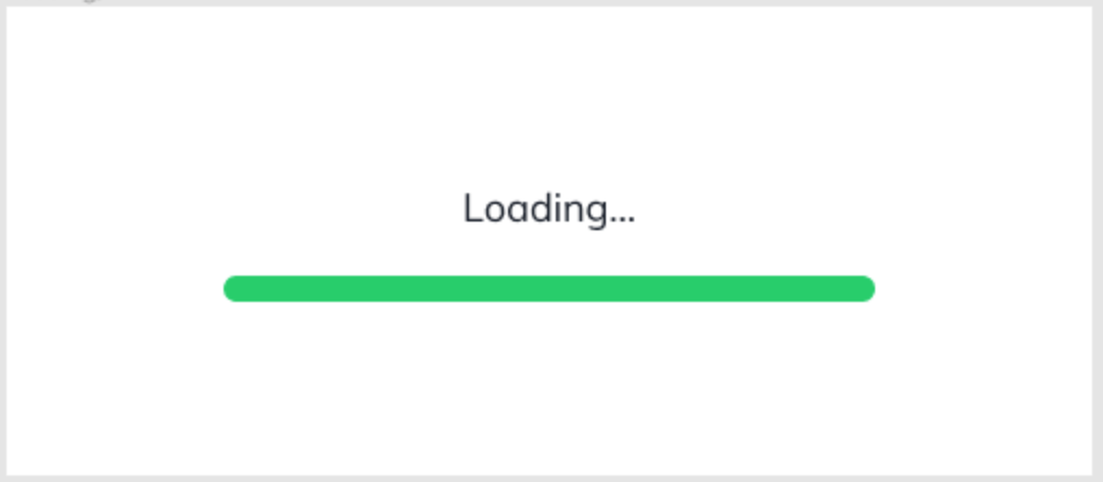
예제 (Loading)
CSS source code
* {
  box-sizing: border-box;
  margin: 0;
}

body {
  font-family: 'Mulish', sans-serif;
  text-align: center;
}

.loading {
  display: flex;
  flex-direction: column;
  justify-content: center;
  align-items: center;
  width: 500px;
  height: 216px;
}

.loading-title {
  margin-bottom: 20px;
  font-size: 18px;
  font-weight: 400;
  line-height: 1.3333333;
  color: #151B26;
  animation-name: wording;
  animation-duration: 1600ms;
  animation-iteration-count: infinite;
  animation-direction: alternate;
}

.progress-bar {
  position: relative;
  width: 300px;
  height: 12px;
  border-radius: 100px;
  background-color: #E5EAEF;
  overflow: hidden;
}

.progress-bar-gauge {
  position: absolute;
  left: 0;
  top: 0;
  height: 12px;
  border-radius: 100px;
  background-color: #13CE66;
  animation-name: loading;
  animation-duration: 1600ms;
  animation-iteration-count: infinite;
  animation-timing-function: ease-out;
}

@keyframes loading {
  0% {
    width: 0;
    opacity: 1;
  }

  90% {
    width: 100%;
    opacity: 1;
  }

  100% {
    width: 100%;
    opacity: 0;
  }
}

@keyframes wording {
  from {
    opacity: 1;
  }

  to {
    opacity: 0;
  }
}
HTML source code
<!DOCTYPE html>
<html lang="en">
  <head>
    <meta charset="UTF-8" />
    <meta name="viewport" content="width=device-width, initial-scale=1.0" />
    <title>Animation</title>
    <link rel="preconnect" href="https://fonts.gstatic.com">
<link href="https://fonts.googleapis.com/css2?family=Mulish&display=swap" rel="stylesheet">
    <link rel="stylesheet" href="./style.css" />
  </head>
  <body>
    <section class="loading">
      <h1 class="loading-title">Loading...</h1>
      <div class="progress-bar" aria-hidden="true">
        <span class="progress-bar-gauge"></span>
      </div>
    </section>
  </body>
</html>
Questions & Learned
- 속성에 animation-name을 반드시 써준다.
- 디테일한 작업이다. 하나하나 적용해보면서 확인하고, 또 적용해보면서 잘 써보도록 한다.