
정렬의 끝판왕! 플렉스 해버린 플렉스박스는 그간 CSS 정렬의 어려움을 깨버렸다. 알아두면 쓸모 많은 flex. 'How to use it?'를 잘 알고 잘 활용하자
flexbox를 쓰는 4 Steps
- 설정
- 나, 플렉스박스 쓸거임! (단호하게 선언하기)
- 가로 정렬할까? 세로 정렬할까?
- 무조건 한 줄 안에 다 정렬할까? 말까?
- 정렬
- 플렉스박스 쓰기
1. 플렉스박스 선언
display: flex; / inline-flex;
- 정렬하고자 하는 요소를 감싸는 부모 요소에게 준다.
2. flex-direction
- flex를 사용하면 보이지 않는 2개의 축(main axis, cross axis)이 생기는데, flex-direction 값에 따라 axis가 달라짐
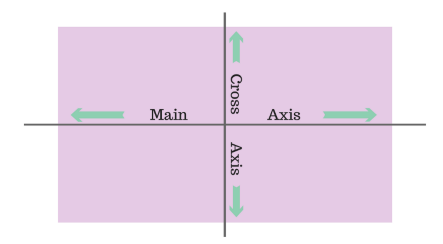
- row : 가로방향 (왼쪽->오른쪽, *기본값)
- row-reverse : 오른쪽->왼쪽
- column : 세로방향 (위->아래)
- column-reverse : 아래 -> 위
'reverse'는 시작 방향 뿐 아니라 속성의 순서도 바꾼다.
3. flex-wrap
- nowrap: flex된 컨텐츠를 감싸지(wrap) 않고, 자식의 사이즈를 줄여서라도 한 줄로 정렬해버림 (*기본값)
- wrap: 한 줄에 모두 정렬하기에 공간이 넉넉하지 않으면 여러 줄로 나누어버림 (사이즈 변경 없음)
4. flexbox
-
main axis 기준 아이템 정렬
- justify-content: flex-start(시작점 *기본값), flex-end(끝 점), 센터(가운데 정렬), space-between(간격 넓히기), space-around(균일하게 양 옆으로 넓히기) -
cross axis 기준 아이템 정렬
- align-items: flex-start(*기본값), flex-end, 센터
- align-contentflexwrap: wrap;일 경우 flex line이 2개가 생기는데, 요소와 요소 사이의 간격을 조정할 때 쓴다.- flex-start, flex-end, 센터, space-between, space-around
flex Items
- order :
order: 1;order: 2;와 같이 값을 지정해주면 순서에 상관없이 order값으로 배열됨 - flex-grow : flex item의 증가 너비 비율 설정. 박스 내에서 공간을 차지하고 싶을 때 쓰고, 정수(1,2,3..)로 표기한다.
- flex-shrink: flex item의 감소 너비 비율 설정
- align-self: 특정 아이템의 정렬을 따로 하고 싶을 때 (교차축 기준) * align-items 보다 우선 적용됨
- flex-flow : flex-direction + flex wrap의 단축 속성(원샷투킬!)
row wrap, column wrap column-reverse wrap-reverse
예제 (user card)

CSS source code
* {
  box-sizing: border-box;
  margin: 0;
}

body {
  font-family: "Muli", sans-serif;
  color: #273444;
  background-color: blue;
}

.profile-name {
  font-size: 18px;
  font-weight: 600;
  line-height: 1.3333333333;
}

.profile-location {
  font-size: 14px;
  line-height: 1.4285714286;
  color: #8492a6;
}

.profile-detail dt {
  font-size: 12px;
  font-weight: 600;
  line-height: 1.6666666667;
  color: #8492a6;
}

.profile-detail dd {
  font-size: 32px;
  font-weight: 300;
  line-height: 1.25;
  color: #0066ff;
}

body {
  width: 100%;
  height: 100vh;
  display: flex;
  justify-content: cente;
  align-items: cente;
}

.profile {
  display: flex;
  flex-direction: column;
  align-items: cente;
  width: 386px;
  padding: 32px 40px;
  border-radius: 16px;
  text-align: cente;
  background-color: #FFFFFF;
}

.profile-image {
  width: 80px;
  height: 80px;
  border-radius: 50%;
  margin-bottom: 16px;
}

.profile-name {
  margin-bottom: 4px;
}

.profile-location {
  margin-bottom: 32px;
}

.profile-detail {
  display: flex;
  justify-content: space-between;
  align-items: cente;
}
HTML source code
<!DOCTYPE html>
<html lang="en">
<head>
    <meta charset="UTF-8">
    <meta http-equiv="X-UA-Compatible" content="IE=edge">
    <meta name="viewport" content="width=device-width, initial-scale=1.0">
    <title>Flexbox-3</title>
    <link href="https://fonts.googleapis.com/css?family=Muli:300,400,600&display=swap" rel="stylesheet" />
    <link rel="stylesheet" href="style.css">
</head>
<body>
    <section class="profile">
        <img src="./assets/user.jpg" alt="Noah Mdsen" class="profile-image"/>
        <h1 class="profile-name">Noah madsen</h1>
        <p class="profile-location">Copenhagen, Denmark</p>

        <dl class="profile-detail">
            <div class="profile-detail-item">
                <dt>Friends</dt>
                <dd>730</dd>
            </div>
            <div class="profile-detail-item">
                <dt>Projects</dt>
                <dd>3</dd>
            </div>
            <div class="profile-detail-item">
                <dt>Reviews</dt>
                <dd>243</dd>
            </div>
        </dl>
    </section>
</body>
</html>
Questions & Learned
- 전체 요소를 가운데 정렬할 때 그 요소를 감싸는 부모에게 flex를 적용하면 간단하게 처리할 수 있다.
- 컨텐츠 가운데 정렬하기 : body에 flex 주기
body {
  width: 100%;
  height: 100vh;
  display: flex;
  justify-content: cente;
  align-items: cente;
}
출처: '김버그의 HTML&CSS는 재밌다'를 학습하고 정리한 내용입니다.
