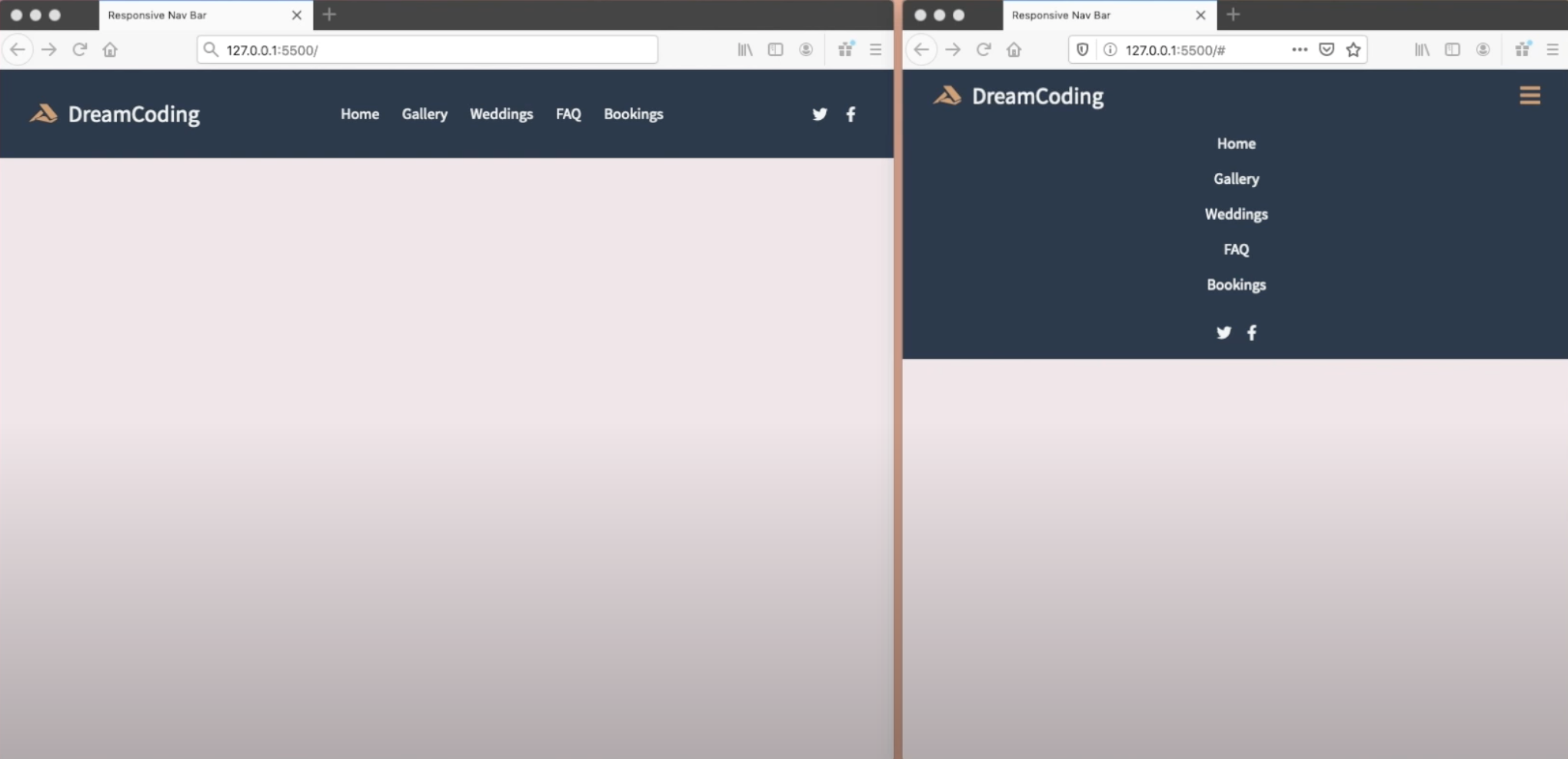
반응형 웹페이지 작업 중 최상단 헤더 부분을 만들어보았다!
CSS
/* 사이즈가 작아 졌을때!! */
@media screen and (max-width: 768px) {
    .navbar{
        flex-direction: column;
        align-items: flex-start;
        padding: 8px 24px;
    }
    .nav__menu {
        display: none;
        flex-direction: column;
        align-items: center;
        width: 100%;
    }
    .nav__menu>li{
        width: 100%;
        text-align: center;
    }
    .nav__icon {
        display: none;
        justify-content: center;
        width: 100%;
    }

    .nav__toogleBtn {
        display: block;
    }
    .nav__menu.active,
    .nav__icon.active {
        display: flex;
    }
}
FE 개발 공부 중