#20 잠깐이나마 한 소중한 경험!
styled-components
이번에는 CSS in JS 라는 기술이다. 이 문구가 뜻하는 대로, 이 기술은 JS 안에 CSS 를 작성하는 것이다. 우리는 해당 기술을 다뤄보는 라이브러리인 styled-components 를 알아보겠다.
Tagged Template Literal
styled-components 을 알아보기 전에, Tagged Template Literal 이라는 문법에 대해 짚고 넘어가면 styled-components 가 어떻게 작동되는지 이해할 수 있다.
내용이 다소 어려울 수 있어서 완벽히 이해하지 않아도 styled-components 를 사용하는데는 전혀 지장이 가지 않아서 가볍게 읽고 가면된다.
Template Literal 에 대해서는 들어봤을 것 이다. 문자열 조합을 더욱 쉽게 할 수 있게 해주는 ES6 문법이다.
const name = 'react';
const message = `hello ${name}`;

console.log(message);
// "hello react"
우리가 Template Literal 을 사용 할 때 ${ } 안에 일반 숫자 / 문자열이 아닌 객체를 넣는다면 어떻게 될까?
const object = { a: 1 };
const text = `${object}`
console.log(text);
// "[object Object]"
이번에는 함수를 넣어보면...
const fn = () => true
const msg = `${fn}`;
console.log(msg);
// "() => true"
우리가 Template Literal 을 사용하면서도, 그 내부에 넣은 자바스크립트 값을 조회하고 싶을 때 Tagged Template Literal 문법을 사용할 수 있다.
const red = '빨간색';
const blue = '파란색';
function favoriteColors(texts, ...values) {
  console.log(texts);
  console.log(values);
}
favoriteColors`제가 좋아하는 색은 ${red}과 ${blue}입니다.`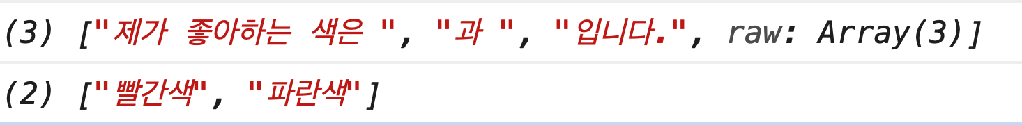
출처 : 벨로퍼트와 함께하는 모던 리액트
위에서 함수 파라미터쪽에 rest 문법이 사용되었다. 우리가 입력한 문자열이 모두 분해되어서, 우리가 넣어준 텍스트와 ${ } 를 통해서 넣어준 자바스크립트 값을 따로 볼 수 있는데 이러한 값들을 조합하여 우리는 이런 작업을 할 수 있다.
const red = '빨간색';
const blue = '파란색';
function favoriteColors(texts, ...values) {
   return texts.reduce((result, text, i) => `${result}${text}${values[i] ? `<b>${values[i]}</b>` : ''}`, '');
}
favoriteColors`제가 좋아하는 색은 ${red}과 ${blue}입니다.`
// 제가 좋아하는 색은 <b>빨간색</b>과 <b>파란색</b>입니다.
코드가 조금 복잡하긴 하다. 앞으로 개발하면서 favoriteColors 같은 함수를 작성할 일은 없으니 이해가기 어려워도 너무 걱정할 필요는 없다. 지금은 저런 문법이 있구나 하고 알아두기만 하면 된다.
styled-components 에서는 이런한 문법을 사용해서 컴포넌트의 props 를 읽어오기도 한다. 맛보기로 한 번 확인해보겠다.
const StyledDiv = styled`
  background: ${props => props.color};
`;
Tagged Template Literal 을 사용하면 만약 ${ } 을 통하여 함수를 넣어줬다면, 해당 함수를 사용이 가능하다.
밑에 코드를 확인해보면...
function sample(texts, ...fns) {
  const mockProps = {
    title: '안녕하세요',
    body: '내용은 내용내용 입니다.'
  };
  return texts.reduce((result, text, i) => `${result}${text}${fns[i] ? fns[i](mockProps) : ''}`, '');
}
sample`
  제목: ${props => props.title}
  내용: ${props => props.body}
`
/*
"
  제목: 안녕하세요
  내용: 내용은 내용내용 입니다.
"
*/
styled-components 사용하기
이제 본격적으로 styled-components 을 사용해보겠다.
새로운 프로젝트를 생성하고 styled-components 를 설치해준다.
$ npx create-react-app styling-with-styled-components

$ cd styling-with-styled-components

$ npm install styled-components
설치가 완료되면 App 컴포넌트를 열어서 다음과 같이 styled-components 로 스타일링한 첫번째 컴포넌트를 만들어준다.
App.js
import React from 'react';
import styled from 'styled-components';

const Circle = styled.div`
  width: 5rem;
  height: 5rem;
  background: black;
  border-radius: 50%;
`;

function App() {
  return <Circle />;
}

export default App;
그리고 개발자 서버를 실행해서 결과물을 확인해보자!
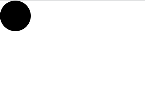
이렇게 검정색인 원을 볼 수 있다. 우리는 styled-components 를 사용해서 이렇게 스타일을 입력함과 동시에 해당 스타일을 가진 컴포넌트를 만들 수 있다.
만약에 span 을 스타일링 하고 싶으면, styled.span, input 이면 styled.input 이런식으로 작성을하면 된다.
이번에는, Circle 컴포넌트에 color 라는 props 를 넣어줘보겠다.
App.js
import React from 'react';
import styled from 'styled-components';

const Circle = styled.div`
  width: 5rem;
  height: 5rem;
  background: ${props => props.color || 'black'};
  border-radius: 50%;
`;

function App() {
  return <Circle color="blue" />;
}

export default App;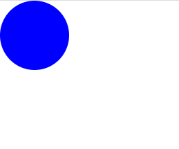
파란색 원이 나타났다!
Circle 컴포넌트에서는 color props 값을 설정해줬으면 해당 값을 배경색으로 설정하고, 그렇지 않으면 검정색으로 배경색을 사용하도록 설정해두었다.
이번에는 huge 라는 props 를 설정됐을 때 크기를 더 키워서 보여주도록 작업을 해보겠다.
App.js
import React from 'react';
import styled, { css } from 'styled-components';

const Circle = styled.div`
  width: 5rem;
  height: 5rem;
  background: ${props => props.color || 'black'};
  border-radius: 50%;
  ${props =>
    props.huge &&
    css`
      width: 10rem;
      height: 10rem;
    `}
`;

function App() {
  return <Circle color="red" huge />;
}

export default App;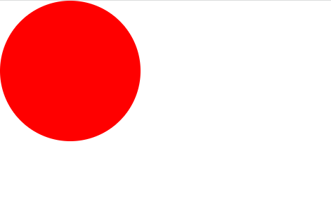
전보다 커진 빨간 원을 볼 수 있다.
이런식으로 여러 줄의 CSS 코드를 조건부로 보여주고 싶다면 css 를 사용해야 한다. css 를 불러와서 사용을 해야 그 스타일 내부에서도 다른 props 를 조회 할 수 있다.
Button 만들기
이번에는 우리가 이전에 Sass 를 배울 때 만들었던 재사용성 높은 Button 컴포넌트를 styled-components 로 구현을 해보겠다.
우선, src 안에 components 디렉토리를 생성하고 Button.js 파일을 만들어준다.
components/Button.js
import React from 'react';
import styled from 'styled-components';

const StyledButton = styled.button`
  /* 공통 스타일 */
  display: inline-flex;
  outline: none;
  border: none;
  border-radius: 4px;
  color: white;
  font-weight: bold;
  cursor: pointer;
  padding-left: 1rem;
  padding-right: 1rem;

  /* 크기 */
  height: 2.25rem;
  font-size: 1rem;

  /* 색상 */
  background: #228be6;
  &:hover {
    background: #339af0;
  }
  &:active {
    background: #1c7ed6;
  }

  /* 기타 */
  & + & {
    margin-left: 1rem;
  }
`;

function Button({ children, ...rest }) {
  return <StyledButton {...rest}>{children}</StyledButton>;
}

export default Button;
그리고 App 컴포넌트에서 Button 을 렌더링해준다.
App.js
import React from 'react';
import styled from 'styled-components';
import Button from './components/Button';

const AppBlock = styled.div`
  width: 512px;
  margin: 0 auto;
  margin-top: 4rem;
  border: 1px solid black;
  padding: 1rem;
`;

function App() {
  return (
    <AppBlock>
      <Button>BUTTON</Button>
    </AppBlock>
  );
}

export default App;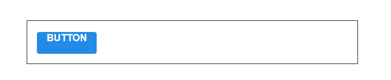
버튼이 잘 나왔다.
polished의 스타일 관련 유틸 함수 사용하기
우리가 Sass 를 사용할 때 lighten() 또는 darken() 과 같은 유틸 함수를 사용하여 색상에 변화를 주었는데, CSS in JS 에서도 비슷한 유틸 함수를 사용하고 싶다면 polished 라는 라이브러리를 사용하면 된다.
패키지를 설치해준다.
$ npm install polished그럼 기존 색상 부분을 polished 의 유틸 함수들로 대체를 해보겠다.
Button.js
import React from 'react';
import styled from 'styled-components';
import { darken, lighten } from 'polished';

const StyledButton = styled.button`
  /* 공통 스타일 */
  display: inline-flex;
  outline: none;
  border: none;
  border-radius: 4px;
  color: white;
  font-weight: bold;
  cursor: pointer;
  padding-left: 1rem;
  padding-right: 1rem;

  /* 크기 */
  height: 2.25rem;
  font-size: 1rem;

  /* 색상 */
  background: #228be6;
  &:hover {
    background: ${lighten(0.1, '#228be6')};
  }
  &:active {
    background: ${darken(0.1, '#228be6')};
  }

  /* 기타 */
  & + & {
    margin-left: 1rem;
  }
`;

function Button({ children, ...rest }) {
  return <StyledButton {...rest}>{children}</StyledButton>;
}

export default Button;
커서를 버튼에 올렸을 때 색상이 바뀌었다.
이제 핑크색, 회색 버튼들을 만들어볼건데, 색상 코드를 지닌 변수를 Button.js 에서 선언을 하는 대신에 ThemeProvider 라는 기능을 사용하여 styled-components 로 만드는 모든 컴포넌트에서 조회하여 사용 할 수 있는 전역적인 값을 설정하겠다.
App 컴포넌트를 다음과 같이 수정해준다.
App.js
import React from 'react';
import styled, { ThemeProvider } from 'styled-components';
import Button from './components/Button';

const AppBlock = styled.div`
  width: 512px;
  margin: 0 auto;
  margin-top: 4rem;
  border: 1px solid black;
  padding: 1rem;
`;

function App() {
  return (
    <ThemeProvider
      theme={{
        palette: {
          blue: '#228be6',
          gray: '#495057',
          pink: '#f06595'
        }
      }}
    >
      <AppBlock>
        <Button>BUTTON</Button>
      </AppBlock>
    </ThemeProvider>
  );
}

export default App;
theme 을 설정하면 ThemeProvider 내부에서 렌더링된 styled-components 로 만든 컴포넌트에서 palette 를 조회하여 사용 할 수 있다.
한 번 Button 컴포넌트에서 우리가 선언한 palette.blue 값을 조회해보겠다.
Button.js
import React from 'react';
import styled, { css } from 'styled-components';
import { darken, lighten } from 'polished';

const StyledButton = styled.button`
  /* 공통 스타일 */
  display: inline-flex;
  outline: none;
  border: none;
  border-radius: 4px;
  color: white;
  font-weight: bold;
  cursor: pointer;
  padding-left: 1rem;
  padding-right: 1rem;

  /* 크기 */
  height: 2.25rem;
  font-size: 1rem;

  /* 색상 */
  ${props => {
    const selected = props.theme.palette.blue;
    return css`
      background: ${selected};
      &:hover {
        background: ${lighten(0.1, selected)};
      }
      &:active {
        background: ${darken(0.1, selected)};
      }
    `;
  }}

  /* 기타 */
  & + & {
    margin-left: 1rem;
  }
`;

function Button({ children, ...rest }) {
  return <StyledButton {...rest}>{children}</StyledButton>;
}

export default Button;
ThemeProvider 로 설정한 값은 styled-components 에서 props.theme 로 조회 할 수 있다.
우리는 selected 값을 무조건 blue 값을 가르키게 했는데, 이 부분을 Button 컴포넌트가 color props 를 를 통하여 받아오게 될 색상을 사용하도록 수정해보겠다.
Button.js
import React from 'react';
import styled, { css } from 'styled-components';
import { darken, lighten } from 'polished';

const StyledButton = styled.button`
  /* 공통 스타일 */
  display: inline-flex;
  outline: none;
  border: none;
  border-radius: 4px;
  color: white;
  font-weight: bold;
  cursor: pointer;
  padding-left: 1rem;
  padding-right: 1rem;

  /* 크기 */
  height: 2.25rem;
  font-size: 1rem;

  /* 색상 */
  ${props => {
    const selected = props.theme.palette[props.color];
    return css`
      background: ${selected};
      &:hover {
        background: ${lighten(0.1, selected)};
      }
      &:active {
        background: ${darken(0.1, selected)};
      }
    `;
  }}

  /* 기타 */
  & + & {
    margin-left: 1rem;
  }
`;

function Button({ children, ...rest }) {
  return <StyledButton {...rest}>{children}</StyledButton>;
}

Button.defaultProps = {
  color: 'blue'
};

export default Button;
지금은 기본 색상이 blue 가 되도록 설정해두었다.
App 컴포넌트를 열어서 핑크색, 회색 버튼을 렌더링해보겠다.
App.js
import React from 'react';
import styled, { ThemeProvider } from 'styled-components';
import Button from './components/Button';

const AppBlock = styled.div`
  width: 512px;
  margin: 0 auto;
  margin-top: 4rem;
  border: 1px solid black;
  padding: 1rem;
`;

function App() {
  return (
    <ThemeProvider
      theme={{
        palette: {
          blue: '#228be6',
          gray: '#495057',
          pink: '#f06595'
        }
      }}
    >
      <AppBlock>
        <Button>BUTTON</Button>
        <Button color="gray">BUTTON</Button>
        <Button color="pink">BUTTON</Button>
      </AppBlock>
    </ThemeProvider>
  );
}

export default App;
결과를 확인해보면...
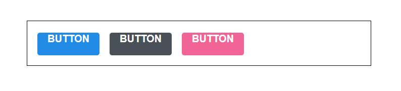
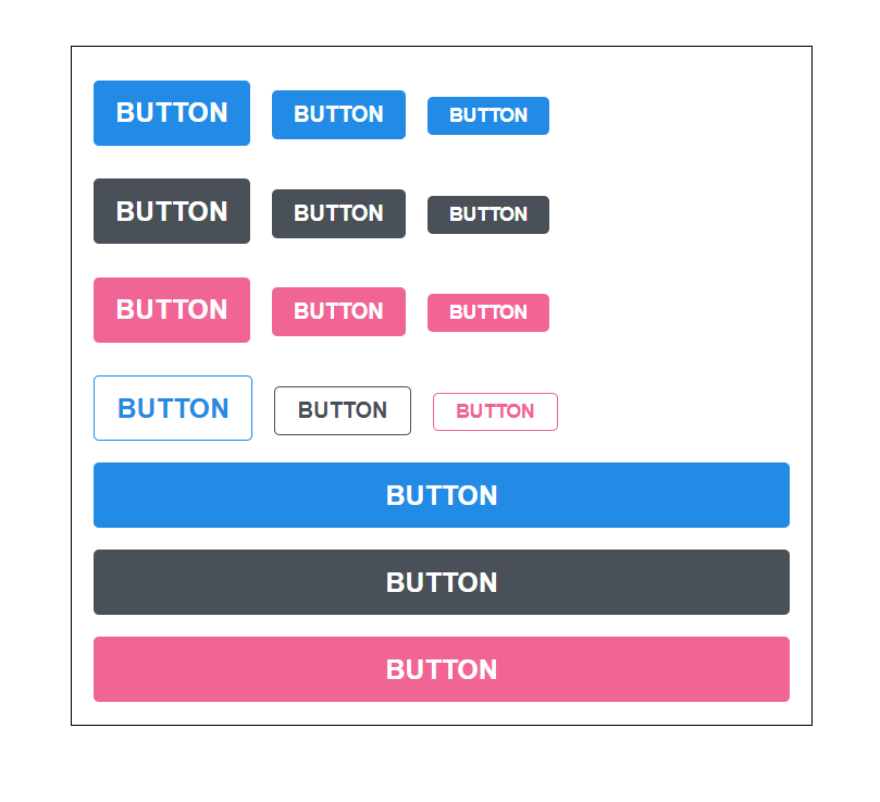
세 개의 버튼이 잘 출력된 것을 볼 수 있다.
Button 컴포넌트의 코드는 다음과 같이 리팩토링 할 수 있다.
components/Button.js
import React from 'react';
import styled, { css } from 'styled-components';
import { darken, lighten } from 'polished';

const StyledButton = styled.button`
  /* 공통 스타일 */
  display: inline-flex;
  outline: none;
  border: none;
  border-radius: 4px;
  color: white;
  font-weight: bold;
  cursor: pointer;
  padding-left: 1rem;
  padding-right: 1rem;

  /* 크기 */
  height: 2.25rem;
  font-size: 1rem;

  /* 색상 */
  ${({ theme, color }) => {
    const selected = theme.palette[color];
    return css`
      background: ${selected};
      &:hover {
        background: ${lighten(0.1, selected)};
      }
      &:active {
        background: ${darken(0.1, selected)};
      }
    `;
  }}

  /* 기타 */
  & + & {
    margin-left: 1rem;
  }
`;

function Button({ children, color, ...rest }) {
  return <StyledButton color={color} {...rest}>{children}</StyledButton>;
}

Button.defaultProps = {
  color: 'blue'
};

export default Button;
props.theme.palette.blue 이런식으로 값을 조회하는 대신에 비구조화 할당 문법을 사용하여 가독성을 높여주었다.
참고로 위의 코드는 색상에 관련된 것들을 분리하여 사용 할 수 있다.
Button.js
import React from 'react';
import styled, { css } from 'styled-components';
import { darken, lighten } from 'polished';

const colorStyles = css`
  ${({ theme, color }) => {
    const selected = theme.palette[color];
    return css`
      background: ${selected};
      &:hover {
        background: ${lighten(0.1, selected)};
      }
      &:active {
        background: ${darken(0.1, selected)};
      }
    `;
  }}
`;

const StyledButton = styled.button`
  /* 공통 스타일 */
  display: inline-flex;
  outline: none;
  border: none;
  border-radius: 4px;
  color: white;
  font-weight: bold;
  cursor: pointer;
  padding-left: 1rem;
  padding-right: 1rem;

  /* 크기 */
  height: 2.25rem;
  font-size: 1rem;

  /* 색상 */
  ${colorStyles}

  /* 기타 */
  & + & {
    margin-left: 1rem;
  }
`;

function Button({ children, color, ...rest }) {
  return <StyledButton color={color} {...rest}>{children}</StyledButton>;
}

Button.defaultProps = {
  color: 'blue'
};

export default Button;
다음으로 size props 를 설정해서 버튼의 크기도 다양하게 만들어보겠다.
components/Button.js
import React from 'react';
import styled, { css } from 'styled-components';
import { darken, lighten } from 'polished';

const colorStyles = css`
  ${({ theme, color }) => {
    const selected = theme.palette[color];
    return css`
      background: ${selected};
      &:hover {
        background: ${lighten(0.1, selected)};
      }
      &:active {
        background: ${darken(0.1, selected)};
      }
    `;
  }}
`;

const sizeStyles = css`
  ${props =>
    props.size === 'large' &&
    css`
      height: 3rem;
      font-size: 1.25rem;
    `}

  ${props =>
    props.size === 'medium' &&
    css`
      height: 2.25rem;
      font-size: 1rem;
    `}

    ${props =>
      props.size === 'small' &&
      css`
        height: 1.75rem;
        font-size: 0.875rem;
      `}
`;

const StyledButton = styled.button`
  /* 공통 스타일 */
  display: inline-flex;
  outline: none;
  border: none;
  border-radius: 4px;
  color: white;
  font-weight: bold;
  cursor: pointer;
  padding-left: 1rem;
  padding-right: 1rem;

  /* 크기 */
  ${sizeStyles}

  /* 색상 */
  ${colorStyles}

  /* 기타 */
  & + & {
    margin-left: 1rem;
  }
`;

function Button({ children, color, size,  ...rest }) {
  return (
    <StyledButton color={color} size={size} {...rest}>
      {children}
    </StyledButton>
  );
}

Button.defaultProps = {
  color: 'blue'
};

export default Button;
참고로 sizeStyles 에 해당하는 코드를 따로 분리하지 않고 StyledButton 의 스타일 내부에서 바로 적어도 상관은 없다.
다만, 이렇게 분리해두면 나중에 유지보수를 할 때 더 편해게 작업할 수 있다.
이제 사이즈가 다른 버튼들을 렌더링해준다.
App.js
import React from 'react';
import styled, { ThemeProvider } from 'styled-components';
import Button from './components/Button';

const AppBlock = styled.div`
  width: 512px;
  margin: 0 auto;
  margin-top: 4rem;
  border: 1px solid black;
  padding: 1rem;
`;

const ButtonGroup = styled.div`
  & + & {
    margin-top: 1rem;
  }
`;

function App() {
  return (
    <ThemeProvider
      theme={{
        palette: {
          blue: '#228be6',
          gray: '#495057',
          pink: '#f06595'
        }
      }}
    >
      <AppBlock>
        <ButtonGroup>
          <Button size="large">BUTTON</Button>
          <Button>BUTTON</Button>
          <Button size="small">BUTTON</Button>
        </ButtonGroup>
        <ButtonGroup>
          <Button color="gray" size="large">
            BUTTON
          </Button>
          <Button color="gray">BUTTON</Button>
          <Button color="gray" size="small">
            BUTTON
          </Button>
        </ButtonGroup>
        <ButtonGroup>
          <Button color="pink" size="large">
            BUTTON
          </Button>
          <Button color="pink">BUTTON</Button>
          <Button color="pink" size="small">
            BUTTON
          </Button>
        </ButtonGroup>
      </AppBlock>
    </ThemeProvider>
  );
}

export default App;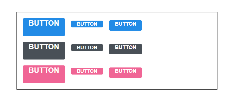
추가로 ButtonGroup 이라는 컴포넌트를 만들어서 서로간의 여백을 1rem 으로 설정을 해주었다.
우리가 작성했던 sizeStyles 를 보면, 중복되는 코드들이 은근히 있다. 해당 코드를 리팩토링한다면 다음과 같이 할 수 있다.
components/Button.js
import React from 'react';
import styled, { css } from 'styled-components';
import { darken, lighten } from 'polished';

const colorStyles = css`
  ${({ theme, color }) => {
    const selected = theme.palette[color];
    return css`
      background: ${selected};
      &:hover {
        background: ${lighten(0.1, selected)};
      }
      &:active {
        background: ${darken(0.1, selected)};
      }
    `;
  }}
`;

const sizes = {
  large: {
    height: '3rem',
    fontSize: '1.25rem'
  },
  medium: {
    height: '2.25rem',
    fontSize: '1rem'
  },
  small: {
    height: '1.75rem',
    fontSize: '0.875rem'
  }
};

const sizeStyles = css`
  ${({ size }) => css`
    height: ${sizes[size].height};
    font-size: ${sizes[size].fontSize};
  `}
`;

const StyledButton = styled.button`
  /* 공통 스타일 */
  display: inline-flex;
  outline: none;
  border: none;
  border-radius: 4px;
  color: white;
  font-weight: bold;
  cursor: pointer;
  padding-left: 1rem;
  padding-right: 1rem;

  /* 크기 */
  ${sizeStyles}

  /* 색상 */
  ${colorStyles}

  /* 기타 */
  & + & {
    margin-left: 1rem;
  }
`;

function Button({ children, color, size, ...rest }) {
  return (
    <StyledButton color={color} size={size} {...rest}>
      {children}
    </StyledButton>
  );
}

Button.defaultProps = {
  color: 'blue',
  size: 'medium'
};

export default Button;
그 다음으로, Button 컴포넌트에 outline 이라는 props 를 설정하여 이 값이 true 일 때에는 테두리만 지닌 버튼을 보여주도록 설정해보겠다.
이 작업을 할 때에는 colorStyles 만 수정해주면 된다.
components/Button.js
import React from 'react';
import styled, { css } from 'styled-components';
import { darken, lighten } from 'polished';

const colorStyles = css`
  ${({ theme, color }) => {
    const selected = theme.palette[color];
    return css`
      background: ${selected};
      &:hover {
        background: ${lighten(0.1, selected)};
      }
      &:active {
        background: ${darken(0.1, selected)};
      }
      ${props =>
        props.outline &&
        css`
          color: ${selected};
          background: none;
          border: 1px solid ${selected};
          &:hover {
            background: ${selected};
            color: white;
          }
        `}
    `;
  }}
`;

const sizes = {
  large: {
    height: '3rem',
    fontSize: '1.25rem'
  },
  medium: {
    height: '2.25rem',
    fontSize: '1rem'
  },
  small: {
    height: '1.75rem',
    fontSize: '0.875rem'
  }
};

const sizeStyles = css`
  ${({ size }) => css`
    height: ${sizes[size].height};
    font-size: ${sizes[size].fontSize};
  `}
`;

const StyledButton = styled.button`
  /* 공통 스타일 */
  display: inline-flex;
  outline: none;
  border: none;
  border-radius: 4px;
  color: white;
  font-weight: bold;
  cursor: pointer;
  padding-left: 1rem;
  padding-right: 1rem;

  /* 크기 */
  ${sizeStyles}

  /* 색상 */
  ${colorStyles}

  /* 기타 */
  & + & {
    margin-left: 1rem;
  }
`;

function Button({ children, color, size, outline, ...rest }) {
  return (
    <StyledButton color={color} size={size} outline={outline} {...rest}>
      {children}
    </StyledButton>
  );
}

Button.defaultProps = {
  color: 'blue',
  size: 'medium'
};

export default Button;
이제 outline 스타일을 렌더링해보자!
App.js
import React from 'react';
import styled, { ThemeProvider } from 'styled-components';
import Button from './components/Button';
const AppBlock = styled.div`
width: 512px;
margin: 0 auto;
margin-top: 4rem;
border: 1px solid black;
padding: 1rem;
`;
const ButtonGroup = styled.div`
& + & {
margin-top: 1rem;
}
`;
function App() {
return (
<ThemeProvider
theme={{
palette: {
blue: '#228be6',
gray: '#495057',
pink: '#f06595'
}
}}
>
<AppBlock>
<ButtonGroup>
<Button size="large">BUTTON</Button>
<Button>BUTTON</Button>
<Button size="small">BUTTON</Button>
</ButtonGroup>
<ButtonGroup>
<Button color="gray" size="large">
BUTTON
</Button>
<Button color="gray">BUTTON</Button>
<Button color="gray" size="small">
BUTTON
</Button>
</ButtonGroup>
<ButtonGroup>
<Button color="pink" size="large">
BUTTON
</Button>
<Button color="pink">BUTTON</Button>
<Button color="pink" size="small">
BUTTON
</Button>
</ButtonGroup>
<ButtonGroup>
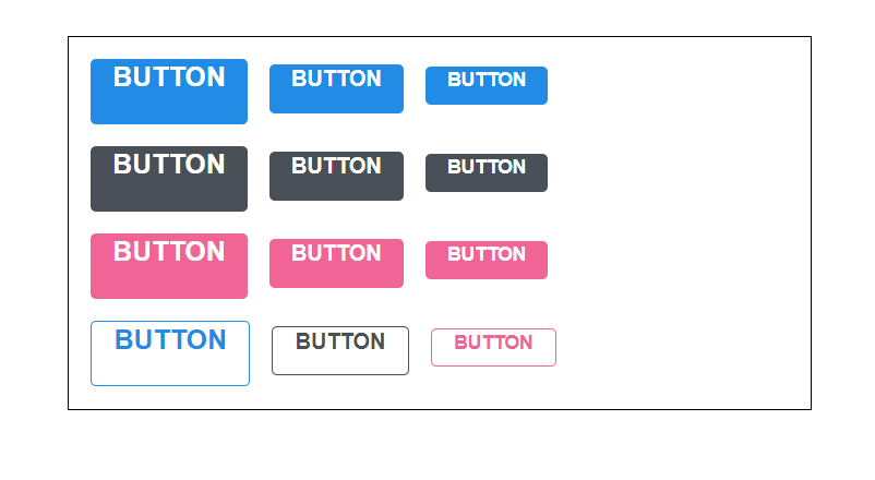
<Button size="large" outline>
BUTTON
</Button>
<Button color="gray" outline>
BUTTON
</Button>
<Button color="pink" size="small" outline>
BUTTON
</Button>
</ButtonGroup>
</AppBlock>
</ThemeProvider>
);
}
export default App;화면에 잘 나타난다.
이제 Button 컴포넌트에서 해야 할 마지막 작업이 한가지 더 남아있다. fullWidth 라는 props 가 주어졌다면 버튼의 크기가 100% 를 차지하도록 만들어겠다.
components/Button.js
import React from 'react';
import styled, { css } from 'styled-components';
import { darken, lighten } from 'polished';

const colorStyles = css`
  ${({ theme, color }) => {
    const selected = theme.palette[color];
    return css`
      background: ${selected};
      &:hover {
        background: ${lighten(0.1, selected)};
      }
      &:active {
        background: ${darken(0.1, selected)};
      }
      ${props =>
        props.outline &&
        css`
          color: ${selected};
          background: none;
          border: 1px solid ${selected};
          &:hover {
            background: ${selected};
            color: white;
          }
        `}
    `;
  }}
`;

const sizes = {
  large: {
    height: '3rem',
    fontSize: '1.25rem'
  },
  medium: {
    height: '2.25rem',
    fontSize: '1rem'
  },
  small: {
    height: '1.75rem',
    fontSize: '0.875rem'
  }
};

const sizeStyles = css`
  ${({ size }) => css`
    height: ${sizes[size].height};
    font-size: ${sizes[size].fontSize};
  `}
`;

const fullWidthStyle = css`
  ${props =>
    props.fullWidth &&
    css`
      width: 100%;
      justify-content: center;
      & + & {
        margin-left: 0;
        margin-top: 1rem;
      }
    `}
`;

const StyledButton = styled.button`
  /* 공통 스타일 */
  display: inline-flex;
  outline: none;
  border: none;
  border-radius: 4px;
  color: white;
  font-weight: bold;
  cursor: pointer;
  padding-left: 1rem;
  padding-right: 1rem;
  align-items:center;
  margin-right:1rem;

  /* 크기 */
  ${sizeStyles}

  /* 색상 */
  ${colorStyles}

  /* 기타 */
  & + & {
    margin-left: 1rem;
  }

  ${fullWidthStyle}
`;

function Button({ children, color, size, outline, fullWidth, ...rest }) {
  return (
    <StyledButton
      color={color}
      size={size}
      outline={outline}
      fullWidth={fullWidth}
      {...rest}
    >
      {children}
    </StyledButton>
  );
}

Button.defaultProps = {
  color: 'blue',
  size: 'medium'
};

export default Button;
fullWidth 스타일을 지닌 컴포넌트들도 렌더링해보자!
App.js
import React from 'react';
import styled, { ThemeProvider } from 'styled-components';
import Button from './components/Button';
const AppBlock = styled.div`
width: 512px;
margin: 0 auto;
margin-top: 4rem;
border: 1px solid black;
padding: 1rem;
`;
const ButtonGroup = styled.div`
& + & {
margin-top: 1rem;
}
`;
function App() {
return (
<ThemeProvider
theme={{
palette: {
blue: '#228be6',
gray: '#495057',
pink: '#f06595'
}
}}
>
<AppBlock>
<ButtonGroup>
<Button size="large">BUTTON</Button>
<Button>BUTTON</Button>
<Button size="small">BUTTON</Button>
</ButtonGroup>
<ButtonGroup>
<Button color="gray" size="large">
BUTTON
</Button>
<Button color="gray">BUTTON</Button>
<Button color="gray" size="small">
BUTTON
</Button>
</ButtonGroup>
<ButtonGroup>
<Button color="pink" size="large">
BUTTON
</Button>
<Button color="pink">BUTTON</Button>
<Button color="pink" size="small">
BUTTON
</Button>
</ButtonGroup>
<ButtonGroup>
<Button size="large" outline>
BUTTON
</Button>
<Button color="gray" outline>
BUTTON
</Button>
<Button color="pink" size="small" outline>
BUTTON
</Button>
</ButtonGroup>
<ButtonGroup>
<Button size="large" fullWidth>
BUTTON
</Button>
<Button size="large" color="gray" fullWidth>
BUTTON
</Button>
<Button size="large" color="pink" fullWidth>
BUTTON
</Button>
</ButtonGroup>
</AppBlock>
</ThemeProvider>
);
}
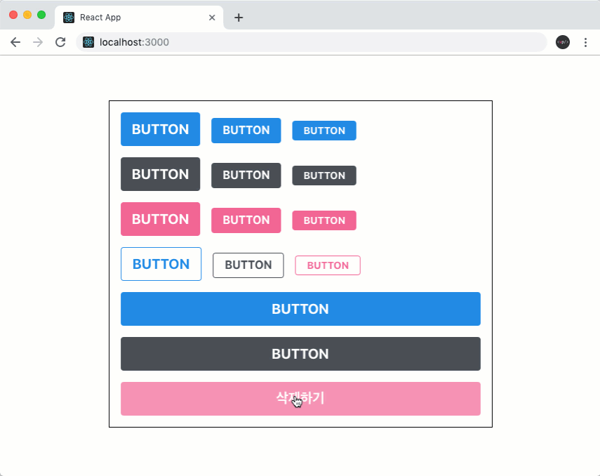
export default App;화면을 확인해보면...
Dialog 만들기
이번에는 기존 화면을 가리게 되면서 정보를 보여주게 되는 Dialog 컴포넌트를 만들어보겠다.
이 컴포넌트를 만드는 과정에서 우리가 아까 만들었던 Button 컴포넌트를 재사용하게 될 것이다.
우선 components 디렉터리에 Dialog.js 파일을 생성 후 다음 코드를 입력해준다.
components/Dialog.js
import React from 'react';
import styled from 'styled-components';
import Button from './Button';

const DarkBackground = styled.div`
  position: fixed;
  left: 0;
  top: 0;
  width: 100%;
  height: 100%;
  display: flex;
  align-items: center;
  justify-content: center;
  background: rgba(0, 0, 0, 0.8);
`;

const DialogBlock = styled.div`
  width: 320px;
  padding: 1.5rem;
  background: white;
  border-radius: 2px;
  h3 {
    margin: 0;
    font-size: 1.5rem;
  }
  p {
    font-size: 1.125rem;
  }
`;

const ButtonGroup = styled.div`
  margin-top: 3rem;
  display: flex;
  justify-content: flex-end;
`;

function Dialog({ title, children, confirmText, cancelText }) {
  return (
    <DarkBackground>
      <DialogBlock>
        <h3>{title}</h3>
        <p>{children}</p>
        <ButtonGroup>
          <Button color="gray" style={{marginTop: "16px"}}>{cancelText}</Button>
          <Button color="pink">{confirmText}</Button>
        </ButtonGroup>
      </DialogBlock>
    </DarkBackground>
  );
}

Dialog.defaultProps = {
  confirmText: '확인',
  cancelText: '취소'
};

export default Dialog;
우리가 h3, 과 p 를 스타일링 때 굳이 다음과 같이 따로 따로 컴포넌트를 만들어주지 않아도
const Title = styled.h3``;
const Description = styled.p``;
Nested CSS 문법을 사용 할 수 있기 때문에 DialogBlock 안에 있는 h3 와 p 에게 특정 스타일을 주고 싶다면 다음과 같이 작성 할 수 있다.
const DialogBlock = styled.div`
  h3 {}
  p {}
`;
그럼 이 컴포넌트를 App 에 렌더딩해준다.
App.js
import React from 'react';
import styled, { ThemeProvider } from 'styled-components';
import Button from './components/Button';
import Dialog from './components/Dialog';
const AppBlock = styled.div`
width: 512px;
margin: 0 auto;
margin-top: 4rem;
border: 1px solid black;
padding: 1rem;
`;
const ButtonGroup = styled.div`
& + & {
margin-top: 1rem;
}
`;
function App() {
return (
<ThemeProvider
theme={{
palette: {
blue: '#228be6',
gray: '#495057',
pink: '#f06595'
}
}}
>
<>
<AppBlock>
<ButtonGroup>
<Button size="large">BUTTON</Button>
<Button>BUTTON</Button>
<Button size="small">BUTTON</Button>
</ButtonGroup>
<ButtonGroup>
<Button color="gray" size="large">
BUTTON
</Button>
<Button color="gray">BUTTON</Button>
<Button color="gray" size="small">
BUTTON
</Button>
</ButtonGroup>
<ButtonGroup>
<Button color="pink" size="large">
BUTTON
</Button>
<Button color="pink">BUTTON</Button>
<Button color="pink" size="small">
BUTTON
</Button>
</ButtonGroup>
<ButtonGroup>
<Button size="large" outline>
BUTTON
</Button>
<Button color="gray" outline>
BUTTON
</Button>
<Button color="pink" size="small" outline>
BUTTON
</Button>
</ButtonGroup>
<ButtonGroup>
<Button size="large" fullWidth>
BUTTON
</Button>
<Button size="large" color="gray" fullWidth>
BUTTON
</Button>
<Button size="large" color="pink" fullWidth>
BUTTON
</Button>
</ButtonGroup>
</AppBlock>
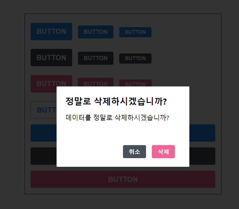
<Dialog
title="정말로 삭제하시겠습니까?"
confirmText="삭제"
cancelText="취소"
>
데이터를 정말로 삭제하시겠습니까?
</Dialog>
</>
</ThemeProvider>
);
}
export default App;그리고 회색 버튼에 스타일을 넣은이유는 핑크색 버튼과의 높이가 맞지않아 따로 추가해줬다.
<Button color="gray" style={{marginTop: "16px"}}>{cancelText}</Button>
<Button color="pink">{confirmText}</Button>
Dialog 컴포넌트를 예시 내용과 함께 AppBlock 하단에 넣어주었으며, ThemeProvider 내부는 하나의 리액트 엘리먼트로 감싸져있어야 하기 때문에 AppBlock 과 Dialog 를 fragments (<></>) 으로 감싸주었다.
지금 보면 이 Dialog 에서는 취소 버튼과 삭제 버튼의 간격이 조금 넓어보이는 느낌이 든다. 그리하여 styled-components로 컴포넌트의 스타일을 특정 상황에서 덮어쓰는 방법에 대해서 알아보겠다.
Dialog.js 에서 다음과 같이 ShortMarginButton 을 만들고 기존 Button 을 대체시켜본다.
components/Dialog.js
import React from 'react';
import styled from 'styled-components';
import Button from './Button';

const DarkBackground = styled.div`
  position: fixed;
  left: 0;
  top: 0;
  width: 100%;
  height: 100%;
  display: flex;
  align-items: center;
  justify-content: center;
  background: rgba(0, 0, 0, 0.8);
`;

const DialogBlock = styled.div`
  width: 320px;
  padding: 1.5rem;
  background: white;
  border-radius: 2px;
  h3 {
    margin: 0;
    font-size: 1.5rem;
  }
  p {
    font-size: 1.125rem;
  }
`;

const ButtonGroup = styled.div`
  margin-top: 3rem;
  display: flex;
  justify-content: flex-end;
`;

const ShortMarginButton = styled(Button)`
  &:not(:first-child) {
    margin-left: -.5rem;
  }
`;

function Dialog({ title, children, confirmText, cancelText }) {
  return (
    <DarkBackground>
      <DialogBlock>
        <h3>{title}</h3>
        <p>{children}</p>
        <ButtonGroup>
          <ShortMarginButton color="gray" style={{marginTop:"16px"}}>{cancelText}</ShortMarginButton>
          <ShortMarginButton color="pink">{confirmText}</ShortMarginButton>
        </ButtonGroup>
      </DialogBlock>
    </DarkBackground>
  );
}

Dialog.defaultProps = {
  confirmText: '확인',
  cancelText: '취소'
};

export default Dialog;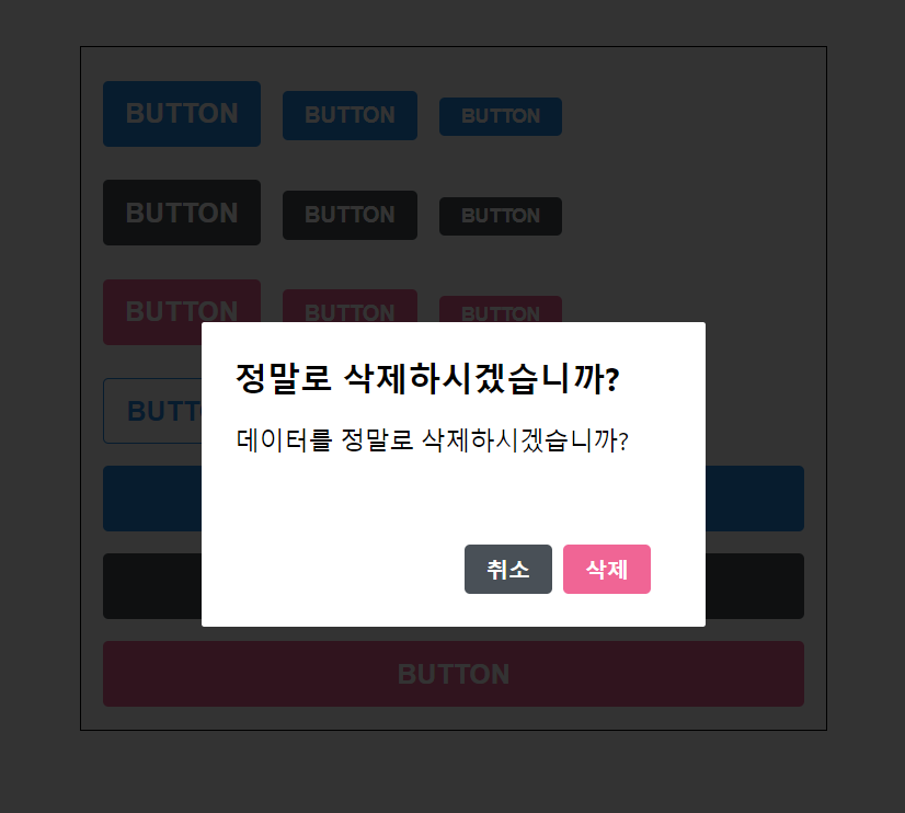
여백이 줄어들었다. 이렇게 컴포넌트의 스타일을 커스터마이징 할 때에는 해당 컴포넌트에서 className props 를 내부 엘리먼트에게 전달이 되고 있는지 확인해주어야 한다.
const MyComponent = ({ className }) => {
  return <div className={className}></div>
};

const ExtendedComponent = styled(MyComponent)`
  background: black;
`;
그리고 우리가 만든 Button 컴포넌트는 ...rest 를 통해서 전달이 되고 있다.
이제는 열고 닫을 수 있는 기능을 구현해보겠다. Dialog 에서 onConfirm 과 onCancel 을 props 로 받아오도록 하고 해당 함수들을 각 버튼들에게 onClick 으로 설정하면 된다.
그리고, visible props 도 받아와서 이 값이 false 일 때 컴포넌트에서 null 을 반환하도록 설정해준다.
components/Dialog.js
import React from 'react';
import styled from 'styled-components';
import Button from './Button';

const DarkBackground = styled.div`
  position: fixed;
  left: 0;
  top: 0;
  width: 100%;
  height: 100%;
  display: flex;
  align-items: center;
  justify-content: center;
  background: rgba(0, 0, 0, 0.8);
`;

const DialogBlock = styled.div`
  width: 320px;
  padding: 1.5rem;
  background: white;
  border-radius: 2px;
  h3 {
    margin: 0;
    font-size: 1.5rem;
  }
  p {
    font-size: 1.125rem;
  }
`;

const ButtonGroup = styled.div`
  margin-top: 3rem;
  display: flex;
  justify-content: flex-end;
`;

const ShortMarginButton = styled(Button)`
  &:not(:first-child) {
    margin-left: -0.5rem;
  }
`;

function Dialog({
  title,
  children,
  confirmText,
  cancelText,
  onConfirm,
  onCancel,
  visible
}) {
  if (!visible) return null;
  return (
    <DarkBackground>
      <DialogBlock>
        <h3>{title}</h3>
        <p>{children}</p>
        <ButtonGroup>
          <ShortMarginButton color="gray" style={{marginTop:"16px"}} onClick={onCancel}>
            {cancelText}
          </ShortMarginButton>
          <ShortMarginButton color="pink" onClick={onConfirm}>
            {confirmText}
          </ShortMarginButton>
        </ButtonGroup>
      </DialogBlock>
    </DarkBackground>
  );
}

Dialog.defaultProps = {
  confirmText: '확인',
  cancelText: '취소'
};

export default Dialog;
그 다음으로 App 컴포넌트에서 useState 를 사용하여 Dialog 를 가시성 상태를 관리해보자!
App.js
import React, { useState } from 'react';
import styled, { ThemeProvider } from 'styled-components';
import Button from './components/Button';
import Dialog from './components/Dialog';
const AppBlock = styled.div`
width: 512px;
margin: 0 auto;
margin-top: 4rem;
border: 1px solid black;
padding: 1rem;
`;
const ButtonGroup = styled.div`
& + & {
margin-top: 1rem;
}
`;
function App() {
const [dialog, setDialog] = useState(false);
const onClick = () => {
setDialog(true);
};
const onConfirm = () => {
console.log('확인');
setDialog(false);
};
const onCancel = () => {
console.log('취소');
setDialog(false);
};
return (
<ThemeProvider
theme={{
palette: {
blue: '#228be6',
gray: '#495057',
pink: '#f06595'
}
}}
>
<>
<AppBlock>
<ButtonGroup>
<Button size="large">BUTTON</Button>
<Button>BUTTON</Button>
<Button size="small">BUTTON</Button>
</ButtonGroup>
<ButtonGroup>
<Button color="gray" size="large">
BUTTON
</Button>
<Button color="gray">BUTTON</Button>
<Button color="gray" size="small">
BUTTON
</Button>
</ButtonGroup>
<ButtonGroup>
<Button color="pink" size="large">
BUTTON
</Button>
<Button color="pink">BUTTON</Button>
<Button color="pink" size="small">
BUTTON
</Button>
</ButtonGroup>
<ButtonGroup>
<Button size="large" outline>
BUTTON
</Button>
<Button color="gray" outline>
BUTTON
</Button>
<Button color="pink" size="small" outline>
BUTTON
</Button>
</ButtonGroup>
<ButtonGroup>
<Button size="large" fullWidth>
BUTTON
</Button>
<Button size="large" color="gray" fullWidth>
BUTTON
</Button>
<Button size="large" color="pink" fullWidth onClick={onClick}>
삭제
</Button>
</ButtonGroup>
</AppBlock>
<Dialog
title="정말로 삭제하시겠습니까?"
confirmText="삭제"
cancelText="취소"
onConfirm={onConfirm}
onCancel={onCancel}
visible={dialog}
>
데이터를 정말로 삭제하시겠습니까?
</Dialog>
</>
</ThemeProvider>
);
}
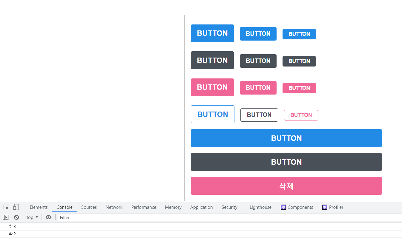
export default App;맨 아래에 있는 큰 핑크색 버튼의 이름을 "삭제" 로 변경한 후 해당 버튼을 누르면 우리가 만든 Dialog 가 보여지도록 설정을 하고, Dialog 에 onConfirm, onCancel, visible 값을 전달해주었다.
브라우저에서 삭제 버튼을 눌렀을 때 콘솔에 확인/취소 텍스트가 출력되는지도 확인해보라!
트랜지션 구현하기
이제 Dialog 의 기능은 모두 구현을 해주었다. 이번에는 Dialog 가 나타나거나 사라질 때 트랜지션 효과를 적용해보겠다.
트랜지션 효과를 적용 할 때에는 CSS Keyframe 을 사용하며, styled-components 에서 이를 사용 할 때에는 keyframes 라는 유틸을 사용한다.
Dialog가 나타날 때 DarkBackground 쪽에는 서서히 나타나는 fadeIn 효과를 주고, DialogBlock 에는 아래에서부터 위로 올라오는 효과를 보여주는 slideUp 효과를 줘보겠다. 애니메이션의 이름은 마음대로 정해둬 상관없다.
components/Dialog.js
import React from 'react';
import styled, { keyframes } from 'styled-components';
import Button from './Button';

const fadeIn = keyframes`
  from {
    opacity: 0
  }
  to {
    opacity: 1
  }
`;

const slideUp = keyframes`
  from {
    transform: translateY(200px);
  }
  to {
    transform: translateY(0px);
  }
`;

const DarkBackground = styled.div`
  position: fixed;
  left: 0;
  top: 0;
  width: 100%;
  height: 100%;
  display: flex;
  align-items: center;
  justify-content: center;
  background: rgba(0, 0, 0, 0.8);

  animation-duration: 0.25s;
  animation-timing-function: ease-out;
  animation-name: ${fadeIn};
  animation-fill-mode: forwards;
`;

const DialogBlock = styled.div`
  width: 320px;
  padding: 1.5rem;
  background: white;
  border-radius: 2px;
  h3 {
    margin: 0;
    font-size: 1.5rem;
  }
  p {
    font-size: 1.125rem;
  }

  animation-duration: 0.25s;
  animation-timing-function: ease-out;
  animation-name: ${slideUp};
  animation-fill-mode: forwards;
`;

const ButtonGroup = styled.div`
  margin-top: 3rem;
  display: flex;
  justify-content: flex-end;
`;

const ShortMarginButton = styled(Button)`
  &:not(:first-child) {
    margin-left: -0.5rem;
  }
`;

function Dialog({
  title,
  children,
  confirmText,
  cancelText,
  onConfirm,
  onCancel,
  visible
}) {
  if (!visible) return null;
  return (
    <DarkBackground>
      <DialogBlock>
        <h3>{title}</h3>
        <p>{children}</p>
        <ButtonGroup>
          <ShortMarginButton color="gray" style={{marginTop:"16px"}} onClick={onCancel}>
            {cancelText}
          </ShortMarginButton>
          <ShortMarginButton color="pink" onClick={onConfirm}>
            {confirmText}
          </ShortMarginButton>
        </ButtonGroup>
      </DialogBlock>
    </DarkBackground>
  );
}

Dialog.defaultProps = {
  confirmText: '확인',
  cancelText: '취소'
};

export default Dialog;
이렇게 하면 컴포넌트가 나타날 때 트랜지션 효과가 나타날 것이다. 이제 사라지는 트랜지션 효과도 만들어볼 것 인데, 이는 구현하기 조금 까다롭지만, 원리만 알면 굉장히 쉽다.
사라지는 효과를 구현하려면 Dialog 컴포넌트에서 두개의 로컬 상태를 관리해주어야 한다.
하나는 현재 트랜지션 효과를 보여주고 있는 중이라는 상태를 의미하는 animate, 나머지 하나는 실제로 컴포넌트가 사라지는 시점을 지연시키기 위한 localVisible 값이다.
그리고 useEffect 를 하나 작성해주어야 하는데요, visible 값이 true 에서 false 로 바뀌는 시점을 감지하여 animate 값을 true 로 바꿔주고 setTimeout 함수를 사용하여 250ms 이후 false로 바꾸어 주어야 한다.
추가적으로, !visible 조건에서 null 를 반환하는 대신에 !animate && !localVisible 조건에서 null 을 반환하도록 수정해주어야 한다.
components/Dialog.js
import React, { useState, useEffect } from 'react';
import styled, { keyframes } from 'styled-components';
import Button from './Button';

const fadeIn = keyframes`
  from {
    opacity: 0
  }
  to {
    opacity: 1
  }
`;

const slideUp = keyframes`
  from {
    transform: translateY(200px);
  }
  to {
    transform: translateY(0px);
  }
`;

const DarkBackground = styled.div`
  position: fixed;
  left: 0;
  top: 0;
  width: 100%;
  height: 100%;
  display: flex;
  align-items: center;
  justify-content: center;
  background: rgba(0, 0, 0, 0.8);

  animation-duration: 0.25s;
  animation-timing-function: ease-out;
  animation-name: ${fadeIn};
  animation-fill-mode: forwards;
`;

const DialogBlock = styled.div`
  width: 320px;
  padding: 1.5rem;
  background: white;
  border-radius: 2px;
  h3 {
    margin: 0;
    font-size: 1.5rem;
  }
  p {
    font-size: 1.125rem;
  }

  animation-duration: 0.25s;
  animation-timing-function: ease-out;
  animation-name: ${slideUp};
  animation-fill-mode: forwards;
`;

const ButtonGroup = styled.div`
  margin-top: 3rem;
  display: flex;
  justify-content: flex-end;
`;

const ShortMarginButton = styled(Button)`
  &:not(:first-child){
      margin-left:-0.5rem;
  }
`;

function Dialog({
  title,
  children,
  confirmText,
  cancelText,
  onConfirm,
  onCancel,
  visible
}) {
  const [animate, setAnimate] = useState(false);
  const [localVisible, setLocalVisible] = useState(visible);

  useEffect(() => {
    // visible 값이 true -> false 가 되는 것을 감지
    if (localVisible && !visible) {
      setAnimate(true);
      setTimeout(() => setAnimate(false), 250);
    }
    setLocalVisible(visible);
  }, [localVisible, visible]);

  if (!animate && !localVisible) return null;
  return (
    <DarkBackground>
      <DialogBlock>
        <h3>{title}</h3>
        <p>{children}</p>
        <ButtonGroup>
          <ShortMarginButton color="gray" style={{marginTop:"16px"}} onClick={onCancel}>
            {cancelText}
          </ShortMarginButton>
          <ShortMarginButton color="pink" onClick={onConfirm}>
            {confirmText}
          </ShortMarginButton>
        </ButtonGroup>
      </DialogBlock>
    </DarkBackground>
  );
}

Dialog.defaultProps = {
  confirmText: '확인',
  cancelText: '취소'
};

export default Dialog;
이제 확인 / 취소를 눌렀을 때 약간의 딜레이 이후에 Dialog 가 사라지는 것을 확인할 수 있다.
다음으로 DarkBackground 와 DialogBlock 에 disappear 라는 props 를 주어서 사라지는 효과가 나타나도록 설정을 해보겠다.
각 컴포넌트의 disappear 값은 !visible 로 해주면 된다.
components/Dialog.js
import React, { useState, useEffect } from 'react';
import styled, { keyframes, css } from 'styled-components';
import Button from './Button';

const fadeIn = keyframes`
  from {
    opacity: 0
  }
  to {
    opacity: 1
  }
`;

const fadeOut = keyframes`
  from {
    opacity: 1
  }
  to {
    opacity: 0
  }
`;

const slideUp = keyframes`
  from {
    transform: translateY(200px);
  }
  to {
    transform: translateY(0px);
  }
`;

const slideDown = keyframes`
  from {
    transform: translateY(0px);
  }
  to {
    transform: translateY(200px);
  }
`;

const DarkBackground = styled.div`
  position: fixed;
  left: 0;
  top: 0;
  width: 100%;
  height: 100%;
  display: flex;
  align-items: center;
  justify-content: center;
  background: rgba(0, 0, 0, 0.8);

  animation-duration: 0.25s;
  animation-timing-function: ease-out;
  animation-name: ${fadeIn};
  animation-fill-mode: forwards;

  ${props =>
    props.disappear &&
    css`
      animation-name: ${fadeOut};
    `}
`;

const DialogBlock = styled.div`
  width: 320px;
  padding: 1.5rem;
  background: white;
  border-radius: 2px;
  h3 {
    margin: 0;
    font-size: 1.5rem;
  }
  p {
    font-size: 1.125rem;
  }

  animation-duration: 0.25s;
  animation-timing-function: ease-out;
  animation-name: ${slideUp};
  animation-fill-mode: forwards;

  ${props =>
    props.disappear &&
    css`
      animation-name: ${slideDown};
    `}
`;

const ButtonGroup = styled.div`
  margin-top: 3rem;
  display: flex;
  justify-content: flex-end;
`;

const ShortMarginButton = styled(Button)`
  &:not(:first-child) {
    margin-left: -0.5rem;
  }
`;

function Dialog({
  title,
  children,
  confirmText,
  cancelText,
  onConfirm,
  onCancel,
  visible
}) {
  const [animate, setAnimate] = useState(false);
  const [localVisible, setLocalVisible] = useState(visible);

  useEffect(() => {
    // visible 값이 true -> false 가 되는 것을 감지
    if (localVisible && !visible) {
      setAnimate(true);
      setTimeout(() => setAnimate(false), 250);
    }
    setLocalVisible(visible);
  }, [localVisible, visible]);

  if (!animate && !localVisible) return null;
  return (
    <DarkBackground disappear={!visible}>
      <DialogBlock disappear={!visible}>
        <h3>{title}</h3>
        <p>{children}</p>
        <ButtonGroup>
          <ShortMarginButton color="gray" style={{marginTop:"16px"}} onClick={onCancel}>
            {cancelText}
          </ShortMarginButton>
          <ShortMarginButton color="pink" onClick={onConfirm}>
            {confirmText}
          </ShortMarginButton>
        </ButtonGroup>
      </DialogBlock>
    </DarkBackground>
  );
}

Dialog.defaultProps = {
  confirmText: '확인',
  cancelText: '취소'
};

export default Dialog;
트랜지션 효과가 잘 작동하는 것을 확인할 수 있다.
출처 : 벨로퍼트와 함께하는 모던 리액트
CSS in JS 의 경우 기존 css 파일을 분리하여 작성하는 방식과 개발 흐름이 조금 다르기 때문에 처음에 조금 적응 기간이 필요 할 수 있다. 하지만 적용 기간을 거치고나서는 가장 많이 쓰일 것으로 보인다.
참고 : 벨로퍼트와 함께하는 모던 리액트
느낀점 :
- 오늘은 styled-components 의 대해 알아보는 시간을 가졌다.
- 너무나도 방대한 정보들이 물밀듯이 들어오니까 약간 멘붕이 오는데 다시 한 번 시간을 가져서 공보해서 완전히 내 것으로 만들어보겠다.
