#18 벌써 리액트 입문이 끝나다?!
이 시리즈를 통해서 우리는 리액트의 기본적인 것들을 대부분 배웠다. 이 정도면 리액트가 어떻게 작동하는지 충분히 이해했다고 볼 수 있다. 앞으로 남은 것들은 지금까지 배운 것들을 어떻게 활용할 지, 그리가 다른 라이브러리들과 어떻게 사용 할 지 배우는 것 이다.
Sass
Sass (Syntactically Awesome Style Sheets: 문법적으로 짱 멋진 스타일시트)
- CSS pre-processor 로서 복잡한 작업을 쉽게 할 수 있게 해주고, 코드의 재활용성을 높임으로써 가독성을 높여주고 유지보수를 쉽게해준다.
우리는 기초적인 Sass 내용만 다루게 될 것 이다.
그리고 알아야 할 점은...
Sass 에서는 두가지의 확장자 (.scss/.sass) 를 지원한다.
Sass 가 처음 나왔을떈 sass 만 지원되었다.
sass
$font-stack:    Helvetica, sans-serif
$primary-color: #333

body
  font: 100% $font-stack
  color: $primary-color
scss
$font-stack:    Helvetica, sans-serif;
$primary-color: #333;

body {
  font: 100% $font-stack;
  color: $primary-color;
}
보통 대부분의 사람들은 scss 문법을 더 많이 사용하므로, 우리도 .scss 확장자로 스타일을 작성해보겠다.
본격적으로 시작하기 앞서, 새로운 리액트 프로젝트를 생성한다.
$ npx create-react-app styling-with-sass다음으로, 해당 프로젝트 디렉토리에 node-sass 라는 라이브러리를 설치해준다.
$ cd styling-with-sass
$ npm install sass
이 라이브러리는 Sass 를 Css 로 변환해주는 역할을 한다.
Button 컴포넌트 만들기
Button 이라는 컴포넌트르 만들어주고, Sass 를 사용해서 스타일링 해준다.
src 디렉토리에 components 디렉토리를 생성한 후, 그 안에서 Button 이라는 파일을 만들어준다.
components/Button.js
import React from 'react';
import './Button.scss';

function Button({ children }) {
  return <button className="Button">{children}</button>;
}

export default Button;
그리고, components 디렉터리에 Button.scss 파일도 만들어준다.
components/Button.scss
$blue: #228be6; // 주석 선언

.Button {
  display: inline-flex;
  color: white;
  font-weight: bold;
  outline: none;
  border-radius: 4px;
  border: none;
  cursor: pointer;

  height: 2.25rem;
  padding-left: 1rem;
  padding-right: 1rem;
  font-size: 1rem;

  background: $blue; // 주석 사용
  &:hover {
    background: lighten($blue, 10%); // 색상 10% 밝게
  }

  &:active {
    background: darken($blue, 10%); // 색상 10% 어둡게
  }
}
위의 코드에서 우리가 사용하지 못했던 문법들이 있습니다.
$blue: #228be6; 이런 식으로 스타일 파일에서 사용할 수 있는 변수를 선언할 수 있고, lighten( ) 또는 darken( ) 과 같이 색상을 더 밝게하거나 어둡게 해주는 함수도 사용 할 수 있다.
이 버튼을 App 컴포넌트에 사용해보겠다.
App.js
import React from 'react';
import './App.scss';
import Button from './components/Button';

function App() {
  return (
    <div className="App">
      <div className="buttons">
        <Button>BUTTON</Button>
      </div>
    </div>
  );
}

export default App;
기존의 App.css 를 App.scss 로 파일 이름을 수정한 뒤, 내용을 다음과 같이 작성해본다.
App.scss
.App {
width: 512px;
margin: 0 auto;
margin-top: 4rem;
border: 1px solid black;
padding: 1rem;
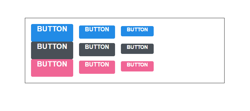
}그리고 프로젝트를 실행해주면...
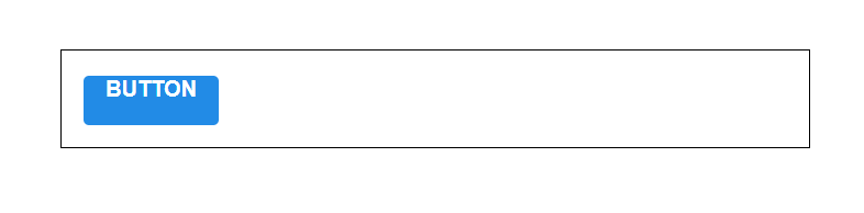
이렇게 버튼이 잘 출력이되었다.
우리는 다음과 같이 다양한 옵션들을 가진 버튼을 만들어볼 것 이다.
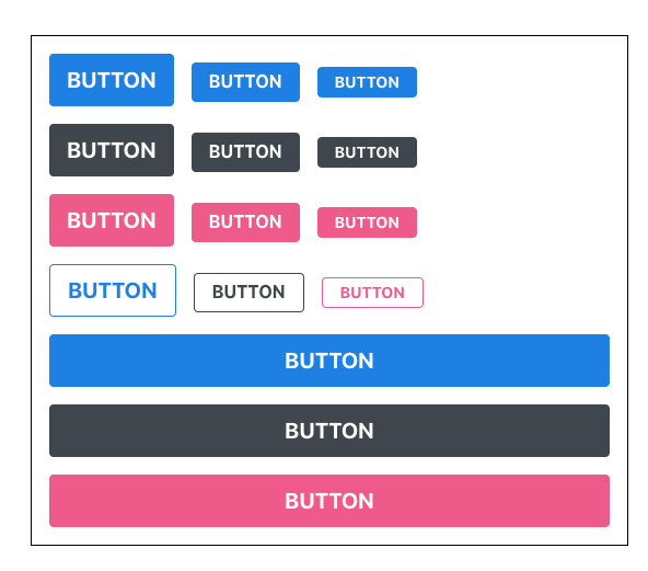
출처 : 벨로퍼트와 함께하는 모던 리액트
버튼 사이즈 조정하기
우선 버튼 크기에 large, medium, small 를 설정해줄 수 있도록 구현해 보겠다.
Button.js 에서 다음과 같이 defaultProps 를 통하여 size 의 기본값을 medium 으로 설정하고, 이 값을 button 의 className 에 넣어준다.
Button.js
import React from 'react';
import './Button.scss';

function Button({ children, size }) {
  return <button className={['Button', size].join(' ')}>{children}</button>;
}

Button.defaultProps = {
  size: 'medium'
};

export default Button;
className 에 CSS 클래스 이름을 동적으로 넣어주고 싶으면 이렇게 설정을 해줘야 한다.
className={['Button', size].join(' ')}또는 이렇게 처리 할 수 있다.
className={`Button ${size}`}하지만, 조건부로 CSS 클래스를 넣어주고 싶을때는 이렇게 문자열을 직접 조합해주는 것 보다 classnames 라는 라이브러리를 사용하는 것이 훨씬 편리하다.
classNames 를 사용하면 다음과 같이 조건부 스타일링을 할 때 함수의 인자에 문자열, 배열, 객체 등을 전달하여 손쉽게 문자열을 조합 할 수 있다.
예 )
classNames('foo', 'bar'); // => 'foo bar'
classNames('foo', { bar: true }); // => 'foo bar'
classNames({ 'foo-bar': true }); // => 'foo-bar'
classNames({ 'foo-bar': false }); // => ''
classNames({ foo: true }, { bar: true }); // => 'foo bar'
classNames({ foo: true, bar: true }); // => 'foo bar'
classNames(['foo', 'bar']); // => 'foo bar'

// 동시에 여러개의 타입으로 받아올 수 도 있습니다.
classNames('foo', { bar: true, duck: false }, 'baz', { quux: true }); // => 'foo bar baz quux'

// false, null, 0, undefined 는 무시됩니다.
classNames(null, false, 'bar', undefined, 0, 1, { baz: null }, ''); // => 'bar 1'
classNames 를 설치해주겠다.
npm install classnames설치가 완료되면 Button 에 적용해보겠다.
Button.js
import React from 'react';
import classNames from 'classnames';
import './Button.scss';

function Button({ children, size }) {
  return <button className={classNames('Button', size)}>{children}</button>;
}

Button.defaultProps = {
  size: 'medium'
};

export default Button;
이제 props 로 받은 값이 button 태그의 className 으로 전달이 될 것 이다. 이에 따라서 Button.scss 에서 다른 크기를 지정해둔다.
Button.scss
$blue: #228be6;

.Button {
  display: inline-flex;
  color: white;
  font-weight: bold;
  outline: none;
  border-radius: 4px;
  border: none;
  cursor: pointer;

  // 사이즈 관리
  &.large {
    height: 3rem;
    padding-left: 1rem;
    padding-right: 1rem;
    font-size: 1.25rem;
  }

  &.medium {
    height: 2.25rem;
    padding-left: 1rem;
    padding-right: 1rem;
    font-size: 1rem;
  }

  &.small {
    height: 1.75rem;
    font-size: 0.875rem;
    padding-left: 1rem;
    padding-right: 1rem;
  }

  background: $blue;
  &:hover {
    background: lighten($blue, 10%);
  }

  &:active {
    background: darken($blue, 10%);
  }
}
그리고 위의 코드에서
.Button {
  &.large {

  }
}
이 의미는...
.Button.large {

}
이 것을 의미한다.
두 CSS 클래스가 함께 적용되어 있으면 우리가 원하는 스타일로 꾸밀수 있다.
이제 App.js 에서 버튼들을 2개 더 렌더링하고, size 값도 설정해준다.
App.js
import React from 'react';
import './App.scss';
import Button from './components/Button';
function App() {
return (
<div className="App">
<div className="buttons">
<Button size="large">BUTTON</Button>
<Button>BUTTON</Button>
<Button size="small">BUTTON</Button>
</div>
</div>
);
}
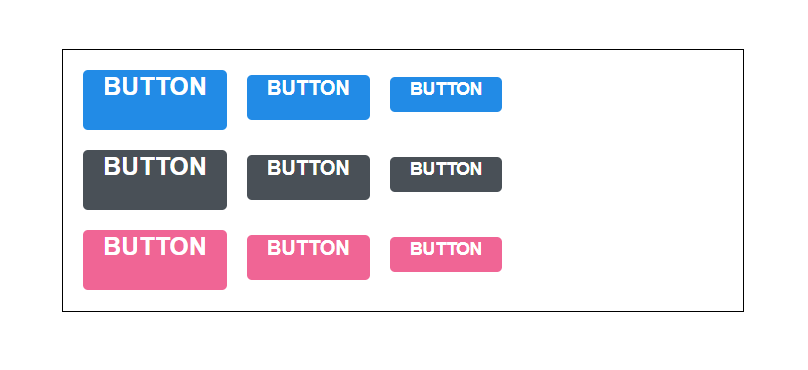
export default App;화면을 확인해보면..
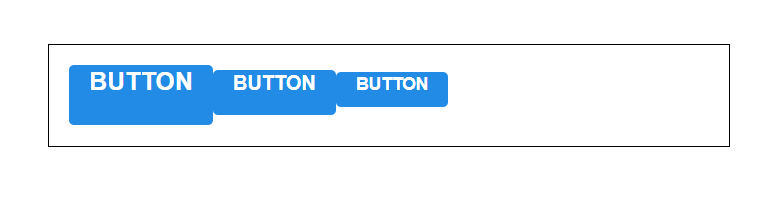
버튼을 더 예쁘게 꾸미기위해서 사이에 여백을 주겠다.
Button.scss
$blue: #228be6;

.Button {
  display: inline-flex;
  color: white;
  font-weight: bold;
  outline: none;
  border-radius: 4px;
  border: none;
  cursor: pointer;

  // 사이즈 관리
  &.large {
    height: 3rem;
    padding-left: 1rem;
    padding-right: 1rem;
    font-size: 1.25rem;
  }

  &.medium {
    height: 2.25rem;
    padding-left: 1rem;
    padding-right: 1rem;
    font-size: 1rem;
  }

  &.small {
    height: 1.75rem;
    font-size: 0.875rem;
    padding-left: 1rem;
    padding-right: 1rem;
  }

  background: $blue;
  &:hover {
    background: lighten($blue, 10%);
  }

  &:active {
    background: darken($blue, 10%);
  }

  & + & {
    margin-left: 1rem;
  }
}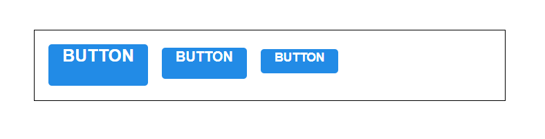
맨 아래에 & + & 가 의미 하는 것은 .Button + .Button 을 의미한다.
만약 함께 있다면 우측에 있는 버튼에 여백을 설정 한 것 이다.
버튼 색상 설정하기
이번에는 버튼에 파란색 이 외에 다른 색으로 설정하는 작업에 대해 알아보겠다.
우리는 각 버튼들을 blue, gray, pink 을 설정하도록 구현할 것 이다.
우선, Button 에서 color 라는 props 를 받아올 수 있도록 설정하고, 기본 값으로 blue 를 설정해준다. 그리고 size 와 마찬가지로 color 값도 className 에 포함시켜준다.
components/Button.js
import React from 'react';
import classNames from 'classnames';
import './Button.scss';

function Button({ children, size, color }) {
  return (
    <button className={classNames('Button', size, color)}>{children}</button>
  );
}

Button.defaultProps = {
  size: 'medium',
  color: 'blue'
};

export default Button;
이 때, Button.scss 또한 수정해준다.
components/Button.scss
$blue: #228be6;
$gray: #495057;
$pink: #f06595;

.Button {
  display: inline-flex;
  color: white;
  font-weight: bold;
  outline: none;
  border-radius: 4px;
  border: none;
  cursor: pointer;

  // 사이즈 관리
  &.large {
    height: 3rem;
    padding-left: 1rem;
    padding-right: 1rem;
    font-size: 1.25rem;
  }

  &.medium {
    height: 2.25rem;
    padding-left: 1rem;
    padding-right: 1rem;
    font-size: 1rem;
  }

  &.small {
    height: 1.75rem;
    font-size: 0.875rem;
    padding-left: 1rem;
    padding-right: 1rem;
  }

  // 색상 관리
  &.blue {
    background: $blue;
    &:hover {
      background: lighten($blue, 10%);
    }

    &:active {
      background: darken($blue, 10%);
    }
  }

  &.gray {
    background: $gray;
    &:hover {
      background: lighten($gray, 10%);
    }

    &:active {
      background: darken($gray, 10%);
    }
  }

  &.pink {
    background: $pink;
    &:hover {
      background: lighten($pink, 10%);
    }

    &:active {
      background: darken($pink, 10%);
    }
  }

  & + & {
    margin-left: 1rem;
  }
}
코드 맨위에 색상 변수를 선언해주고, 하단에서 CSS 클래스에 따라 다른 색상이 적용되도록 코드를 작성해주었다.
위의 코드를 보면 반복하는 코드들일 존재한다.
  &.blue {
    background: $blue;
    &:hover {
      background: lighten($blue, 10%);
    }

    &:active {
      background: darken($blue, 10%);
    }
  }

  &.gray {
    background: $gray;
    &:hover {
      background: lighten($gray, 10%);
    }

    &:active {
      background: darken($gray, 10%);
    }
  }

  &.pink {
    background: $pink;
    &:hover {
      background: lighten($pink, 10%);
    }

    &:active {
      background: darken($pink, 10%);
    }
  }
이렇게 반복되는 코드들은 Sass 의 mixin 이라는 기능을 사용하여 쉽게 재사용 할 수 있다. button-color라는 mixin 을 만들어서 사용해보겠다.
components/Button.scss
$blue: #228be6;
$gray: #495057;
$pink: #f06595;

@mixin button-color($color) {
  background: $color;
  &:hover {
    background: lighten($color, 10%);
  }
  &:active {
    background: darken($color, 10%);
  }
}

.Button {
  display: inline-flex;
  color: white;
  font-weight: bold;
  outline: none;
  border-radius: 4px;
  border: none;
  cursor: pointer;

  // 사이즈 관리
  &.large {
    height: 3rem;
    padding-left: 1rem;
    padding-right: 1rem;
    font-size: 1.25rem;
  }

  &.medium {
    height: 2.25rem;
    padding-left: 1rem;
    padding-right: 1rem;
    font-size: 1rem;
  }

  &.small {
    height: 1.75rem;
    font-size: 0.875rem;
    padding-left: 1rem;
    padding-right: 1rem;
  }

  // 색상 관리
  &.blue {
    @include button-color($blue);
  }

  &.gray {
    @include button-color($gray);
  }

  &.pink {
    @include button-color($pink);
  }

  & + & {
    margin-left: 1rem;
  }
}
이 mixin 이라는 기능을 사용하니 코드가 훨씬 깔끔해보인다.
이제, 이 색상이 잘 이루어지고 있는지 App 컴포넌트에서 버튼들을 렌더링해준다.
App.js
import React from 'react';
import './App.scss';
import Button from './components/Button';

function App() {
  return (
    <div className="App">
      <div className="buttons">
        <Button size="large">BUTTON</Button>
        <Button>BUTTON</Button>
        <Button size="small">BUTTON</Button>
      </div>
      <div className="buttons">
        <Button size="large" color="gray">
          BUTTON
        </Button>
        <Button color="gray">BUTTON</Button>
        <Button size="small" color="gray">
          BUTTON
        </Button>
      </div>
      <div className="buttons">
        <Button size="large" color="pink">
          BUTTON
        </Button>
        <Button color="pink">BUTTON</Button>
        <Button size="small" color="pink">
          BUTTON
        </Button>
      </div>
    </div>
  );
}

export default App;
이렇게 화면이 보일 것 이다.
보면은 맨 왼쪽에 있는 버튼들이 너무 서로 붙여있다. 다음과 같이 수정해준다.
App.scss
.App {
  width: 512px;
  margin: 0 auto;
  margin-top: 4rem;
  border: 1px solid black;
  padding: 1rem;
  .buttons + .buttons {
    margin-top: 1rem;
  }
}
그러면 이제는 잘 배치가 되어서 나타난다.
outline 옵션 만들기
이번에는 outline 이라는 옵션을 주면 버튼에서 테두리만 보여지도록 설정을 해보겠다.
Button.js 를 다음과 같이 수정해겠다.
components/Button.js
import React from 'react';
import classNames from 'classnames';
import './Button.scss';

function Button({ children, size, color, outline }) {
  return (
    <button className={classNames('Button', size, color, { outline })}>
      {children}
    </button>
  );
}

Button.defaultProps = {
  size: 'medium',
  color: 'blue'
};

export default Button;
여기서는 outline 값을 props 로 받아와서 객체 안에 집어 넣은 다음에 classNames() 에 포함시켜줬다.
이렇게 하면 outline 값이 true 일 때에만 button 에 outline CSS 클래스가 적용이된다.
만약에 outline CSS 클래스가 존재한다면, 테두리만 보여지도록 스타일 코드도 수정해준다.
components/Button.scss
$blue: #228be6;
$gray: #495057;
$pink: #f06595;

@mixin button-color($color) {
  background: $color;
  &:hover {
    background: lighten($color, 10%);
  }
  &:active {
    background: darken($color, 10%);
  }
  &.outline {
    color: $color;
    background: none;
    border: 1px solid $color;
    &:hover {
      background: $color;
      color: white;
    }
  }
}

.Button {
  display: inline-flex;
  color: white;
  font-weight: bold;
  outline: none;
  border-radius: 4px;
  border: none;
  cursor: pointer;

  // 사이즈 관리
  &.large {
    height: 3rem;
    padding-left: 1rem;
    padding-right: 1rem;
    font-size: 1.25rem;
  }

  &.medium {
    height: 2.25rem;
    padding-left: 1rem;
    padding-right: 1rem;
    font-size: 1rem;
  }

  &.small {
    height: 1.75rem;
    font-size: 0.875rem;
    padding-left: 1rem;
    padding-right: 1rem;
  }

  // 색상 관리
  &.blue {
    @include button-color($blue);
  }

  &.gray {
    @include button-color($gray);
  }

  &.pink {
    @include button-color($pink);
  }

  & + & {
    margin-left: 1rem;
  }
}
우리는 mixin 을 만들었기 때문에 작업이 매우 원활하게 되었다.
그러면 이제 App 에서 사용해보겠다.
App.js
import React from 'react';
import './App.scss';
import Button from './components/Button';

function App() {
  return (
    <div className="App">
      <div className="buttons">
        <Button size="large">BUTTON</Button>
        <Button>BUTTON</Button>
        <Button size="small">BUTTON</Button>
      </div>
      <div className="buttons">
        <Button size="large" color="gray">
          BUTTON
        </Button>
        <Button color="gray">BUTTON</Button>
        <Button size="small" color="gray">
          BUTTON
        </Button>
      </div>
      <div className="buttons">
        <Button size="large" color="pink">
          BUTTON
        </Button>
        <Button color="pink">BUTTON</Button>
        <Button size="small" color="pink">
          BUTTON
        </Button>
      </div>
      <div className="buttons">
        <Button size="large" color="blue" outline>
          BUTTON
        </Button>
        <Button color="gray" outline>
          BUTTON
        </Button>
        <Button size="small" color="pink" outline>
          BUTTON
        </Button>
      </div>
    </div>
  );
}

export default App;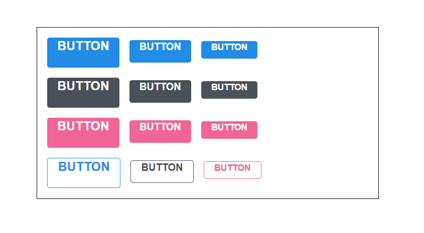
전체 너비 차지하는 옵션
이번에는 fullWidth 라는 옵션이 있으면 버튼이 전체 너비를 차지하도록 구현해보겠다. outline 구현 방식과 매우 비슷하다.
Button.js 을 다음과 같이 수정해준다.
Button.js
import React from 'react';
import classNames from 'classnames';
import './Button.scss';

function Button({ children, size, color, outline, fullWidth }) {
  return (
    <button
      className={classNames('Button', size, color, { outline, fullWidth })}
    >
      {children}
    </button>
  );
}

Button.defaultProps = {
  size: 'medium',
  color: 'blue'
};

export default Button;
버튼의 스타일도 수정해준다.
components/Button.scss
$blue: #228be6;
$gray: #495057;
$pink: #f06595;

@mixin button-color($color) {
  background: $color;
  &:hover {
    background: lighten($color, 10%);
  }
  &:active {
    background: darken($color, 10%);
  }
  &.outline {
    color: $color;
    background: none;
    border: 1px solid $color;
    &:hover {
      background: $color;
      color: white;
    }
  }
}

.Button {
  display: inline-flex;
  color: white;
  font-weight: bold;
  outline: none;
  border-radius: 4px;
  border: none;
  cursor: pointer;

  // 사이즈 관리
  &.large {
    height: 3rem;
    padding-left: 1rem;
    padding-right: 1rem;
    font-size: 1.25rem;
  }

  &.medium {
    height: 2.25rem;
    padding-left: 1rem;
    padding-right: 1rem;
    font-size: 1rem;
  }

  &.small {
    height: 1.75rem;
    font-size: 0.875rem;
    padding-left: 1rem;
    padding-right: 1rem;
  }

  // 색상 관리
  &.blue {
    @include button-color($blue);
  }

  &.gray {
    @include button-color($gray);
  }

  &.pink {
    @include button-color($pink);
  }

  & + & {
    margin-left: 1rem;
  }

  &.fullWidth {
    width: 100%;
    justify-content: center;
    & + & {
      margin-left: 0;
      margin-top: 1rem;
    }
  }
}
완료가되면 App 에서 사용해보자!
App.js
import React from 'react';
import './App.scss';
import Button from './components/Button';
function App() {
return (
<div className="App">
<div className="buttons">
<Button size="large">BUTTON</Button>
<Button>BUTTON</Button>
<Button size="small">BUTTON</Button>
</div>
<div className="buttons">
<Button size="large" color="gray">
BUTTON
</Button>
<Button color="gray">BUTTON</Button>
<Button size="small" color="gray">
BUTTON
</Button>
</div>
<div className="buttons">
<Button size="large" color="pink">
BUTTON
</Button>
<Button color="pink">BUTTON</Button>
<Button size="small" color="pink">
BUTTON
</Button>
</div>
<div className="buttons">
<Button size="large" color="blue" outline>
BUTTON
</Button>
<Button color="gray" outline>
BUTTON
</Button>
<Button size="small" color="pink" outline>
BUTTON
</Button>
</div>
<div className="buttons">
<Button size="large" fullWidth>
BUTTON
</Button>
<Button size="large" fullWidth color="gray">
BUTTON
</Button>
<Button size="large" fullWidth color="pink">
BUTTON
</Button>
</div>
</div>
);
}
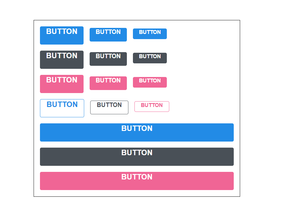
export default App;화면으로는...
...rest props 전달하기
버튼 컴포넌트를 다 만들었다면, 우리는 이제 컴포넌트에 onClick 을 설정을 해준다.
components/Button.js
import React from 'react';
import classNames from 'classnames';
import './Button.scss';

function Button({ children, size, color, outline, fullWidth, onClick }) {
  return (
    <button
      className={classNames('Button', size, color, { outline, fullWidth })}
      onClick={onClick}
    >
      {children}
    </button>
  );
}

Button.defaultProps = {
  size: 'medium',
  color: 'blue'
};

export default Button;
만약 onMouseMove 이벤트를 관리한다면...
import React from 'react';
import classNames from 'classnames';
import './Button.scss';

function Button({ children, size, color, outline, fullWidth, onClick, onMouseMove }) {
  return (
    <button
      className={classNames('Button', size, color, { outline, fullWidth })}
      onClick={onClick}
      onMouseMove={onMouseMove}
    >
      {children}
    </button>
  );
}

Button.defaultProps = {
  size: 'medium',
  color: 'blue'
};

export default Button;
필요한 이벤트가 있을때 마다 매번 이렇게 넣어주는것은 비효율적이다.
이러한 문제를 해결해줄 수 있는 문법이 바로 spread 와 rest 이다.
이 문법은 주로 배열과 객체, 함수의 파라미터, 인자를 다룰 때 사용하는데, 컴포넌트에서도 사용을 할 수 있다.
components/Button.js
import React from 'react';
import classNames from 'classnames';
import './Button.scss';

function Button({ children, size, color, outline, fullWidth, ...rest }) {
  return (
    <button
      className={classNames('Button', size, color, { outline, fullWidth })}
      {...rest}
    >
      {children}
    </button>
  );
}

Button.defaultProps = {
  size: 'medium',
  color: 'blue'
};

export default Button;
이렇게 ...rest를 사용해서 우리가 지정한 props 를 제외한 값들을 rest 라는 객체에 모아주고, 버튼 태그에 {...rest} 를 해주면, rest 안에 있는 객체안에 있는 값들을 모두 버튼 태그에 설정을 해둔다.
만약에 App.js 에서 사용한 가장 첫번째 버튼에 onClick 을 설정해준다면...
App.js
import React from 'react';
import './App.scss';
import Button from './components/Button';

function App() {
  return (
    <div className="App">
      <div className="buttons">
        <Button size="large" onClick={() => console.log('클릭됐다!')}>
          BUTTON
        </Button>
        <Button>BUTTON</Button>
        <Button size="small">BUTTON</Button>
      </div>
      <div className="buttons">
        <Button size="large" color="gray">
          BUTTON
        </Button>
        <Button color="gray">BUTTON</Button>
        <Button size="small" color="gray">
          BUTTON
        </Button>
      </div>
      <div className="buttons">
        <Button size="large" color="pink">
          BUTTON
        </Button>
        <Button color="pink">BUTTON</Button>
        <Button size="small" color="pink">
          BUTTON
        </Button>
      </div>
      <div className="buttons">
        <Button size="large" color="blue" outline>
          BUTTON
        </Button>
        <Button color="gray" outline>
          BUTTON
        </Button>
        <Button size="small" color="pink" outline>
          BUTTON
        </Button>
      </div>
      <div className="buttons">
        <Button size="large" fullWidth>
          BUTTON
        </Button>
        <Button size="large" color="gray" fullWidth>
          BUTTON
        </Button>
        <Button size="large" color="pink" fullWidth>
          BUTTON
        </Button>
      </div>
    </div>
  );
}

export default App;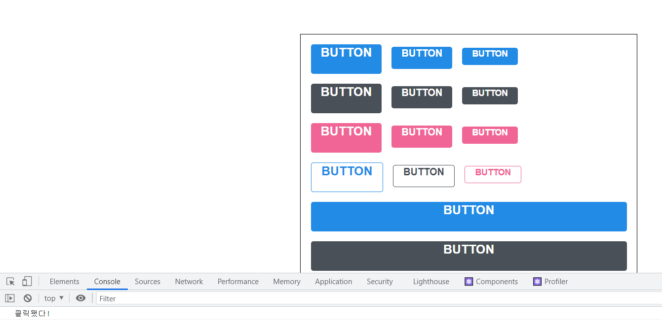
버튼을 클릭했을 때, onClick 이 잘 호출된다.
그리하여 이렇게 컴포넌트가 어떤 props 를 받을 지 확실치는 않지만 그대로 다른 컴포넌트 또는 HTML 태그에 전달을 해주어야 하는 상황에는 이렇게 ...rest 문법을 활용하면 된다.
참고 : 벨로퍼트와 함께하는 모던 리액트
느낀점 :
- Sass 에 대해 알아가면서 확실히 일반 css 보다 편리하며 구조도 훨씬 가독성이 있다.
