TIL DAY 204
오늘 배운 일
✔️ CSS Layout
🎸 Grid [part VI]
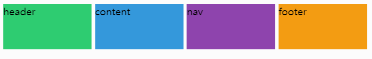
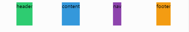
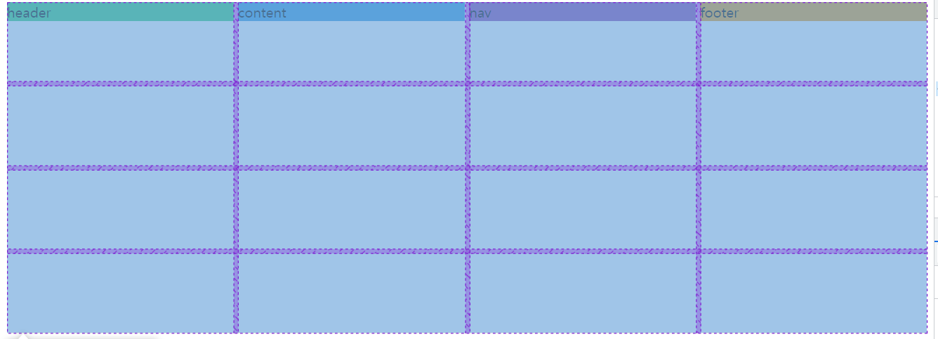
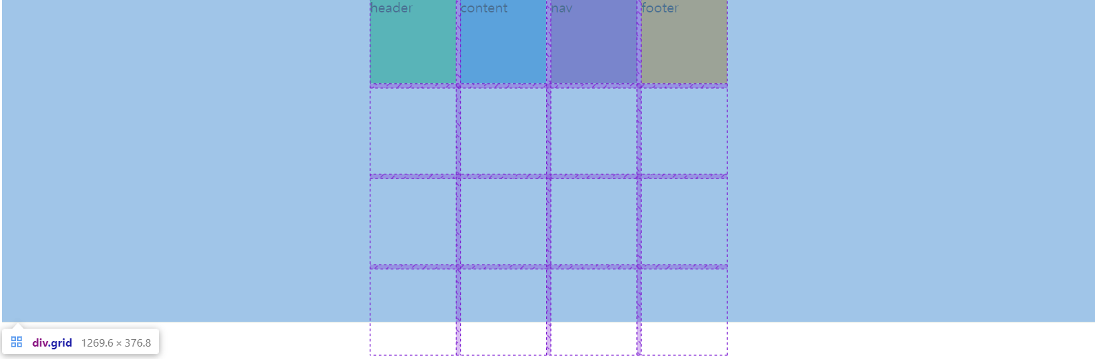
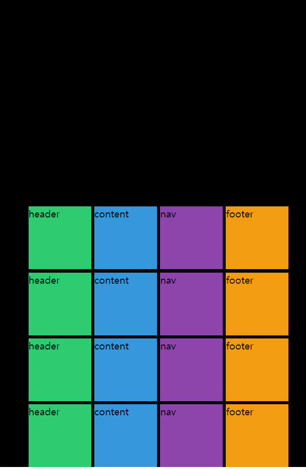
시작하기 앞서, 전의 코드를 수정해서 4x4 모양으로 다시 만들어보자!
index.html
<body>
  <div class="grid">
    <div class="header">header</div>
    <div class="content">content</div>
    <div class="nav">nav</div>
    <div class="footer">footer</div>
  </div>
</body>
style.css
.grid {
  display: grid;
  gap: 5px;
  height: 50vh;
  grid-template-columns: repeat(4, 1fr);
  grid-template-rows: repeat(4, 1fr);
}

.header {
  background-color: #2ecc71;
}

.content {
  background-color: #3498db;
}

.nav {
  background-color: #8e44ad;
}

.footer {
  background-color: #f39c12;
}
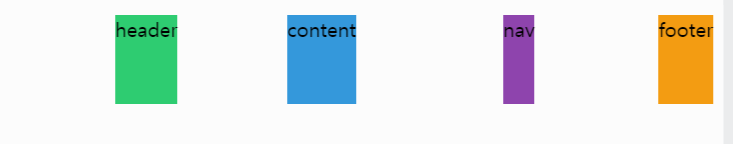
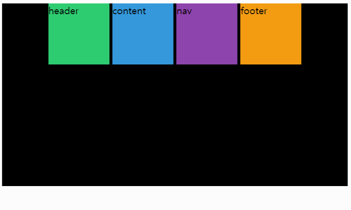
이번에 배울게 될 것은 justify-items 와 align-items 이다!
이 프로퍼티들은 부모 요소에 쓰인다. (grid container)
justify-items 의 기본값은 stretch 이다.
stretch 를 하면 grid container (부모 요소)가 grid 를 갖고 grid 를 늘려서 grid 자체를 채우도록 한다.
그럼 start 라고 바꾸면 어떨까?
.grid {
  display: grid;
  gap: 5px;
  height: 50vh;
  grid-template-columns: repeat(4, 1fr);
  grid-template-rows: repeat(4, 1fr);
  justify-items: start;
}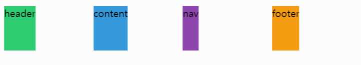
item 들이 처음부터 시작해서 글자 크기대로 길이를 맞추었다.
우리의 grid 박스를 확인해보면...
grid 는 여전히 같은 크기의 column 과 row 를 갖고 있다.
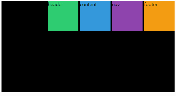
그럼 center (중앙) 으로 하면 어떨까?
.grid {
  display: grid;
  gap: 5px;
  height: 50vh;
  grid-template-columns: repeat(4, 1fr);
  grid-template-rows: repeat(4, 1fr);
  justify-items: center;
}
item 들이 grid 박스의 중앙으로 정렬된다.
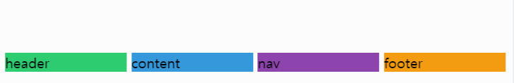
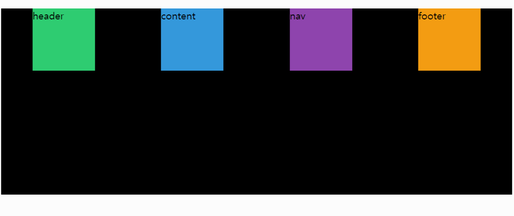
다음으로 end 를 해보면?
.grid {
  display: grid;
  gap: 5px;
  height: 50vh;
  grid-template-columns: repeat(4, 1fr);
  grid-template-rows: repeat(4, 1fr);
  justify-items: end;
}
end 는 start 와 반대로 오른쪽 끝으로 정렬한다.
다시 말해, justify-items 는 수평으로 정렬시킨다.
그럼 수직으로 정렬시키는 것은 나머지 align-items 인것이다.
코드를 살짝 justify-items 에서 align-items 수정해보면...
.grid {
  display: grid;
  gap: 5px;
  height: 50vh;
  grid-template-columns: repeat(4, 1fr);
  grid-template-rows: repeat(4, 1fr);
  align-items: end;
}
가로로 길게 늘렸고 수직으로는 맨 아래로 정렬되었다.
아까처럼 center 를 해주면...
맨 위로 올리고 싶으면 바로 start 를 쓰면 된다!
justify-items 처럼 align-items 또한, 기본값으로 stretch 를 갖는다.
그럼 둘 다 같이 써보자!
.grid {
  display: grid;
  gap: 5px;
  height: 50vh;
  grid-template-columns: repeat(4, 1fr);
  grid-template-rows: repeat(4, 1fr);
  align-items: end;
  justify-items: end;
}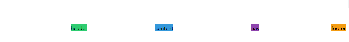
그럼 만약에 요소에 아무런 내용이 없으면 어떻게 될까?
index.html
<body>
  <div class="grid">
    <div class="header"></div>
    <div class="content"></div>
    <div class="nav"></div>
    <div class="footer"></div>
  </div>
</body>
아무 것도 볼 수 없다.
그 이유는 높이와 너비가 없기 때문이다.
이전에 볼 수 있었던 건 div 의 높이와 너비가 글자였기 때문이다.
그럼 자식들한테 높이를 지정해주면 어떨까?
style.css
.grid {
  display: grid;
  gap: 5px;
  height: 50vh;
  grid-template-columns: repeat(4, 1fr);
  grid-template-rows: repeat(4, 1fr);
  align-items: end;
  justify-items: end;
}

.header {
  background-color: #2ecc71;
  height: 40px;
  width: 40px;
}

.content {
  background-color: #3498db;
  height: 40px;
  width: 40px;
}

.nav {
  background-color: #8e44ad;
  height: 40px;
  width: 40px;
}

.footer {
  background-color: #f39c12;
  height: 40px;
  width: 40px;
}
높이와 너비가 똑같이 40px 를 가지고 있다.
결과를 확인해보면...
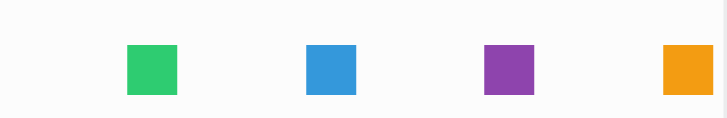
40px 정사각형들을 볼 수 있다.
이것들은 grid 안에 있다.
다시 복습!
- justify-items 는 수평으로!
- align-items 는 수직!
- grid 박스 크기 만큼 늘릴 수 있고 줄일 수 있다.
만약 둘다 쓰기 귀찮으면 지름길이 존재한다.
그것은 바로 place-items 을 쓰는것이다.
첫 번쨰는 수직이고 그 다음엔 수평이다.
그러니까 정확히는...
place-items: y x;이러한 구조다!
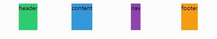
적용하기 전에 다시 원상복구 해준다.
index.html
<body>
  <div class="grid">
    <div class="header">header</div>
    <div class="content">content</div>
    <div class="nav">nav</div>
    <div class="footer">footer</div>
  </div>
</body>
style.css
.grid {
  display: grid;
  gap: 5px;
  height: 50vh;
  grid-template-columns: repeat(4, 1fr);
  grid-template-rows: repeat(4, 1fr);
}

.header {
  background-color: #2ecc71;
}

.content {
  background-color: #3498db;
}

.nav {
  background-color: #8e44ad;
}

.footer {
  background-color: #f39c12;
}
그럼 place-items 를 적용해보자!
.grid {
  display: grid;
  gap: 5px;
  height: 50vh;
  grid-template-columns: repeat(4, 1fr);
  grid-template-rows: repeat(4, 1fr);
  place-items: stretch center;
}
수직으로 늘어나고 수평으로는 가운데이다.
다음으로 넘어가서...
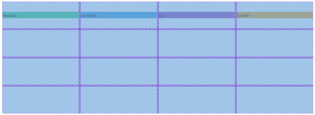
우리는 더 이상 fr 를 쓰지 않을 것이다.
100px 를 사용한다!
.grid {
  display: grid;
  gap: 5px;
  height: 50vh;
  grid-template-columns: repeat(4, 100px);
  grid-template-rows: repeat(4, 100px);
}
그 이유는 justify 와 align content 를 알아볼 것 이다.
content 는 전체 grid 이다.
justify-content 의 기본값은 start 이다.
그러면 center 라고 해주면 어떨까?
.grid {
  display: grid;
  gap: 5px;
  height: 50vh;
  grid-template-columns: repeat(4, 100px);
  grid-template-rows: repeat(4, 100px);
  justify-content: center;
}
center 로 하니 grid 를 중앙에 놔둔다.
grid element 를 확인해보면...
.grid {
  background: #000;
  display: grid;
  gap: 5px;
  height: 50vh;
  grid-template-columns: repeat(4, 100px);
  grid-template-rows: repeat(4, 100px);
  justify-content: center;
}
100% width 로 되어있다.
justify-content 는 grid 를 움직이는 것이다.
grid-container 는 100%의 width 이다.
그럼 end 라고 해보면...
space-around 도 해보면...
이게 grid 의 content 를 정렬하는 방법이다.
justify-content 는 수평(horizontal)적인 것들만 얘기하는 것이다.
그럼 다음으로 align-content 를 알아보면...
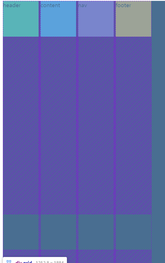
아 그리고 중요한게 크기를 안 가지고 있으면 아무것도 정렬할 수 없다.
그럼 높이를 250vh 로 지정해주자!
.grid {
  background: #000;
  display: grid;
  gap: 5px;
  height: 250vh;
  grid-template-columns: repeat(4, 100px);
  grid-template-rows: repeat(4, 100px);
  align-content: space-between;
}
화면이 너무 커서 내용들을 복사해서 화면을 보면...
<body>
  <div class="grid">
    <div class="header">header</div>
    <div class="content">content</div>
    <div class="nav">nav</div>
    <div class="footer">footer</div>
    <div class="header">header</div>
    <div class="content">content</div>
    <div class="nav">nav</div>
    <div class="footer">footer</div>
    <div class="header">header</div>
    <div class="content">content</div>
    <div class="nav">nav</div>
    <div class="footer">footer</div>
    <div class="header">header</div>
    <div class="content">content</div>
    <div class="nav">nav</div>
    <div class="footer">footer</div>
  </div>
</body>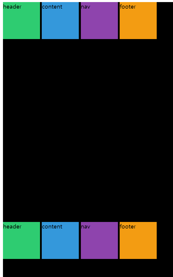
grid 는 여전히 크지만, 각 박스들은 잘 정렬되어 있다.
그럼 start 로 해주면...
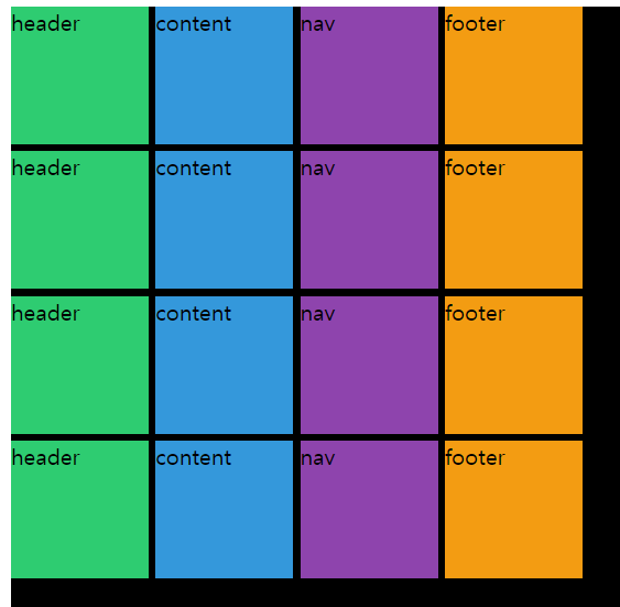
그럼 row 를 100px 대신 1fr 로 해보면 어떻게 바뀔까?
.grid {
  background: #000;
  display: grid;
  gap: 5px;
  height: 250vh;
  grid-template-columns: repeat(4, 100px);
  grid-template-rows: repeat(4, 1fr);
  align-content: start;
}
박스들이 grid 끝까지 늘어난다.
justify-content 와 align-content 완전 다른것이다.
justify-content 는 grid 를 수평적으로 움직이는 것이고 align 은 수직적으로 움직인다.
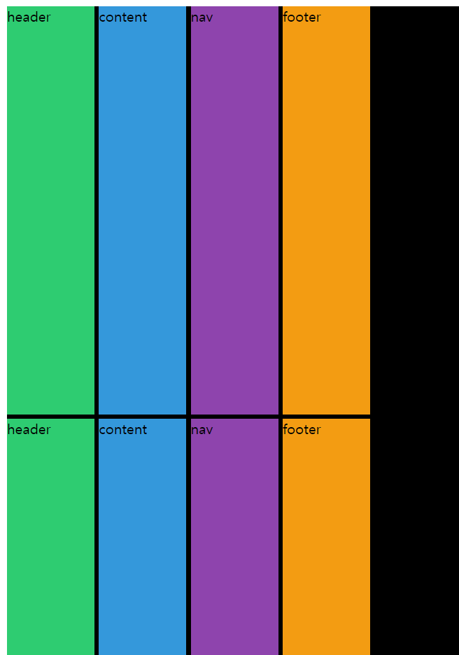
그럼 이 두개를 한 번에 쓸 수 있는 방법은 바로...
place-content 를 사용하면 된다.
place-items 과 마찬가지로 처음은 수직으로 움직이고 두 번째는 수평으로 움직인다.
.grid {
  background: #000;
  display: grid;
  gap: 5px;
  height: 250vh;
  grid-template-columns: repeat(4, 100px);
  grid-template-rows: repeat(4, 100px);
  place-content: end center;
}
끝에다가 수직적으로 정렬을 했고, 그리고 수평적으로 중앙으로 움직였다.
끝으로 :
- 오늘은 grid 의 item 을 움직여서 정렬시키거나 박스들 다같이 움직여서 정렬를 해보았다.
- 확실히 flex 를 미리 공부하니, 쉽게 이해하가 가고 편리한 기능 같다.
