TIL DAY 201

오늘 배운 일
✔️ CSS Layout
🎴 Grid [part III]
저번에 이어서 하자면, 필요없는 template-areas 부분들은 다 지워준다.
index.html
<body>
  <div class="grid">
    <div class="header"></div>
    <div class="content"></div>
    <div class="nav"></div>
    <div class="footer"></div>
  </div>
</body>
style.css
.grid {
  display: grid;
  grid-template-columns: auto 200px;
  grid-template-rows: 100px repeat(2, 200px) 100px;
}

.header {
  background-color: #2ecc71;
}

.content {
  background-color: #3498db;
}

.nav {
  background-color: #8e44ad;
}

.footer {
  background-color: #f39c12;
}
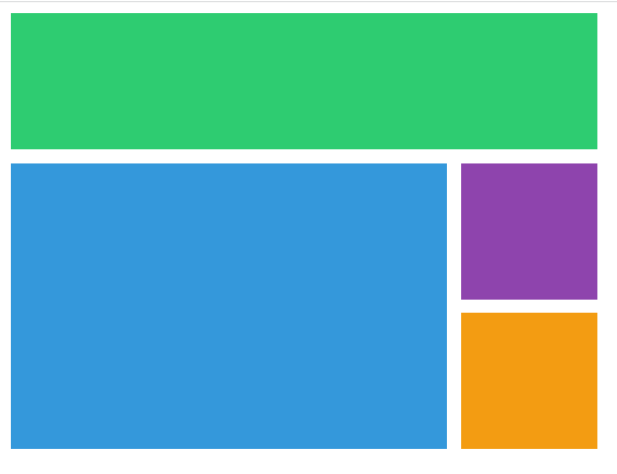
전에 배웠던걸 생각해보면, header 가 맨 위에 있고 content 와 nav 가 중간에 그리고 footer 가 맨 마지막에 자리잡았었다.
grid area 를 사용하지 않고, column 과 row 의 숫자를 사용해서 해 볼것이다!
그리고 약간 코드를 수정해준다.
style.css
.grid {
  display: grid;
  grid-template-columns: repeat(4, 100px);
  grid-template-rows: repeat(4, 100px);
}

.header {
  background-color: #2ecc71;
}

.content {
  background-color: #3498db;
}

.nav {
  background-color: #8e44ad;
}

.footer {
  background-color: #f39c12;
}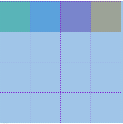
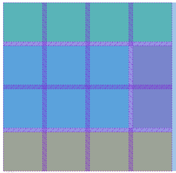
4x4 행과 열이 생겼다.
이제는 grid 의 자식 요소한테 column 과 row 가 어디서 시작하고 끝나는지 말해줄 수 있다.
먼저 header 부터 코드를 수정해주면...
.header {
  background-color: #2ecc71;
  grid-column-start: 1;
  grid-column-end: 2;
}
column 의 처음을 1로 지정하고 마지막을 2로 지정해두었다.
결과를 보면...
아무런 변화가 없다.
그 이유는 start 와 end 는 column 을 얘기하는게 아니다.
줄을 말하는 것이다.
grid 한테 gap 을 주면...
.grid {
  display: grid;
  gap: 10px;
  grid-template-columns: repeat(4, 100px);
  grid-template-rows: repeat(4, 100px);
}
그럼 end 를 3을 주면 어떨까?
아까 말했듯이, 줄을 의미하는 것인데 첫 번째 줄이...

두 번째 줄은...

세 번쨰는 당연히...

초록색 박스 맨 끝 줄을 의미한다.
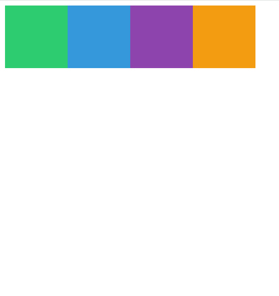
그러면 end 를 5로 해줘야 끝으로 갈 것이다.
.header {
  background-color: #2ecc71;
  grid-column-start: 1;
  grid-column-end: 5;
}
줄 1부터 해서 5까지 늘어난 것 이다.
다음은 content 로 가보자!
.content {
  background-color: #3498db;
  grid-column-start: 1;
  grid-column-end: 4;
}
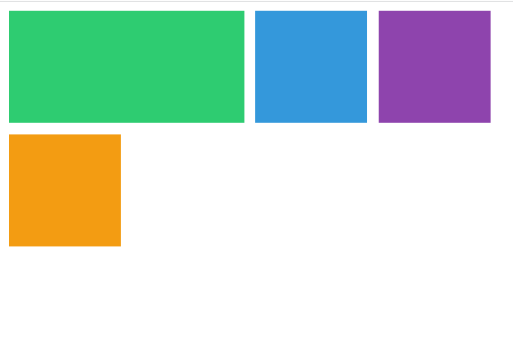
처음은 1이고 (맨 처음 줄) 그리고 end 를 4로 하니, nav 가 한칸 생겼다.
nav 는 특별히 바꿀게 없다.
하지만 문제는 content 를 똑같이 세 번째 행에서도 늘이고 싶다.
content 는 두 번째 행에서 시작해서 세 번째 행에서 끝나야 한다.
그럼 본격적으로 해보면, grid-row-start 를 1로 해보면 어떨까?
.content {
  background-color: #3498db;
  grid-column-start: 1;
  grid-column-end: 4;
  grid-row-start: 1;
}
header 와 content 가 서로 위치를 바꾸었다.
그 이유는 정렬이 다르기 때문이다.
그럼 다시 start 를 2로 바꾸면...

원상복구가 되었다.
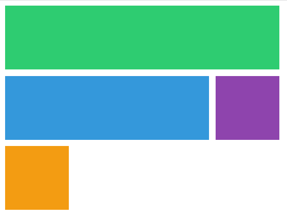
row 의 마지막을 4로 해두면...
.content {
  background-color: #3498db;
  grid-column-start: 1;
  grid-column-end: 4;
  grid-row-start: 2;
  grid-row-end: 4;
}
얼추 우리가 원하는 layout 으로 바뀌고 있는걸 볼 수 있다.
nav 와 footer 를 수정해주어야 하는데, 먼저 nav 먼저 바꾸어보자!
.nav {
  background-color: #8e44ad;
  grid-row-start: 2;
  grid-row-end: 4
}
마지막으로 footer 를 수정해보자면...
.footer {
  background-color: #f39c12;
  grid-column-start: 1;
  grid-column-end: 5;
}
명심할것은 우리는 grid 를 공부하고 있다.
가로 세로 길이를 늘려서 우리가 작성한 4x4 박스에 맞춰서 늘렸다.
그럼 이제 손쉬은 방법을 이용해서 만들어 보자!
.header {
  background-color: #2ecc71;
  grid-column: 1 / 5;
}
start 와 end 를 쓰지않고, grid-column 을 작성하고 값으로는
시작하는 숫자 / 끝나는 숫자 이렇게 작성하면 된다.
다 바꿔보면...
style.css
.grid {
  display: grid;
  gap: 10px;
  grid-template-columns: repeat(4, 100px);
  grid-template-rows: repeat(4, 100px);
}

.header {
  background-color: #2ecc71;
  grid-column: 1 / 5;
}

.content {
  background-color: #3498db;
  grid-column: 1 / 4;
  grid-row: 2 / 4;
}

.nav {
  background-color: #8e44ad;
  grid-row: 2 / 4
}

.footer {
  background-color: #f39c12;
  grid-column: 1 / 5;
}
이것도 괜찬은데 더 쉬운 방법으로 할 수 있다.
예를 들어...
grid-row: 2 / 4;row 2에서 시작해서 4로 끝나는건 이해한데, 문제는 1부터 끝까지 갈 때 일어난다.
언제부터 시작하고 끝나는지를 적는거 보단 얼마나 큰지를 적는게 더 낫다.
1부터 5에서 끝나는 것 대신에 첫 번째 줄부터 마지막 줄까지를 적는게 더 편하다.
그리하여 마지막을 -1 로 적어주면 된다!
grid-column: 1 / -1;
1이 왼쪽 끝부터 시작하면, -1은 오른쪽 맨 끝부터 시작한다.
이게 정말 유용한게 몇 개의 줄이 있는지 모를 때 사용하면 편리하다!
그래서 스타일들을 다 바꿔보자면...
style.css
.grid {
  display: grid;
  gap: 10px;
  grid-template-columns: repeat(4, 100px);
  grid-template-rows: repeat(4, 100px);
}

.header {
  background-color: #2ecc71;
  grid-column: 1 / -1;
}

.content {
  background-color: #3498db;
  grid-column: 1 / -2;
  grid-row: 2 / 4;
}

.nav {
  background-color: #8e44ad;
  grid-row: 2 / 4
}

.footer {
  background-color: #f39c12;
  grid-column: 1 / -1;
}
하지만 이것도 귀찮으면 더 편리한 지름길이 존재한다!
grid-column 에 시작과 끝을 적는 대신에 span 을 사용할 수 있다.
span 은 시작점과 끝점을 적는걸 대신한다.
작성방법은 span 을 써주고 얼마나 많은 사각형을 (cell)을 차지하는지 적어주는 것이다.
예 )
.footer {
  background-color: #f39c12;
  grid-column: span 4;
}
박스 4x4 로 이루어졌으니, span 4 를 작성해주면...

아무것도 바뀌지 않았다.
그러면 content 도 바꿔보면...
.content {
  background-color: #3498db;
  grid-column: 1 / -2;
  grid-row: span 2;
}
2 공간을 차지하니 span 2 를 적어주면...

grid 가 엉망이 됐는데 왜냐하면 content 가 어디서 시작하는지 적지 않았기 때문이다.
nav 는 시작점이 있기 때문에 중간에 위에처럼 공간을 차지한 것이다.
그러면 해결방법은...
.content {
  background-color: #3498db;
  grid-column: 1 / -2;
  grid-row: 2 / span 2;
}
시작점을 먼저 적고 (위의 경우 2) 그리고 / 를 해주고 span 2 을 적어주면...

끝으로 :
- 오늘은 부모 요소보다 자식 요소한테 프로퍼티를 적용해보았다.
- grid column 과 row 를 작성해서 공간들을 차지할 수 있다.
