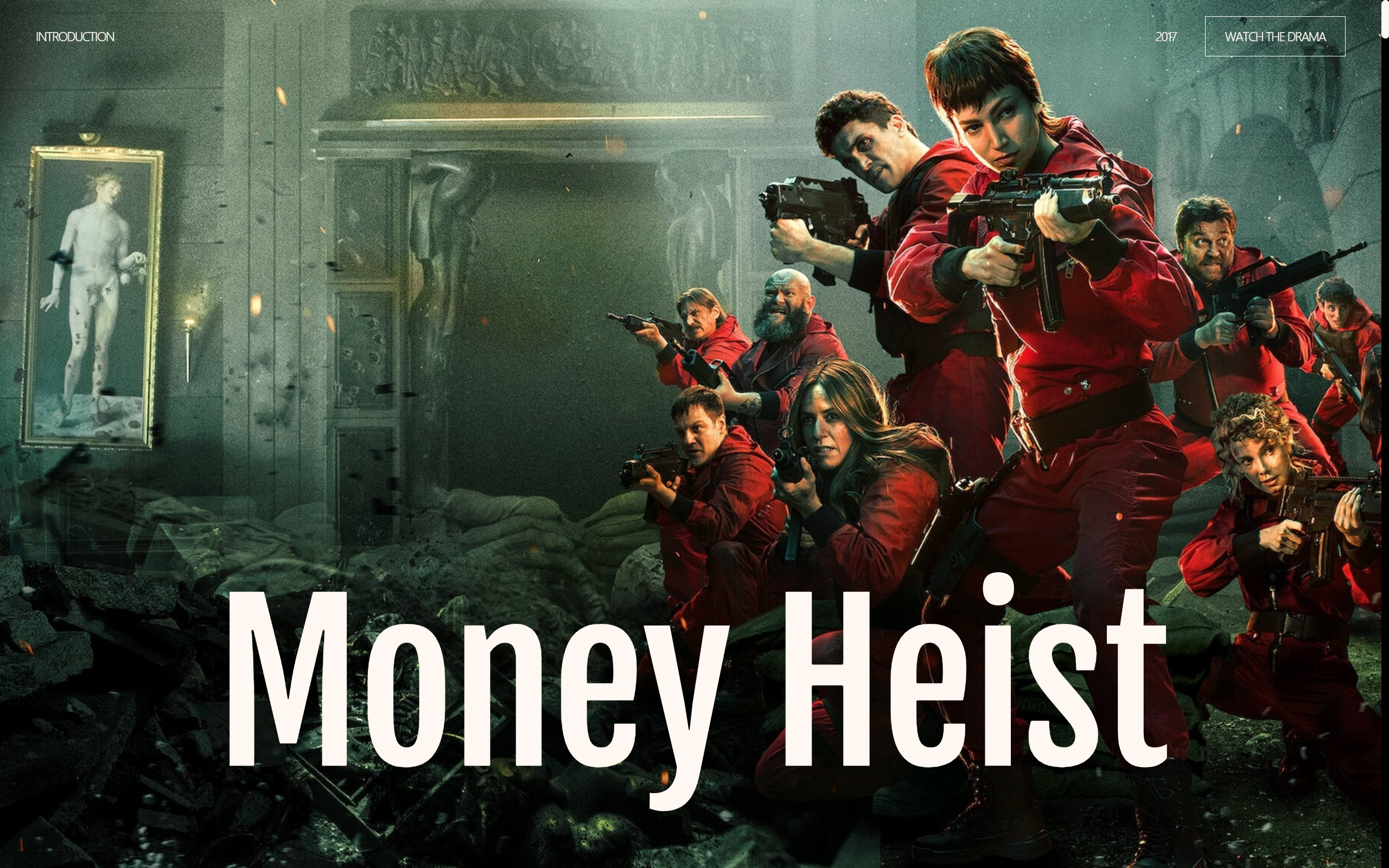
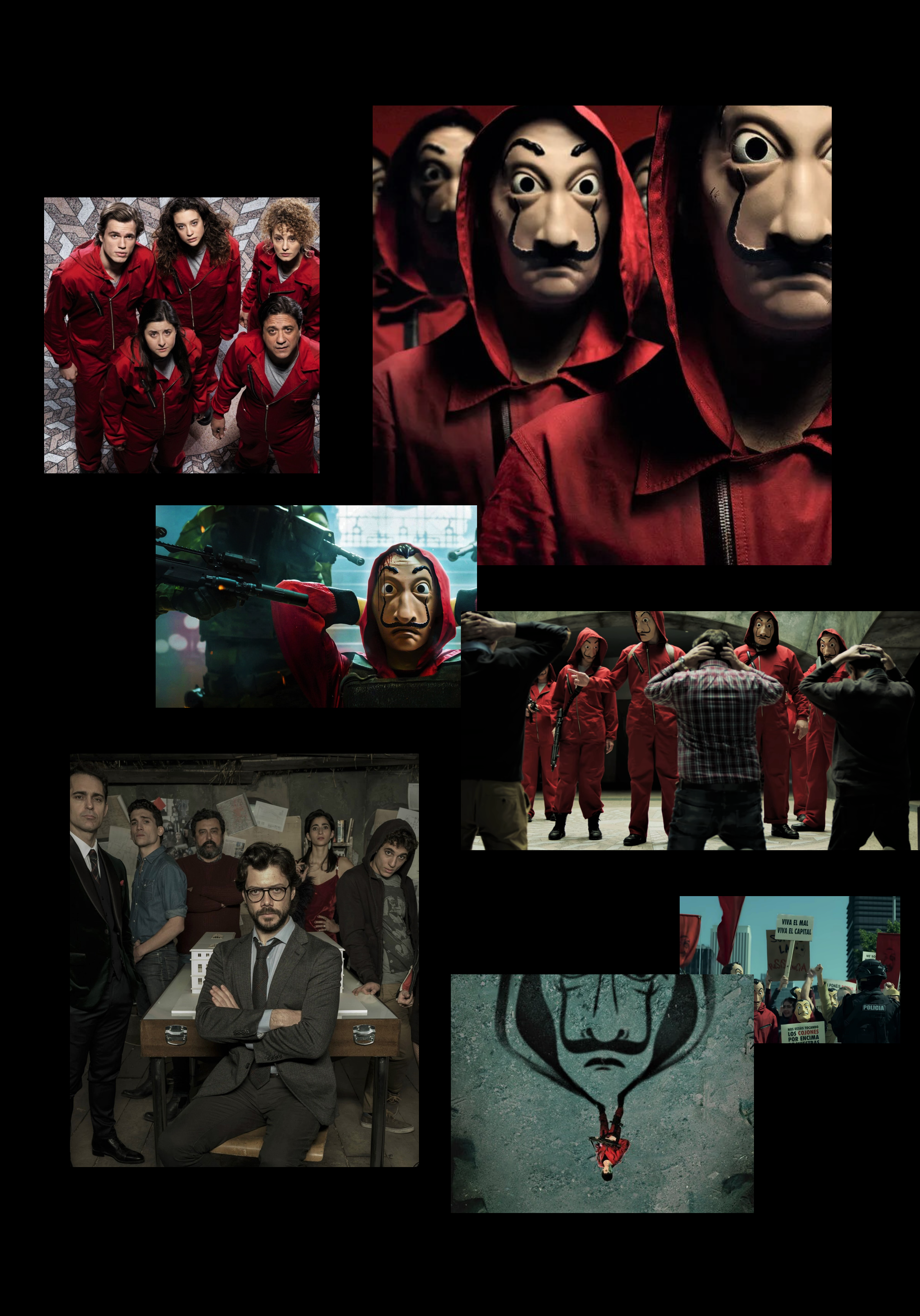
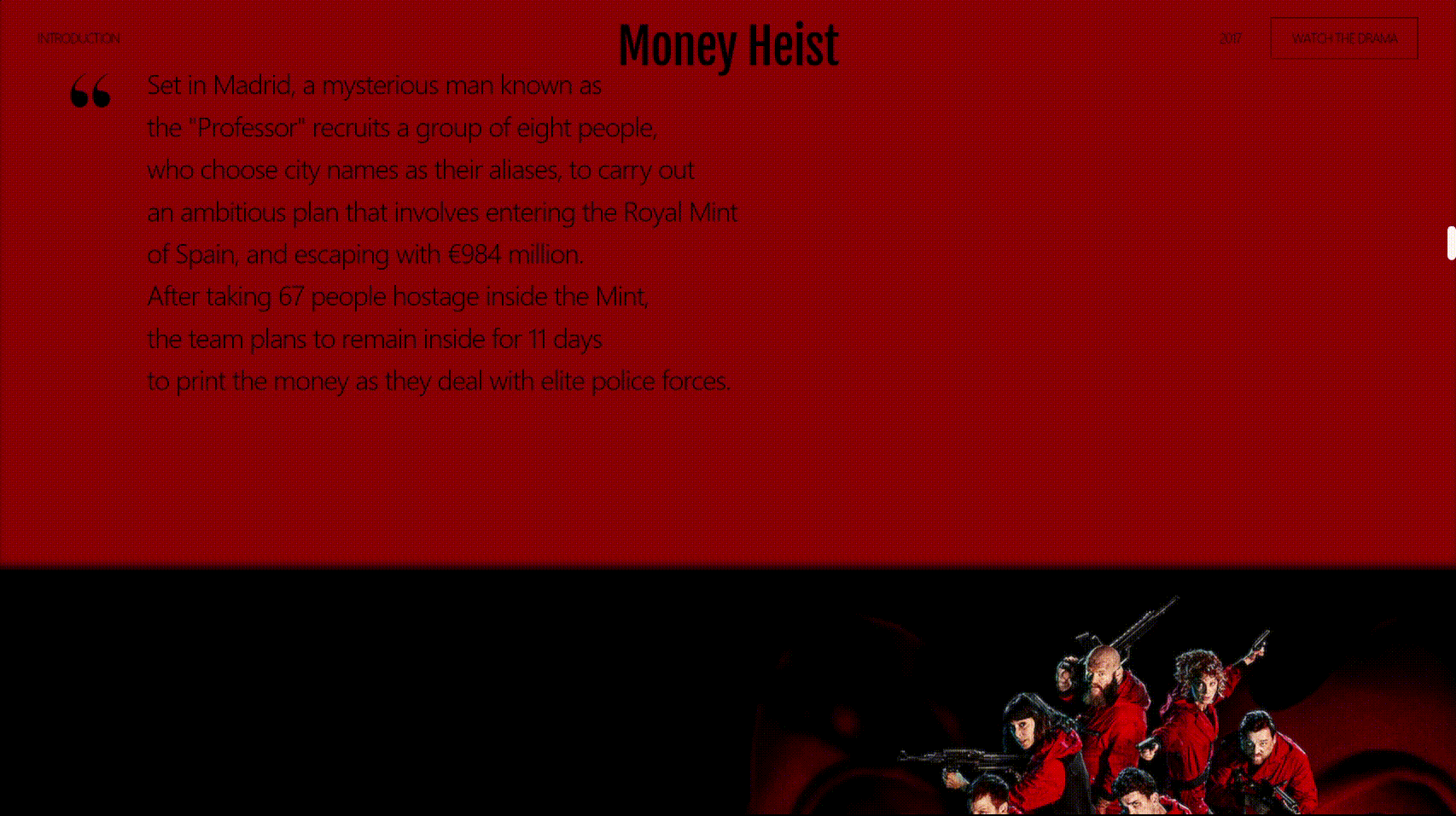
✔️종이의 집
제작기간 : 23.03.11 ~ 23.03.19 (9일)
사용 : HTML, SCSS, GSAP
분류 : 반응형
⭐레퍼런스 사이트를 참고하여 넷플릭스 드라마 '종이의 집' 소개 사이트를 만들었습니다.⭐
파일 구조
- index.html : 마크업
- assets
1) css : scss에서 컴파일 된 css파일
2) fonts : 폰트파일
3) images : 이미지파일
4) js : 스크립트 - main : 메인 스크립트 / SplitType.min : 텍스트 쪼개기
5) scss
- base
- _common : 공통 소스
- _reset : 리셋
- _typo : 폰트
- layout
- _header : 헤더
- _footer : 푸터
- page
- _main : 메인 페이지
- util
- _mixin : 재활용 가능한 소스
- style : @import
1. 반응형을 위한 GSAP의 matchMedia와 saveStyle
-
pc와 모바일에서 각각 다른 애니메이션 효과를 사용하거나 모바일에서는 애니메이션 효과를 사용하고 싶지 않은 경우 matchMedia()를 사용해서 해결 할 수 있음.
-
또한 페이지가 로드되고 해당 요소의 css를 저장하는 기능을 하는 saveStyles()도 필요함. gsap 애니메이션 효과는 인라인 스타일로 삽입되기 때문에 css 파일보다 우선적용 됨. 따라서 화면이 리사이즈 될 경우 방금 실행된 애니메이션 때문에 요소의 기존 css가 깨질 수 있어서 saveStyle로 인라인 스타일을 지워야 망가지지 않음!
-
작성방법
$(function(){
    gsap.registerPlugin(ScrollTrigger);
    ScrollTrigger.saveStyles(".mobile, .desktop");
    ScrollTrigger.matchMedia({
        "(min-width: 1281px)": function() {
			...
        },
        "(min-width: 1025px) and (max-width: 1280px)": function() {
        	...
        },
        "(min-width: 768px) and (max-width: 1024px)": function() {
			...
        },
        "(max-width: 767px)": function() {
			...
        },
        "all": function() {
			...
        }
    });
});
2. SCSS에서 미디어쿼리
- SCSS에서 미디어쿼리를 사용할 때, mixin을 사용하여 코드를 정리하면 편하게 사용 가능함
/*반응형 화면 크기 변수 설정*/
$mobile: 767px;
$tablet: 1024px;
$desktop: 1280px;

/* 브라우저 크기가 767px 이하일때*/
@mixin mobile{
    @media (max-width: $mobile){
        @content;
    }
}
/* 브라우저 크기가 768px이상 1024px 이하일때*/
@mixin tablet{
    @media (max-width: $tablet){
        @content;
    }
}
/* 브라우저 크기가 1025px 이상 1280px 이하일때*/
@mixin desktop{
    @media (max-width: $desktop){
        @content;
    }
}
🔷@mixin
재사용 가능한 기능을 만드는 방식
- 선언 :
@mixin - 사용 :
@include
3. 스크롤트리거
🔷헤더 logo 크기, 위치 변화
📌css
.header{
    position: fixed;
    top: 0;
    left: 0;
    right: 0;
    display: flex;
    justify-content: space-between;
    color: #fff7f2;
    padding: 20px 44px 0;
    z-index: 15;
    transition: color .5s;
	...
    .logo{
        position: absolute;
        left: 50%;
        top: 10px;
        transform: translateX(-50%);
        font-family: 'Fjalla One', serif;
        font-size: 57px;
        pointer-events: none;

        @include mobile{
            font-size: 8.2vw;
            top: 30px;
        }
    }
    ...
}
📌js
gsap.from('.header .logo',{
    scrollTrigger:{
        trigger:'.sc-visual',
        start:'0% 0%',
        end:'100% 0%',
        // markers:true,
        scrub: 0.3,
    },
    scale: 4.5, // 스케일 4.5배에서 1배로 변화        (gsap.from() -> css 속성값)
    top: '75vh' // top 위치 75vh에서 10px로 변화
});
🔷헤더 layout 색상 변화
📌html
<section class="sc-plot common-inner" data-theme="black">
	<h2 class="blind">plot</h2>
    ...
</section>
📌js
/**
 * @헤더_색상
 */
document.querySelectorAll('[data-theme=black]').forEach(element => {
// data-theme 속성값이 black인 모든 요소를 각각 선택
    ScrollTrigger.create({
        trigger:element,
        start: `0% 40%`,
        end:`100% 0%`,
        // markers:true,
        toggleClass:{targets:'.header',className:'on'},
      	// data-theme 속성값이 black인 요소에 도달하면 .header에 on 클래스 추가(흰 -> 검)
      	// 빠져나가면 .header에 on 클래스 제거(검 -> 흰)
    });
});
🔷헤더 푸터 layout 사라짐 나타남
📌js
/**
* @헤더푸터레이아웃_사라짐나타남
*/
const hideLayout = gsap.timeline({
scrollTrigger:{
trigger:'.sc-collage',
start:'0% 50%',
end:'100% 80%',
// markers:true,
scrub:1,
}
});
hideLayout
.addLabel('a')
.to('.header',{
yPercent:-100, // 헤더를 100%만큼 위로 올려서 숨김
opacity:0,
},'a')
.from('.footer',{
yPercent:100, // 초기에 푸터가 100%만큼 밑에 숨겨져 있음
// .sc-collage에 도달하면 yPercent가 0으로 변화하면서 나타남
opacity:0,
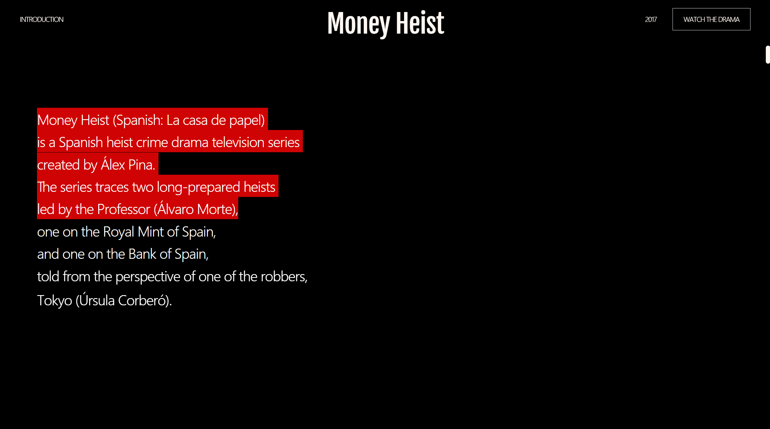
},'a+=0.2'); // 'a' 애니메이션 종료 시점에서 0.2초 뒤에 애니메이션이 시작됨🔷text 숨어있다가 부드럽게 나타남
📌html
<section class="sc-intro">
    <h2 class="blind">intro</h2>
    <div class="text-box">
        <p class="desc" data-scroll="up"><span>Money Heist (Spanish: La casa de papel)</span></p>
        <p class="desc" data-scroll="up"><span>is a Spanish heist crime drama television series</span></p>
        <p class="desc" data-scroll="up"><span>created by Álex Pina.</span></p>
      	...
    </div>
</section>
📌css
[data-scroll="up"]{ /* 넘치는 것을 가려야함 */
    overflow: hidden;
}
[data-scroll="up"] span{ /* inline인 span의 위치를 조절하려면 display: block이어야 함. */
    display: block;
}
📌js
/**
 * @스크롤텍스트_나타남
 */
document.querySelectorAll('[data-scroll=up]').forEach(element => {
  	// data-scroll 속성값이 up인 모든 요소를 각각 선택
    gsap.from(element.children[0],{
    // 그 요소의 첫번째 자식인 span
        scrollTrigger:{
            trigger:element,
            start:"0% 85%",
            end:"100% 65%",
            scrub:0.3,
            // markers:true,
        },
        yPercent:100 // 초기에 span이 100%만큼 밑에 숨어있음.
      				 // 각각 data-scroll 속성값이 up인 요소에 도달하면,
      				 // yPercent는 0으로 변화하면서 텍스트가 나타남.
    });
});
🔷box 조각남
📌html
<div class="trans-wrap">
    <div class="trans-box">
        <div class="trans" data-parallax-bar="500"></div>
        <div class="trans" data-parallax-bar="400"></div>
        <div class="trans" data-parallax-bar="730"></div>
        <div class="trans" data-parallax-bar="450"></div>
        <div class="trans" data-parallax-bar="550"></div>
    </div>
</div>
📌js
/**
 * @스크롤_조각나는박스
 */
document.querySelectorAll('[data-parallax-bar]').forEach(element => {
  	// data-parallax-bar 속성이 있는 모든 요소를 각각 선택
    heightVal = element.dataset.parallaxBar
  	// data-parallax-bar 속성값을 .dataset.parallaxBar로 가져와서
    // heightVal 변수에 담음
    gsap.to(element,{
        scrollTrigger:{
            trigger:element,
            start:"0% 150%",
            end:"100% 60%",
            scrub:0.3,
            // markers:true,
        },
        height:heightVal
      	// 각각의 .trans 박스는 자신의 data-parallax-bar 값만큼 높이가 바뀜
    });
});
🔷image 상하 움직임
📌html
<section class="sc-scene">
    <h2 class="blind">scene</h2>
    <ul class="s-grid">
        <li class="img-box sc-1" data-parallax-scroll="-6"><img src="" alt class="parallax"></li>
        <li class="img-box sc-2" data-parallax-scroll="6"><img src="" alt class="parallax-reverse"></li>
        <li class="img-box sc-3" data-parallax-scroll="-6"><img src="" alt class="parallax"></li>
        <li class="img-box sc-4" data-parallax-scroll="6"><img src="" alt class="parallax-reverse"></li>
        <li class="img-box sc-5" data-parallax-scroll="-6"><img src="" alt class="parallax"></li>
        <li class="img-box sc-6" data-parallax-scroll="-6"><img src="" alt class="parallax"></li>
        <li class="img-box sc-7" data-parallax-scroll="6"><img src="" alt class="parallax-reverse"></li>
    </ul>
</section>
📌css
.parallax{ /* 시차. 배경은 그대로고 이미지만 움직임 */
    width: 100%;
    height: 120%; /* 이미지는 더 넘치게 120% -> 부모의 overflow: hidden으로 잘라버림 */
    object-fit: cover;

    &-reverse{ /* parallax-reverse. parallax의 반대 방향으로 움직임 */
        position: relative;
        bottom: 20%;
        /* 스크롤과 이미지의 이동 방향이 같으므로,
		   위치를 미리 올려둬서 이미지가 온전히 나오도록 함 */
        width: 100%;
        height: 120%;
        object-fit: cover;
    }
}
.sc-scene{
    position: relative;
    padding-top: 200px;
    padding-bottom: 50vh;
    ...
    .s-grid{
        position: relative;
        display: grid;
        grid-template-columns: repeat(3, 1fr);
        grid-auto-columns: 1fr;
        grid-gap: 5vw 3vw;
		...
    }
    .img-box{
        overflow: hidden; /* 넘치는 이미지 자르기 */
        width: 100%;

        &.sc-1{
            width: 30vw;
            height: 30vw;

            grid-column: 1 / 3;
            grid-row: 1 / 2;
            align-self: center;
        }
	}
}
📌js
/**
 * @이미지_상하움직임
 */
document.querySelectorAll('[data-parallax-scroll]').forEach(element => {
  	// data-parallax-scroll 속성이 있는 모든 요소를 각각 선택
    windowStart = element.dataset.start ? element.dataset.start : '0%';
  	// 요소의 data-start 속성값이 존재하면, 그 값을 windowStart 변수에 할당하고
    // 존재하지 않으면, '0%'를 windowStart 변수에 할당
    yVal = element.dataset.parallaxScroll;
  	// data-parallax-scroll 속성값을 .dataset.parallaxScroll로 가져와서
    // yVal 변수에 담음
    gsap.to(element.children[0],{
        scrollTrigger:{
            trigger:element,
            start:`${windowStart} 100%`,
            end:"100% 0%",
            scrub:1,
            // markers:true,
        },
        yPercent:yVal
        // 숫자에 %를 붙여줌
    });
});
🔷하단 text 좌우 나타남
📌html
<section class="sc-collage">
	<h2 class="headline">
		<span class="left desc"><span>Want</span></span>
		<span class="right desc"><span>Money</span></span>
	</h2>
</section>
📌css
.sc-collage{
    ...
    .headline{
        ...
        .left{
            ...
        }
        .right{
            ...
        }
        .desc{
            position: relative;
            font-size: 20vh;
            opacity: 0; /* 초기에 불투명도가 0으로, text가 안 보임 */
            ...
        }
    }
 	...
}
📌js
/**
 * @하단텍스트_좌우나타남
 */
const showText = gsap.timeline({
    scrollTrigger:{
        trigger:'.sc-collage',
        start:'10% 100%',
        end:'95% 100%',
        // markers:true,
        scrub:1,
    }
});
showText
.addLabel('a')
.fromTo('.sc-collage .left',{x:-250,},{x:0, opacity:1,},'a')
// 오른쪽으로 250px 치우쳐저 있다가 .sc-collage에 도달하면 0으로 이동하며 opacity 1이 됨
.fromTo('.sc-collage .right',{x:250,}, {x:0, opacity:1,},'a');
4. grid 속성으로 요소 배치
📌html
<section class="sc-scene">
    <h2 class="blind">scene</h2>
    <ul class="s-grid">
        <li class="img-box sc-1" data-parallax-scroll="-6"><img src="" alt class="parallax"></li>
        <li class="img-box sc-2" data-parallax-scroll="6"><img src="" alt class="parallax-reverse"></li>
        <li class="img-box sc-3" data-parallax-scroll="-6"><img src="" alt class="parallax"></li>
        <li class="img-box sc-4" data-parallax-scroll="6"><img src="" alt class="parallax-reverse"></li>
        <li class="img-box sc-5" data-parallax-scroll="-6"><img src="" alt class="parallax"></li>
        <li class="img-box sc-6" data-parallax-scroll="-6"><img src="" alt class="parallax"></li>
        <li class="img-box sc-7" data-parallax-scroll="6"><img src="" alt class="parallax-reverse"></li>
    </ul>
</section>
📌css
.s-grid{
    position: relative;
    display: grid;
    grid-template-columns: repeat(3, 1fr); /* 컬럼영역을 1fr씩 3개 사용 */
    grid-auto-columns: 1fr;
    grid-gap: 5vw 3vw;

    @include tablet{
        grid-gap: 0 6vw;
    }
}
.img-box{
    overflow: hidden;
    width: 100%;

    &.sc-1{
        width: 30vw;
        height: 30vw;

        grid-column: 1 / 3; /* 첫번째 컬럼라인부터 세번째 컬럼라인까지 사용 */
        grid-row: 1 / 2; /* 첫번째 로우라인부터 두번째 로우라인까지 사용 */
        align-self: center; /* 단일 요소를, 중심으로 수직배치 */
    }
    &.sc-2{
        width: 50vw;
        height: 50vw;

        grid-column: 2 / 4;
        grid-row: 1 / 2;
        justify-self: center; /* 단일 요소를, 중심으로 수평배치 */
        align-self: center;

        @include tablet{
            width: auto;
        }
    }
    &.sc-3{
        width: 35vw;
        height: 22vw;

        grid-column: 1 / 3;
        grid-row: 1 / 3;
        justify-self: center;
        align-self: end;
        z-index: 1;
    }
    &.sc-4{
        position: relative;
        right: -85px;
        height: 26vw;
        width: 50vw;
        z-index: 1;

        justify-self: end;
        align-self: center;
        grid-row: 2 / 4;
        grid-column: 2 / 4;

        @include tablet{
            right: -8vw;
        }
    }
    &.sc-5{
        position: relative;
        left: 48px;
        height: 45vw;
        width: 38vw;

        justify-self: start;
        align-self: center;
        grid-column: 1 / 3;
        grid-row: 3 / 6;

        @include tablet{
            left: 0;
        }
    }
    &.sc-6{
        position: relative;
        left: 48px;
        height: 16vw;
        width: 24vw;

        justify-self: end;
        align-self: center;
        grid-column: 2 / 4;
        grid-row: 4 / 5;

        @include tablet{
            left: 0;
        }
    }
    &.sc-7{
        position: relative;
        height: 26vw;
        width: 33vw;

        justify-self: center;
        align-self: end;
        grid-column: 2 / 4;
        grid-row: 4 / 7;
        z-index: 1;

        @include tablet{
            top: 12vw;
            left: 8vw;
        }
    }
}
5. sticky 속성 / SplitType 글씨 쪼개기
-
CSS 포지션(position)에서 화면을 고정하는 방법은 fixed 속성과 sticky 속성이 있으며 간략한 차이는 아래와 같음
-
position: fixed-> 최상위 브라우저 창을 기준으로 절대 위치를 지정
position: sticky-> 부모 태그의 크기를 기준으로 절대 위치를 지정 -
sticky 속성은 선언한 영역의 위치 값을 고정시켜주는 역할을 하며 top, left와 같은 위치값을 반드시 작성해줘야 sticky 속성이 적용됨
-
또한 sticky 속성을 적용할 HTML 태그의 부모 태그에 무조건 height가 있어야 하며 상위 부모태그에 height 를 준 만큼만 고정됨
📌html
<section class="sc-highlight"> <!-- 부모 태그 -->
    <div class="h-sticky"> <!-- sticky 속성을 적용할 자식 태그 -->
        <h2 class="headline">We want a lot of MONEY!</h2>
        <img src="./assets/images/highlight.jpg" alt>
        <div class="h-overlay"></div>
    </div>
</section>
📌css
.sc-highlight{
	height: 600vh;
	/* 부모 태그에게 높이 600vh를 줌. 즉 600vh만큼만 sticky 속성이 적용되어 화면이 고정됨*/
	/* v는 뷰포트. 현재 보이는 브라우저 화면 크기 */
    padding-right: 0;
    padding-left: 0;
    font-family: 'Dahlia Condensed', serif;

    .h-sticky{ /* sticky 속성을 적용한 자식 태그 */
        display: flex;
        align-items: center;
        position: sticky;
        top: 0; /* top으로 위치값 작성 */
        height: 100vh;
        overflow: hidden;

        .headline{
            position: relative;
            font-size: 15vw;
            white-space: nowrap;
            z-index: 1;

            @include tablet{
                font-size: 17vw;
            }
            @include mobile{
                font-size: 19vw;
            }
        }
        img{
            position: absolute;
            left: 0;
            top: auto;
            right: 0;
            bottom: 0;
            width: 100%;
            height: 100%;
            object-fit: cover;
        }
        .h-overlay{
            position: absolute;
            left: 0;
            top: 0;
            right: 0;
            bottom: 0;
            background: #da0000;
            mix-blend-mode: multiply; /* 겹쳐 있는 요소의 색상을 곱한 값으로 표시함 */
									  /* 결과적으로 색이 어둡게 색이 보여짐. */
            @include mobile{
                display: none;
            }
        }
    }
}
📌js
/**
 * @가로스크롤_텍스트
 */
// 불러온 SplitType 스크립트로 글씨를 words, chars 형태로 쪼갬.
const highlightTxt = new SplitType('.sc-highlight .headline', { types: 'words, chars' });

// gsap.set()으로 요소의 속성값을 즉시 설정
gsap.set('.sc-highlight .h-overlay',{opacity:0});
gsap.set('.sc-highlight img',{scale:1.2});
gsap.set('.sc-highlight .headline',{xPercent:80});
gsap.set(highlightTxt.chars,{opacity:0,yPercent:25});

// .sc-highlight 영역에 도달했을 때 highlightTxtHori 변수에 담겨있는 효과를 차례대로 보여줌
highlightTxtHori = gsap.timeline({
    scrollTrigger:{
        trigger:".sc-highlight",
        start:"0% 0%",
        end:"100% 0%",
        markers:true,
        scrub:1,
    }
});

// a라는 label을 추가하여 모든 효과가 동시에 일어남
highlightTxtHori
.addLabel('a')
.to('.sc-highlight img',{scale:1},'a')
.to('.sc-highlight .h-overlay',{opacity:1},'a')
.to('.sc-highlight .headline',{xPercent:-60},'a');

// .sc-highlight 영역에 도달했을 때 .sc-highlight .headline .char가 변화되는 효과
gsap.to('.sc-highlight .headline .char',{
    scrollTrigger:{
        trigger:".sc-highlight",
        start:"0% 0%",
        end:"100% 0%",
        scrub:1,
    },
    opacity:1, yPercent:0, stagger:0.05
});
6. 마우스 드래그시 배경 및 글자색 변경
-
가상요소 선택자 ::selection을 이용하면 마우스로 드래그한 영역의 스타일을 변경할 수 있음
-
웹 사이트에 테마 컬러가 있을 경우 드래그 선택시 테마 컬러로 선택되도록 배경색을 지정해서 사이트의 통일감을 높일 수 있음
::selection{
    background: #cf0303;
    color: #fff;
}
* 웹 표준 검사 통과
The W3C Markup Validation Service의 Nu Html Checker를 통해 index.html의 마크업이 웹 표준에 적합함을 확인했습니다.
