
✔️구찌 리뉴얼
제작기간 : 23.03.25 ~ 23.04.01 (8일)
사용 : HTML, SCSS, GSAP
분류 : 반응형
⭐레퍼런스 사이트를 참고하여 구찌 사이트를 리뉴얼 했습니다.⭐

파일 구조
- index.html : 마크업
- assets
1) css : scss에서 컴파일 된 css파일
2) fonts : 폰트파일
3) images : 이미지파일
4) js : 스크립트 - main : 메인 스크립트 / SplitType.min : 텍스트 쪼개기
5) scss
- base
- _common : 공통 소스
- _reset : 리셋
- _typo : 폰트
- component : 소형 레이아웃
- fixed : 특정 영역에 고정된 요소
- _btn : 연락 버튼
- _cursor : 커서
- layout
- _header : 헤더
- _footer : 푸터
- page
- _main : 메인 페이지
- util
- _mixin : 재활용 가능한 소스
- style : @import
1. 마우스를 따라 움직이는 효과
- 커스텀 커서가 실제 커서의 위치에 딱 붙어 움직이게 하기 위해서 window에 mousemove 이벤트 추가하고, 마우스가 움직일 때마다 상대적 커서의 좌표값(offsetX, offsetY)을 커스텀 커서가 이동할 x, y(gsap.top의 x, y)에 넣어줌
offsetX, offsetY
이벤트 대상이 기준.
offsetX : 이벤트 대상 객체에서의 상대적 마우스 x좌표 위치를 반환
offsetY : 이벤트 대상 객체에서의 상대적 마우스 y좌표 위치를 반환
🔷구찌 프로젝트 내 마우스 효과
📌css
.cursor1{
	/* flex 속성으로 내부 택스트를 중앙에 배치 */
    display: flex;
    justify-content: center;
    align-items: center;
    /* absolute 속성과 margin으로 커서를 영역의 중앙에 배치 */
    position: absolute;
    top: 50%;
    left: 50%;
    width: 170px;
    height: 170px;
    margin-left: -85px;
    margin-top: -85px;
    ...

    @include tablet{
        display: none;
    }
}
.cursor-common, .cursor5{
	/* flex 속성으로 내부 택스트를 중앙에 배치 */
    display: flex;
    justify-content: center;
    align-items: center;
    /* absolute 속성과 margin으로 커서를 영역의 좌측상단에 배치 */
    position: absolute;
    top: 0;
    left: 0;
    width: 170px;
    height: 170px;
    margin-left: -85px;
    margin-top: -85px;
    ...

    &.show{
        opacity: 1;
        z-index: 1;

        @include tablet{
            display: none;
        }
    }
    ...
}-
.cursor1 요소는 .sc-more 요소 내에서 고정되어 이동하며, 마우스 이벤트가 발생한 .sc-more 요소의 위치에 상대적으로 이동
-
.cursor-common 요소는 각각의 .col-sticky 요소에 대해 개별적으로 이동하며, 마우스 이벤트가 발생한 .col-sticky 요소의 위치에 상대적으로 이동
📌js
/**
 * @마우스커서1_제품찾기
 */
$('.sc-more').mousemove(function(e){ // 마우스가 해당 요소 내에서 움직일 때
    leftVal = e.offsetX;
    topVal = e.offsetY - ($('.sc-more').outerHeight()/2);
  	// 마우스 커서의 위치를 .sc-more 요소 내에서의 상대적인 위치로 조정

    gsap.to('.cursor1',{
        left: '0%',
        x:leftVal,
        y:topVal,
    });
});
$('.sc-more').mouseleave(function(e){ // 마우스가 해당 요소를 벗어날 때
    gsap.to('.cursor1',{
        x:0,
        y:0,
        left: '50%'
      	// 커서는 영역의 중앙으로 다시 돌아감
    });
});
/**
 * @마우스커서공통_카테고리
 */
$('.col-sticky').mousemove(function(e){
    leftVal = e.offsetX;
    topVal = e.offsetY;
    $(this).find('.cursor-common').addClass('show');
  	// 해당 요소 내에서 .cursor-common를 찾고 거기에 show 클래스 추가

    gsap.to($(this).find('.cursor-common'),{
        x:leftVal,
        y:topVal,
    });
});
$('.col-sticky').mouseleave(function(){
    $(this).find('.cursor-common').removeClass('show');
    // 해당 요소 내에서 .cursor-common를 찾고 거기에 show 클래스 제거
});
2. sticky 속성을 활용한 요소가 쌓이는 효과
.sticky-inner{
	/* sticky 속성의 기준 */
    position: relative;
    padding-bottom: 90px;

    @include desktop{
        padding-bottom: 0;
    }

    .cate-sticky{
    	/* 각각의 .cate-sticky에 sticky 속성을 줌 */
        position: sticky;
        display: flex;
        border: 1px solid #174036;
        background: #f6f0eb;

        @include desktop{
        	/* 1280px 이하에서는 sticky 속성을 뺌 */
            position: relative;
        }
        @include tablet{
        	/* 1024px 이하에서는 grid 속성으로 일렬로 배열 */
            display: grid;
            grid-template-columns: 1fr;
        }
        &:nth-child(1){
        	/* 요소가 고정되는 높이. */
            /* 쌓이는 효과를 주기위해 나중에 나오는 요소에 점점 더 높은 top값을 줬음 */
            top: 40px;

            @include desktop{
            	/* 1280px 이하에서는 쭉 펼쳐진 상태로 이어져서 나오게 하기 위함 */
                top: 0;
            }
        }
        &:nth-child(2){
            top: 180px;

            @include desktop{
                top: 0;
            }
        }
        &:nth-child(3){
            top: 320px;

            @include desktop{
                top: 0;
            }
        }
        &:nth-child(4){
        	/* 마지막 요소는 sticky 효과를 빼고 top값을 줘서 흐름을 자연스럽게 만들었음 */
            position: relative;
            top: 80px;

            @include desktop{
                top: 0;
            }
        }
3. 윈도우 창 너비에 따른 헤더 menu 레이아웃
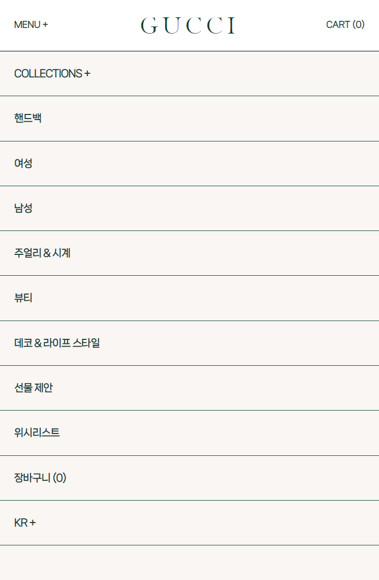
- 윈도우 창 너비가 특정 px일 때 .side-nav를 사용할 수 있으며, 왼쪽에서 열고 닫는 슬라이드임.
📌html
<header class="header">
	<div class="logo-area">
    	<h1 class="logo"><a href="">GUCCI</a></h1>
	</div>
	<nav class="gnb">
    	<ul class="nav-list">
        	<li class="nav-item"><a href="" class="nav">Collections +</a></li>
        	...
    	</ul>
    	<ul class="util-list">
        	<li class="util-item"><a href="" class="util">뷰티</a></li>
        	...
    	</ul>
    	<button class="btn-menu">Menu +</button>
    	<a href="" class="util cart">Cart (0)</a>
    	<nav class="side-nav">
        	<ul class="list">
            	<li class="item"><a href="" class="nav">Collections +</a></li>
            	...
        	</ul>
    	</nav>
	</nav>
</header>
📌css
.side-nav{
    display: none; /* 윈도우 창 너비가 1281px 이상일 때 숨김 */

    @include desktop{ //
        display: block; /* 윈도우 창 너비가 1280px 이하일 때 block이 됨 */
        visibility: hidden; /* 초기에는 안 보임. 영역은 존재 */
        position: fixed;
        top: 70px;
        height: calc(100vh - 70px); /*높이가 한정되어 있어야 스크롤 기능 가능*/
        background: #f9f6f3;
        width: 100%;
        left: -100%; /* x축으로 -100%만큼 숨겨져 있음 */
        overflow-y: auto; /* 높이에 따라서 y축 스크롤바 생김 */
        transition: .3s;
    }

    &.on{ /* 버튼으로 on 클래스가 추가되면, */
        left: 0; /* x축 원래 위치로 이동 */
        		 /* 왼쪽에서 열고 닫는 슬라이드가 됨 */
        visibility: visible; /* 눈에 보임 */
    }
    .nav{
        display: block;
        width: 100%;
        ...
        }
    }
📌js
"(min-width: 1281px)": function() {
    /**
     * @사이드내비_너비조절
     */
    $(window).resize(function(){ // 윈도우 창 크기가 변할 때

        windowVal = $(window).width();

        if(windowVal >= 1281){ // 윈도우 창 너비가 1281px 이상이면,
            $('body').removeClass('hidden'); // body에 hidden 클래스 제거
        }
    });
  	...
},
"(min-width: 1025px) and (max-width: 1280px)": function() {
    $(window).resize(function(){ // 윈도우 창 크기가 변할 때

        windowVal = $(window).width();

        if(windowVal >= 1280){ // 윈도우 창 너비가 1280px 이상이면,
            $('body').removeClass('hidden'); // body에 hidden 클래스 제거
        }else{ // 아니라면,
            if($('.gnb .side-nav').hasClass('on')){
            // .gnb .side-nav에 on 클래스가 있다면,
                $('body').addClass('hidden');
              	// body에 hidden 클래스 추가
            }
        }
    });
  	...
},
"(min-width: 768px) and (max-width: 1024px)": function() {
    $(window).resize(function(){ // 윈도우 창 크기가 변할 때

        windowVal = $(window).width();

        if(windowVal <= 1024 && $('.gnb .side-nav').hasClass('on')){
        // 윈도우 창 너비가 1024px 이하이고 .gnb .side-nav에 on 클래스가 있다면,
            $('body').addClass('hidden');
          	// body에 hidden 클래스 추가
        }
    });
  	...
},
"(max-width: 767px)": function() {
    $(window).resize(function(){

        windowVal = $(window).width();

        if(windowVal <= 767 && $('.gnb .side-nav').hasClass('on')){
            $('body').addClass('hidden');
        }
    });
  	...
},


"all": function() {
  	/**
 	* @사이드내비_버튼
 	*/
	$('.gnb .btn-menu').click(function(){// 요소를 클릭하면,
    	$('.gnb .side-nav').toggleClass('on');
      	// .gnb .side-nav에 on 클래스 토글 (숨어있던 .side-nav가 나타남)
    	$('body').toggleClass('hidden');
      	// body에 hidden 클래스 토글. (뒷배경 스크롤 막음)
	});
  	...
}
4. 시차를 두고 쪼개져서 나타나는 텍스트
🔷구찌
- 사이트를 처음 켰을 때와 새로고침했을 때 즉시 작동
/**
 * @구찌텍스트_나타남
*/
const gucciTxt = new SplitType('.sc-intro .desc span', { types: 'words, chars'});
// SplitType 스크립트로 텍스트를 words, chars로 쪼개기

$('.sc-intro').each(function(i,el){
// each() : 선택한 요소들을 순회하면서 각 요소에 대해 지정한 동작을 수행
// i - 인덱스, el - 해당 요소.

    child = $(this).find('.desc span .char');
    gsap.timeline({
        paused: true, // 맨처음에 멈춰있다가
    })
    .to(child,{yPercent:-100, stagger:0.08,})
  	// 초기에 텍스트가 css로 100%만큼 밑에 숨어있다가
  	// 나중에 요소간 딜레이가 0.08초씩 있으면서 -100%만큼 위로 올라옴
    .play(); // 후에 생성한 timeline을 작동
});
🔷컬렉션 타이틀
- 텍스트 나타남은 최초로 트리거에 도달했을 때 작동
/**
 * @컬렉션텍스트_나타남
 */
const headTxt = new SplitType('.sc-collection .col-sticky .title span', { types: 'words, chars'});

$('.col-sticky').each(function(i,el){

    child = $(this).find('.col-bg.on'); // 불투명한 검은색 배경
    child2 = $(this).find('.title span .char'); // 쪼개지는 텍스트

    gsap.to(child,{
        scrollTrigger:{
            trigger:el, // 각각의 요소
            start:"top top",
            end:"bottom top",
            scrub:1,
            // markers:true,
        },
        opacity:0.7 // 불투명도가 0.2에서 0.7로 변화
    });
    gsap.to(child2,{
        scrollTrigger:{
            trigger:el,
            start:"top top",
            end:"bottom top",
            // markers:true,
        },
        yPercent:-100,
        stagger:0.03,
        // 초기에 텍스트가 css로 100%만큼 밑에 숨어있다가
      	// 나중에 요소간 딜레이가 0.03초씩 있으면서 -100%만큼 위로 올라옴
    });
});
5. :hover시 제품 이미지 나타남

📌css
img{
    position: absolute;
    width: 250px;
    height: 250px;
    top: 50%;
    left: 50%;
    transform: translate(-50%, -50%);
    opacity: 0; /* 초기에 이미지가 안 보임 */
    z-index: -1;
    transition: 0.3s;
    object-fit: cover;
    pointer-events: none;
}
&:hover{
    img{
        opacity: 1; /* 호버하면 이미지가 보임 */

        @include mobile{
            opacity: 0;
        }
    }
}
📌js
/**
 * @제품색상선택텍스트_호버
 */
$('.sc-theme .theme-area a').hover(function(){ // 마우스가 머물면
    $(this).siblings().css("opacity",0.1);
  	// 대상의 형제의 opacity값을 0.1로 바꿔라
},function(){ // 마우스가 벗어나면
    $(this).siblings().css("opacity",1);
  	// 대상의 형제의 opacity값을 1로 되돌려라
});
6. 스크롤시 내려오는 푸터
/**
 * @푸터_상하움직임
 */
gsap.to('footer',{
    scrollTrigger:{
        trigger:'footer', // 자가자신이 트리거
        start:`100% 100%`,
        end:"200% 100%",
        scrub:0,
        // markers:true,
    },
    yPercent:100
    // 초기에 푸터가 css로 -100%만큼 위에 숨어있다가
    // 나중에 100%만큼 내려와서 나타남
});
* 웹 표준 검사 통과
The W3C Markup Validation Service의 Nu Html Checker를 통해 index.html의 마크업이 웹 표준에 적합함을 확인했습니다.

.