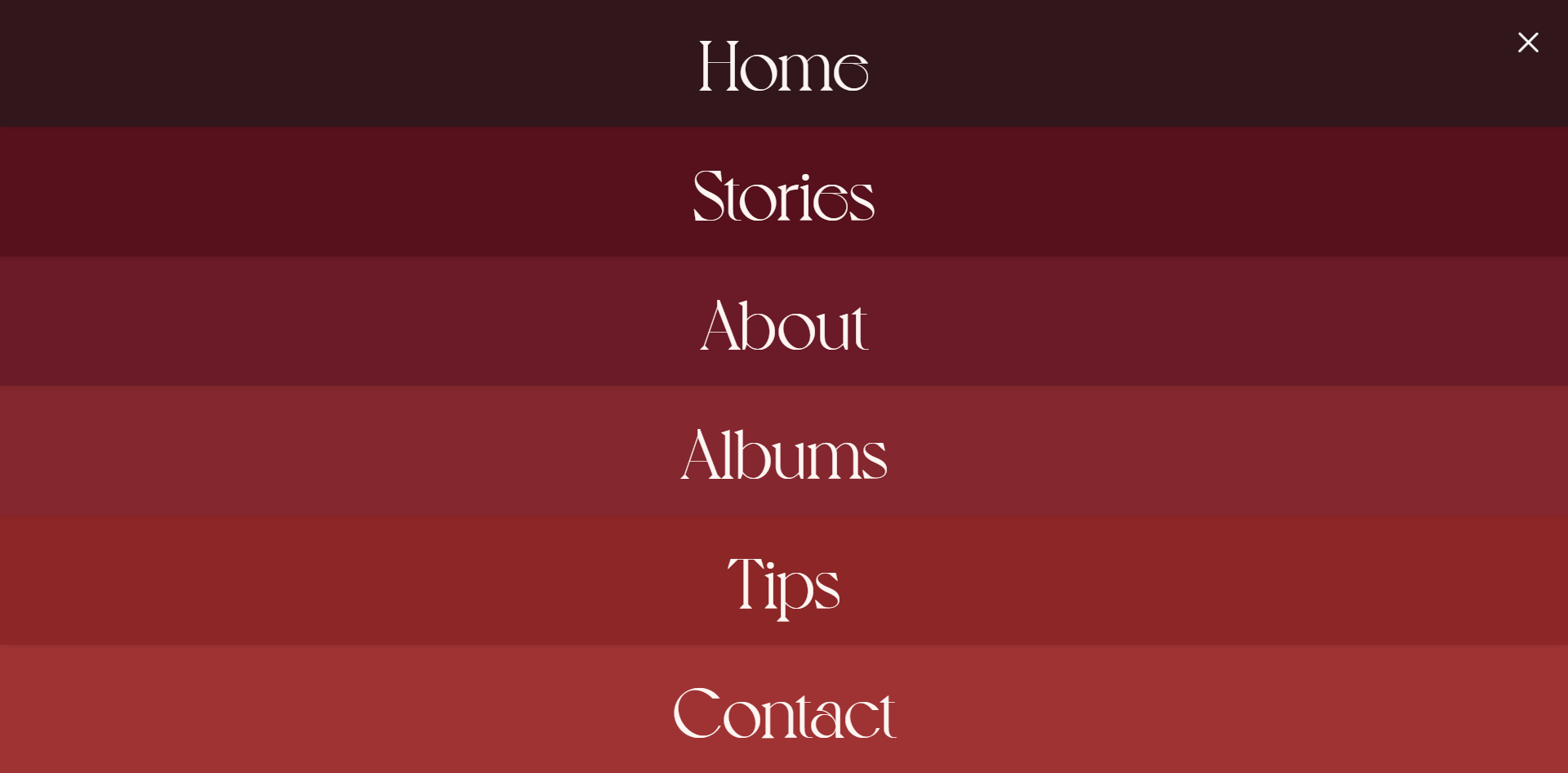
위에 사진처럼 메뉴 하나하나 색이 다르고 꽉 차게 나오는 메뉴구성 만들기
🧩 html 시맨틱 태그 활용하여 마크업 작성
	<a href="#" class="btn-menu" role="button" aria-label="메뉴열기">
    	<span class="menu-bar top"></span>
        <span class="menu-bar bottom"></span>
    </a> // 메뉴 버튼

	<nav class="group-nav">
    	<ul class="menu-list">
        	<li class="menu-item home">
            	<a href="#" class="link-menu">Home</a>
          	</li>
          	<li class="menu-item stories">
          		<a href="#" class="link-menu">Stories</a>
          	</li>
          	<li class="menu-item about">
          		<a href="#" class="link-menu">About</a>
          	</li>
          	<li class="menu-item albums">
          		<a href="#" class="link-menu">Albums</a>
          	</li>
          	<li class="menu-item tips">
          		<a href="#" class="link-menu">Tips</a>
          	</li>
          	<li class="menu-item contact">
          		<a href="#" class="link-menu">Contact</a>
          	</li>
    	</ul>
	</nav> // 메뉴
🧩 variable.scss 주요 컬러 변수 저장
    $color-red01:#35141B;
    $color-red02:#5E071A;
    $color-red03:#750E25;
    $color-red04:#901B2B;
    $color-red05:#991821;
    $color-red06:#AD272E;
    // 사이트의 주요 색을 변수로 만들어 쉽게 활용한다
🧩 header.scss 꾸며주기
	.btn-menu {
    	position: relative;
        width: 30px;
        height: 30px;
        z-index: 100;
        .menu-bar {
            position: absolute;
            display: block;
            width: 100%;
            height: 3px;
            border-radius: 10px;
            transition: rotate 0.5s;
            background: #fff;
            &.top {
                top: 6px;
            }
            &.bottom {
                top: auto;
                bottom: 6px;
            }
        }
        &.active .menu-bar.top {
        	top: 50%;
        	transform: translateY(-50%) rotate(-45deg);
        }
        &.active .menu-bar.bottom {
        	top: 50%;
        	transform: translateY(-50%) rotate(45deg);
        }
        // active 클래스를 넣어주고 클릭했을때에 버튼의 모양을 x 모양으로 바꿈
    }

    .group-nav {
        display: none;
        // none을 하지 않으면, 메뉴가 닫혀 있을 때에도, 개발자 모드에 형태가 계속 찍힌다던가,
        // 다른 영역의 영향을 끼칠 수 있다
        .menu-list {
            position: absolute;
            top: 0;
            left: 0;
            width: 100%;
            height: 100vh;
            display: flex;
            flex-direction: column;
        }
        .menu-item {
            display: flex;
            align-items: center;
            justify-content: center;
            flex: 1;
            width: 100%;
            box-shadow: 0 -6px 9px 0 #000;
            font-size: 4.5vw;
            font-weight: 400;
            font-family: $font-en;
            text-align: center;
            cursor: pointer;
            &.home {background: $color-red01; z-index: 6;}
            &.stories {background: $color-red02;z-index: 5;}
            &.about {background:$color-red03;z-index: 4;}
            &.albums {background: $color-red04;z-index: 3;}
            &.tips {background:$color-red05;z-index: 2;}
            &.contact {background: $color-red06;z-index: 1;}
            // 메뉴 위치상 아래에 위치한 메뉴가 인덱스가 낮아야 box-shadow가 이쁘게 잘 보인다
        }
    }
🧩 main.js에 gsap를 활용하여 모션 적용
    gsap.set('.group-nav .home',{yPercent:-100})
    gsap.set('.group-nav .stories',{yPercent:-200})
    gsap.set('.group-nav .about',{yPercent:-300})
    gsap.set('.group-nav .albums',{yPercent:-400})
    gsap.set('.group-nav .tips',{yPercent:-500})
    gsap.set('.group-nav .contact',{yPercent:-600})
👌 gsap.set으로 기본 셋팅을 해준다
메뉴 li 하나하나 위로 올려준다. 후에 차례차례 스르륵 나오게 하는 효과를 주기 위해!
    const menu = gsap.timeline({
        paused:true
    })
    menu.to('.group-nav',{display:'block'})
    .to('.menu-item',{yPercent:0,stagger:0.05})
👌 타임라인을 만들어주고 멈춤 상태여야 해서 paused true를 준다
css에서 display none 해주었던 걸 block으로 풀어주고, yPercent와 stagger를 이용해 위로 올라가 있던 li들이 차례대로 내려올 수 있도록 해준다
    $('.btn-menu').click(function(e){
        e.preventDefault();
        if($(this).hasClass('active')){
            $(this).removeClass('active')
            menu.reverse();
            $('body').removeClass('hidden') // 스크롤방지
        }else{
            $(this).addClass('active')
            menu.restart();
            $('body').addClass('hidden') // 스크롤방지
        }
    });
👌 오른쪽 상단에 있는 버튼을 눌렀을때, 메뉴가 열리고 닫혀야 하는 동작.
버튼을 클릭했을때, active클래스가 있다면!!
active를 없애주고 타임라인menu를 되돌려라
active클래스가 없다면!!
active를 만들어주고 메뉴를 실행시켜라
🧩 메뉴가 열렸을때, 스크롤 방지 시키기
reset.scss

  body {
      &.hidden{
          overflow: hidden;
      } // 클래스가 붙었을 때, overflow hidden 으로 잘라내 스크롤 방지한다
  }
코드공부