210514
CSS 프로터피에는 키워드, 크기 단위, 색상 표현 단위 등 특정 단위를 갖는 값을 지정한다.
1.키워드
각 프로퍼티에 따라 사용할 수 있는 키워드가 존재. ex) display 프로퍼티의 값으로 사용할 수 있는 키워드 -> block, inline, inline-bock, none
2.크기 단위
CSS에서 사용하는 대표적 크기 단위 -> px, em, %
px - 절대값
em, % - 상대값
대부분 브라우저의 폰트 사이즈 기본값은 16px, 1em, 100%
프로퍼티 값이 0 인 경우, 단위 생략가능
2.1 px
px - 픽셀(화소) 단위. 1px = 화소 1개 크기를 의미
ex)해상도가 1680 * 1050 -> 가로 1680개 세로 1050개의 픽셀을 가진다는 의미.
<!DOCTYPE html>
<html lang="en">
<head>
  <meta charset="UTF-8">
  <meta http-equiv="X-UA-Compatible" content="IE=edge">
  <meta name="viewport" content="width=4, initial-scale=1.0">
  <title>Document</title>
  <style>
    body {
      text-align: center;
    }
    div {
      font-size: 20px;
      font-weight: bold;
      padding: 2em;
      background-color: rgba(255, 0, 0, 0.5);
    }
    h1 {
      font-size: 14px;
      font-style: italic;
      padding: 2em;
      background-color: royalblue;
    }
  </style>
</head>
<body>
  <div>Font size: 20px</div>
  <h1>Font size: 14px</h1>
</body>
</html>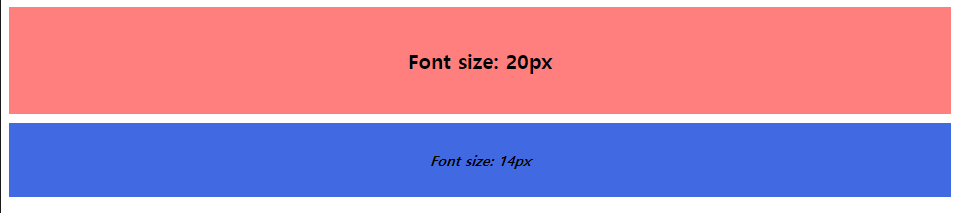
2.2 %
% - 백분률 단위의 상대 단위. 요소에 지정된 사이즈(상속된 사이즈나 디폴트 사이즈)에 상대적인 사이즈를 설정한다.
<!DOCTYPE html>
<html lang="en">
<head>
  <meta charset="UTF-8">
  <meta http-equiv="X-UA-Compatible" content="IE=edge">
  <meta name="viewport" content="width=4, initial-scale=1.0">
  <title>Document</title>
  <style>
    body {
      text-align: center;
      font-size: 14px;
    }
    div {
      font-size: 120%;
      font-weight: bold;
      padding: 2em;
      background-color: rgba(255, 0, 0, 0.5);
    }
    h1 {
      font-size: 100%;
      font-style: italic;
      padding: 2em;
      background-color: royalblue;
    }
  </style>
</head>
<body>
  <div>Font size: 14px * 120% → 16.8px</div>
  <h1>Font size: 14px * 100% → 14px</h1>
</body>
</html>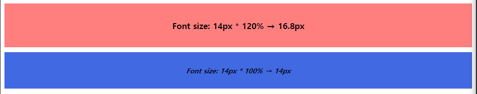
2.3 em
em - 배수단위로 상대 단위이다. 요소에 지정된 사이즈에 상대적인 사이즈를 설정.
1em은 요소에 지정된 사이즈와 같고 2em은 요소에 지정된 사이즈의 2배이다.
폰트 사이즈 설정이나 콘텐츠를 포함하는 컨테이너의 크기 설정에 사용하면 상대적인 설정이 가능하며 편리.
<!DOCTYPE html>
<html lang="en">
<head>
  <meta charset="UTF-8">
  <meta http-equiv="X-UA-Compatible" content="IE=edge">
  <meta name="viewport" content="width=4, initial-scale=1.0">
  <title>Document</title>
  <style>
    body {
      text-align: center;
      font-size: 14px;
    }
    div {
      font-size: 1.5em;
      font-weight: bold;
      padding: 2em;
      background-color: rgba(255, 0, 0, 0.5);
    }
    h1 {
      font-size: 1em;
      font-style: italic;
      padding: 2em;
      background-color: royalblue;
    }
  </style>
</head>
<body>
  <div>Font size: 1.5em → 14px * 1.5</div>
  <h1>Font size: 1em → 14px * 1</h1>
</body>
</html>
중첩된 자식 요소에 em을 지정하면 모든 자식 요소의 사이즈에 영향을 준다.
<!DOCTYPE html>
<html lang="en">
<head>
  <meta charset="UTF-8">
  <meta http-equiv="X-UA-Compatible" content="IE=edge">
  <meta name="viewport" content="width=4, initial-scale=1.0">
  <title>Document</title>
  <style>
    body {
      text-align: center;
      font-size: 14px;
    }
    div {
      font-size: 1.2em;
      font-weight: bold;
      padding: 2em;
    }
    .box1 { background-color: rgba(0, 0, 255, 0.2); }
    .box2 { background-color: rgba(0, 0, 255, 0.6); }
    .box3 { background-color: rgba(0, 0, 255, 0.8); }
  </style>
</head>
<body>
  <div class="box1">
    Font size: 1.2em → 14px * 1.2 = 16.8px
    <div class="box2">
      Font size: 1.2em → 16.8px * 1.2 = 20.16px
      <div class="box3">
        Font size: 1.2em → 20.16px * 1.2 = 24.192px
      </div>
    </div>
  </div>
</body>
</html>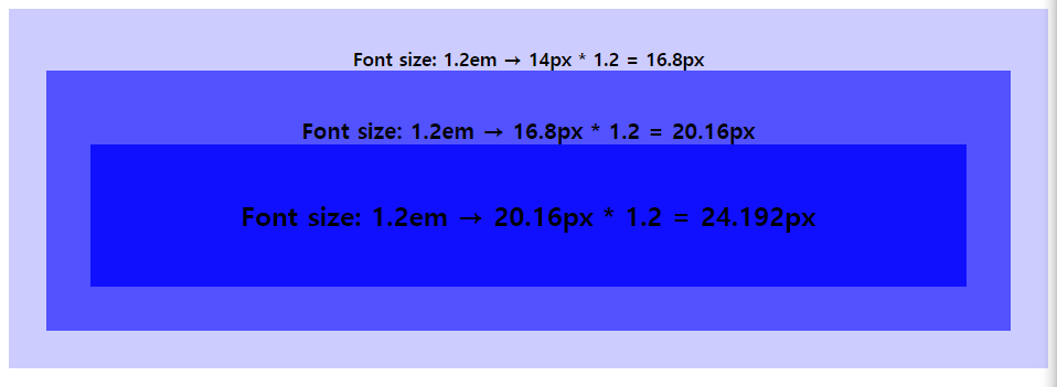
주의가 필요. 상대 단위인 em의 기준이 상속의 영향으로 바뀔 수 있음
2.4 rem
em의 기준은 상속의 영향으로 바뀔 수 있지만 rem은 최상위 요소(html)의 사이즈를 기준으로 삼는다. rem 의 r은 root를 의미함
<!DOCTYPE html>
<html lang="en">
<head>
  <meta charset="UTF-8">
  <meta http-equiv="X-UA-Compatible" content="IE=edge">
  <meta name="viewport" content="width=4, initial-scale=1.0">
  <title>Document</title>
  <style>
    html {
      font-size: 14px;
    }
    div {
      font-size: 1.2rem;
      font-weight: bold;
      padding: 2em;
      text-align: center;
    }
    .box1 { background-color: rgba(0, 0, 255, 0.2); }
    .box2 { background-color: rgba(0, 0, 255, 0.6); }
    .box3 { background-color: rgba(0, 0, 255, 0.8); }
    .box11 { background-color: rgba(255, 0, 0, 0.2); }
    .box22 { background-color: rgba(255, 0, 0, 0.6); }
    .box33 { background-color: rgba(255, 0, 0, 0.8); }

</style>
</head>
<body>
  <div class="box1">
    Font size: 1.2rem → 14px * 1.2 = 16.8px
    <div class="box2">
      Font size: 1.2rem → 14px * 1.2 = 16.8sspx
      <div class="box3">
        Font size: 1.2rem → 14px * 1.2 = 16.8px
      </div>
    </div>
  </div>
  <hr>
  <div class="box11">
    other class box11
    <div class="box22">
      other class box22
      <div class="box33">
        other class box33
      </div>
    </div>
  </div>
</body>
</html>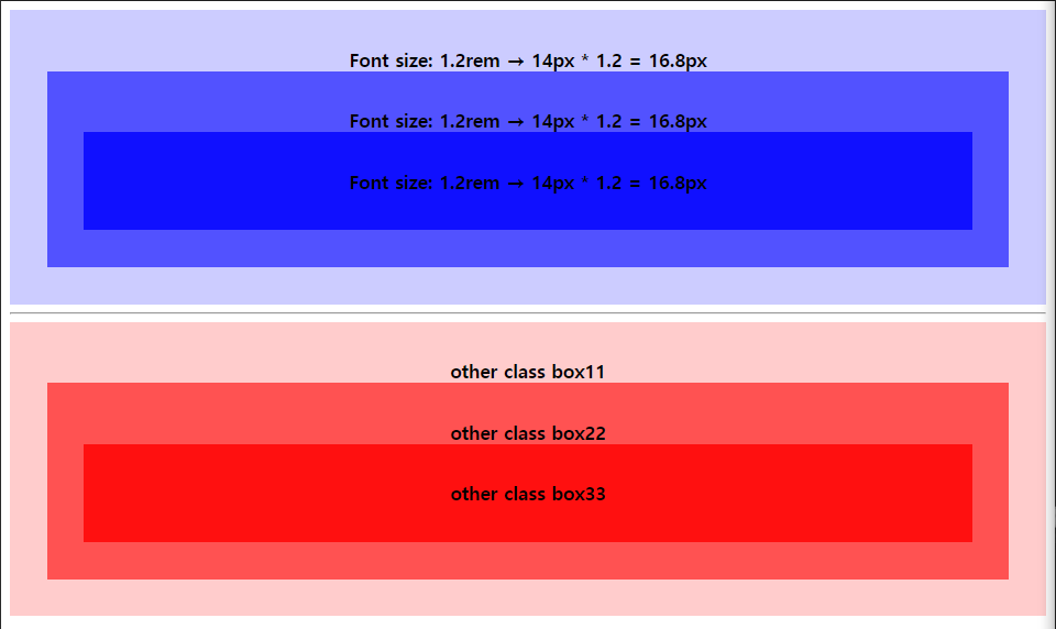
사용자가 브라우저의 기본 폰트 크기를 변경하더라도 이에 따라 웹사이트의 레이아웃을 적절히 조정할 수 있다는 장점. 따라서 폰트 사이즈 뿐만 아니라 콘텐츠의 크기에 따라 가변적으로 대응하여야 하는 wrapper요소 등에 적합.
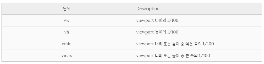
2.5 Viewport 단위 (vh, vw, vmin, vmax)
반응형 웹디자인은 화면의 크기에 동적으로 대응하기 위해 % 단위를 자주 사용한다. 하지만 % 단위는 em과 같이 상속에 의해 부모 요소에 상대적 영향을 받는다.
viewport를 기준으로 한 상대적 사이즈이다.
<!DOCTYPE html>
<html lang="en">
<head>
  <meta charset="UTF-8">
  <meta http-equiv="X-UA-Compatible" content="IE=edge">
  <meta name="viewport" content="width=4, initial-scale=1.0">
  <title>Document</title>
    <style>
      body { margin: 0px; }
      .item {
        width: 50vw;
        height: 50vh;
        text-align: center;
        line-height: 50vh;
        font-size: 3rem;
        color: white;
      }
      .item1 { background-color: black;}
      .item2 { background-color: brown;}
    </style>
</head>
<body>
  <div class="item item1">item1</div>
  <div class="item item2">item2</div>
</body>
</html>
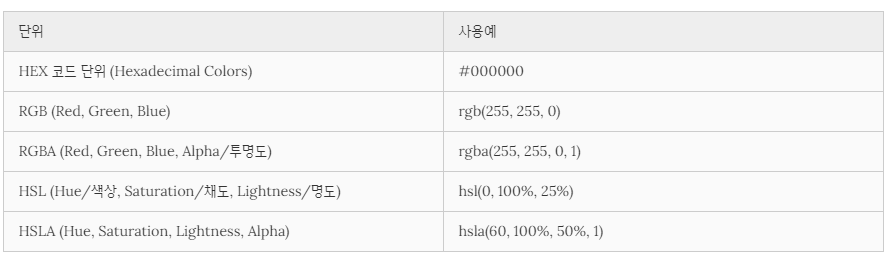
3.색상 표현 단위
키워드(red, blue...) - 사용이 간편 / 표현할 수 있는 색상의 수 제한
다양한 색상을 표현하기 위해 다음과 같은 색상 표현 단위를 사용할 수 있음.
HTML COLOR CODES 참조
http://htmlcolorcodes.com/
그 외 많은 color keywords
링크 참조