Codestates pre course 15일차
오늘은 코드스테이츠 프리 코스 15일차
오늘부터 html, css 파트 시작.css flexbox, grid 복습이 필요하다. (안 쓰니깐 다 까먹는다...)
flex-shrink, flex-grow, flex-basis 다시 정리해보기.
flex-direction에 따른 align-items, justify-content base 축 완벽히 숙지하기.시멘틱 태그도 한번 다시 쭉 볼 필요가 있어 보이고 내일은 그리드 봐야지.
오랜만에 마크업 해보니깐 그래도 재미가 있더라.
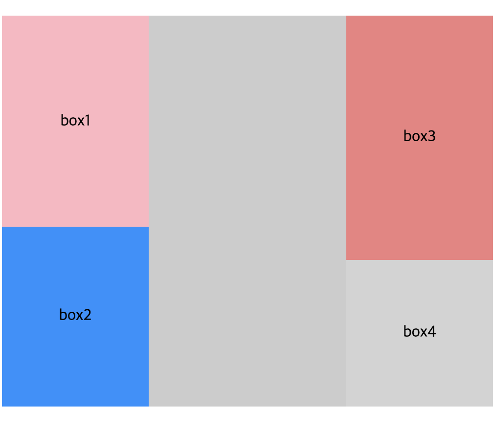
index.html
<div class="flex-container container1">
  <div class="flex-item">box1</div>
  <div class="flex-item">box2</div>
  <div class="flex-item">box3</div>
</div>
style.css
.flex-container {
	display: flex;
	margin-bottom: 100px;
}

.flex-item {
	display: flex;
	justify-content: center;
	align-items: center;
	width: 150px;
	height: 150px;
}

.container1 {
	justify-content: space-around;
	height: 100vh;
}

.container1 .flex-item:nth-of-type(1) {
	align-self: center;
}

.flex-item:nth-of-type(1) {
	background: lightpink;
	flex-grow: 2;
	flex-shrink: 2;
}
.flex-item:nth-of-type(2) {
	background: dodgerblue;
	flex-grow: 1;
	flex-shrink: 2;
}
.flex-item:nth-of-type(3) {
	background: lightcoral;
	flex-grow: 1;
	flex-shrink: 2;
}
.flex-item:nth-of-type(4) {
	background: lightgrey;
	flex-grow: 0;
	flex-shrink: 2;
}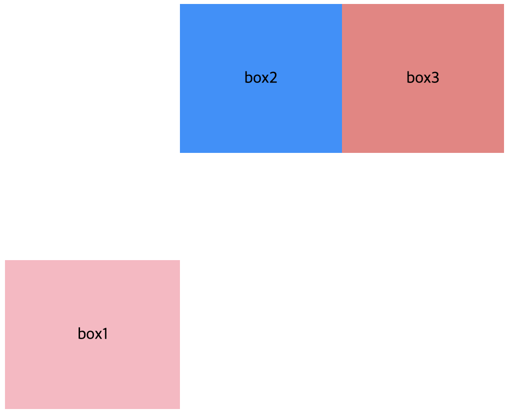
index.html
<div class="flex-container container2">
  <div class="flex-item">box1</div>
  <div class="flex-item">box2</div>
  <div class="flex-item">box3</div>
  <div class="flex-item">box4</div>
</div>
style.css
.flex-container.container2 {
	flex-direction: column;
	justify-content: space-between;
	align-items: flex-start;
	align-content: space-between;
	background: rgba(0, 0, 0, 0.2);
	flex-wrap: wrap;
	height: 60vh;
}