React.js + Storybook 학습

-
스토리북? => 스토리북은 UI 컴포넌트 개발 도구
스토리북은 처음에는 리액트 스토리북으로 시작을 했지만, 현재는 RN, Vue, Angular 등 대부분의 프레임워크 또는 라이브러리를 지원한다.
UI 컴포넌트 테스트 및 프로토타이핑을 할 수도 있고, 디자인 시스템 개발을위한 도구로도 사용이 가능하다. 단순하게 사용한다면 샘플코드와 props 등을 정보를 제공하는 용도로도 사용이 가능하다. -
스토리북 시작하기
npx create-react-app storybook-app --template typescript빠르게 스토리북을 사용해보고자 create-react-app 을 사용하였고, 템플릿은 typescript 를 사용하였습니다.
프로젝트가 잘 생성이 되었다면, 이후에 아래 명령어를 실행합니다.
npx -p @storybook/cli sb init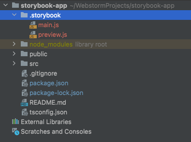
.storybook 이라는 폴더가 해당 프로젝트내에 생성된게 확인이 됩니다. 그리고 package.json 에 아래와 같은 실행 스크립트가 추가가 되었습니다.
"storybook": "start-storybook -p 6006 -s public",
"build-storybook": "build-storybook -s public"
npm run storybook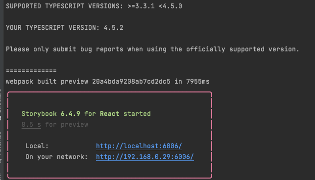
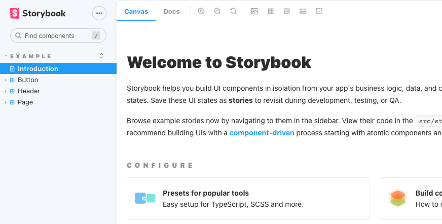
실행을 해보니, Welcome to Storybook 화면이 저를 반겨줍니다!
Checkbox 컴포넌트를 하나 작성 하였습니다.(오랜만에 CSS 하니 헷갈리네요)
import React, {SyntheticEvent} from 'react';
import './Checkbox.css';

interface CheckboxProps {
    label?: string;
    leftLabel?: boolean;
    name?: string;
    id?: string;
    value?: string;
    size?: 'sm' | 'lg';
    onChange?: ({checked, value}: onChangeInterface) => void;
}

interface onChangeInterface {
    checked: boolean;
    value: string;
}

/**
 * Checkbox UI component
 */
export default function Checkbox({
                                     label = '',
                                     leftLabel = false,
                                     name = '',
                                     id = '',
                                     value = '',
                                     size = undefined,
                                     onChange = () => {
                                     }
                                 }: CheckboxProps): React.ReactElement {

    const handleChange = (e: SyntheticEvent) => {
        const targetEl = e.target as HTMLInputElement;
        console.log(targetEl.checked, targetEl.value);
        onChange({checked: targetEl.checked, value: targetEl.value});
    };

    return (
        <div className='checkbox-wrap'>
            <label className='checkbox-label'>
                {leftLabel === true && (
                    <span className='label-text label-left'>
                    {label}
                </span>
                )}
                <input type='checkbox' name={name} id={id} value={value} onChange={handleChange}/>
                <div
                    className={[`checkbox-icon-wrap`, `${size === 'sm' ? `checkbox-icon-wrap-${size}` : ``}`, `${size === 'lg' ? `checkbox-icon-wrap-${size}` : ``}`].join(' ')}>
                    <svg
                        xmlns='http://www.w3.org/2000/svg'
                        viewBox='0 0 20 20'
                        width='18'
                        height='18'>
                        <path stroke='currentColor' fill='currentColor' fillRule='nonzero' strokeWidth='1'
                              d='M8.489 13.597l7.304-7.304a1 1 0 0 1 1.414 1.414l-8 8a1 1 0 0 1-1.403.011l-4-3.875a1 1 0 1 1 1.392-1.436l3.293 3.19z'></path>
                    </svg>
                </div>
                {leftLabel === false && (
                    <span className='label-text label-right'>
                    {label}
                </span>
                )}

            </label>
        </div>
    )
}
.checkbox-wrap {
}
.checkbox-wrap .checkbox-label {
cursor: pointer;
display: inline-flex;
align-items: center;
}
.checkbox-label > input[type='checkbox'] {
height: 0;
appearance: none;
outline: none;
display: none !important;
}
.checkbox-label .label-text {
font-size: 14px;
}
.checkbox-label .label-left {
padding-right: 8px;
}
.checkbox-label .label-right {
padding-left: 8px;
}
.checkbox-label .checkbox-icon-wrap {
display: inline-flex;
align-items: center;
justify-content: center;
box-shadow: 0 0 0 2px #1976d2 inset;
border-radius: 2px;
background-color: transparent;
margin: 0;
padding: 0;
box-sizing: border-box;
position: relative;
}
.checkbox-label .checkbox-icon-wrap:before {
background: rgba(0, 0, 0, 0.12);
border-radius: 50%;
content: "";
position: absolute;
bottom: 0;
left: 0;
right: 0;
top: 0;
transform: scale(0);
transition: transform 0.2s linear;
}
.checkbox-label .checkbox-icon-wrap > svg {
color: transparent;
}
.checkbox-label:hover .checkbox-icon-wrap:before {
transform: scale(1.7);
}
.checkbox-label > input[type='checkbox']:checked + .checkbox-icon-wrap {
background-color: #1976d2;
}
.checkbox-label > input[type='checkbox']:checked + .checkbox-icon-wrap > svg {
color: #ffffff;
}
.checkbox-icon-wrap-sm {
width: 16px;
height: 16px;
}
.checkbox-icon-wrap-lg {
width: 20px;
height: 20px;
}
기본 예제들이 존재해서 사용하기 편리하다는 생각을 하였다.
/src/stories 경로에 스토리들을 작성하면 된다.
/.storybook 경로를 확인해보면, main.js / preview.js 파일이 존재를 한다. -> 스토리북 설정파일들이다.
// /.storybook/main.js
module.exports = {
  "stories": [
    "../src/**/*.stories.mdx",
    "../src/**/*.stories.@(js|jsx|ts|tsx)"
  ],
  "addons": [
    "@storybook/addon-links",
    "@storybook/addon-essentials",
    "@storybook/preset-create-react-app"
  ],
  "framework": "@storybook/react"
}
main.js 를 살펴보면 stories 프로퍼티에 배열값을 가지고 있는게 보이는데 유추를 해보면 어떤 경로에 스토리북 내용들을 읽어올지 형식을 설정하는걸 알수가 있다.
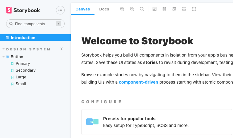
Introduction 같은 경우는 Introduction.stories.mdx 라는 파일에 작성이 되어있다.
Meta title 이라는 태그가 존재를 하는데, 해당 태그내에
example/Introduction 이라고 작성이 되어있다. 이걸 Introduction 이라고 변경하면 example 그룹핑에서 빠져나온다.
*.stories.tsx 내용을 보면,
export default {
  title: 'Design System/Button',
  component: Button,
  // More on argTypes: https://storybook.js.org/docs/react/api/argtypes
  argTypes: {
    backgroundColor: { control: 'color' },
  },
} as ComponentMeta<typeof Button>;
여기서 title 을 건들면 example 그룹핑에서 빼낼수 있다.
// Checkbox.stories.tsx
import React from 'react';
import {ComponentStory, ComponentMeta} from '@storybook/react';

import CheckboxComponent from '../components/checkbox/Checkbox';

export default {
    title: 'Design System/Checkbox',
    component: CheckboxComponent,
    argTypes: {
        onChange: {action: 'changed'}
    },
} as ComponentMeta<typeof CheckboxComponent>

const Template: ComponentStory<typeof CheckboxComponent> = (args) => <CheckboxComponent {...args} />

export const Checkbox = Template.bind({});
Checkbox.args = {
    label: 'Test',
    value: 'agree',
}

export const CheckboxSM = Template.bind({});
CheckboxSM.args = {
    label: 'Test SM',
    value: 'agree',
    size: 'sm',
}

export const CheckboxLG = Template.bind({});
CheckboxLG.args = {
    label: 'Test LG',
    value: 'agree',
    size: 'lg',
}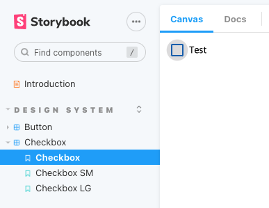
스토리북에 작성한 Checkbox 스토리가 추가가 되었다.
export default {
    title: 'Design System/Checkbox',
    component: CheckboxComponent,
    argTypes: {
        onChange: {action: 'changed'}
    },
} as ComponentMeta<typeof CheckboxComponent>
이 부분은 컴포넌트의 정보를 작성하는 부분이다. 이러한 형식을 CSF(Component Story Format) 라고 부른다. 컴포넌트의 이야기를 기술하라? 꽤 좋은 네이밍인거 같다.
argTypes 는 arg 의 유형을 지정한다.
Template 구문은 컴포넌트의 템플릿을 셋팅하는 구문이다.
생성한 Template 을 각각의 컴포넌트 스토리를 작성해서 사용이 가능하다.
현재 작성방식은 단일컴포넌트 방식으로 작성을 하였다.
이후에는 복합컴포넌트 방식으로도 한번 진행을 해보도록 하겠다.