display 속성(Block , inline , inline-block)
<!DOCTYPE html>
<html lang="en">
<head>
    <meta charset="UTF-8">
    <meta http-equiv="X-UA-Compatible" content="IE=edge">
    <meta name="viewport" content="width=device-width, initial-scale=1.0">
    <title>Document</title>
    <style>
        div {
      		display : inline-block;
            width: 200px;
            height: 50px;
            background-color: red;
        }
        span {
            background-color: yellow;
        }
    </style>
</head>
<body>
    <div></div>
    <div></div>
    <div></div>
    <span>sdsd</span>
    <span>sdsd</span>
</body>
</html>
정리
- div의 display default 속성은 block
- display 속성에는 inline 속성도 있는데
inline은 width와 height를 가질 수 없음
- block 속성은 옆에 다른 것이 올수 없는 반면 inline은 한줄에 올수 있는 것들 ex) span - block속성을 block 이지만 inline 처럼 만들기 위해 display 옵션을 inline-block으로 설정가능 그래서 width , height , margin 등을 가질 수 있지만
반응형 디자인이 지원되지 않아서사용자의 화면 해상도에 따라 다른 결과를 보여주는 단점이 있어서 쓰지 않음.(inline-block은 안쓴다.!!) - 이러한 문제점을 해결하기 위해 display의
flex옵션을 이용한다.
Flex
-
flex 옵션을 사용하기 위한 3가지 규칙
1. 원하는 tag의 속성을 flex하게 만들기 위해서는 자식 엘리먼트에 적는 것이 아닌 부모 엘리먼트에 flex 옵션을 주어야 한다.
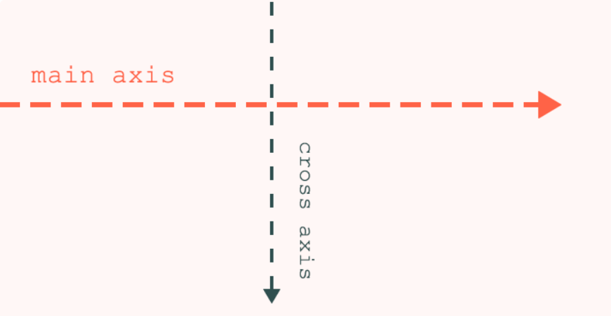
2. flexbox에는 2가지 축(main axis , cross axis이 있음) 주축은 기본값이 수평축이고 , 교차축은 기본값이 수직이고 기본값이 반대가 되도록 설정할 수 있음.
3. 주축에 관한 옵션justify-content
4. 교차축에 관한 옵션align-items
5. 주축과 , 교차축 옵션들을 주어 자식 엘리먼트의 정렬 상태등을 조정할 수 있다. -
vh(viewport height): 사용자의 화면에 따른 높이 단위
ex) 100vh 화면 높이의 100%의미
<!DOCTYPE html>
<html lang="en">
<head>
    <meta charset="UTF-8">
    <meta http-equiv="X-UA-Compatible" content="IE=edge">
    <meta name="viewport" content="width=device-width, initial-scale=1.0">
    <title>Document</title>
    <style>
        body {
            display: flex;
            height: 100vh;
            justify-content: center;
            align-items: center;
        }
        div {
            margin : 10px;
            width: 200px;
            height: 50px;
            background-color: red;
        }
    </style>
</head>
<body>
    <div></div>
    <div></div>
    <div></div>

</body>
</html>
<!DOCTYPE html>
<html lang="en">
<head>
<meta charset="UTF-8">
<meta http-equiv="X-UA-Compatible" content="IE=edge">
<meta name="viewport" content="width=device-width, initial-scale=1.0">
<title>Document</title>
<style>
body {
display: flex;
height: 100vh;
flex-direction: column;
justify-content: end;
align-items: center;
}
div {
display: flex;
margin : 10px;
width: 200px;
height: 50px;
background-color: red;
color : black;
justify-content: center;
align-items: center;
}
#second {
background-color: blue;
}
</style>
</head>
<body>
<div>1</div>
<div id = "second">2</div>
<div>3</div>
</body>
</html>-
flex-direction : column;으로 지정하면 주축이 수직이고 교차축이 수평이 됨. (column-reverse , row-reverse 등의 옵션도 있음)
-
div의 자식 element들도 flex box처럼 변경하기 위해서는 자식 element의 부모인 div의 display속성을 flex로 변경하고 앞에서 했던 것 처럼 justify-content , align-items속성들을 div에서 변경하게 되면 div의 자식 element들이 변하게 된다.
-
이때 div의 부모인 body는 flex이지만 div가 flex 속성을 가지지 않으면 div의 자식 element는 변화하지 않는다.
즉 자식 element를 flex하게 변경하고 싶으면 부모의 display : flex로 변경해야 하고, div에서 여러 값들을 변경하여 자식 element를 변경한다.
flex box관련 옵션(매우 많이 있음)
- flex-wrap : wrap , nowrap (화면 크기 변할때 크기 변화를 줄지 말지 여부)