들어가기 전..
-
인라인 상자
- 상하 여백은 적용 ❌
👉 밀어내지 못한다고 말하는 것이 좀 더 정확, 덧그려진다. - 좌우 여백은 적용 ⭕
- 상하 여백은 적용 ❌
-
블록 상자
- 상하좌우 여백 적용 ⭕
- 상하좌우 여백 적용 ⭕
📖 예제 1
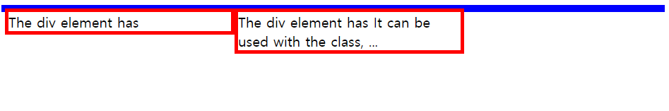
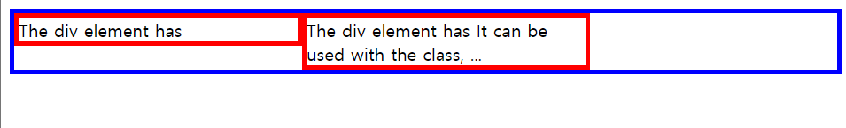
<div>를 사용해서 부모 요소 안에 자식 요소를 두 개 만들고, 자식 요소에게 float: left 속성을 주었다. 이때, 자식 요소들은 공중에 붕 떠있게 된다.
<!DOCTYPE html>
<html>
<head>
  <style>
    .mother {
      border: 4px solid blue;
    }

    .box {
      border: 4px solid red;
      width: 252px;
      float: left;
    }
  </style>
</head>

<body>
  <div class="mother">
    <div class="box">
      The div <span>element</span> has
    </div>
    <div class="box">
      The div <span>element</span> has It can be used with the class, ...
    </div>
  </div>
</body>
</html>
👉 실행 결과
자식 요소가 부모 요소 안에 들어가지 않은 상태로 화면에 출력된다.
❗ 이때 BFC 재계산이 필요하다.
ref: https://developer.mozilla.org/ko/docs/Web/Guide/CSS/Block_formatting_context
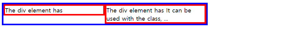
부모에게 hidden 속성을 주게 되면, BFC 재계산을 하여 부모 요소가 자식 요소를 담을 수 있게 된다.
👩💻 .mother에 속성 추가
자식 요소가 떠있는데 부모 요소가 안지 못하는 상황에 사용될 수 있는 것들은 다음과 같다.
.mother {
      border: 4px solid blue;
      overflow: hidden;
      /* float: left; */
      /* display: inline-block; */
      /* display: table-cell; */
      /* position: absolute; */
}
👉 실행 결과
각 속성의 성질에 따라 여백이 생기기도, 요소에 딱 맞는 크기로 나타나기도 한다.
🤔
text-align은 블록 요소에 적용
.mother에text-align속성을 주면 안에 있는 글자만 가운데 온다. 따라서mother의 부모인body에 속성을 주어 상속되도록 해야 한다.body { text-align: center; }👉 글자에 관련된 것은 대부분 상속이 된다!
📖 예제 2
다음 코드에서 photo 옆에 글자들이 흐르도록 해보자.
<!DOCTYPE html>
<html>
<head>
  <style>
    .mother {
      border: 4px solid lime;
      width: 270px;
      padding: 20px;
    }

    .mother > .photo {
      width: 100px;
      height: 100px;
      border: 10px solid lime;
    }
  </style>
</head>

<body>
  <div class="mother">
    <div class="photo"></div>
    <div class="box">
      Lorem ipsum dolor sit amet consectetur adipisicing elit. Culpa amet nobis itaque porro recusandae, maiores mollitia voluptatem praesentium? Blanditiis quaerat laboriosam, excepturi ut veniam sequi id accusamus nam enim optio.
    </div>
  </div>
</body>
</html>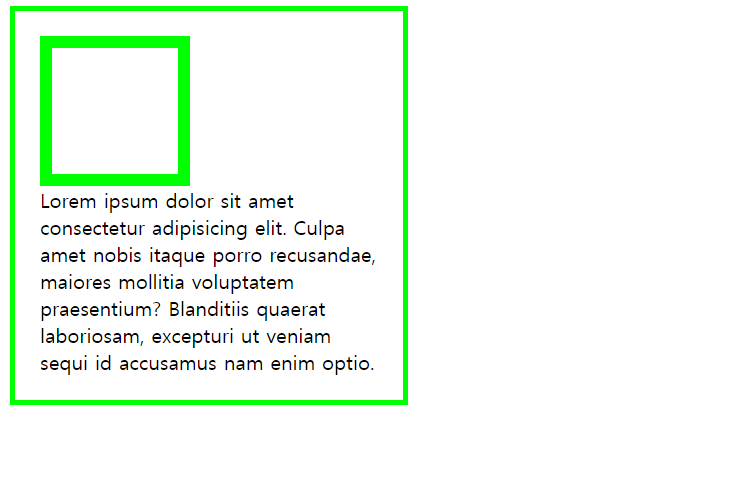
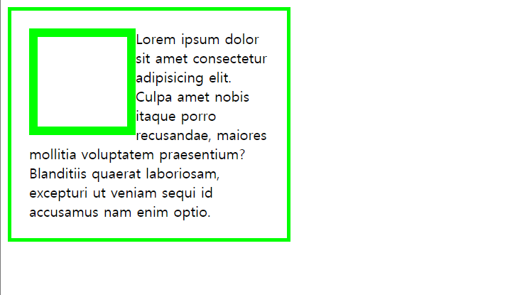
상자 옆에 글자가 오게 하려면 상자에만 float 속성을 주면 되고, 상자 옆에 상자가 오게 하려면 둘 다 float 속성을 주어야 한다.
👩💻 방법 1. .mother에 속성 추가
이때 위 이미지처럼 부모 요소가 자식 요소(photo)를 안지 못하는데 부모에게 height를 주는 것은 좋지 않은 선택이다.
👉 BFC 재계산을 하여 자동으로 밀어내게 해야 한다!
.mother {
      border: 4px solid lime;
      width: 270px;
      padding: 20px;
      overflow: hidden; /* 부모에게 속성을 주어야 자식을 안을 수 있음 */
    }

    .mother > .photo {
      width: 100px;
      height: 100px;
      border: 10px solid lime;
      float: left;
    }
👉 실행 결과
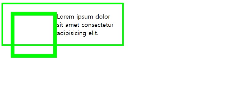
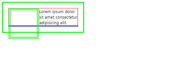
👩💻 방법 2. 빈 태그(.fix) 추가
이번에는 부모를 똑똑하게 만드는 것(overflow: hidden;)이 아닌 자식(fix, 빈 태그)을 추가해보자.
photo가 떠있고(float) 공간이 생기면서 text가 그 공간을 차지하게 된다.
<!DOCTYPE html>
<html>
<head>
  <style>
    .mother {
      border: 4px solid lime;
      width: 270px;
      padding: 20px;
      /* overflow: hidden; */
    }

    .mother > .photo {
      width: 100px;
      height: 100px;
      border: 10px solid lime;
      float: left;
      opacity: 0.5;
    }

    .mother > .text {
      border: 2px solid red;
    }

    .fix {
      border: 2px solid blue;
    }
  </style>
</head>

<body>
  <div class="mother">
    <div class="photo"></div>
    <div class="text">
      Lorem ipsum dolor sit amet consectetur adipisicing elit.
    </div>
    <div class="fix"></div>
  </div>
</body>
</html>
👉 실행 결과
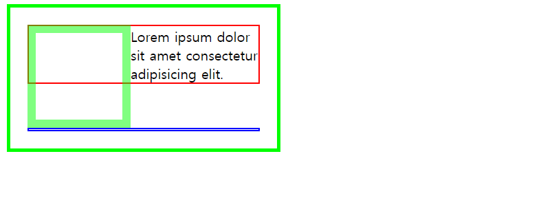
이때 .fix에 clear 속성을 추가하면 막내 자식까지 부모가 안아줄 수 있다.
clear: both도 가능하다. (흔히 사용)
.fix {
      border: 2px solid blue;
      clear: left;
    }
👉 실행 결과
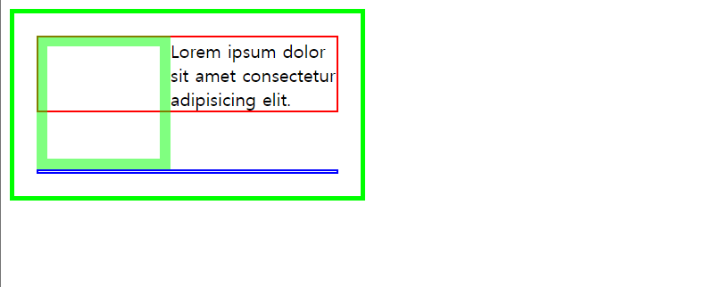
👩💻 방법 3. ::after 이용
float 할 때마다 빈 태그(fix)를 넣기 싫다면 빈 태그를 삭제하고 가상 요소를 사용하면 된다!
이때 가상 요소는 인라인 요소이므로 clear가 적용되지 않는다. 따라서 가상 요소를 블록 요소로 바꿔야 한다.
.mother::after {
      content: '';
      border: 2px solid blue;
      clear: left;
      display: block;
    }
👉 실행 결과
📖 예제 3
엄마(mother)를 두 개 나란히 오도록 배치해보자.
- 할머니를 똑똑하게 만든다. 할머니에게 속성으로
overflow: hidden;를 부여한다. - 할머니의 막내 자식을 만든다.
나는 첫 번째 방법으로 구현했다.
👩💻 .grandmom에 속성 추가
<!DOCTYPE html>
<html>
<head>
<style>
.mother {
border: 4px solid lime;
width: 270px;
padding: 20px;
}
.mother.left {
float: left;
}
.mother.right {
float: right;
}
.mother > .photo {
width: 100px;
height: 100px;
border: 10px solid lime;
float: left;
opacity: 0.5;
}
.mother > .text {
border: 2px solid red;
}
/* 엄마가 똑똑해지면서 (float->bfc 재계산을 일으킴) */
/* fix::after가 필요 없어졌다. */
/* .fix::after {
content: '';
border: 2px solid blue;
clear: both;
display: block;
} */
.grandmom {
border: 4px solid black;
padding: 20px;
overflow: hidden;
width: 700px;
}
</style>
</head>
<body>
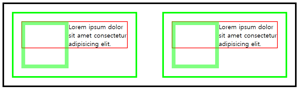
<div class="grandmom">
<div class="mother left fix">
<div class="photo"></div>
<div class="text">
Lorem ipsum dolor sit amet consectetur adipisicing elit.
</div>
</div>
<div class="mother right fix">
<div class="photo"></div>
<div class="text">
Lorem ipsum dolor sit amet consectetur adipisicing elit.
</div>
</div>
</div>
</body>
</html>👉 실행 결과
📖 예제 4
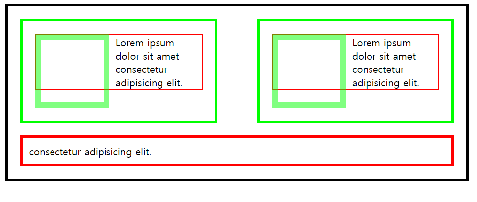
나란히 배치된 두 개의 엄마 밑에 요소(bottom)를 하나 더 추가해보자.
bottom에게 clear 속성을 주었으므로 grandmom의 overflow 속성이 필요 없어졌다.
<!DOCTYPE html>
<html>
<head>
  <style>
    .mother {
      border: 4px solid lime;
      width: 270px;
      padding: 20px;
      margin-bottom: 20px;
    }

    .mother.left {
      float: left;
    }
    .mother.right {
      float: right;
    }

    .mother > .photo {
      width: 100px;
      height: 100px;
      border: 10px solid lime;
      float: left;
      opacity: 0.5;
      margin-right: 10px;
    }

    .mother > .text {
      border: 2px solid red;
      /* margin-left: 10px; bottom과 마찬가지로 photo가 떠있으므로 적용 X*/
      /* 따라서 photo에게 margin-right를 주어야 함. */
    }

    /* .fix::after {
      content: '';
      border: 2px solid blue;
      clear: both;
      display: block;
    } */

    .grandmom {
      border: 4px solid black;
      padding: 20px;
      /* overflow: hidden; */
      width: 700px;
    }

    .bottom {
      border: 4px solid red;
      clear: both; /* float의 영향력을 clear시킨다. */
      padding: 10px;
      /* margin-top: 20px; 누나들(mother)이 떠있어서(float) margin이 적용되지 않는다. */
      /* 따라서 떠있는 누나들한테 margin-bottom을 주어야 한다. */
    }

  </style>
</head>

<body>
  <div class="grandmom">
    <div class="mother left fix">
      <div class="photo"></div>
      <div class="text">
        Lorem ipsum dolor sit amet consectetur adipisicing elit.
      </div>
    </div>

    <div class="mother right fix">
      <div class="photo"></div>
      <div class="text">
        Lorem ipsum dolor sit amet consectetur adipisicing elit.
      </div>
    </div>

    <div class="bottom">consectetur adipisicing elit.</div>
  </div>
</body>
</html>
👉 실행 결과