
style-components
styled-components란 JS 파일 내에서 css를 사용할 수 있게 해주는
React를 주요 대상으로 한 css-in-js 라이브러리이다.
설치 방법
$ npm install styled-components사용 방법
import styled from "styled-components";
styled-components를 styled라는 이름으로 import 한다.
const StyleTest = s.div `
  width: 100px;
  height: 100px;
  background: black;
`
const 컴포넌트명 = styled.{태그명}``;
App.js
전체코드
import React from "react";
import styled from "styled-components";

const StyleTest = styled.div `
  width: 100px;
  height: 100px;
  background: black;
`

function App() {

  return (
    <>
      <StyleTest />
    </>
  )
}
실행화면

styled-component를 쓰는 이유 중 하나가 props 값을 넘겨줄 수 있다는 것이다.
const StyleTest = styled.div `
  width: 100px;
  height: 100px;
  background: ${props => props.color || 'black'};
`

function App() {
  return (
    <>
      <StyleTest color="red"/>
    </>
  )
}
StyleTest 컴포넌트에 color라는 props를 넣어주고 만약 color라는 props가 있으면 해당 색을 넣어주고 없으면 black을 배경색으로 사용
실행화면

위의 예제 말고도 이렇게도 사용이 가능하다.
app.js
const StyleTest = styled.div `
  width: 100px;
  height: 100px;
  background: ${props => props.color || 'black'};
  ${props =>
    props.big &&
    css`
      width: 150px;
      height: 150px;
    `
  }
`

function App() {
  return (
    <>
      <StyleTest color="red" big/>
    </>
  )
}
만약 big이라는 props가 있다면 크기가 커지도록 설정 했다. 위와 같이 한줄 이상의 코드가 필요하다면
import styled, { css } from "styled-components";css를 import 해준 후 css`` 같이 사용해야 한다. 프로젝트 진행 시 자주 쓰이는 공통 스타일을 따로 만들어서 관리가 가능하다.
ButtonStyle.js
import React from "react";
import styled, { css } from "styled-components"

const ButtonST = styled.button`
  display: flex;
  align-items: center;
  justify-contents: center;
  outline: none;
  border: none;
  border-radius: 4px;
  color: white;
  font-weight: bold;
  cursor: pointer;
  padding-left: 1rem;
  padding-right: 1rem;

  height: 2.25rem;
  font-size: 1rem;

  background: #228be6;
  &:hover {
    background: #339af0;
  }
  &:active {
    background: #1c7ed6;
  }

  ${props =>
    props.cancel &&
    css`
      background: #FF0000;
      &:hover {
        background: #FF3333;
      }
      &:active {
        background: #FF3333;
      }
    `
  }

  `
  function Button({children, ...rest}) {
    return <ButtonST {...rest}>{children}</ButtonST>
  }

export default Button
...rest 참고 링크
https://learnjs.vlpt.us/useful/07-spread-and-rest.html
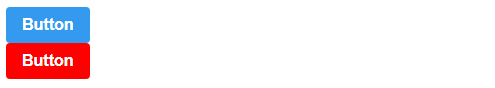
app.js
import React from "react";
import Button from "./components/ButtonStyle"


function App() {
  return (
    <>
      <Button>Button</Button>
      <Button cancel>Button</Button>
    </>
  )
}
위의 코드처럼 ButtonStyle.js라는 컴포넌트를 따로 만들어서 사용이 가능하다.
실행화면
app.js
import React, { useState } from "react";
import styled from "styled-components";

function App() {
  const [bgcolor, setbgcolor] = useState(true);

  function onChange() {
    setbgcolor(!bgcolor);
  }

  const Background = styled.div`
    width: 150px;
    height: 150px;
    background: ${props => props.bg ? 'black' : 'blue'}
  `

  return (
    <>
      <Background bg={bgcolor} />
      <button onClick={onChange}> Change </button>
    </>
  )
}

export default App;
위의 코드처럼 state 값을 받아 와 사용도 가능 하다.
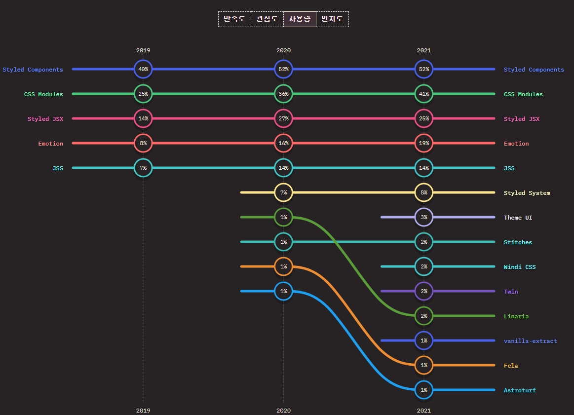
2019년 ~ 2021년도 까지의 styled component의 사용량은 1위에 달한다고 한다.

코딩너무어려워