Visualizing distributions
A plot tells a thousand words
수치상으로는 동일, 그러나 시각화하니..?
- 평균도, 표준편차도 다 동일한 데이터셋이 존재한다고 가정해보자.
- 그러나 이들을 그래프로 그려보니..
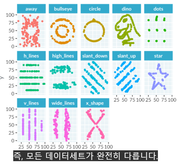
- 띠용?! 다 다르다!
- 즉, 수치만으로는 데이터를 다 알 수 없다. 때론 그래프가 더 많은 것을 알려준다.
Continuous vs Catrgorical variables
- 연속형 변수: 보통 숫자
- 범주형 변수: 보통 문자
- 또는, 둘다
- ex. 연령: 연령 or 연령대, 시간 등등
Histogram
- bin width를 적절히 설정하는것이 곧 좋은 통찰을 가져다줌.
- 봉우리는 몇개인가? unimodal, bimodal, trimodal..
- 왜곡 skewed: 꼬리가 어느쪽을 향하냐로 이름이 정해짐. left-skewed: 꼬리가 왼쪽을 향하고, 데이터가 오른쪽에 치우침
- 첨도 kurtic: 뾰족 or 납작
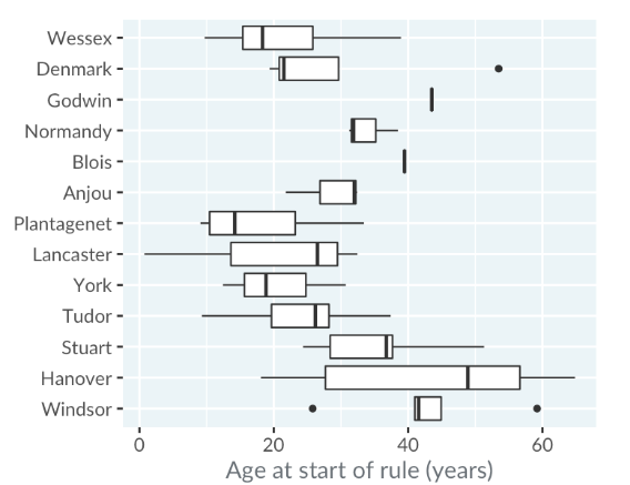
Box plot
- 여러개의 히스토그램을 비교하는건 쉽지 않음.
- 그러나 박스플롯은 한꺼번에 비교하기 용이함.
- ex. 왕들의 즉위 나이를 비교
Visualizing two variables
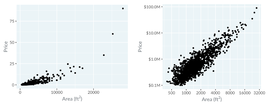
Scatter plots
- 로그 변환
: 잘 보이지 않던 선형 관계가 좀 더 뚜렷하게 보임.
: scale을 조정한 거라고 해야하나..?
Line plots
Bar plots
Dot plots

- 막대 그래프는 로그 변환이 불가능 하다
- 막대 그래프는 항상 0에서 시작하는데, 0의 로그 변환은 마이너스 무한대이기 때문
- 따라서 이럴때는 점 그래프를 쓰자
The color and the shape
Higher dimensions
Using color
- 모든 데이터 포인트를 동일하게 인식하려면?
: 색조-채도-휘도 색상 공간에서 정성적, 순차적 또는 발산 척도를 선택해야한다.
Three types of color scale
Qualitative
- Distinguish unordered categories
Sequential
- Show ordering
Diverging
- Show above or below a midpoint
- 가운대는 흰색으로 하고 양극단으로 갈수록 서로 다른 진한 색으로 한다면, 보기 쉬울 것이다.
Plotting many variables at once
Pair plot
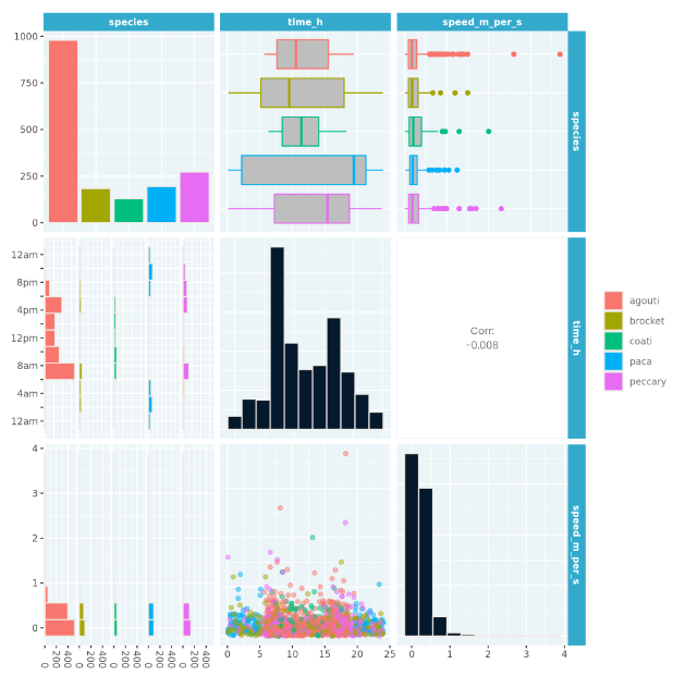
- compare many variables
Correlation
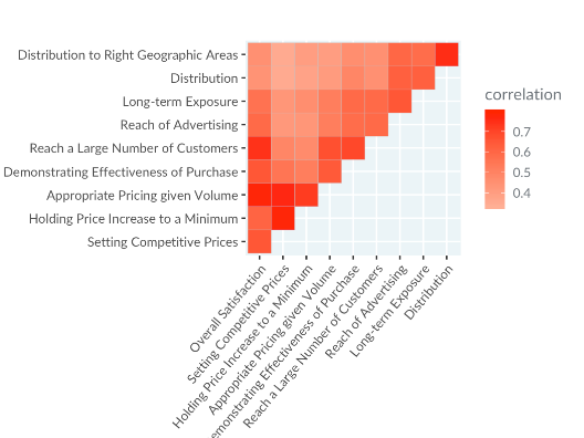
- show related variables
Parallel coordinates plot
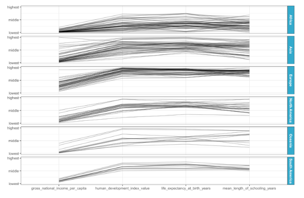
- find patterns across variable
99 problems but a plot ain't one of them
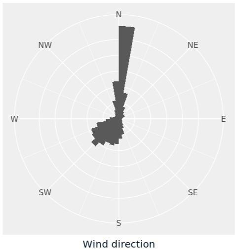
Polar coordinate
Pie plots(Pie charts)
- They are just bar plots converted into polar coordinates
- 단점: humans are generally worse at perceiving angles accurately compared to lengths.
Rose plots
bar plot
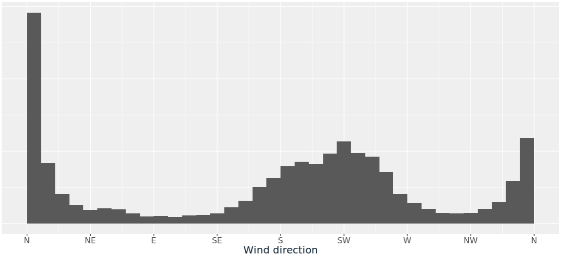
- N극이 두개로 쪼개져 보여서, 마치 peak(봉우리)가 3개인것 처럼 보인다.
rose plot
Axes of evil
Bar plot axes
Bar plot의 막대 길이는 비례한다.
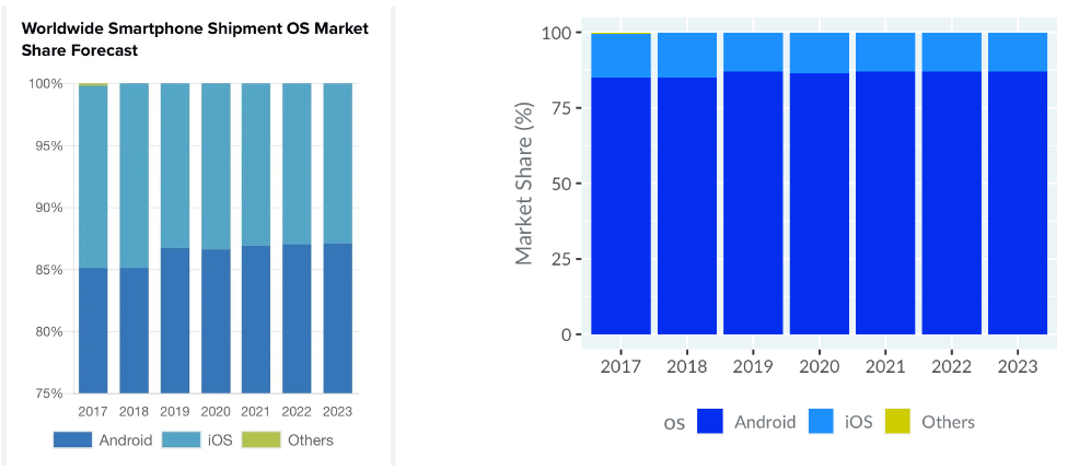
- 범위 설정으로 인해 android와 IOS의 비율이 비슷해 보이는 왼쪽 그래프.
- 즉, If you don't include zero on the axis used for bar lengths, then the relative lengths of bars are distorted, and it is easy to be misled.
Dual axes
Dual axes are misleading
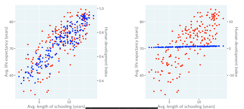
- 파란색은 왼쪽, 빨간색은 오른쪽 y축을 사용하는 왼쪽 그래프
- 이를 같은 범위로 바꾸면 파란색은 상관이 없어보이는 오른쪽 그래프
- 올바르게 그래프를 그리려면, 이렇게 해야한다. 이래야 맞다!!
ex. y축의 범위에 따른 그래프 양상의 변화
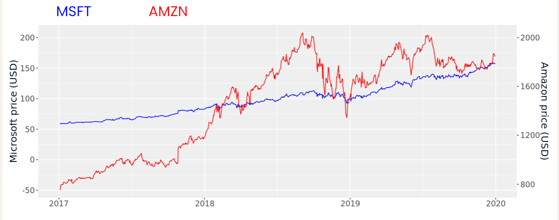
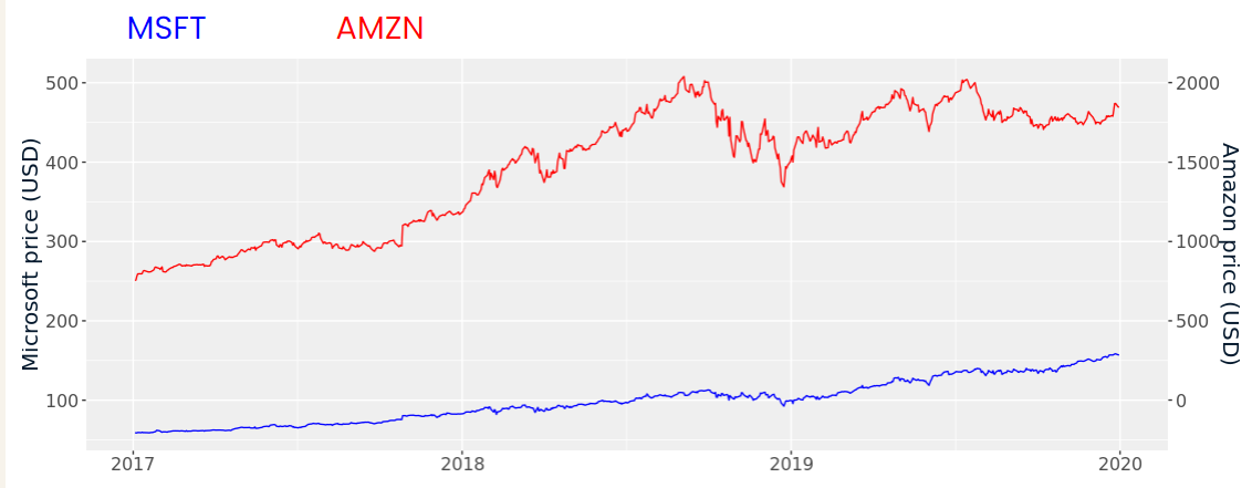
- 이 두 그래프(y축 범위 조정)만 봐서는 MSFT와 AMZN의 상관관계는 알 수 없다.
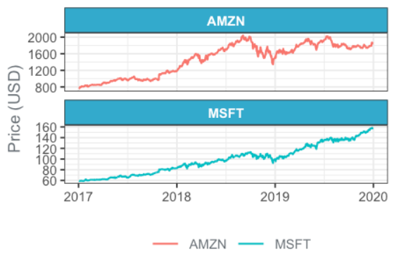
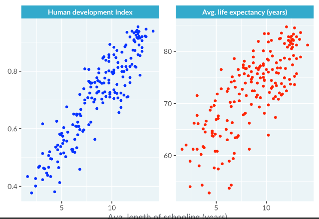
- Delightful debunking of dual axes! It would have been better to draw each line in its own panel, like this
Sensory overload
Measures of a good visualization
- How many interesting insights can your reader get from the plot?
- How quickly can they get those insights?
Chartjunk
: Any element of the plot that distaracts from the reader getting insight.
- Pictures
- skueomorphism: reflections, shadows, etc.
- 현실 세계에서 일어나는 일을 가상 객체에 추가하는 것
- 기간이 임의로 제한된다던가, y축이 0부터 시작되지 않는다던가
- Extra dimensions
- 3d 원근법을 사용한다던가..
- Ostentatious colors or lines
- 왼쪽 색이 난잡..오른쪽이 보기 좋음
Multiple plots
- Sometimes a dataset is so complex that it takes several plots to explore properly.
- 그래프를 나누어서 보는게 더 이해를 돕는다.
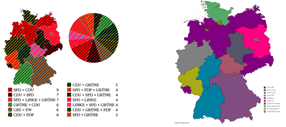
지역별 정당 의석 수 data
Bar plot by coalition
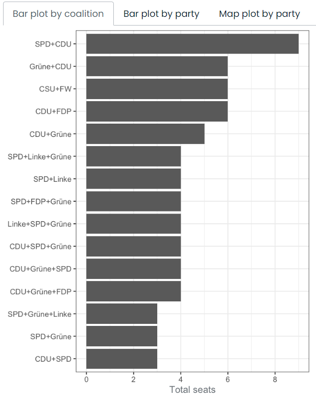
- The coalition with the most seats is 'SPD+CDU'.
Bar plot by party
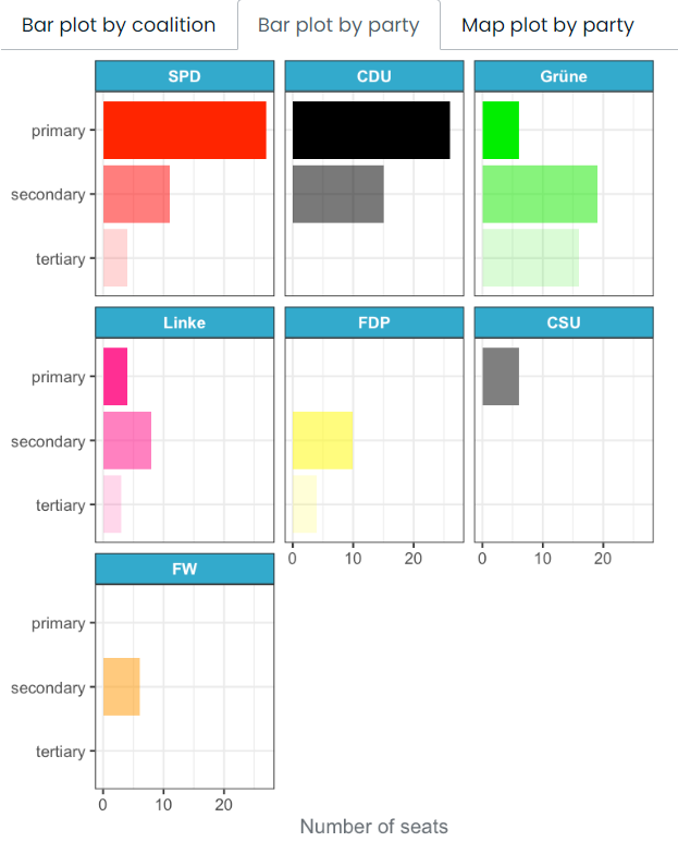
- The Grüne party have more seats as the secondary party in a coalition than any other party.
map plot by plot
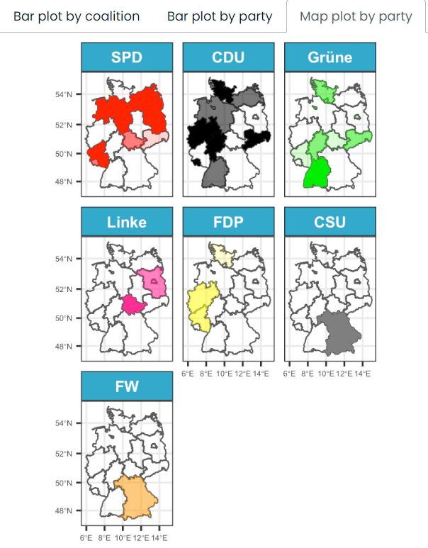
- The FDP only have seats in the Western states.
- Bavaria (the large state in the South East) has different political parties to those found in power in other states.

내 인생의 주연