애니메이션 효과
.box {
      font-size: 200px;
      width: 200px;
      height: 200px;
      background: transparent;
      position: relative;
      /* 이름 */
      animation-name: animate1;
      /* 시간 */
      animation-duration: 2s;
      /* 횟수 */
      animation-iteration-count: infinite;
      /* 마지막 상태 */
      animation-fill-mode: backwards;
      /* 진행방향 */
      animation-direction: alternate;

         /* 한줄로 축약 가능  */
      /* animation: animate2 5s infinite backwards

    }

    @keyframes animate1 {

    퍼센트에 따라 애니메이션 단계 표시.

      0% {
        /* 처음시작시 좌표 */
        transform: translateX(0);
        background-color: red;
      }

      100% {
        transform: translateX(500%) scale(1.5) rotate(360deg);
        background-color: blue;

      }
    }
애니메이션과 관련된 속성(Animation Related Properties)
animation 속성은 애니메이션과 관련된 속성을 일괄적으로 설정합니다.
animation-delay 속성은 애니메이션 지연 시간을 설정합니다.
animation-direction 속성은 애니메이션 움직임 방향을 설정합니다.
animation-duration 속성은 애니메이션 움직임 시간을 설정합니다.
animation-fill-mode 속성은 애니메이션이 끝난 후의 상태를 설정합니다.
animation-iteration-count 속성은 애니메이션 반복 횟수를 설정합니다.
animation-name 속성은 애니메이션 keyframe 이름을 설정합니다.
animation-play-state 속성은 애니메이션 진행상태를 설정합니다.
animation-timing-function 속성은 애니메이션 움직임의 속도를 설정합니다.
/* Bounce 애니메이션 */
@keyframes fadeBounce {
  0% {
    /* opacity 0이면 안보이고 1이면 보임 */
    opacity: 0;
    transform: translateY(-200%);
  }

  45% {
    transform: translateY(0px);
  }

  55% {

    transform: translateY(-100px);
  }

  100% {
    opacity: 1;
    transform: translateY(0);
  }
}

.box-a {
  flex-basis: 100%;
  opacity: 0;
  /* animation: fadeBounce 1s forwards; */
  animation-name: fadeBounce;
  animation-duration: 1s;
  animation-fill-mode: forwards;
  background-color: #e7eff5;
  padding: 20px 20px 0 20px;
  border: 2px solid #d3dee7;
  margin-bottom: 30px;
  box-shadow: 0px 5px 5px -2px rgba(0, 0, 0, 0.1);
  border-radius: 100px;
}

.boxes :nth-child(2) {
  animation-delay: 0.5s;
}

.boxes :nth-child(3) {
  animation-delay: 1s;
}

.boxes :nth-child(4) {
  animation-delay: 1.5s;
}
/* Star 애니메이션 */
@keyframes slideSpin {
  50% {
    transform: translateX(150%) scale(0.5);
  }

  75% {
    transform: translateX(150%) rotate(180deg) scale(0.5);
  }

  100% {
    transform: translateX(300%) rotate(180deg);
  }
}

.star {
  /* 애니메이션 이름, 시간, 반복횟수, 끝난후 방향. */
  animation: slideSpin 2s infinite alternate;
  width: 25%;
  height: auto;
}
@keyfreames 이름 { 0%~ 100%에 따라 좌표계 위치 및 scale }
.이름 { 애니메이션 설정 }
GRID
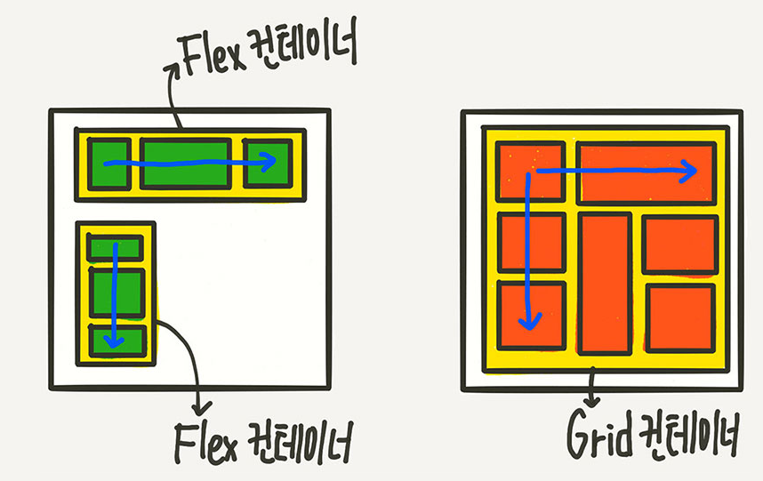
Flex는 한 방향 레이아웃 시스템이고 (1차원)
Grid는 두 방향(가로-세로) 레이아웃 시스템 (2차원)
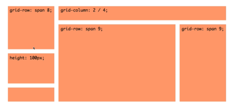
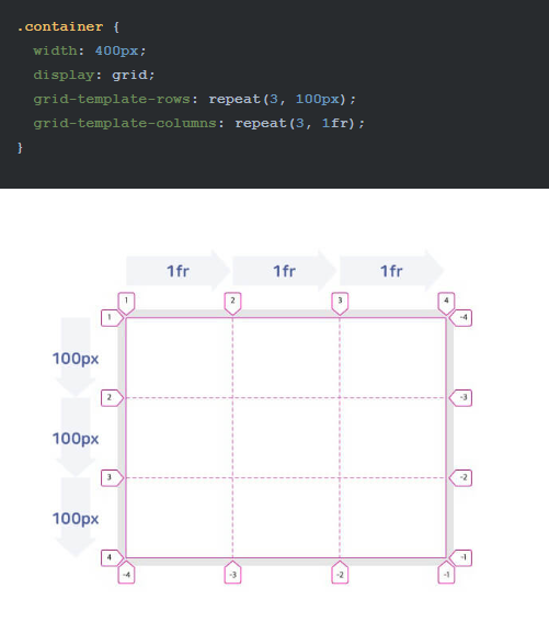
그리드 크기 지정하기
/* 각 행의 크기를 정의합니다. */
.container {
  grid-template-rows: 100px 200px;
}
/* 동시에 각 라인의 이름도 정의할 수 있습니다. */
.container {
  grid-template-rows: [first] 100px [second] 200px [third];
}
/* 라인에 중복된 이름을 지정할 수 있습니다. */
.container {
  grid-template-rows: [row1-start] 100px [row1-end row2-start] 200px [row2-end];
}
또한 fr을 통해 비율 지정도 가능.

추가적으로 flex에서 사용하였떤 align-content, justify-content 사용가능.
구성할 시 해당 사이트를 참조하여 화면 구성.
HelloWorld에서 RealWorld로