Transition
- CSS 속성의 시작과 끝을 지정(전환 효과)하여 중간 값을 애니메이션 처리
| 값 | 의미 | 기본값 |
|---|---|---|
| transition-property | 전환 효과를 사용할 속성 이름 | all |
| transition-duration | 전환 효과의 지속시간 설정 | 0s |
| transition-timing-funtion | 타이밍 함수 지정 | ease |
| transition-delay | 전환 효과의 대기시간 설정 | 0s |
transition 단축속성
transition : property duration timing-funtion delay;
Transitions은 보통 바뀌기 전 상태에 적용한다.
타이밍 함수란? 전환 효과가 빠르게→천천히 끝날것이냐 천천히→빠르게 끝날것이냐, 일정하게 애니메이션을 지속할 것이냐 정하는 것
Easing Funtion URL : https://easings.net/ko#
| 값 | 의미 | 기본 값 | Cubic Bezier 값 |
|---|---|---|---|
| ease | 빠르게 - 느리게 | ease | cubic-bezier(0.25, 0.1, 0.25, 0.1) |
| linear | 일정하게 | cubic-bezier(0, 0, 1, 1) | |
| ease-in | 느리게 - 빠르게 | cubic-bezier(0.42, 0, 1, 1) | |
| ease-out | 빠르게 - 느리게 | cubic-bezier(0, 0, .58, 1) | |
| ease-in-out | 느리게 - 빠르게 - 느리게 | cubic-bezier(0.42, 0, 0.58, 1) | |
| cubic-bezier(n, n, n, n) | 자신만의 값을 정의(0~1) | ||
| steps(n) | n번 분할된 애니메이션 |
Transform
- 요소의 변환 효과(변형)를 지정, deg : 디그리(각도)
transform : 변환함수1 변환함수2 변환함수3 ...;
transform : 원근법 이동 크기 회전 기울임;
/*EX*/
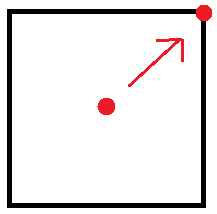
.box { transform : rotate(20deg) translate(10px, 0);
.box { transform : rotate(디그리(각도)) translate(x, y);transform 2D 변환 함수
| 값(변환함수) | 의미 | 단위 |
|---|---|---|
| translate(x, y) | 이동(X축, Y축) | 단위 |
| translateX(x) | 이동(X축) | 단위 |
| translateY(Y) | 이동(Y축) | 단위 |
| scale(x, y) | 크기(X축, Y축) | 없음(배수) |
| scaleX(x) | 크기(X축) | 없음(배수) |
| scaleY(y) | 크기(Y축) | 없음(배수) |
| rotate(degree) | 회전(각도) | deg(degree약어) |
| skew(x-deg, y-deg) | 기울임(X축, Y축) | deg(degree약어) |
| skewX(x-deg) | 기울임(X축) | deg(degree약어) |
| skewY(y-deg) | 기울임(Y축) | deg(degree약어) |
| matrix(n, n, n, n, n, n) | 2차원 변환 효과 | 없음 |
transform 3D 변환 함수
| 값(변환함수) | 의미 | 단위 |
|---|---|---|
| translate3d(x, y, z) | 이동(X축, Y축, Z축) | |
| translateZ(z) | 이동(Z축) | 단위 |
| scale3d(x, y, z) | 크기(X축, Y축, Z축) | 단위 |
| scaleZ(z) | 크기(Z축) | 없음(배수) |
| rotate3d(x, y, z, a) | 회전(X벡터, Y벡터, Z벡터, 각도) | 없음(배수) |
| rotateX(x) | 회전(X축) | 없음, deg |
| rotateY(y) | 회전(Y축) | deg |
| rotateZ(z) | 회전(Z축) | deg |
| perspective(n) | 원근법(거리) | deg |
| matrix3d(n, n, n, n, n, n, n, n, n, n, n, n, n, n, n, n) | 3차변환 효과 | 없음 |
perspective 는 transform 단축속성 맨 앞에 배치되야 한다.(필수)
transform 변환속성
| 속성 | 의미 |
|---|---|
| transform-origin | 요소 변환의 기준점을 설정 |
| transform-style | 3D 변환 요소의 자식 요소도 3D 변환을 사용할 지 설정 |
| perspective | 하위 요소를 관찰하는 원근 거리를 설정 |
| perspective-origin | 원근 거리의 기준점을 설정 |
| backface-visibility | 3D 변환으로 회전된 요소의 뒷면 숨김을 설정 |
transform-origin : 요소의 기준점을 설정
| 값 | 의미 | 기본값 |
|---|---|---|
| X축 | left, right, center, %, 단위 | 50% |
| Y축 | top, bottom, center, %, 단위 | 50% |
| Z축 | 단위 | 0 |
transform-style : 3D 변환 요소의 자식 요소도 3D 변환을 사용할 지 설정
| 값 | 의미 | 기본값 |
|---|---|---|
| flat | 자식 요소의 3D 변환을 사용하지 않음 | flat |
| preserve-3d | 자식 요소의 3D 변환을 사용함 |
.perspective{
  padding: 70px;
  width: 200px;
  perspective: 500px; /*500px의 원근거리*/
}
.grand-parent{
  width: 200px;
  border: 3px solid dodgerblue;
  transition: 1s;
  transform: rotateX(-45deg);
  transform-style: preserve-3d;
}
.parent{
  width: 200px;
  border: 1px solid tomato;
  transition: 1s;
  transform: rotateY(45deg);
  transform-style: preserve-3d;
}
img{
  width: 200px;
  border: 3px solid lightgray;
  transition: 1s;
  transform: rotateX(45deg);
}
perspective : 하위 요소를 관찰하는 원근 거리를 설정
- 관찰하고자 하는 요소들의 상위요소 부분에다가 지정
perspective: 500px;
| 값 | 의미 | 기본값 |
|---|---|---|
| 단위 | px, em, cm 등 단위로 지정 |
perspective 속성과 함수의 차이점
perspective 속성
- 관찰대상의 부모(조상) 요소에 적용하여 하위요소들을 관찰하는 원근거리 설정
- 관찰 대상이 여러개일 때 사용
transform: perspective()변환 함수
- 관찰 대상에 직접 적용하여 그 대상을 관찰하는 원근거리 설정
- 관찰대상이 한개 일 때 사용
| 속성/함수 | 적용대상 | 기준점 설정 |
|---|---|---|
| perspective | 관찰 대상의 부모요소 | perspective-origin |
| transform: perspective() | 관찰 대상 | transform-origin |
perspective-origin : 원근 거리의 기준점을 설정
| 값 | 의미 | 기본값 |
|---|---|---|
| X축 | left, right, center, %, 단위 | 50% |
| Y축 | top, bottom, center, %, 단위 | 50% |
backface-visibility : 3D 변환으로 회전된 요소의 뒷면 숨김을 설정
| 값 | 의미 | 기본값 |
|---|---|---|
| visible | 뒷면 숨기지 않음 | visible |
| hidden | 뒷면 숨김(rotate로 180도 돌리면 뒷면숨김) |
matrix(a, b, c, d, e, f) : 요소의 2차원 변환(TransForms) 효과를 지정
-
scale(), skew(), translate(), 그리고 rotate()를 지정
-
요소에 일반 변환(TransForms) 함수(2D, 3D)를 사용하더라도 브라우저에 의해
matrix함수로 계산되어 적용된다. (2D 변환 함수는matrix, 3D 변환 함수는matrix3d로) -
따라서 일반적인 경우에는
matrix함수가 아닌 일반 변환 함수를 사용하면 된다.
이 글은 패스트캠퍼스 '프론트엔드(React)올인원패키지Online'을 수강하며 정리한 노트입니다.
https://fastcampus.co.kr/search?keyword=%ED%94%84%EB%A1%A0%ED%8A%B8%EC%97%94%EB%93%9C

개발짜🏃♀️