📌 학습한 내용
CSS 애니메이션
1. transform 속성
: 해당 오브젝트의 크기를 축소/확대, 각도 회전, 위치 변경 등
transform: rotate(Ndeg);
: 2차원적인 회전 효과 (N = 음수 - 왼쪽으로 회전 / N = 양수 - 오른쪽으로 회전)transform: scale(width, height);
: 선택한 영역의 크기를 비율로 키움 (x축으로 x width, y축으로 x height) / 크기를 줄일 때는 소수점 단위로 width와 height값 넣기transform: skew(N1deg, N2deg)
: 3차원적인 회전 효과 (N1 - x축으로 회전, N2 - y축으로 회전)transform: translate(N1px, N2px);
: 선택한 영역의 오브젝트의 위치를 변경 (N1 - x축으로 이동, N2 - y축으로 이동)
👉 prefix
: 각 브라우저의 버전의 하위 버전까지 고려해 transform을 적용하기 위해 사용
- -webkit-transform: rotate(10deg); 크롬, 사파리
- -moz-transform: rotate(10deg); 파이어폭스
-ms-transform: rotate(10deg); 익스플로러- -o-transform: rotate(10deg); 오페라
- transform: rotate(10deg); 마지막에 디폴트 값으로 넣어줌
2. transition 속성
: 애니메이션이 변화하는, 움직이는 과정을 보여주고 싶을 때 사용
transition-property: width;: 변화를 주고자 하는 영역transition-duration: N1s;: 변화하는 데 걸리는 시간transition-timing-function: linear;
: 여러 속도의 성격에 영향을 미침 (linear: 시작부터 끝까지 일정한 속도 유지)transition-delay: N2s;: 애니메이션 효과 발동 전까지의 시간
👉 transition: width N1s linear N2s;
: 한 줄로 입력, 순서는 상관x 그러나 N1(먼저나오는 숫자)은 duration, N2(나중에 나오는 숫자)은 delay
👉 transition: width N1s linear, height N1's linear;
: ,(쉼표)를 사용해 변화를 주고자하는 속성을 늘려나갈 수 있음
3. animation 속성
: 해당 영역이 자연스럽게 자동으로 움직이게 할 때 사용
animation-name: 원하는 이름;
: 만들 애니메이션의 이름 정의animation-duration: Ns;
: 애니메이션이 동작하는 데 걸리는 시간animation-timing-function: linear;
: 여러 속도의 성격에 영향을 미침animation-delay: Ns;
: 애니메이션 효과 발동 전까지의 시간
animation-iteration-count: n;
: 애니메이션 진행 횟수, n회 (infinite: 무한으로 진행)animation-direction: normal;
: 애니메이션 진행 방향
(normal: 정방향,alternate: 왕복, 반복효과, interation-count의 절반만큼 진행)
@keyframes : animation 속성을 이용해 구현할 때 함께 써야할 코드, 실제 애니메이션이 발동하는 형태값을 입력
@keyframes 애니메이션이름 {
	0%/* from */ {
		width: 300px;
		height: 300px;
		background-color: yellow;
	}

	50% {
		background-color: greenyellow;
	}

	100% /* to */ {
		width: 600px;
		height: 600px;
		background-color: yellowgreen;
		border: solid 10px blue;
	}
}
👉 animation: 애니메이션이름 N1s linear infinite alternate N2;
: : 한 줄로 입력, 순서는 상관x 그러나 N1(먼저나오는 숫자)은 duration, N2(나중에 나오는 숫자)은 delay
👉
- transform과 같이 prefix 사용 o
- 단,
animation에서는@keyframes에도 넣어줘야 함. - @keyframes에 prefix를 달았다 해도, 자동으로 대표가 되는 것은 아니다.
	animation: spinLion 1.5s linear infinite alternate;
	-webkit-animation: spinLion 1.5s linear infinite alternate;
}

@-webkit-keyframes spinLion {
	from {
		-webkit-transform: rotate(-10deg);
	}

	to {
		-webkit-transform: rotate(10deg);
	}
}
4. 애니메이션 실습
(1) 메뉴
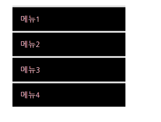
<nav class="mouse-animation">
	<ul>
		<li><a href="#">메뉴1</a></li>
		<li><a href="#">메뉴2</a></li>
		<li><a href="#">메뉴3</a></li>
		<li><a href="#">메뉴4</a></li>
	</ul>
</nav>
html, body {
margin: 0;
padding: 0;
}
ul {
list-style: none;
}
a {
text-decoration: none;
color: #000000;
}
----------------------------------> 초기화 작업
.mouse-animation li {
width: 250px;
background-color: rgba(0, 0, 0, 1);
padding: 20px;
border-top: solid 5px #dfdfdf;
transition: opacity 0.2s, margin-left 0.5s;
}
.mouse-animation li:hover {
background-color: rgba(0, 0, 0, 0.5);
/*opacity: 0.5; */
margin-left: 10px;
}opacity는 안에 모든 내용물에 투명화 시키기 때문에 rgba를 이용해서 부분적으로 투명도를 적용.- rgba (n1, n2, n3, n4(0-1)), n4는 투명도
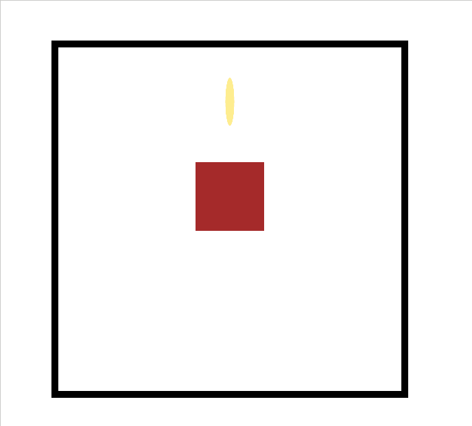
(2) 움직이는 박스
<div class="move-box"></div>.move-box {
position: relative;
width: 200px;
height: 200px;
background-color: red;
animation-name: moveBox;
animation-duration: 4s;
animation-timing-function: linear;
animation-delay: 1s;
animation-iteration-count: infinite;
animation-direction: alternate;
}
@keyframes moveBox {
0% {
background-color: red;
left: 0;
top: 0;
}
25% {
background-color: yellow;
left: 500px;
top: 0;
}
50% {
background-color: gray;
left: 500px;
top: 500px;
border-radius: 50%;
}
75% {
background-color: blue;
left: 0px;
top: 500px;
}<animation 추가 속성>
imation-play-state: (running/paused);
: 애니메이션 동작 상태 (running : 브라우저 접속시 바로 동작, paused : 동작x)animation-fill-mode: backwards;
: 원래의 박스의 색상 등에 관계없이 0%에 입력된 상태를 기준으로 최초상태(최초화면)를 보여줌
(3) 모양을 바꾸는 도형
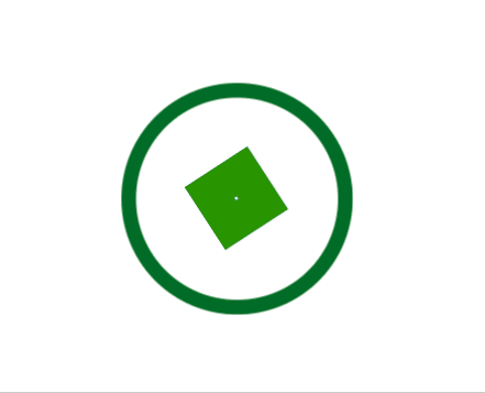
<div class="outer-border">
	<div class="inner-border"></div>
</div>
.outer-border {
display: flex;
justify-content: center;
align-items: center;
width: 200px;
height: 200px;
border: solid 15px red;
border-radius: 50%;
margin: 0 auto; /* 상하좌우 설정후 */
margin-top: 200px; /* 위쪽만 재설정 */
animation: outerBorder 2s infinite;
}
@keyframes outerBorder {
0% { border-color: red; transform: scale(1); }
25% { border-color: yellow; transform: scale(1.2); }
50% { border-color: blue; transform: scale(1.3); }
75% { border-color: green; transform: scale(1.2); }
100% { border-color: pink; transform: scale(1); }
}
.inner-border {
box-sizing: border-box; /* 원을 벗어나지 않게 안쪽으로 */
width: 75px;
height: 75px;
border: 5px solid purple;
animation: innerBorder 2s infinite alternate;
}
@keyframes innerBorder {
0%{ transform: rotate(0deg); }
25%{ border-color: blue; border-width: 10px;}
50%{ border-color: yellow; border-width: 20px;}
75%{ border-color: green; border-width: 40px;}
100%{ border-color: gray; border-width: 5px; transform: rotate(360deg); }
}(4) 슈퍼마리오 코인
<div class="mario-container">
	<div class="mario-coin"></div>
	<div class="mario-box"></div>
</div>
.mario-container {
position: relative;
width: 500px;
height: 500px;
border: solid 10px black;
margin: 0 auto;
margin-top: 200px;
}
.mario-container .mario-coin {
position: relative;
width: 70px;
height: 70px;
background-color: gold;
border-radius: 50%;
margin: 0 auto;
margin-top: 100px;
animation: jumpCoin 0.8s linear infinite;
}
@keyframes jumpCoin {
0% {
transform: translateY(0px);
opacity: 1;
}
50% {
transform: translateY(-100px) rotateY(180deg);
opacity: 0;
}
100% {
transform: translateY(-100px) rotateY(360deg);
opacity: 0;
}
}
.mario-container .mario-box {
width: 100px;
height: 100px;
background-color: brown;
margin: 0 auto;
animation: jumpBox 0.5s linear infinite alternate;
}
@keyframes jumpBox {
0% { transform: translateY(0px); }
50% { transform: translateY(-10px); }
100% { transform: translateY(0px); }
}(5) 확대되는 이미지
(이미지 출처 : https://www.pinterest.co.kr/pin/717057571912752425/)
-
<img>는 태생적으로 하단에 공백을 가지고 있다.
->vertival-align: middle;을 디폴트로 넣어줄 것. -
cursor: pointer;
: 마우스 커서를 올렸을 때, 클릭을 나타내는 커서모양으로 변경
📌 학습내용 중 어려웠던 점
- '(5) 확대되는 이미지' 실습에서 image-info 부분을 이미지와 겹치게 넣었을 때, 레이아웃 부분에서 배운 내용이 활용되었는데, 좌표 기준점을 잡는 부분에서 매우 헷갈렸다.
📌 해결방법
완전히 새로운 개념은 없었기 때문에 실습 파트를 한 번 더 복습하면서 숙지해야겠다.
참고 사이트:
포물선형 애니메이션 만들기 : https://jeremyckahn.github.io/stylie/
색상 코드 변환 : http://hex2rgba.devoth.com/
📌 학습소감
전체적으로 시각적이고 동적인 효과를 넣는 부분이라 개념을 잡을 때는 꽤 즐겁게 했다. 특히 메뉴탭을 만드는 실습은 강의를 듣지 않아도 할 수 있을 정도 였다. 하지만 '모양을 바꾸는 도형'파트와 '확대되는 이미지' 부분은 좀 버벅거렸다. 한 세 번 정도 반복하면 혼자 할 수 있을 것 같다. 화이팅 👊