
이번 글에서는 JavaScript의 Web Component 개념을 간단하게 살펴보고, moonbucks 애플리케이션을 통해 어떻게 프로젝트를 세팅했는지에 대해 말해보려고 합니다.
⚠️ 이 글은 컴포넌트에 대한 이해가 필요한 글 입니다!
Web Component?
그 기능을 나머지 코드로부터 캡슐화하여 재사용 가능한 커스텀 엘리먼트를 생성하고 웹 앱에서 활용할 수 있도록 해주는 다양한 기술들의 모음 - mdn -
web component 개념을 적용하면 마치 react에서 component 다루듯이 바닐라 JS에서도 사용할 수 있으며, 위와 같은 컴포넌트를 만들어놓으면 관심사를 분리할 수 있고 재 사용 가능하기 때문에 간편하게 유지 보수가 가능합니다.
이제 web component의 주요 기술에 대해 살펴보겠습니다.
web component의 주요 기술
mdn에서 설명하고 있는 web component의 주요 기술은 총 3가지 이며 하나씩 살펴보겠습니다.
Custom Elements
사용자 인터페이스에서 원하는 대로 사용할 수 있는 사용자 정의 요소 및 해당 동작을 정의 할 수 있는 JavaScript API
class CustomInput extends HTMLInputElement {
	constructor() {
    	super();
    }
}

customElements.define('custom-input', CustomInput)<custom-input></custom-input>custom elements는 class를 통해 생성하며, window.customElemetns.define 메서드를 통해 html에서 사용이 가능합니다.
define의 첫 번째 인수는 html에 사용할 tagName으로, 주로 cabab-case로 정의합니다.
두 번째 인수는 생성한 class 입니다.
customElements.define("word-count", WordCount, { extends: "p" });세 번째 인수로는 optional로 객체를 추가할 수 있는데, 위 코드는 word-count라는 요소가 p태그를 확장한다는 것을 의미합니다.
<word-count></word-count>
<p is="word-count"></p>
세 번째 인수를 추가할 경우 정의했던 tagName을 사용할 수도 있지만 기존 p 태그의 is attribute를 사용해서 정의할 수도 있습니다.
const $customInput = document.querySelector('custom-input');

$customInput.classList.add('hi');
이렇게 만든 custom elements는 다른 DOM들과 동일하게 취득, 조작이 가능하며, 클래스 내 다양한 생명 주기 함수 들을 통해 요소의 생명 주기내 특정한 시점에서 실행할 수 있습니다.
생명 주기 함수의 종류는 아래와 같습니다.
connectedCallback
사용자 정의 요소가 문서에 연결된 요소에 추가될 때마다 호출되는 메서드
connectedCallback은 노드가 이동될 때마다 발생하며 요소의 내용이 완전히 해석되기 전에 발생할 수도 있기 때문에, 메서드 내부에 Node.isConnected를 사용하여 확실하게 정의할 수도 있습니다.
<body>
    <welcome-message></welcome-message>
    <script>
      class WelcomeMessage extends HTMLElement {
        constructor() {
          super();
        }

        connectedCallback() {
          if (this.isConnected) {
            this.innerHTML = `<h1>Welcome, User!</h1>`;
          }
        }
      }

      customElements.define('welcome-message', WelcomeMessage);
    </script>
</body>
위 예시로 살펴보면 connectedCallback 내 isConnected를 통해 document에 해당 요소가 연결될 때 innerHTML로 h1 element를 할당함으로써 렌더링 되는 것을 알 수 있습니다.
disconnectedCallback
사용자 정의 요소가 document의 DOM에서 연결 해제되었을 때마다 호출되는 메서드
disconnectedCallback을 통해선 요소가 사라졌을 때 실행할 로직을 정의할 수 있습니다.
<body>
  <welcome-message></welcome-message>
  <script>
    class WelcomeMessage extends HTMLElement {

      // ...

      disconnectedCallback() {
        alert('welcome message 사라짐!');
      }
    }

    // ...

    setTimeout(() => {
      const element = document.querySelector('welcome-message');
      if (element) {
        element.remove();
      }
    }, 1000);
  </script>
</body>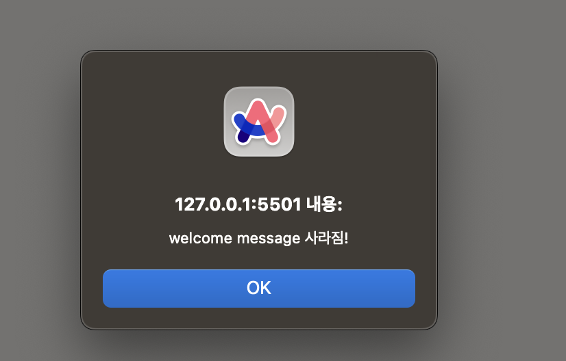
예제 코드를 살펴보면 1초 뒤에 welcome message 컴포넌트가 사라지면서 alert 메시지가 나타나는 것을 확인할 수 있습니다.
이는 disconnectedCallback이 요소가 사라졌을 때 실행되었다는 것을 확인할 수 있습니다.
adoptedCallback
사용자 정의 요소가 새로운 document로 이동되었을 때마다 호출되는 메서드
<body>
  <div>
    <welcome-message></welcome-message>
    <iframe id="target-iframe" style="height: 200px; width: 100%"></iframe>
  </div>
  <script>
    class WelcomeMessage extends HTMLElement {
      // ...

      adoptedCallback() {
        alert('hi');
      }
    }

    // ...

    window.onload = () => {
      const element = document.querySelector('welcome-message');
      const iframe = document.getElementById('target-iframe');

      if (element && iframe && iframe.contentDocument) {
        iframe.contentDocument.body.appendChild(element);
      }
    };
  </script>
</body>
위 예시 코드는 브라우저가 load 되면 welcome-message 태그가 iframe 내부로 추가되는 로직입니다.

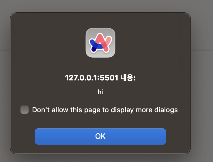

위 로직은 iframe 내부로 추가 될 때 새로운 document로 이동하기 때문에 adoptedCallback의 alert가 호출되는 것을 확인할 수 있습니다.
attributeChangedCallback
사용자 정의 요소의 특성들 중 하나가 추가되거나, 제거되거나, 변경될 때마다 호출되는 메서드
어떤 특성이 변경에 대해 알릴지는 static get observedAttributes 메서드에서 명시할 수 있습니다.
<body>
  <attribute-watcher data-message="나는 누구"></attribute-watcher>

  <script>
    class AttributeWatcherElement extends HTMLElement {
      static get observedAttributes() {
        return ['data-message'];
      }

      attributeChangedCallback(name, oldValue, newValue) {
        if (name === 'data-message') {
          this.innerHTML = `<h1>${newValue}</h1>`;
          if (oldValue !== null) {
            alert(`${oldValue}에서 ${newValue}로 변경되었습니다.`);
          }
        }
      }
    }

    customElements.define('attribute-watcher', AttributeWatcherElement);
  </script>
</body>
위 예제 코드를 살펴보면, AttributeWatcherElement 내 observedAttributes 메서드를 통해 data-message를 감지하도록 설정한 것을 알 수 있습니다.
그 후, attributeChangedCallback을 통해 data-message 속성이 변경되면 if 문 내부의 로직을 실행하여 새로운 newValue를 렌더링 후 alert를 실행할 것을 예상할 수 있습니다.
setTimeout(() => {
  const element = document.querySelector('attribute-watcher');
  if (element) {
    element.setAttribute('data-message', '나는 jiny');
  }
}, 3000);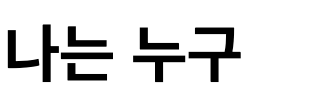


3초 후 setAttribute를 통해 data-message 속성을 나는 jiny로 바꾸게 되면 attributeChangedCallback가 실행되어 나는 jiny가 렌더링 된 후 alert가 호출된 것을 확인할 수 있습니다.
Shadow DOM
캡슐화된 Shadow DOM 트리를 엘리먼트를 추가하고 연관된 기능을 제어하기 위한 JavaScript API의 집합
Shadow DOM은 DOM과는 독립적인 요소로 엘리먼트의 기능을 프라이빗하게 유지할 수 있어, 문서의 다른 부분과의 충돌에 대한 걱정 없이 스크립트와 스타일을 작성할 수 있습니다.
또한, Shadow DOM이 제공하는 API들은 캡슐화의 핵심 파트이며, 숨겨진 분리된 DOM을 요소에 부착하는 방법을 제공 합니다.

Shadow host- shadow DOM이 부착되는 통상적인 DOM 노드.
Shadow tree- shadow DOM 내부의 DOM 트리.
Shadow boundary- shadow DOM이 끝나고, 통상적인 DOM이 시작되는 장소.
Shadow root- shadow 트리의 root 노드.
구조를 살펴보면 DOM Tree 내부의 Shadow DOM을 사용하는 HTML Element의 경우 shadow host가 존재하는 것을 알 수 있습니다.
shadow host는 shadow tree와 연결되며 시작 노드는 shadow root인 것을 알 수 있습니다.
즉, Shadow DOM 안에 있는 노드에도, non-shadow node와 같은 방식으로 영향을 줄 수 있으며 children을 붙이거나, 속성을 설정하거나, element.style로 스타일을 설정하는 방식을 쓸 수 있습니다.
이렇게 shadow host 내부엔 shadow tree가 dom tree와 별개로 존재하기 때문에, 스타일 및 요소 충돌을 방지할 수 있습니다.
기본 사용법
class MyCustomElement extends HTMLElement {
  constructor() {
    super();
    this.attachShadow({ mode: 'open' });

    this.shadowRoot.innerHTML = `
      <style>
        .text {
          color: green;
          font-size: 18px;
        }
      </style>
      <div class="text">Shadow DOM 내부의 텍스트</div>
    `;
  }
}attachShadow()를 통해 shadow root를 부착할 수 있으며, 객체 내 mode 프로퍼티를 통해 외부에서 shadow root 접근 여부를 설정할 수 있습니다.
open- 외부에서 shadow root 접근 가능closed- 외부에서 shadow root 접근 불가능

개발자 도구에서 확인해보면 #shadow-root라는 별도의 공간 안에 style과 div 태그가 추가되어있는 것을 확인할 수 있습니다.
Shadow DOM을 사용하는 이유
<body>
  <div class="text">외부 DOM의 텍스트</div>
  <my-custom-element></my-custom-element>

  <script>
    class MyCustomElement extends HTMLElement {
      constructor() {
        super();

        this.innerHTML = `
          <style>
            .text {
              color: green;
              font-size: 18px;
            }
          </style>
          <div class="text">Shadow DOM 내부의 텍스트</div>
        `;
      }
    }

    customElements.define('my-custom-element', MyCustomElement);
  </script>

  <style>
    .text {
      color: red;
      font-size: 24px;
    }
  </style>
</body>
예제 코드를 살펴보면 MyCustomElement 내 style 태그로 .text에 대해 color를 green으로 설정한 것을 알 수 있습니다.

하지만, script 아래의 style 태그와 충돌하여 css 규칙(top-down 형태로 실행)에 의해 두 텍스트의 컬러 모두 red로 나오는 것을 알 수 있습니다.
하지만 MyCustomElement 내 shadow root를 설정하여 해결할 수 있습니다.
class MyCustomElement extends HTMLElement {
  constructor() {
    super();

    this.attachShadow({ mode: 'open' });

    this.shadowRoot.innerHTML = `
      <style>
        .text {
          color: green;
          font-size: 18px;
        }
      </style>
      <div class="text">Shadow DOM 내부의 텍스트</div>
    `;
  }
}
shadow dom을 사용하게 되면 MyCustomElement의 범위 내에서 스타일을 정할 수 있기 때문에 외부 스타일과 충돌이 발생하지 않는 것을 확인할 수 있습니다.
template & slot tag
웹 컴포넌트의 Shadow DOM을 채우는 데 사용할 수 있는 유연한 템플릿을 만드는 태그들
template tag
HTML에서 클라이언트 측의 콘텐츠를 보관하기 위해 사용되는 메커니즘
이 태그 안에 있는 내용은 페이지가 로드될 때 렌더링되지 않으며, JavaScript를 사용하여 페이지의 다른 부분으로 복제하고 삽입할 수 있습니다.
이를 통해 동일한 구조를 반복적으로 사용할 때 유용하게 사용할 수 있습니다.
<template id="my-template">
  <style>
    .my-component {
      border: 1px solid #ddd;
      padding: 10px;
      border-radius: 8px;
    }
  </style>
  <div class="my-component">
    <h2>My Web Component</h2>
    <p>This is a paragraph inside the component.</p>
  </div>
</template>
class MyComponent extends HTMLElement {
  constructor() {
    super();

    this.attachShadow({ mode: 'open' });

    const template = document.getElementById('my-template');
    const content = template.content.cloneNode(true);

    this.shadowRoot.appendChild(content);
  }
}

customElements.define('my-component', MyComponent);
template 태그로 컴포넌트에 대한 style 태그와 element를 정의한 후 custom element를 정의하는 단계에서 DOM 취득 API를 통해 template을 가져와 cloneNode로 복사 후 shadowRoot에 추가할 수 있습니다.
이 때, 주의해야 할 점은 template를 가져올 때 cloneNode(true)로 깊은 복사의 형태로 가져와야 합니다.
slot tag
웹 컴포넌트의 Shadow DOM 내에서 사용자가 정의한 콘텐츠를 배치할 수 있는 방법을 제공할 수 있는 tag
<script>
  class MyComponentWithSlot extends HTMLElement {
    constructor() {
      super();

      const shadowRoot = this.attachShadow({ mode: 'open' });

      shadowRoot.innerHTML = `
        <style>
          .container {
            border: 1px solid #333;
            padding: 10px;
            border-radius: 8px;
          }
          ::slotted(span) {
            color: blue;
          }
        </style>
        <div class="container">
          <slot name="my-slot"></slot>
        </div>
      `;
    }
  }

  customElements.define('my-component-with-slot', MyComponentWithSlot);
</script>
<my-component-with-slot>
  <span slot="my-slot">안녕 나는 슬롯 안에 있어</span>
</my-component-with-slot>
custom element에는 slot 태그로 정의했지만, html 내 my-component-with-slot 내부에 span 태그를 살펴보면 slot attribute로 my-slot을 추가한 것을 확인할 수 있습니다.

이 경우 브라우저에서 렌더링 될 때 slot 태그가 span 태그로 변환되어 렌더링 되기 때문에 다음과 같이 화면이 보이는 것을 알 수 있습니다.
이 처럼 slot은 동적으로 요소를 렌더링 할 때 유용하게 사용이 가능합니다.
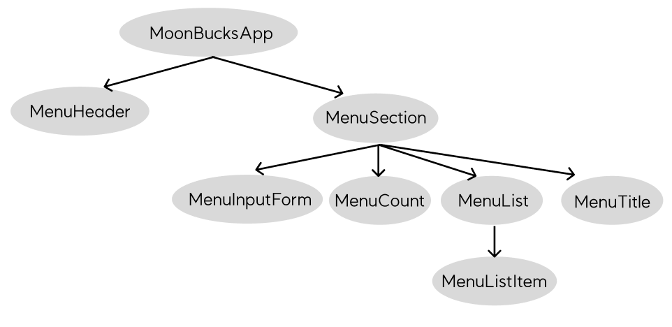
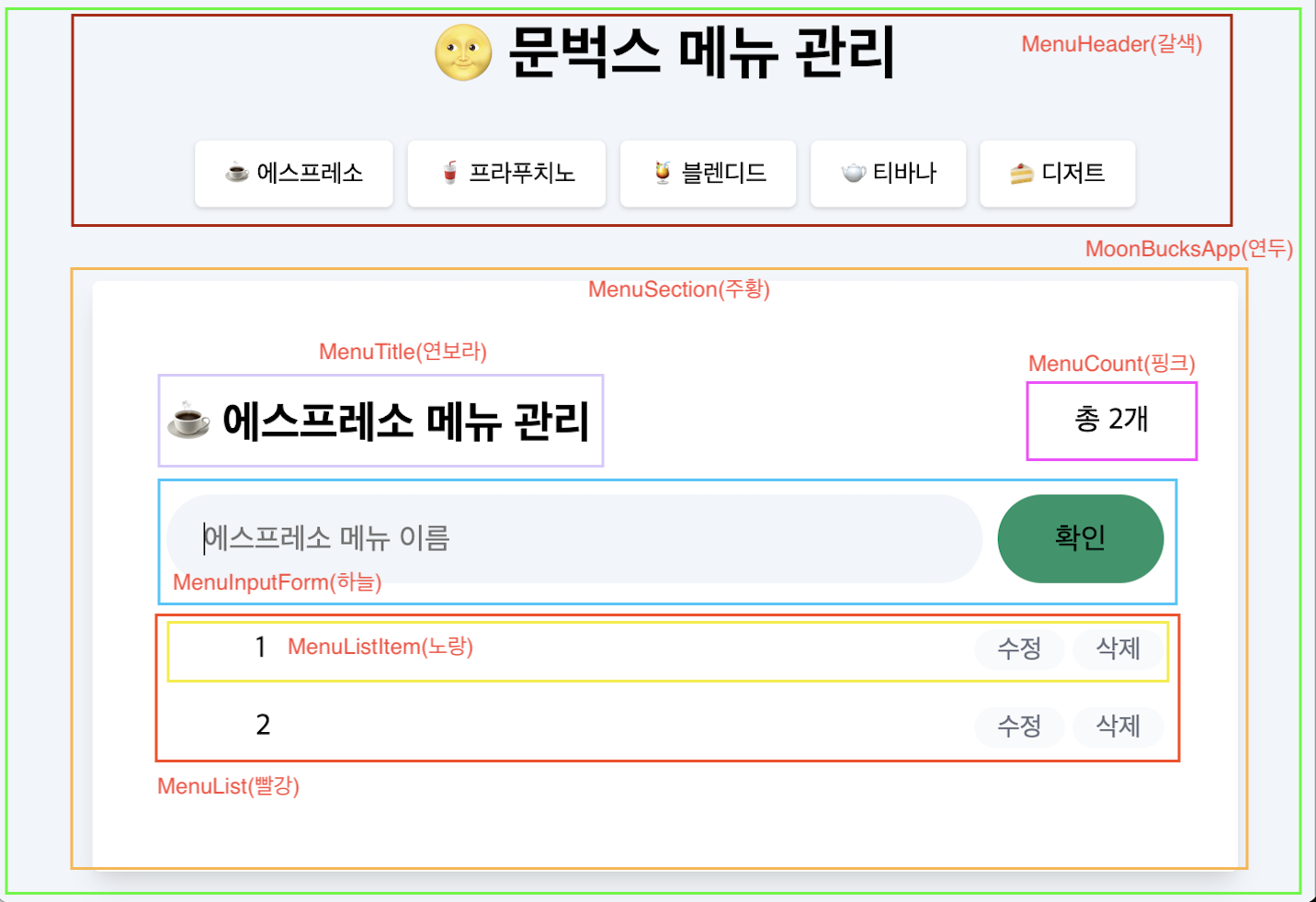
Web Component 적용 (with moonbucks app)
이제 부턴 학습한 내용을 바탕으로 실제 moonbucks(todo list app)앱에 어떻게 적용했는가에 대한 이야기를 풀어내보려고 합니다.
컴포넌트 구조화
컴포넌트를 분리할 때 가장 중요하게 생각했던 건 아래와 같습니다.
- 스스로 일을 처리할 수 있는가?
- 변경 사항이 생겼을 때 빠르게 확인 후 변경 할 수 있는가?
- 재 사용이 가능한가?
이러한 기준을 바탕으로 아래와 같이 컴포넌트를 구조화 하였습니다.
BaseComponent 생성
class BaseComponent extends HTMLElement {
  constructor() {
    super();
  }

  connectedCallback() {
    this.render();
    this.setEvent();
  }

  disconnectedCallback() {}

  render() {}

  setEvent() {}

  emit(eventType, detail) {
    const customEvent = new CustomEvent(eventType, {
      bubbles: true,
      detail,
    });
    this.dispatchEvent(customEvent);
  }

  on(target, eventName, eventHandler) {
    target.addEventListener(eventName, eventHandler);
  }

  off(target, eventName, eventHandler) {
    target.removeEventListener(eventName, eventHandler);
  }
}

export default BaseComponent;
custom element를 만들며 중복되는 로직들을 중앙화 시키기 위해 BaseComponent를 만든 후 extends 하는 형태로 사용하고자 하였습니다. (추가적으로 hide나 open을 만들어 컴포넌트를 조건부로 렌더링도 가능합니다!)
각 메서드들의 기능은 다음과 같습니다.
connectedCallback- 컴포넌트가 렌더링 될 때 실행하는 메서드
disconnectedCallback- 컴포넌트가 사라질 때 실행하는 메서드
render- 컴포넌트 렌더링을 위한 메서드
setEvent- 이벤트 핸들러를 정의 하기 위한 메서드
emit- 커스텀 이벤트를 dispatch 하는 메서드
on- addEventListener를 간략화 한 메서드
off- removeEventListener를 간략화 한 메서드
잘 살펴보면, attributeChangedCallback를 사용하지 않는 것을 알 수 있습니다.
해당 메서드의 경우 데이터 바인딩을 목적으로 사용해보려 했으나 데이터 바인딩 할 수 있는 방법은 아래와 같습니다.
- 커스텀 이벤트와 이벤트 위임 활용
data-*attribute와 attributeChangedCallback, observedAttributes 활용- 전역 store(createStore) 활용
이렇게 3가지 방법이 있지만, 프로젝트 규모가 크지 않다는 점과 보안 상의 이유로 1번의 방법을 채택 했고, 다른 목적이 없었기 때문에 따로 정의하지 않았습니다.
index.html, index.js
<!DOCTYPE html>
<html lang="kr">
  <head>
    <meta charset="UTF-8" />
    <title>문벅스 메뉴</title>
    <meta name="viewport" content="width=device-width, initial-scale=1" />
    <link rel="shortcut icon" href="src/images/favicon.ico" />
    <link rel="icon" href="src/images/favicon.png" />
    <link rel="stylesheet" href="src/css/index.css" />
  </head>
  <body>
    <moonbucks-app id="app" class="px-4"></moonbucks-app>
    <script type="module" src="./components/moonbucksApp/component.js"></script>
    <script type="module" src="./components/menuHeader/component.js"></script>
    <!-- 수 많은 script 태그들... -->
  </body>
</html>
web component를 사용하면서 많은 고민을 했던 부분 중 하나가 컴포넌트를 나누게 되면 나누는 만큼 index.html에 script 태그로 추가해야 한다는 점 이었습니다.
그래서 index.js에 사용하는 컴포넌트를 한꺼번에 import 하는 방법을 택했습니다.
index.html
<!DOCTYPE html>
<html lang="kr">
  <head>
    <meta charset="UTF-8" />
    <title>문벅스 메뉴</title>
    <meta name="viewport" content="width=device-width, initial-scale=1" />
    <link rel="shortcut icon" href="src/images/favicon.ico" />
    <link rel="icon" href="src/images/favicon.png" />
    <link rel="stylesheet" href="src/css/index.css" />
  </head>
  <body>
    <moonbucks-app id="app" class="px-4"></moonbucks-app>
    <script type="module" src="./src/js/index.js"></script>
  </body>
</html>
index.js
import './components/moonbucksApp/component.js';
import './components/menuHeader/component.js';
import './components/menuSection/component.js';
import './components/menuInputForm/component.js';
import './components/menuList/component.js';
import './components/menuListItem/component.js';
import './components/menuCount/component.js';
이렇게 하면 script 태그를 번거롭게 만들지 않아도 되며, 컴포넌트를 추가하면 index.js에 import만 추가하여 간편하게 사용이 가능했습니다.
소스 코드
web component로 실습한 moonbucks app 소스 코드
자세한 세부 로직은 위 링크를 통해 확인이 가능합니다!
레퍼런스