들어가기
frontEnd부분의 Login부분 page Design
component로 만들어서 signUp page에도 재활용되게 함.
처음에 통으로 만들었다가 component로 분리시킴.
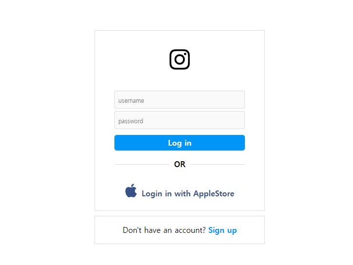
components
1.src/compnents/auth/AuthLayout.js
import styled from 'styled-components'

const Containier = styled.div`
  display: flex;
  height: 100vh;
  justify-content: center;
  align-items: center;
  flex-direction: column
`
const Wrapper = styled.div`
  max-width: 350px;
  width: 100%;
`
///page에 그려질 모든 속성에 기본적으로 적용될 UI

function AuthLayout({ children }) {
  return (
    <Containier>
      <Wrapper>{children}</Wrapper>
    </Containier>
  )
}
//{children}을 넣어서 안에 들어올 component들을 다 받음.

export default AuthLayout
2.src/compnents/auth/BottomBox.js
밑의 박스 Don't have an account? Sign up이 있는 부분 design
import { Link } from 'react-router-dom'
//page간 이동을 할떄는 'react-router-dom'의 Link 를 사용한다.
import styled from 'styled-components'
import { BaseBox } from '../shared'

const SBottomBox = styled(BaseBox)`
	//BaseBox를 상속함.

  padding: 20px 0px;
  text-align: center;
  a {
    font-weight: 600;
    margin-left: 5px;
    color: #0095f6;
  }
  ///a 부분만 디자인(Sign-up)링크가 이동하는 곳.
`

function BottomBox({ cta, link, linkText }) {
//Login.js 및 SignUp.js에서 props로 받음.(cta, link, link등)
  return (
    <SBottomBox>
      <span>{cta}</span>
      <Link to={link}>{linkText}</Link>
      //Link하는 문법
    </SBottomBox>
  )
}

export default BottomBox
3.src/compnents/auth/Button.js
import styled from 'styled-components'

const SButton = styled.input`
  border: none;
  border-radius: 5px;
  margin-top: 12px;
  background: #0095f6;
  color: white;
  text-align: center;
  padding: 8px 0px;
  font-weight: 600;
  width: 100%;
`

function Button(props) {
  return <SButton {...props} />
}
//별거 없고, props를 받을떄, {...props}로 통으로 받음.

export default Button
4.src/compnents/auth/FormBox.js
TopBox전체의 UI
사이에 들어갈 component들이 많이 있어서 {children}으로 받아줌.
import styled from 'styled-components'
import { BaseBox } from '../shared'

const Container = styled(BaseBox)`
  display: flex;
  justify-content: center;
  align-items: center;
  flex-direction: column;
  padding: 35px 40px 25px 40px;
  margin-bottom: 10px;
  form {
    margin-top: 35px;
    width: 100%;
    display: flex;
    flex-direction: column;
    justify-content: center;
    align-items: center;
  }
  //input 밒 button이 들어가는 form은 추가로 design해준다.
  //BaseBox는 상속해준다.
`

function FormBox({ children }) {
  return <Container>{children}</Container>
}

export default FormBox
5.src/compnents/auth/Input.js
Input 창 design
import styled from 'styled-components'

const Input = styled.input`
  width: 100%;
  border-radius: 3px;
  padding: 7px;
  background-color: #fafafa;
  border: 0.5px solid rgb(219, 219, 219);
  margin-top: 5px;
  box-sizing: border-box;
  &::placeholder {
    font-size: 12px;
  }
`

export default Input
6.src/compnents/auth/Separator.js
Topbox(FormBox)와 BottomBox 사이의 ----or---- 요거 만드는 UI
import styled from 'styled-components'

const SSeperator = styled.div`
  margin: 20px 0px 30px 0px;
  text-transform: uppercase;
  display: flex;
  justify-content: center;
  width: 100%;
  align-items: center;
  div {
    width: 100%;
    height: 1px;
    background-color: rgb(219, 219, 219);
  }
  span {
    margin: 0px 10px;
    font-weight: 600;
    color: 388ee8e;
  }
`

function Separator() {
  return (
    <SSeperator>
      <div></div>
      <span>Or</span>
      <div></div>
    </SSeperator>
  )
}

export default Separator
7.src/compnents/shared.js
import styled from 'styled-components'

export const BaseBox = styled.div`
  background-color: white;
  border: 1px solid rgb(219, 219, 219);
  width: 100%;
`
코딩하는초딩쌤