블록 & 인라인 & 인라인-블록
1. 블록
2. 인라인
3. 인라인-블록
2. position(박스의 배치)
- 정적 배치 - position : static(디폴트)
- 상대 배치 - position : relative
- 절대 배치 - position : absolute
- 고정 배치 - position : fixed
- 유동 배치 - float : left 혹은 float : right
- positin property를 사용할 때, 태그의 위치와 크기 조정
- top, bottom, left, right, width, height 프로퍼티로 지정한다.
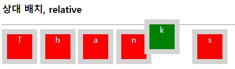
2_1) relative(상대 배치)
- normal flow의 기본 위치에서 left, top, bottom, right 등의 프로퍼티 값만큼 이동한 '상대 위치'에 배치한다.
- +를 할 수록 안쪽으로, -를 할 수록 바깥으로 간다.
<!DOCTYPE html>
<html>
<head>
<meta charset="UTF-8">
<style>
div {
display: inline-block;
height: 50px;
width: 50px;
border: 10px solid lightgray;
text-align: center;
color: white;
background: red;
}
#down:hover {
position: relative;
left: 20px;
top: 20px;
background: green;
}
#up:hover {
position: relative;
right: 20px;
bottom: 20px;
background: green;
}
</style>
</head>
<body>
<h3>상대 배치, relative</h3>
<hr>
<div>T</div>
<div id="down">h</div>
<div>a</div>
<div>n</div>
<div id="up">k</div>
<div>s</div>
</body>
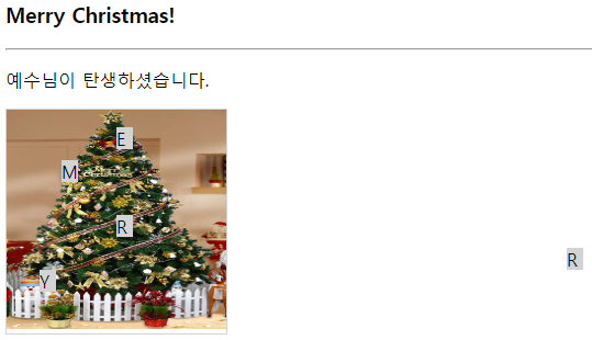
</html>2_2) absolute(절대 배치)
- 브라우저 크기가 변해도 절대 배치된 태그 위치는 변하지 않는다.
<!DOCTYPE html>
<html>
<head>
<meta charset="UTF-8">
<style>
div {
display: inline-block;
position: absolute; /*절대배치*/
border: 1px solid lightgray;
}
div>p {
display: inline-block; /*div의 자식 p*/
position: absolute; /*절대배치*/
height: 20px;
width: 15px;
background: lightgray;
}
</style>
</head>
<body>
<h3>Merry Christmas!</h3>
<hr>
<p>예수님이 탄생하셨습니다.</p>
<div>
<img src="../../images/christmastree.png" width="200" height="200"
alt="크리스마트 트리">
<p style="left: 50px; top: 30px">M</p>
<p style="left: 100px; top: 0px">E</p>
<p style="left: 100px; top: 80px">R</p>
<p style="left: 510px; top: 110px">R</p>
<p style="left: 30px; top: 130px">Y</p>
</div>
</body>
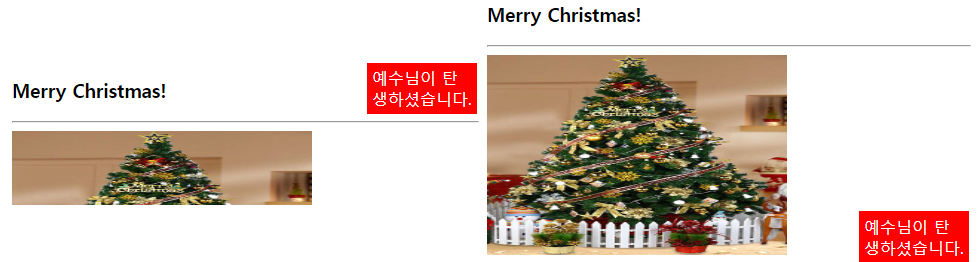
</html>2_3) fixed(고정 배치)
- 브라우저 기준으로 고정 배치 즉 브라우저 사이즈에 따라 위치가 변화한다.
<!DOCTYPE html>
<html>
<head>
<meta charset="UTF-8">
<style>
#fixed {
	position: fixed;
	bottom: 100px;
	right: 10px;
	width: 100px;
	padding: 5px;
	background: red;
	color: white;
}
</style>
</head>
<body>
	<h3>Merry Christmas!</h3>
	<hr>
	<img src="../../images/christmastree.png" width="300" height="200"
		alt="크리스마트 트리">
	<div id="fixed">예수님이 탄생하셨습니다.</div>
</body>
</html>
2_4) float(유동 배치)
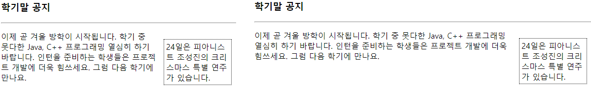
- 브라우저에서 고정된 위치에 배치하며 float로 배치된 영역은 다른 영역을 밀어낸다.
<!DOCTYPE html>
<html>
<head>
<meta charset="UTF-8">
<style>
#float {
float: right;
border: 1px dotted black;
width: 8em;
padding: 0.25em;
margin: 1em;
}
</style>
</head>
<body>
<h3>학기말 공지</h3>
<hr>
<div>
<p id="float">24일은 피아니스트 조성진의 크리스마스 특별 연주가 있습니다.</p>
<p>이제 곧 겨울 방학이 시작됩니다. 학기 중 못다한 Java, C++ 프로그래밍 열심히 하기 바랍니다. 인턴을
준비하는 학생들은 프로젝트 개발에 더욱 힘쓰세요. 그럼 다음 학기에 만나요.</p>
</div>
</body>
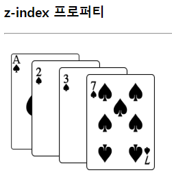
</html>2_5) z-index
- 위치 지정 요소와 그 하위 플렉스 아이템의 Z축 순서를 지정한다. 더 큰 z-index 값을 가진 요소가 작은 값의 요소 위를 덮는다.
<!DOCTYPE html>
<html>
<head>
<meta charset="UTF-8">
<title>z-index 프로퍼티</title>
<style>
div {
position: absolute;
}
img {
position: absolute;
}
#spadeA {
z-index: 0;
left: 10px;
top: 20px;
}
#spade2 {
z-index: 2;
left: 40px;
top: 30px;
}
#spade3 {
z-index: 3;
left: 80px;
top: 40px;
}
#spade7 {
z-index: 7;
left: 120px;
top: 50px;
}
</style>
</head>
<body>
<h3>z-index 프로퍼티</h3>
<hr>
<div>
<img id="spadeA" src="../../images/spade-A.png" width="100" height="140" alt="스페이드A">
<img id="spade2" src="../../images/spade-2.png" width="100" height="140" alt="스페이드2">
<img id="spade3" src="../../images/spade-3.png" width="100" height="140" alt="스페이드3">
<img id="spade7" src="../../images/spade-7.png" width="100" height="140" alt="스페이드7">
</div>
</body>
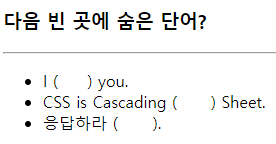
</html>2_6) visibility로 텍스트 숨기기
- 공간은 차지하지만 텍스트는 보이지 않는다.
<!DOCTYPE html>
<html>
<head>
<meta charset="UTF-8">
</title>
<style>
span {
visibility: hidden;
}
</style>
</head>
<body>
<h3>다음 빈 곳에 숨은 단어?</h3>
<hr>
<ul>
<li>I (<span>love</span>) you.
<li>CSS is Cascading (<span>Style</span>) Sheet.
<li>응답하라 (<span>1988</span>).
</ul>
</body>
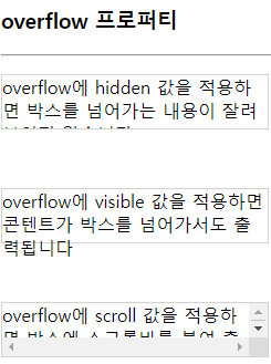
</html>2_7) overflow 프로퍼티 활용
hidden,visible,scroll이 있다.
<!DOCTYPE html>
<html>
<head>
<meta charset="UTF-8">
<style>
p {
	width: 15em;
	height: 3em;
	border: 1px solid lightgray;
}

.hidden {
	overflow: hidden;
}

.visible {
	overflow: visible;
}

.scroll {
	overflow: scroll;
}
</style>
</head>
<body>
	<h3>overflow 프로퍼티</h3>
	<hr>
	<p class="hidden">overflow에 hidden 값을 적용하면 박스를 넘어가는 내용이 잘려 보이지
		않습니다.</p>
	<br>
	<p class="visible">overflow에 visible 값을 적용하면 콘텐트가 박스를 넘어가서도 출력됩니다</p>
	<br>
	<p class="scroll">overflow에 scroll 값을 적용하면 박스에 스크롤바를 붙여 출력합니다.</p>
</body>
</html>
3. 표 꾸미기
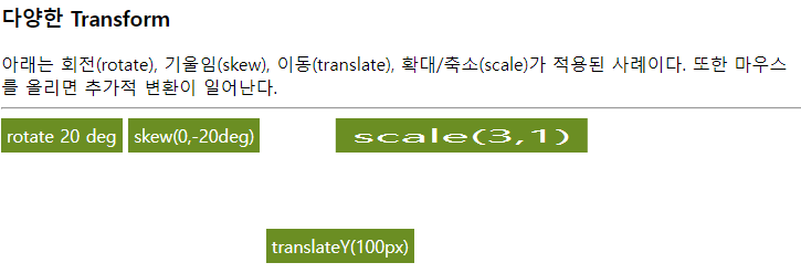
6. transform 사용하기
	<!DOCTYPE html>
	<html>
	<head>
	<meta charset="UTF-8">
	<title>다양한 변환 사례</title>
	<style>
	div{
	display: inline-block;
	padding: 5px;
	color: white;
	background: olivedrab;}

	/*변환*/
	div#rotate { transform: rotate(20de);}
	div#skew { transform: skew(odeg,-20deg);}
	div#translate {transform: translateY(100px);}
	div#scale { transform: scale(3,1);}

	/*마우스 올릴때 추가 변환*/
	div#rotate:hover { transform: rotate(80deg);}
	div#skew:hover { transform: skew(0deg, -60deg);}
	div#translate:hover { transform: translate(50px, 100px);}
	div#scale:hover { transform: scale(4,2);}

	/*마우스 누를때 추가 변환*/
	div#scale:active { transform: scale(1,5)}
	</style>
	</head>
	<body>
		<h3>다양한 Transform</h3>
		아래는 회전(rotate), 기울임(skew), 이동(translate),
		확대/축소(scale)가 적용된 사례이다.
		또한 마우스를 올리면 추가적 변환이 일어난다.
		<hr>
		<div id="rotate">rotate 20 deg</div>
		<div id="skew">skew(0,-20deg)</div>
		<div id="translate">translateY(100px)</div>
		<div id="scale">scale(3,1)</div>
	</body>
	</html>
Let's smile for future 🤩