# Flex는 무엇인가 ?
한마디로 하자면 Flex는 레이아웃 배치전용기능이다.
# 부모 속성,자식 속성??
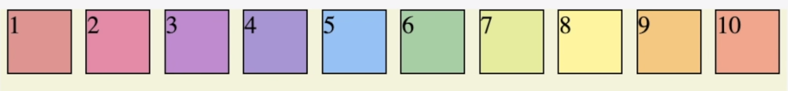
<div id="outer">
  <div class="box">box1</div>
  <div class="box">box2</div>
  <div class="box">box3</div>
</div>
Flex의 속성들은,
- 부모에 적용하는 속성
- 자식에게 적용하는 적성
이렇게 두가지로 나뉜다.
1. 부모에 적용되는 속성들
(1) display: flex; (선언)
#outer {
  display: flex;
  border: 1px dotted red;
  padding: 10px;
}flex-direction: row;
	/* flex-direction: column; */
	/* flex-direction: row-reverse; */
	/* flex-direction: column-reverse; */
}

.box {
  border: 1px solid green;
  padding: 10px;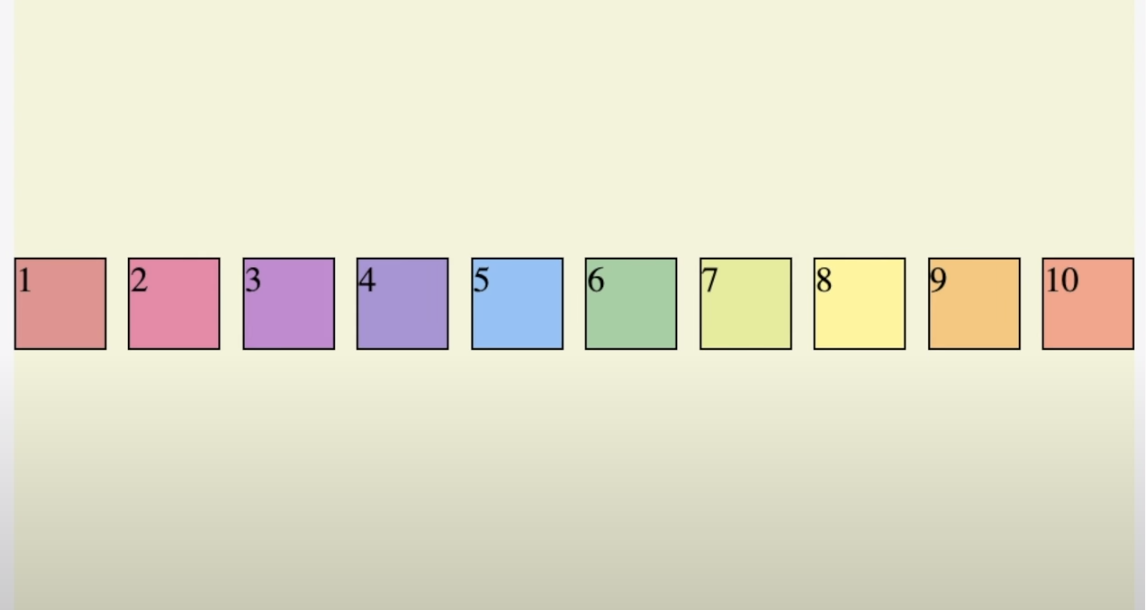
}- 기본값으로, display: flex가 적용된 부모 박스의 자식 요소는 왼쪽부터 차례대로 이어 배치됩니다.

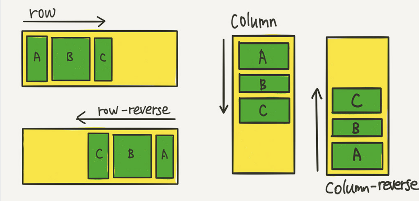
(2) flex-direction (배치 방향 설정)
#outer {
       flex-direction: row;// 기본값//
	   flex-direction: column;
	   flex-direction: row-reverse;
	   flex-direction: column-reverse;
}
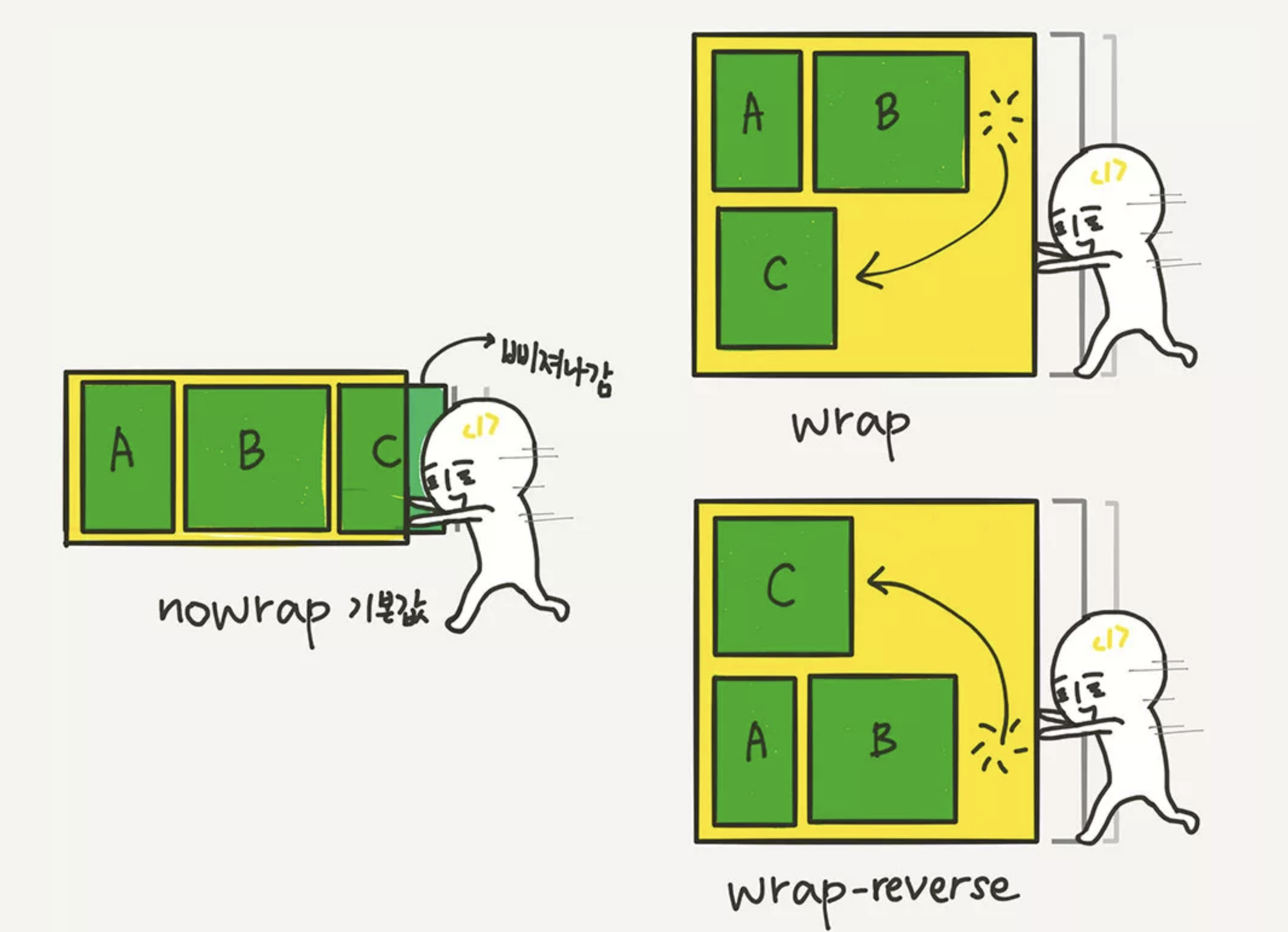
(3) flex-wrap (줄넘김 처리)
- 창을 줄이거나 할때 no wrap일경우 밑으로 내려가지 않고 크기가 줄어듭니다.
#outer {
       flex-wrap: norap; //기본값//
       flex-wrap: wrap;
       flex-wrap: wrap-reverse;
}
(4) flex-flow (flex-direction과 flex-wrap을 한꺼번에 지정할 수 있는 단축 속성)
#outer {
     flex-flow: row wrap;
}
(5) justify-content (중심 축에서 아이템을 어떻게 배치를 할건지 정해줍니다.)
- flex-direction 중심 축이 row(가로)일때 '수평 정렬'을 합니다.
#outer {
       justify-content: flex-start;// 기본값//
	   justify-content: flex-end;
	   justify-content: center;
	   justify-content: space-around;
       justify-content: space-evenly;
       justify-content: space-between;
}-
flex-start

-
flex-end
-
center

-
space around (box에 스페이스를 둘러쌓게 해서 넣어준다.)
- 한 박스당 주변공간을 만든다
- 한 박스당 주변공간을 만든다
-
space evenly
- 모든 박스가 균일한 공간을 만든다.

- 모든 박스가 균일한 공간을 만든다.
-
space between
- 왼쪽과 오른쪽을 옆으로 딱 붙인후 공간을 만든다.

- 왼쪽과 오른쪽을 옆으로 딱 붙인후 공간을 만든다.
(6) align-items(교차 축에서 아이템을 어떻게 배치를 할건지 정해줍니다.)
- flex-direction 중심 축이 row(가로)일때 '수직 정렬'을 합니다.
#outer {
       align-items: flex-start;// 기본값//
	   align-items: flex-end;
	   align-items: center;
	   align-items: stretch;
}- center (수평으로 중앙 정렬)
(7) align-content
- flex - wrap이 wrap일경우 흘러 나온 박스를 정렬해준다.
- justify-content의 속성을 다 쓸수 있다.
- space-between
위 아래로 박스들이 붙고 가운데 공간이 생긴다.
- space-between
2. 자식에게 적용되는 속성들
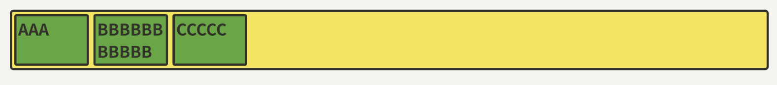
(1) flex-basis (flex-basis는 Flex 아이템의 기본 크기를 설정합니다)
.item {
	flex-basis: auto; /* 기본값 */
	/* flex-basis: 0; */
	/* flex-basis: 50%; */
	/* flex-basis: 300px; */
	/* flex-basis: 10rem; */
	/* flex-basis: content; */
}- 원래의 width가 100px이 안되는 A와 C는 100px로 늘어났고, 원래 100px가 넘는 B는 그대로 유지된다.
.item {
	flex-basis: 100px;
} 
- 반면에 width를 설정하면 원래 100px을 넘는 B도 100px로 맞춰진다.
.item {
	width: 100px;
} 
- 둘다 설정할 경우
.item {
	flex-basis: 100px;
    width: 100px;
} 
(2) flex-grow(flex-grow는 아이템이 flex-basis의 값보다 커질 수 있는지를 결정하는 속성입니다.)
flex-grow에는 숫자값이 들어가는데, 몇이든 일단 0보다 큰 값이 세팅이 되면 해당 아이템이 유연한(Flexible) 박스로 변하고 원래의 크기보다 커지며 빈 공간을 메우게 됩니다.
기본값이 0이기 때문에, 따로 적용하기 전까지는 아이템이 늘어나지 않았던 거예요.
.item {
	flex-grow: 1;
	/* flex-grow: 0; */ /* 기본값 */
}
(3) flex-shrink(flex-shrink는 flex-grow와 쌍을 이루는 속성으로, 아이템이 flex-basis의 값보다 작아질 수 있는지를 결정합니다.)
shrink는 grow와 반대로, 설정한 비율만큼 박스 크기가 작아집니다.
그러나 flex-grow 속성과 flex-shrink 속성을 함께 사용하는 일은 추천하지 않습니다. (충돌 가능성)