Flexbox사용법
<div class="flex-container">
  <div class="box"></div>
  <div class="box"></div>
  <div class="box"></div>
</div>
.flex-container {
display : flex;
}
.box {
width : 100px;
height : 100px;
background : grey;
margin : 5px;
}박스들을 감싸는 요소에 display: flex를 사용하면 된다.
그럼 기본적으로 가로정렬로 배치된다.
Flexbox세부속성
.flex-container {
  display : flex;
  justify-content : center;  /* 좌우정렬 */
  align-items : center;  /* 상하정렬 */
  flex-direction : column; /* 세로정렬 */
  flex-wrap : wrap;  /* 폭이 넘치는 요소 wrap 처리 */
}
.box {
  flex-grow : 2;  /* 폭이 상대적으로 몇배인지 결정 */
}
align-content
display: flex;를 준 요소에서 이 속성 사용 가능
내부에 들어있는 박스들의 상하정렬을 조절 할 수 있다.
align-content는 박스가 가로로 여러줄일 때 상하 배치 조절이 가능한 속성
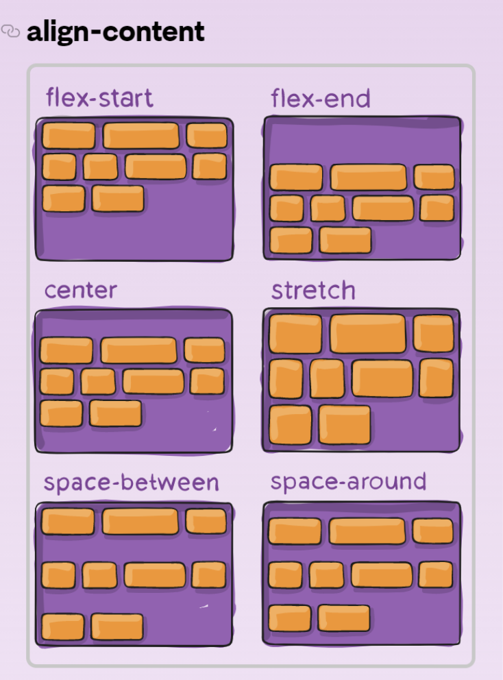
justify-content의 세로버전으로 보면됨

대충적음 전부 나만 볼래