transition은 트리거가 있어야 함
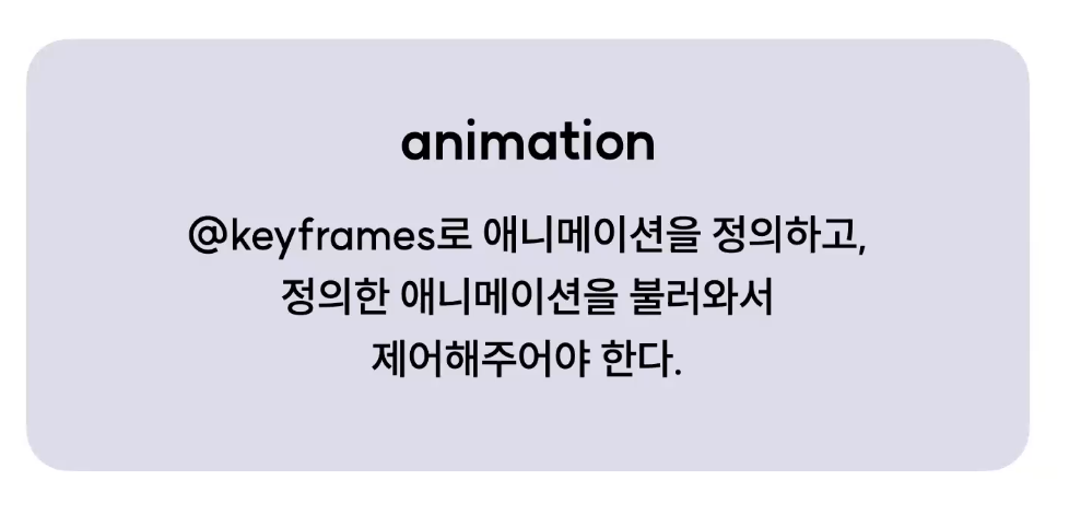
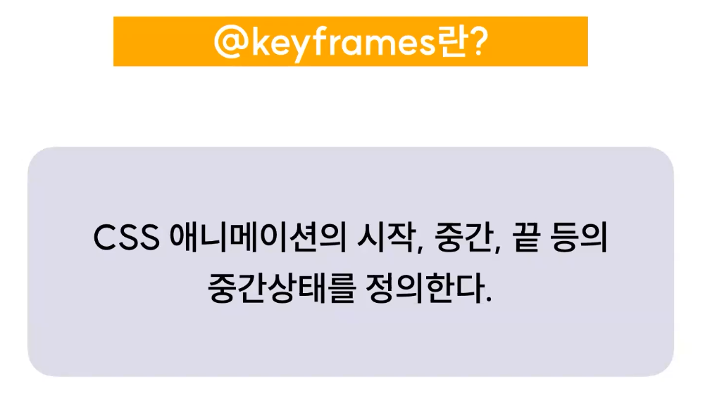
하나의 동작을 만들기 위해 최소한 keyframe, 애니메이션 속성의 선언이 필요(사용 귀찮음)
따라서 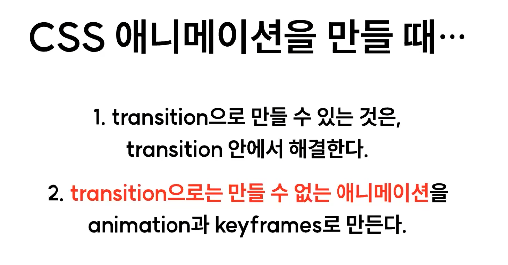
keyframes
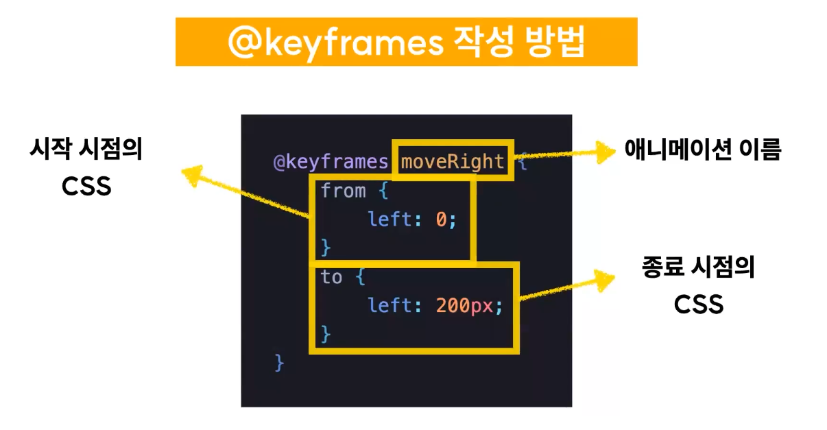
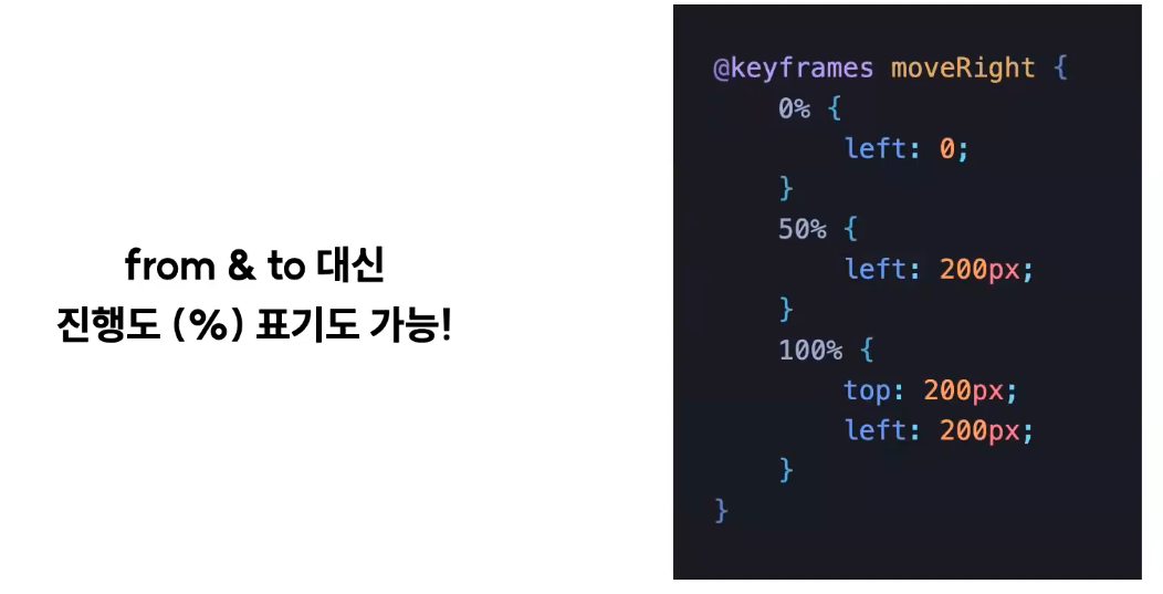
keyframes 작성 방법
animation 관련 속성들
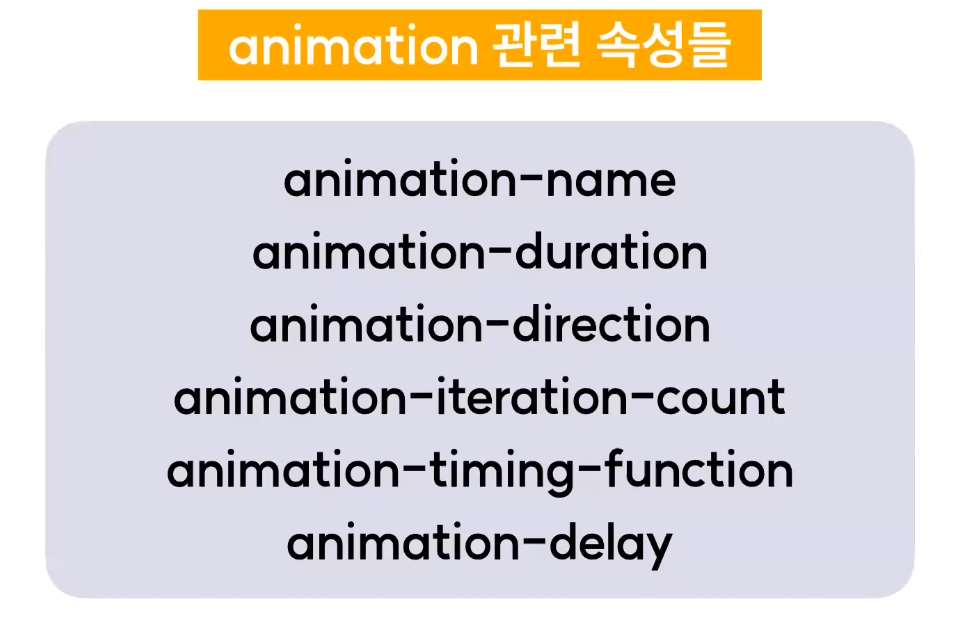
1. animation-name
어떠한 keyframies를 요소에 적용할 것인지 지정
animation-name: moveRight
2. animation-duration
애니메이션 재생 시간 설정 (from - to)
animation-duration: 2s
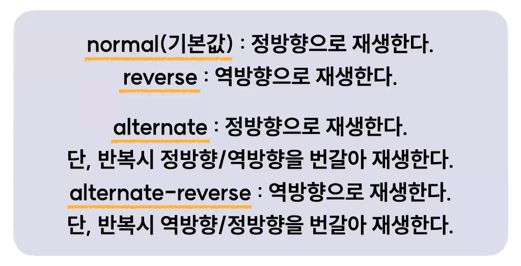
3. animation-direction
애니메이션 재생 방향(정방향/역방향)
animation-direction: alternate | normal | reverse | alternate-reverse
4. animation-iteration-count
애니메이션 재생 횟수
animation-iteration-count: infinite(무한 반복) | 3(구체적인 횟수)
5. animation-timing-function
애니메이션 재생 패턴
transition-timing-function과 거의 같음
animation-timing-function : linear | ease | ease-in-out | ease-in | ease-out
예시 참고: https://codepen.io/Joogumi/full/eYMgrKO
6. animation-delay
애니메이션 시작 지연
animation-delay: 2s
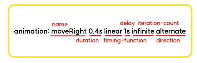
animation 단축 속성
❗️ 실무에서는 대부분 이렇게 사용, 순서 주의!
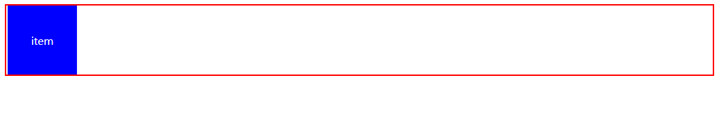
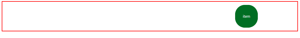
실습
(index.html)<!doctype html> <html lang="ko"> <head> <meta charset="UTF-8"> <meta name="viewport" content="width=device-width, user-scalable=no, initial-scale=1.0, maximum-scale=1.0, minimum-scale=1.0"> <meta http-equiv="X-UA-Compatible" content="ie=edge"> <title>08-01-animation</title> <link rel="stylesheet" href="index.css"> </head> <body> <div class="container"> <div class="item"> <span>item</span> </div> </div> </body> </html>(index.css)
* {
    box-sizing: border-box;
}
.container {
    width: 100%;
    height: 104px;
    border: 2px solid red;
//
    position:relative;
}
.item {
    width: 100px;
    height: 100px;
    background: blue;
    display: flex;
    flex-direction: row;
    justify-content: center;
    align-items: center;
  //
    /*animation-name: moveBox;*/
    /*animation-duration: 2s;*/
    /*animation-timing-function: ease-in-out;*/
    /*animation-iteration-count: infinite;*/
    /*animation-direction: alternate;*/
    animation: moveBox 2s ease-in-out infinite alternate;
  //
    position: absolute;
}
.item span {
    color: white;
}
@keyframes moveBox{
    from{
        border-radius: 0;
        left: 0;
        background: blue;
        transform: scale(1);
    }
    to{
        border-radius: 50%;
        left: calc(100% - 100px);
        background: green;
        transform: scale(0.75);
    }
}
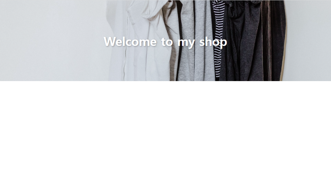
실습 - my shop (banner)
- background-size: cover
- text-shadow
- 텍스트가 통 튀기면서 올라오는 듯한 애니메이션
(banner.html)<!doctype html> <html lang="ko"> <head> <meta charset="UTF-8"> <meta name="viewport" content="width=device-width, user-scalable=no, initial-scale=1.0, maximum-scale=1.0, minimum-scale=1.0"> <meta http-equiv="X-UA-Compatible" content="ie=edge"> <title>Welcome to my shop - banner</title> <link rel="stylesheet" href="./banner.css"> </head> <body> <section class="main-banner"> <h1 class="text">Welcome to my shop</h1> </section> </body> </html>(banner.css)
* {
    box-sizing: border-box;
}
html, body {
    margin: 0;
    padding: 0;
}
.main-banner {
    width: 100%;
    height: 280px;
    background-image: url("./img/banner.jpg");
    background-size: cover;
    display: flex;
    flex-direction: row;
    justify-content: center;
    align-items: center;
}
.main-banner .text {
    font-size: 42px;
    font-weight: 700;
    color: white;
    text-shadow: 2px 2px 5px rgba(0, 0, 0, 0.3);
    animation: titleText 1s ease-in-out;
}
@keyframes titleText {
    0% {
        transform: translateY(70px);
        opacity: 0;
    }
    92% {
        transform: translateY(-10px);
    }
    100% {
        transform: translateY(0);
        opacity: 1;
    }
}
keep growing as a web developer!🧃