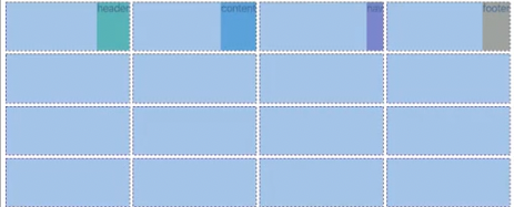
template으로 주로 사용해야 웹사이트의 형태파악이 쉬움
1fr 이란 가질수 있는 최대를 가르킴(예, repeat(4, 1fr)이고
부모의 width 500px이면 거기서 4개로 나눠서 최대)
fr 단위로 설정하면 웹사이트의 크기에 따라 크기가 자동 반영 됨
flexbox와 마찬가지로 모든 cell은 order을 가지고 있으며 기본값은 0 이다.
.grid {
  display: grid;
  gap: 10px;
  height: 100vh;
  grid-template:
    'header header header header' 1fr(row)
    'content content content nav' 2fr(row)
    'footer footer footer footer' 1fr(row) / 1fr(width) 1fr 1fr 1fr;
}

.header {
  background-color: tomato;
  grid-area: header;
}
.content {
  background-color: aquamarine;
  grid-area: content;
}
.nav {
  background-color: black;
  grid-area: nav;
}
.footer {
  background-color: blue;
  grid-area: footer;
}
.grid {
	jusify-items: stretch(기본값) - 최대로 늘린다.
    align-items: - 수직으로
}
둘다 사용하려면 place-items : 수직 수평
예) jusify-items: end
grid-auto-flow : row(default), flex-direaction과 비슷 (방향설정)
grid-auto-rows(반응형으로 내가 설정한 row보다 더 생성되었을때 기본값을 설정해줌),
grid-auto-columns(반응형으로 내가 설정한 column보다 더 생성되었을때 기본값을 설정해줌),
items 각각의 요소 전체, self 하나의 요소에게만 (row, column 둘다 컨트롤 place- )
minmax 최소(더이상 줄어들 수 없다),최대
: grid-template-columns: repeat(4, minmax(100px, 1fr)) 최소 넓이 100px 최대 1fr
반응형할때 사용하면 유용
auto-fill : grid-template-columns: repeat(auto-fill, minmax(100px, 1fr));
// 창 너비가 늘어나면 빈 column들로 row를 채움 (정확한사이즈)
auto-fit : grid-template-columns: repeat(auto-fit, minmax(100px, 1fr));
// 창 너비가 늘어나면 element를 늘려서 row에 맞게 해줌 (유동적사이즈)
max-content : box를 콘텐츠(안에내용)에 필요한만큼 커지게 함
min-content : box를 콘텐츠(안에내용)가 작아질수 있는 만큼 작아지게 함
결합해서 사용 가능 => repeat(4, minmax(min-content, 1fr))