Storybook 소개 / 기본 사용법 | DaleSeo
Storybook | PoiemaWeb
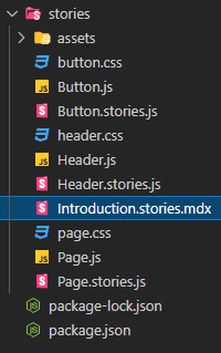
- Introduction.stories.mdx
- Button.stories.mdx
- Button.js
- button.css
- Button.js
- Header.stories.mdx
- Header.js
- button.css
- Header.js
- Page.stories.mdx
- Page.js
- page.css
- Page.js
설정 ⚙ .stories.mdx
제작 🛠 .js
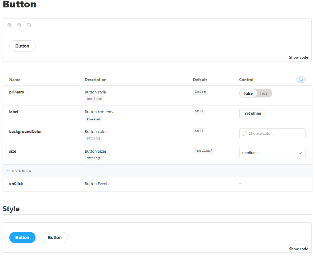
Button 컴포넌트
button.css
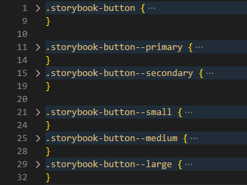
기본 속성 + variant , size 에 따른 스타일 지정
Button.js
import './button.css';
export const createButton = ({ argTypes }) => {
  // <button> element 생성
  // argTypes 에 따라 제작 (class 지정, 텍스트 할당 등)
  return btn;
};
Button.stories.js
Controls | Storybook
ArgsTable | Storybook
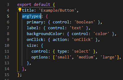
// argTypes
primary: { // Name
  control: 'boolean' | 'text' | 'color' | 'select' ...,
  description: 'Button style', // Description
  defaultValue: false, // Control 에 적용
  table: { // type, Default값 명시
    type: {
      summary: 'boolean',
    },
    defaultValue: {
      summary: 'false',
    },
  },
},
onClick: {
  action: 'onClick',
  description: 'Button Events',
  table: {
    category: 'Events',
  },
},
Button.stories.mdx
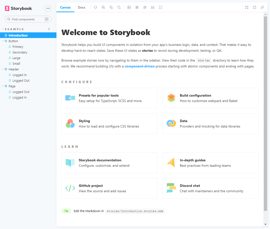
Canvas | Storybook
Story | Storybook
export const Template = (args) => createButton(args);

# Button

<Preview withToolbar>
  <Story name="Standard">
    {Template.bind({})}
  </Story>
</Preview>

<ArgsTable story="Standard" />

## Style

<Canvas>
  <Story name="Primary" args={{
    primary: true,
  }}>
    {Template.bind({})}
  </Story>
  <Story name="Secondary" args={{
    primary: false,
  }}>
    {Template.bind({})}
  </Story>
</Canvas>