
모달창을 쓸 일이 많이 없을 거라 생각했는데, 생각보다.. 모달창의 사용빈도가 많아지고 있어
나도 .. 복붙!
을 이해하고 내 글로 스타일 컴포넌트를 쓰는 리액터분들에게 하나의 템플릿을 제공할 수 있기를..🙆♀️🙆♂️
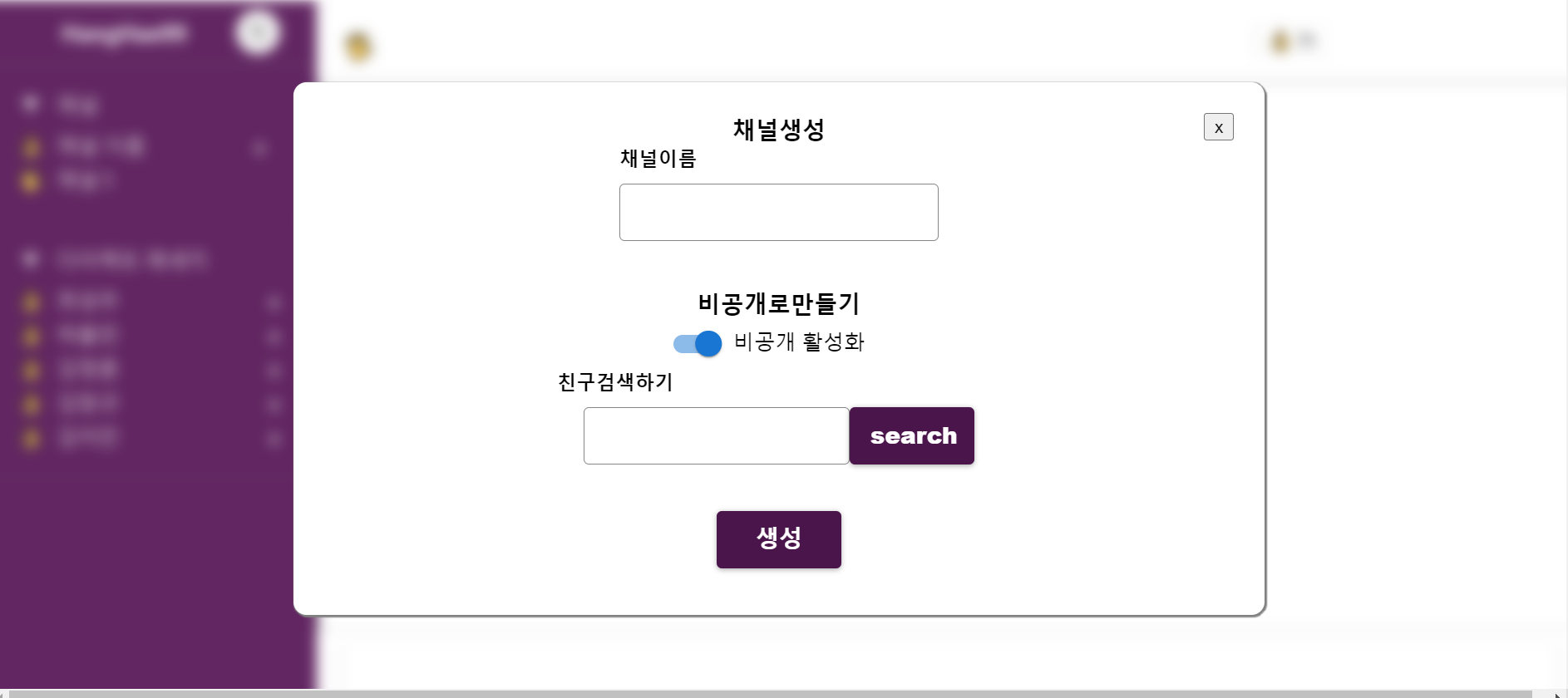
내가원하는 건 버튼을 눌렀을 때 모달창이 나오고 모달창외에 뒷배경을 블러처리하는 것이 목적이었다!
첫번째 원하는 버튼에다가 모달창의 상태를 온클릭으로 제어하는 상태 만들기.
//main.js (모달창이 띄워질 페이지)
const main = () => {

const [ModalHandle,setModalHandle] = React.useState(false);

return (
   <button onClick{()=>{setModalHandle(true)}}> open </button>
)

}
이 다음 모달창 컴포넌트를 하나 만들어준다.
modal js

const modal = () => {


return (

        <Container>
        <Background >
        <ModalBlock >
       <Close  >x</Close> //모달창을 닫을 버튼

         모달창에 들어갈 내용!
	  </ModalBlock >
      </Background>
      </Container>
)

}

const Container = styled.div`
    position: fixed;
    width: 100%;
    height: 100%;
    z-index: 100;
    top: 0;
    left: 0;
    right: 0;
    bottom: 0;
    display: flex;
    flex-direction: column;
    align-items: center;
`;

const Background = styled.div`
    position: fixed;
    width: 100%;
    height: 100%;
    background-color: rgba(255,255,255,0.15);
    backdrop-filter: blur(5px);

`;

const ModalBlock = styled.div`

    position: absolute;
    top: 6.5rem;
    border-radius: 10px;
    padding: 1.5rem;
    background-color: white;
    color: black;
    width: 700px;
    box-shadow: 1px 1px 1px 1px gray;

`;
export default modal
Main 페이지에서 모달창을 닫은 상태를 제어하기 위해선
setModalhandle(true)가 되어야한다! 닫기 버튼을 누르거나 모달창이 아닌 다른 배경을 눌렀을시에 모달창이 닫히는 방식을 하려하기때문에
X버튼과 태그에 onClick{()=>{setModalhandle(true)}}추가 입력한다. 하지만 setModalhandle은 부모컴퍼넌트인 Main에 있기때문에 내려받아야한다.
이후 버튼을 누르면 모달창이 뜨게하려면 일단 main페이지로 모달창을 Import해서 return안에 배치한다.
 const main = () => {

const [ModalHandle,setModalHandle] = React.useState(false);

return (
  <button onClick{()=>{setModalHandle(true)}}> open </button>
)
{openMoadal && <Modal closeModal={setModalhandle} />}
 버튼에 따라서 모달창이 표시여부를 결정하고 부모인 Main에서 setModalhandle를 넘겨준다  자식인 modal 컴포넌트로넘겨준다.
const modal = (closeModal) => {
return (
<Container>
<Background onClick{()=>{closeModal(true)}}>
<ModalBlock onClick{()=>{closeModal(true)}}>
<Close >x</Close> //모달창을 닫을 버튼
모달창에 들어갈 내용!
</ModalBlock >
</Background>
</Container>
)
}
const Container = styled.div`
position: fixed;
width: 100%;
height: 100%;
z-index: 100;
top: 0;
left: 0;
right: 0;
bottom: 0;
display: flex;
flex-direction: column;
align-items: center;
`;
const Background = styled.div`
position: fixed;
width: 100%;
height: 100%;
background-color: rgba(255,255,255,0.15);
backdrop-filter: blur(5px);
`;
const ModalBlock = styled.div`
position: absolute;
top: 6.5rem;
border-radius: 10px;
padding: 1.5rem;
background-color: white;
color: black;
width: 700px;
box-shadow: 1px 1px 1px 1px gray;
`;
export default modal하면 모달이 완료가된다.!
usestate와 뒤쪽블러처리는 다음 게시물에서 다뤄보도록하쟈!

함께 일하고 싶어지는 동료가 되기를 원하는 프론트엔드 개발자입니다.