
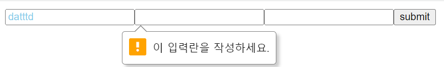
컴포넌트에 attribute 고정으로 사용하기
// input 에 required 적용
import styled from "styled-components";

function App() {
  return (
    <div>
      <form>
        <Input />
        <Input />
        <Input />
        <button type="submit">submit</button>
      </form>
    </div>
  );
}

const Input = styled.input.attrs({ required: true })`
  color: skyblue;
`;
export default App;
attribute를 props로 전달받아 사용하기
// box 컴포넌트에 글자 색상과 박스 bg 색상 각각 적용하기
import styled from "styled-components";

function App() {
  return (
    <div>
      <Box fontColor="white" bgColor="#222">
        Box1
      </Box>
      <Box fontColor="yellow" bgColor="tomato">
        Box2
      </Box>
      <Box fontColor="blue" bgColor="#dbdbdb">
        Box3
      </Box>
    </div>
  );
}

const Box = styled.div`
  display: flex;
  justify-content: center;
  align-items: center;
  width: 100px;
  height: 100px;
  background-color: ${(props) => props.bgColor};
  color: ${(props) => props.fontColor};
`;
export default App;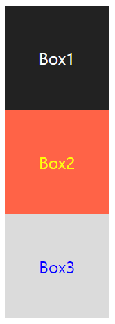
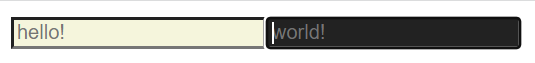
컴포넌트에 selector 사용하기
import styled from "styled-components";

function App() {
  return (
    <div>
      <Input placeholder="hello!" />
      <Input placeholder="world!" />
    </div>
  );
}
const Input = styled.input`
  background-color: beige;
  &:focus {
    color: white;
    background-color: #222;
  }
`;

export default App;

독서와 개발을 좋아하는 프론트 개발자 🍀